While data sculptures date back from the 1990s, the very first sculptures were Venus figurines: A Venus figurine is any Upper Paleolithic statuette portraying a woman with exaggerated physical features. The oldest ones are about 35,000 years old. Right image: modern versions. Also see V.S. Ramachandran on the peak shift principle in art. Sources: Wikipedia article on Venus figurines. Left image from ancient-origins.net, right images from Mari Shiranui's flickr page and heldenshop.de.
5500 BC – Mesopotamian Clay Tokens
The earliest data visualizations were likely physical: built by arranging stones or pebbles, and later, clay tokens. According to an eminent archaeologist (Schmandt-Besserat, 1999): "Whereas words consist of immaterial sounds, the tokens were concrete, solid, tangible artifacts, which could be handled, arranged and rearranged at will. For instance, the tokens could be ordered in special columns according to types of merchandise, entries and expenditures; donors or recipients. The token system […]
2600 BC – Quipus
Quipus were complex assemblies of knotted ropes that were used in South America as a data storage device and played an important role in the Inca administration. Only a handful of specialists could use and decipher them. Their meaning mostly remains a mystery but it seems that color, relative position of knots, knot types and rope length were used to encode categorical and quantitative variables. The oldest known Quipu is 4600 years old. In the late 16th century quipus were still being used by […]
1600 BC – Water Clocks
A water clock (or clepsydra) is an instrument where time is measured by regulating a flow of liquid. The oldest water clocks simply consisted of a pierced bowl placed in a larger pot filled with water (see left image, Persian artefact from 400 BC). These existed back in the 16th century BC. The passage of time was observed by counting how many times the bowl overflowed and its content had to be poured back in the larger pot. This was used for example in Persia to ensure fair irrigation […]
500 BC – Pebble Voting
The earliest participatory visualizations were probably voting systems. Voting in Greece was introduced in the 5th century BC. Adult male citizens were invited to express their opinion by dropping a pebble in an urn: a white pebble meant "yes" and a black pebble meant "no". Sometimes two urns were used. The left image is a detail of a Greek wine cup from the 5th century BC, and is one of the earliest known depictions of the act of voting. The middle image is a modern reconstruction from a TV […]
150 BC – Greek Orrery
An orrery is a mechanical model of the solar system. The left image shows the Antikythera, the oldest known orrery. The middle image shows a virtual reconstruction. The right image shows a contemporary orrery. The Antikythera mechanism is an ancient analog computer designed to predict astronomical positions and eclipses. It was recovered in 1900–01 from the Antikythera wreck, a shipwreck off the Greek island of Antikythera. The instrument was designed and constructed by Greek scientists and has […]
1200 – Pop-Up and Movable Books
While gatefold mechanisms were already used in the 1100s, one of the first movable paper mechanisms was a volvelle created by Benedictine Monk Matthew Paris to calculate the dates of Christian holidays in his book Chronica Majorca (1236-1253, see left image above). Volvelles are paper discs or rings placed on top of each other that rotate around a string or rivet. Many other types of paper mechanisms have been invented since then, such as flaps, which were used in anatomy books starting from […]
1500 – Flow Visualization
Although today computer graphics is often used for doing flow visualization, a range of physical methods exist that can visualize flows in-place. Leonardo da Vinci was presumably one of the first to use these methods: Leonardo da Vinci (1452-1519) also developed techniques for observing the wind (by generating smoke in a tube and adding it to the wind at suitable points). Most important of all, he made actual experiments under controlled conditions. For this purpose, he used, among other […]
1500 – Plans-Reliefs
The first terrain/city models date back from the 16th century and were created for military purposes. Left image: a plan-relief of Bayonne, created by Sébastian Vauban (1633–1707), a famous fortification engineer of King Louis XIV. Right image: a plan-relief of Grenoble from 1848. These scale models were highly prized for the tactical advantage they brought, and they were also shown around for dissuasive purposes. “Il y a un relief de Namur dans les Tuileries, je vous demanderai d'avoir la […]
1660 – Galileo Thermometer
A Galileo thermometer consists of a set of floaters immersed in a clear liquid (typically ethanol) inside a sealed glass tube. Today a floater is typically a glass sphere containing a colored liquid and to which is attached a metallic temperature tag. The composition of a floater is irrelevant, its overall density just needs to be calibrated to a certain value and remain stable. Floaters being made of glass and metal, their volume - and therefore density - is largely unaffected by temperature. […]
1750 – George Adams' Solid Geometry Models
During the 18th century, instrument maker George Adams built and sold solid 3D geometric models as educational complements to the 2D images found in Euclid's Elements of Geometry. As argued by a 18th-century author: It is almost as necessary as in mechanics, to exhibit the objects, whose qualities are to be taught; and to call in the joint assistance of the hands and eyes. According to the Whipple Museum of the History of Science, authors were already experimenting with paper models soon after […]
1753 – Barbeu-Dubourg's Machine Chronologique
Before Joseph Priestley published his famous timelines, Frenchman Jacques Barbeu-Dubourg built a 16-meter long timeline showing 140 years of world history, which can be mechanically scrolled and folded for transport. Not a physical visualization but maybe the first “interactive” timeline representation in history. Seen in a talk by Catherine Plaisant. Sources: Stephen Boyd Davis (2009) The First Modern Timeline? Stephen Ferguson (1991) The 1753 Carte Chronographique by Jacques Barbeu Du Bourg. […]
1787 – Chladni Plates
In 1787, German physicist and musician Ernst Chladni published a technique to visualize the modes of vibration of a rigid surface. Chladni's technique [...] consisted of drawing a bow over a piece of metal whose surface was lightly covered with sand. The plate was bowed until it reached resonance, when the vibration causes the sand to move and concentrate along the nodal lines where the surface is still, outlining the nodal lines. The patterns formed by these lines are what are now called […]
1820 – Papier-Mâché Anatomical Models
Left image: As part of its 2014 exhibition entitled Mind Maps: Stories from Psychology, the London Science Museum showcased this very accurate and intricate papier-mâché brain model from 1900 that shows path of nerve fibers. French physician Louis Thomas Jerôme Auzoux developed this technique around 1820 due to the shortage of human cadavers and wax models to study human anatomy. He was inspired by papier-mâché dolls that were common at the time. His models became popular in schools, […]
1839 – Théodore Olivier's String Models
Between 1839 and 1853 the French mathematician Théodore Olivier created string models to teach and demonstrate descriptive geometry, some of which could be manipulated. He was a student of French mathematician Gaspard Monge, who invented descriptive geometry and was already illustrating his ideas with rudimentary string models. Photo above: intersection of two cylinders. Sources: Nicholas Mee (2013) Strings, Surfaces and Physics. Photo above taken in the Musée des Arts et Métiers in Paris, see […]
1850 – Merryweather's Leech Barometer
In 1850, British doctor and inventor George Merryweather built a barometer that uses live medicinal leeches to predict storms: The twelve leeches are kept in small bottles inside the device; when they become agitated by an approaching storm they attempt to climb out of the bottles and trigger a small hammer which strikes a bell. The likelihood of a storm is indicated by the number of times the bell is struck. The device, which Merryweather called the "tempest prognosticator", was shown at the […]
1862 – Marshall Islands Stick Charts
These physical visualizations show ocean swell patterns, and were built by native Micronesians from the Marshall Islands to facilitate canoe navigation. They were memorized before trips. The Western world remained unaware of the existence of these artifacts until 1862. The photo above is a stick chart from 1974. Straight sticks represent regular currents and waves, curved sticks represent ocean swells, and seashells represent atolls and islands. Sources: Wikipedia. Marshall Islands Stick […]
1866 – Kundt's Tube
Kundt's tube is an apparatus invented in 1866 by German physicist August Kundt for measuring the speed of sound. It mostly consists of a transparent tube of adjustable length with powder in it. Sound is produced at one end of the tube, and the tube's length is adjusted until the sound becomes louder, indicating the tube is at resonance and the sound forms a standing wave. The powder then accumulates at the nodes of the standing wave, where is no vibration. The wavelength of the sound can be […]
1880 – Klein's Mathematical Plaster Models
In the 19th century, mathematicians became interested in the question how mathematical functions look like. Felix Klein, a German mathematician, had several of such physical models in his lab in Göttingen, and popularized them in America when he brought a boatload to the World's Fair in Chicago in 1893. The photo above shows a model of a Clebsch surface from 1880, designed and presumably built by Adolf Weiler, Klein's grad student. It is kept today at the University of Göttingen. Sources: […]
1885 – Ammassalik Wooden Maps
These three-dimensional maps were carved by inuits from the Ammassalik Fjord in Greenland, and used as eyes-free guides for sailing. The left one shows coastline, the right one shows a sequence of offshore islands. These inuit communities had had no direct contact with Europeans before a Danish explorer met them in 1885 and was shown the wooden maps. Sources: Bill Buxton (2007). Sketching User Experiences. page 36. Wikipedia. Ammassalik wooden maps.
1887 – Marey's Movement Sculptures
Bronze sculpture showing the phases of the flight of birds, created by French scientist Étienne-Jules Marey in 1887 based on photographs. Étienne-Jules Marey was a pioneer in the study of dynamic phenomena and invented a variety of scientific and medical instruments, photography techniques, and temporal visualization methods. A wealth of information is available about him online. Also see our entry on Peter Jansen's movement sculptures, inspired from his work. Sources: Russel Naughton (2007) […]
1889 – Gaudí's Hanging Chain Models
Spanish Catalan architect Antoni Gaudí disliked drawings and prefered to explore some of his designs — such as the unfinished Church of Colònia Güell and the Sagrada Família — using scale models made of chains or weighted strings. It was long known that an optimal arch follows an inverted catenary curve, i.e., an upside-down hanging chain. Gaudí's upside-down physical models took him years to build but gave him more flexibility to explore organic designs, since every adjustment would […]
1890 – Polynesian Genealogical Instrument
This artefact from the Marquesas Islands (French Polynesia) served as a memory aid for reciting genealogies during ceremonies. Each thread, made of woven coconut fiber, is a genealogical line and each knot is a generation. The genealogy goes back to the mythical origins of Earth, materialized by the oblong ball on top, made of wood (see left image). The date of the artefact is unknown. It was collected by Alphonse Long, French navy physician, while he was on duty in the Marquesas Islands […]
1896 – James Ive's Mechanical Teaching Map
The boundaries of the United States transformed during the 19th century, often through violent means. Mapmaker James Ives created this mechanical map to help people, especially students, visualize these changes. Sources: Leventhal Map Center (2019) Tweet. Boston Rare Maps (2016) Fantastic mechanical map of United States territorial expansion. Video by the Leventhal Map Center.
1897 – Stop Motion Animation
Stop motion animation is the frame-by-frame capture of (generally) inanimate objects which are manipulated by increments in order to produce the illusion of motion. It was first used in movies to produce magical effects. The first movie to use this technique was The Humpty Dumpty Circus (1897), where a toy circus of acrobats and animals comes to life (left image). With modern 3D computer graphics, stop motion animation has become largely obsolete, but remains occasionally used. A particularly […]
1898 – Tallies Used as Social Displays on Pacific Islands
In the 19th century, the Torres Strait Islanders did not have a numeral system and used sticks to keep counts. Sticks were tied to a string, forming a bundle (called kupe) that could be rolled and unrolled when needed. Kupes were typically used by men to keep track of their accomplishments, such as turtles caught in deep water, fishes speared, or adventures with women (as the one above). These physical visualizations were used as social displays, and big kupes were greatly prized. According to […]
1900 – Pearson and Lee's Height Correlation Chart
The physical model on the left is a bivariate histogram showing the correlation between the heights of fathers (horizontal axis) and sons ("vertical" axis). This data was famously collected by Karl Pearson and Alice Lee between 1893 and 1898. The physical visualization is thought to have been constructed around this time period or soon after, possibly under the supervision of Pearson. It is kept at the Department of Statistical Science, University College London, founded by Pearson in 1911. I […]
1900 – Crum Brown's Mathematical Surface
Model by Alexander Crum Brown (1838-1922) of a half-twist mathematical surface, featuring a non-Euclidean so-called Klein bottle, c. 1900. Sources: Photo from the Science Museum, London, textual description courtesy of Klaus Hentschel. For more, see Klaus Hentschel (2014): Visual Cultures in Science, Technology and Medicine, pp. 96ff. and pl. XIV.
1900 – Modern Solid Terrain Modeling
The Institute of Cartography ETH Zurich published a great review of past and present techniques for doing solid terrain modeling. Although terrain models are not physical visualizations in the strict sense, the techniques could be in principle used to convey data. Physical terrain models were already being built in 16th the century, and the review covers modern techniques from the early 20th century to today's digital fabrication. Source: Institute of Cartography ETH Zurich (2006) Terrain […]
1901 – Davenport's Physical Distributions
In 1901, biologist Charles Davenport "built" physical visualizations that show the distributions of features of objects and people. These visualizations were made out of the objects and the people themselves. The purpose was to explain the notion of statistical distribution to a lay audience. On the left image, seashells are piled up according to how many ribs they have. On the middle image, students are arranged in bins according to their height. On the right image, they are simply sorted. […]
1907 – Pin Maps
Left image: residence of Harvard students 6 years after their graduation (1907); made with beads, pins and wires. Middle image: Sources of the 3,000 first letters of appeal sent to Mrs. E. H. Harriman (1912); eight different kinds of pins were used to represent different kinds of appeals. Right image: collection of pins and beads made for maps. Sources: Willard Cope Brinton (1914) Graphic Methods for Presenting Facts pp. 227-253. John Krygier (2010) A Discourse on Map Pins and Pinnage. New York […]
1913 – Frankfurt Streetcar Load
Strips of woods glued on top of each other convey the average number of passengers carried between two stops. Each strip corresponds to 4,000 passengers. Shown at the 1913 International building trade exhibition in Leipzig. Source: Willard Cope Brinton (1914) Graphic Methods for Presenting Facts pp 224-226.
1914 – Solid 3D Curves for Engineering
In his 1914 book, Brinton discusses various techniques for building solid models of three-dimensional charts and functions for the purposes of engineering, and uses the two designs above as examples. Although these don't look like they could be solid models, the text from Brinton's book suggests they are. The first one (left) is made of plaster and shows the characteristics of a light bulb. The second (right) is made of cardboard and shows the results of tests of a fan. The two artifacts are […]
1915 – Wire Models of Factory Worker Movements
3D wire models of hand motion paths (or chronocyclegraphs) created by Frank Gilbreth, a pioneer in the study of motion in the workplace. In his 1917 book, Gilbreth explains how he created these solid models from time-lapse photographs, and how useful they are to study and teach human motion. Left image: Wire model of foreman on drill press. This shows “positioning” in the midst of “transporting.” Right image: First photograph of wire models showing one man's progress of learning paths of least […]
1920 – Yakama Time Ball
Women from the Yakama Native American tribe used strings of hemp as personal diaries. Each major event in their life was represented by a knot, a bead or a shell. This mnemonic device is called an Ititamat, or counting-the-days ball, or simply time ball. The first image shows an Ititamat created before 1920. On the second image, each string is a different Ititamat. The last image shows a 2003 replica. A young woman would use a time ball to record her courtship, marriage, and other experiences […]
1926 – Karsten's Tridimensional Chart
American economist and statistician Karl G. Karsten patented a method for creating physical visualizations of temporal data by stacking two-dimensional plates, each representing a time period. Each of the plates shown above is a variable-width column chart representing the state of the stock market at the end of a particular month. Each bar is a type of stock, where the height of the bar encodes the stock price and its width encodes volumes of sales. Each month, a new layer is added. Seen from […]
1930 – Mathematical Functions Embodied in Ballistic Cams
These cams are solid models of bivariate and univariate mathematical functions plotted in cylindric coordinates (left and middle images) and polar coordinates (right image). They were not meant to be visually examined, but were used in mechanical analog computers for aiming battleship guns during WWII. They were also called computing cams. Mechanical fire control aids started to be developed in the 1900s and and were still in use in the late 1980s. During WWII, they could solve multivariate […]
1933 – IBM's Cosmograph
The left image above shows a physical flow chart (Sankey diagram) made of 1000 sheets of paper. It was not meant to be directly read, but to be photographed (see right image). The physical apparatus, called Cosmograph, allowed people without graphic skills to easily produce nice-looking Sankey diagrams. It was copyrighted by IBM in 1933 and sold for $50. Sources: Willard Cope Brinton (1939) Graphic Presentation, p. 78. Jim Strickland (2012) Cosmograph? What's a Cosmograph?
1934 – Hayward's Moon Model
Illustrator and model-maker Roger Hayward (1899-1979) working on a model of the lunar surface for the Griffith Planetarium, 1934. Sources: Kevin Kidney (2009) Mr. Hayward's Moon Model. Photo from Keven Kidney's blog, textual description courtesy of Klaus Hentschel. For more, see Klaus Hentschel (2014): Visual Cultures in Science, Technology and Medicine, pp. 217-226.
1934 – Ford's Globe
A large rotating relief globe showing Ford company's industrial sites around the word, exhibited at the Chicago World's Fair in 1934. Sources: Willard Cope Brinton (1939) Graphic Presentation, p. 160. The Henry Ford Blog (2013) Ford at the Fair. More photos from the Henry Ford Online Collection.
1935 – 3D Visualizations of Power Consumption
A large 3D physical visualization made by the Detroit Edison Company showing electricity consumption for the year 1935, with a slice per day and each day split into 30 min intervals. Two other examples from different Edison electricity companies are discussed in Brinton's book. These physical visualizations seem to have been used to better anticipate power demands. Also see our entry 1951 - Electricity Generated or Demanded. Sources: Willard Cope Brinton (1939) Graphic Presentation pp 354-355. […]
1939 – Map of Great Britain's Marine Trade
A physical World map made of copper and glass showing the size of Great Britain's merchant marine and the main trade routes as 9,000 miniature ship models. Exhibited at the New York World Fair in 1939. Sources: Willard Cope Brinton (1939) Graphic Presentation, p. 207. Life Magazine (1939) New York Opens the Gates to the World of Tomorrow. Vol. 6, No. 20, May 15 1939.
1947 – Dorothy Hodgkin's Electron Density Contours
Nobel prize winning crystallographer Dorothy Crowfoot Hodgkin created another physical visualization in the mid 1940's, showing part of the structure of penicillin. An original of this artifact is in the Oxford Museum of the History of Science. This technique recently inspired artist Angela Palmer for her glass portraits. Sources: Lachlan Michael and David Cranswicka (2008) Busting out of crystallography's Sisyphean prison: from pencil and paper to structure solving at the press of a button: […]
1949 – Mississippi River Basin Model
As a response to devastating floods of the Mississippi river in the early 1900s, the US Army Corps of Engineers built a large-scale hydraulic model of the entire river system. The model, 2.5 times the size of Disneyland, allowed them to design better flood control infrastructures and to eventually save millions of dollars. In 1973, the physical model ceased to be used and was replaced by computer models. Nevertheless, mathematical equations still cannot capture all the complexity of river […]
1949 – Moniac: A Hydromechanical Machine to Teach Economics
The MONIAC or Phillips machine is a hydromechanical analog computer built to teach basic economical principles using colored water flowing in transparent pipes. The machine was built in 1951 after electrical-engineer-turned-economist William Phillips and his economist colleague Walter Newlyn realized that flows were used as a metaphor to teach economics, but have never been made physical. Phillips is also known for his eponymous curves. Several MONIACs were built, and a working one is […]
1951 – Microtiter Plates
A microtiter plate is an array of chemical test tubes called "wells", invented in 1951 by a Hungarian medical doctor. They are used in a variety of experimental designs, most typically biochemistry assays. The picture above is an example of a colorimetric assay result. Most of the time, they are not directly interpreted visually, as in this example, but are instead put into a plate reader that measure light transmission in each well and converts it to a numerical result. See an example catalog […]
1957 – Proteine Visualizations
Left image: The very first physical model of a protein (myoglobin) built by crystallographer John Kendrew in 1957 using plasticine. The image is from a 1958 Nature article, for a more recent photo see here. In 1960 Kendrew completed a higher-resolution skeletal model known as the "forest of rods". The model was 2-meter wide, made of brass, and supported with 2,500 vertical rods, making it barely legible. Colored clips were attached to the rods to visualize electron density. See photos here and […]
1960 – 3D Spectrogram
The object on the left may be one of the first sound sculptures. It appears in a 1960 book by German acoustician and musicologist Fritz Winckel (click on the middle image to see the full page). It is a physical 3D spectrogram showing a frequency analysis of an 8-second recording of Beethoven's Eighth Symphony. The left axis is frequency, the bottom/right axis is time, and the vertical axis is the strength of a particular frequency at a particular time. The figure caption uses the term […]
1965 – Stop Motion Animation of Physical 3D Map
This educational movie from the 1960s uses physical bars and stop motion animation to show the evolution of population in the Paris area between 1801 and 1961. It was made between 1962 and 1967 by the Institut des Sciences Humaines Appliquées (ISHA) and the Centre de Mathématique Sociale et de Statistique (CMSS), in collaboration with the Laboratoire de Cartographie directed by Jacques Bertin. You can see the physical visualization from all sides by […]
1968 – Jacques Bertin's Reorderable Matrices
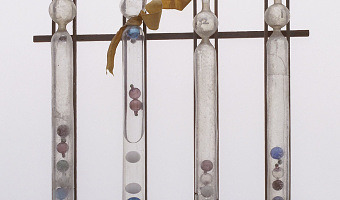
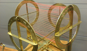
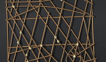
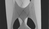
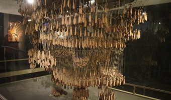
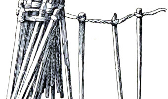
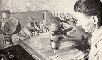
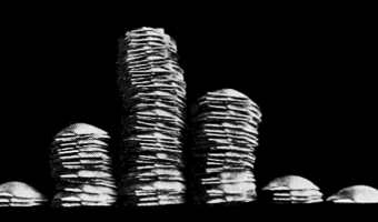
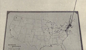
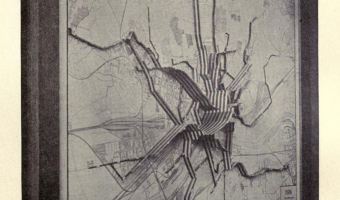
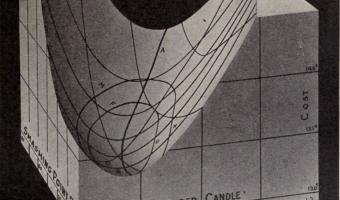
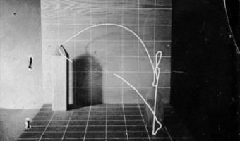
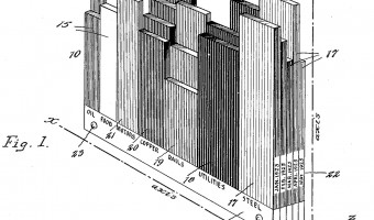
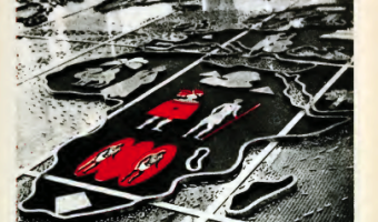
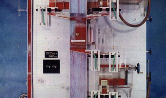
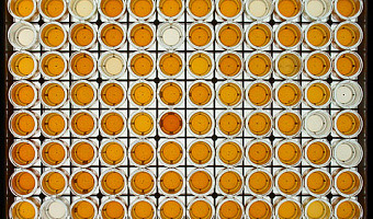
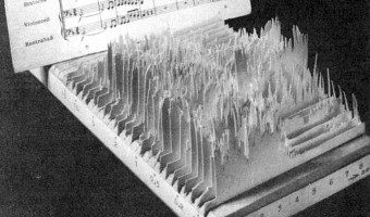
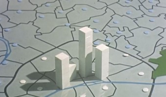
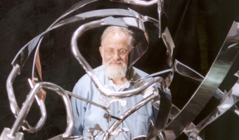
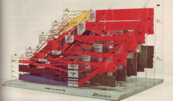
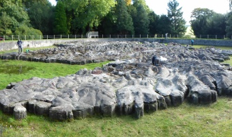
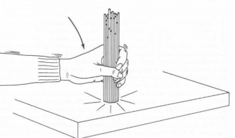
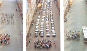
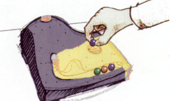
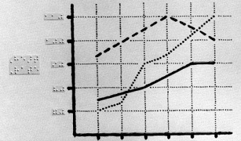
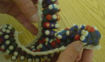
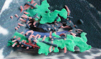
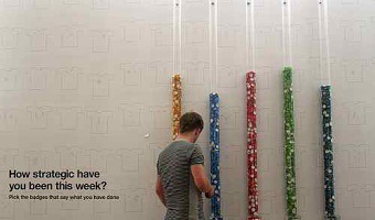
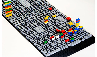
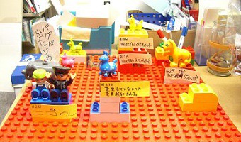
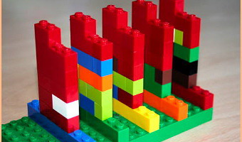
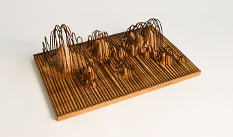
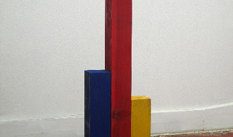
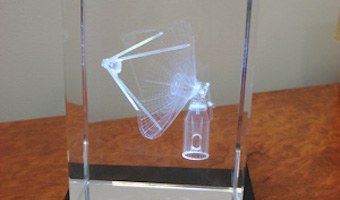
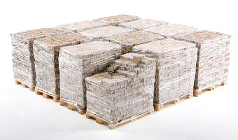
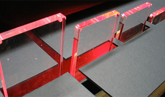
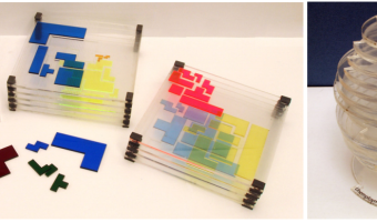
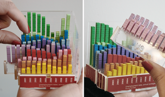
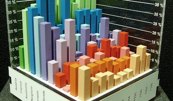
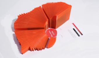
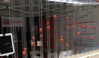
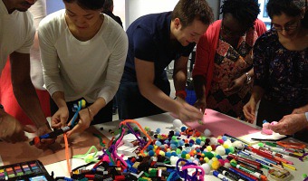
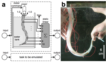
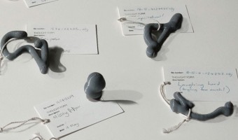
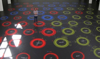
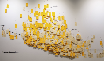
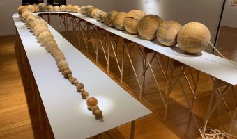
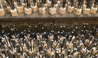
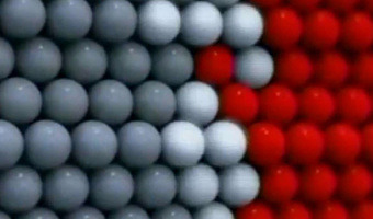
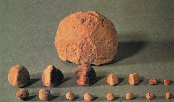
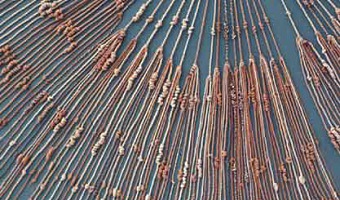
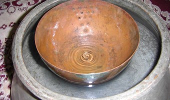
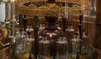
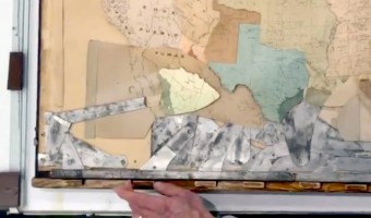
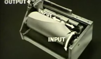
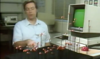
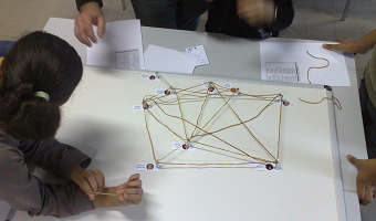
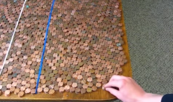
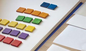
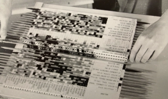
The reorderable matrix is a physical device developed in the mid 1960s by French cartographer Jacques Bertin for exploring and presenting tabular data. Bertin designed several reorderable physical matrices he called Dominos, each with a different size and visual encoding. The first three images above show a small, medium, and large version. A rod mechanism allowed unlocking either rows or columns for reordering. The dominos were part of a general method of “graphic information processing”, […]
1970 – Byron's Bender
In the early 1970's, crystallographer Byron Rubin invented a tool that bends wires to make proteins models. The tool was popular until the 1990s. Byron Rubin became an artist who builds large-scale molecular sculptures. Eric Martz and Eric Francoeur explain how such physical models yielded important scientific insights: An example illustrating the importance of models from Byron's Bender occurred at a scientific meeting in the mid 1970's. At this time, less than two dozen protein structures had […]
1970 – MoMA Poll: Participatory Bar Chart
German-American artist Hans Haacke created a participatory physical bar chart as part of a 1970 exhibition at the Museum of Modern Art (MoMA). The audience expressed his opinion on the question "Would the fact that Governor Rockefeller has not denounced President Nixon's Indochina Policy be a reason for your not voting for him in November?". The left plexiglass box collected "Yes" answers, while the right box collected "No" answers. Rockefeller was running for re-election and was a major donor […]
1970 – 3D Sankey Diagram
This physical 3D Sankey diagram shows complex energy flows and was created in the 70s by the Center for Strategic & International Studies (CSIS). Little information is available about it. It seems to be composed of five layers of transparent sheet, with four additional layers running perpendicularly. Physical size unknown. Source: Energy Education References Wiki. Energy Flow Diagrams 1949-2009.
1973 – Mazamet Ville Morte
In 1973, the French town of Mazamet had a population that closely matched the nationwide number of motor vehicule deaths across the previous year. A TV reporter decided to show all inhabitants lying on the floor to symbolize these deaths. Source: Marieaunet (2010) 1973 Mazamet ville morte.
1977 – Graphical Waterfall
A graphical waterfall is a display where images are formed by water droplets falling from computer-controlled nozzles. It was invented in 1977 by Stephen Pevnick, an American artist. Graphical waterfalls can be used with regular lighting (as on the left video) or with a stroboscope (as on the right video), depending on the desired effect. It is unclear whether such devices have been already used to display data. Sources: Pevnick Design (2018), Invention of […]
1979 – Great Polish Map of Scotland
The "Great Polish Map of Scotland" is a 50 x 40 m concrete terrain model of Scotland. It was built by a Polish sergeant who stationed in Scotland during WWII and ended up living there. It is claimed to be the world's largest terrain model, although the Chinese built a 900 x 700 m model in 1999. Source: Atlas Obscura. Great Polish Map of Scotland.
1984 – Dewdney's Analog Gadgets
Alexander Dewdney is a Canadian mathematician and computer scientist who authored the recreational mathematics column in the Scientific American magazine from 1984 to 1991, after Martin Gardner and Douglas Hofstadter. In 1984, he describes a number of imaginary analog computers he calls "Analog Gadgets", which can in principle solve computing problems instantly. The first one, shown on the left image, uses spaghetti to sort numbers. The second one uses strings to find the shortest path in a […]
1985 – Using the Physical to Explain the Virtual
In this 1985 video, Rick Becker from AT&T Bell Labs explains the concept of "dynamic graphics". Already in the early 70s, statisticians like John Tukey were starting to experiment with multidimensional data visualization on flat computers screens, including 3D data visualizations that could be interactively rotated to convey depth. This video shows how enthusiastic these people were to transition from the physical to the virtual. Nevertheless, it is interesting to see that Rick Becker felt […]
1987 – All the Submarines of the United States of America
This installation from American artist Chris Burden shows the 625 submarines of the US fleet from the late 1890s to the late 1980s. The cardboard models have been suspended at different heights to look like a school of fish. Also see our other entries on single-datum physical visualizations. Sources: Found on Loren Madsen's lecture slides Art as Information – Information as Art. Wikipedia article on Chris Burden. Photo from Giorgia Valli, Grey Magazine.
1991 – Münster Congestion Visualization
In order to encourage bus use, in 1991 the city of Münster, Germany created a poster that compares the space taken by 72 bicycles (left), 72 cars (middle), and a bus (right). This idea is not new. For example, the city of London has made a very similar poster in 1965. Thanks to Will Stahl-Timmins for pointing this out. Sources: Benjamin Starr (2014) How Much Space Do Cars Take? Cyclists Demonstrate How Bicycles Flight Congestion Image from visualnews.com
1992 – Durrell Bishop's Marble Answering Machine
In 1992, Durrell Bishop, then a student at the Royal College of Art, came up with an original answering machine design that is considered as one of the first tangible user interfaces (TUIs). The machine spits out a marble each time an incoming voice message is recorded. The order of the marbles indicates the order in which the messages arrived. Messages can be played back by putting a marble in a small dent. If the message is for somebody else it can be placed on a small dish to the side that […]
1992 – Tactile Infographics
In 1994 the American Printing House for the Blind publishes a short guidebook explaining how to convey infographics for the blind using tactile graphics (first and second images). Most of it is inspired by a 1992 book by Polly Edman. Although it's not clear when were the first tactile infographics created, (non-thematic) tactile maps already existed in the 1910s (right image). Sources: APH (American Printing House for the Blind), Inc. (1994) Tactile Graphics Starter Kit. Polly Edman (1992) […]
1995 – San Diego TeleManufacturing Facility
In 1995, Mike Bailey from the San Diego Supercomputer Center created the SDSC TeleManufacturing Facility to help scientists visualize their data in physical form. In 1997, the facility produced one of the first digitally-fabricated molecular models using laminated object manufacturing. The biochemists involved in the project got insights that they were not able to get from the on-screen 3D models, and concluded that: modern physical models are important tools that significantly extend the […]
1995 – Loren Madsen's Early Data Sculptures
Californian artist Loren Madsen has been making data sculptures since 1995 and still continues today. CPI / Cost of Living (left image) is the first of his series: A lamination is one year. Vertical axis is the Consumer Price Index (CPI) for food; the horizontal axis is the CPI for gasoline + electricity. The rising center line is the CPI for housing. The 'snout' is the 1960's when housing and food were cheap. The bulge above the snout is 1973---OPEC, gasoline lines, etc. Thereafter the cost of […]
1996 – Ned Kahn's Wind-Visualizing Facades
Since 1996, Nothern California artist Ned Kahn creates large-scale installations that visualize wind patterns. The left image shows Wind veil (2000), a facade of a parking garage covered with 80,000 small aluminum panels that are hinged to move freely in the wind. The right video shows Wind arbor (2011), a facade of a hotel lobby in Singapore covered with a cable net structure composed of a half a million hinged elements. Sources: List of Ned Kahn's wind sculptures on his website. David Mather […]
1999 – World's Largest Solid Terrain Model
In 2006, a mysterious 900x700m solid terrain model with military facilities was discovered by a German Google Earth user next to the Chinese town of Huangyangtan. It was quickly identified as a 1:500 replica of a disputed area in Tibet between China and India 2400km away, with perfectly matching orientation. Chinese authorities claimed the model was built 7-8 years earlier as a tank training facility. It is unclear whether the right image represents the same model. Sources: Newswatch (2011) The […]
2000 – A Shape Display Appears in a Movie
An imaginary ultra high-resolution 2.5D shape display appears in the 2000 movie X-Men. The rendering and animations are visually quite appealing. Notice how impossible overhangs appear at 0:27 (the bridge) and 0:33 (the torch of the Statue of Liberty). This movie scene has prompted a company to design and build an actuated solid terrain model for military customers, see our entry 2004 – XenoVision Mark III. Also see our entry 2009 – Leithinger’s Interactive Shape Displays for a much […]
2000 – Kanban Boards
A Kanban board is a task management tool where sticky notes representing work items are moved across a board to reflect their state of advancement. The simplest form has three states: to do, in progress, and done (left image). A Kanban board provides a visual overview over all work items that makes it possible to rapidly spot time management issues, such as too many items in progress. Although software versions exist, many people prefer Kanban boards to be physical. Several recent blog posts […]
2000 – Graph Boards
Mathematics and geometry are often taught to blind students using a cork board with raised grid lines, push pins and rubber bands. The right image shows a teacher explaining the use of the Graphic Aid for Mathematics, a physical kit sold by the American Printing House for the Blind. Date of invention unknown. Sources: Suzan Osterhaus (2001) Teaching Math to Visually Impaired Students. Youtube video series explaining the traditional cork board: APH Graph Board with Susan Osterhaus. McGookin et […]
2002 – Bathsheba Grossman's Crystal Engravings
Artist Bathsheba Grossman has been 3D printing mathematical surfaces as early as 1997. In 2002 she started to use subsurface laser engraving to produce 3D physical visualizations of data from astronomy, biology, and physics. Left image: a piece of DNA molecule. Right image: a 3D map of our nearby stars. The artist explains to us: This medium excels at imaging less structural data such as disconnected volumes, non-compact point clouds, and the convoluted strands of proteins. It works by […]
2003 – Pattern Recognition in a Bucket
Chrisantha Fernando and Sampsa Sojakka from the University of Sussex published a paper where they demonstrate that a bucket of water can carry out complex, parallel computations, and can even do simple speech recognition. Their setup called "liquid brain" consists in a transparent water tank suspended over an overhead projector and four LEGO motors. Input values are sent to the motors which vibrate the water. A camera then reads the watter ripples and sends the data to a simple perceptron. The […]
2003 – Time Pieces: Physical Space-Time Cubes
Artist Marilynn Taylor created seven three-dimensional maps (one for each day of the week) in which time is the z-axis and a copper wire shows how she moved across the city during the day. Source: Maryline Taylor (2003) Time pieces - Mapping the time and space of place (2003 version).
2003 – Solid Terrain Model with Airplane Trajectory
A real case study involving the use of a physical 3D trajectory visualization on top of a 3D terrain model to analyze the causes of a plane crash. This case study is interesting in terms of cost-benefit analysis, since these models appear to be extremely time-consuming to build. The case study includes an informal comparison with animations: "The mock jurors later related that the physical model was easier to understand and it allowed them to discuss the issues with each other more easily than […]
2003 – Mount Fear: Elevation Map of Crime Rates
A 3D map of East London where elevation represents the rate of violent crimes between 2002 & 2003. Corrugated cardboard, 145h x 540w x 425d cm. Source: Abigail Reynolds. Mount Fear East London.
2004 – Of All the People in All the World: Stats with Rice
Since around 2004 the British group of artists Stan’s Cafe is creating data landscapes all over the world by mapping each grain of rice to a person in order to convey various statistics such as city populations or deaths in the holocaust. The size and theme of the show change depending on the location. The largest one involved 104 tons of rice. Rice is weighted manually in small quantities and manually poured over piles. This labor-intensive process is part of the show. Sources: Stan's […]
2004 – Cylinder: Early Sound Sculpture
Cylinder by Andy Huntington and Drew Allan may be one of the first digitally-fabricated sound sculptures. Also see our entry 2007 - Explosion of sound sculptures. Source: http://extraversion.co.uk/2003/cylinder/
2004 – Scripps' Molecule Models
Since 2004 the Molecular Graphics Laboratory at the Scripps Research Institute has been making heavy use of 3D-printed full-color physical molecule models, some of which are articulated (left image), flexible (middle image), and even self-assembling (right image, see video). They also publish augmented reality systems that use those physical models. Also see our entry 1995 – SDSC TeleManufacturing Facility. Sources: Web Page: http://mgl.scripps.edu/projects/tangible_models Tommy Toy (2011) How […]
2004 – XenoVision Mark III: A Dynamic Solid Terrain Model
The XenoVision Mark III Dynamic Sand Table by the company Xenotran is a self-reconfigurable solid terrain model with military applications. There is little information on this device but it seems well ahead of its time. Michael Schmitz and coauthors explain how this high-resolution shape display with 7000 actuators was originally inspired by a scene from the X-Men movie (see our entry 2000 – A Shape Display Appears in a Movie). Sources: Directions Magazine (2004) Interview with Xenotran […]
2004 – Full-Color 3D-Printed Scientific Visualizations
In 2004, the Visualization Research Lab from Brown University printed full-color 3D models of scientific visualizations. They published a poster on the topic where they discuss the technical challenges they faced. The printer used was a Zcorp Z406. Also see our entry 1995 – SDSC TeleManufacturing Facility. Source: http://vis.cs.brown.edu/areas/projects/rapid.html
2005 – Molecular Jewellery
Raven Hanna got her PhD in biochemistry in 2000, and five years later, she became an artist and started to create jewelry based on molecular structures in order to communicate science through art. Image above: endorphine necklace. Sources: Raven Hanna www.madewithmolecules.com (see 2005 version) Leigh Krietsch Boerner (2010) Profile: Molecular Jewelry Design
2005 – Time-Evolving Scatterplot
Unemployment rate plotted against inflation for 8 countries over 10 years. Every layer represents a year and each country is a wire of a different color. This physical visualization was built by Tim Dwyer for his PhD dissertation. His goal was to experimentally compare a 3D and a 2D data representation, and he used a physical object to emulate a perfect 3D display. Source: Tim Dwyer (2005) Two and a Half Dimensional Visualisation of Relational Networks. PhD Dissertation.
2006 – Peter Jansen's Movement Sculptures
Dutch artist Peter Jansen creates sculptures of moving characters by merging successive snapshots into a single monolithic object. These are not physical visualizations as they do not display data, but the technique could certainly inspire the creation of physical visualizations for complex temporal data. The idea of merging time slices is reminiscent of the pioneering work of Étienne-Jules Marey in the 1880s on chronophotography. See our entry on Marey's movement sculptures. Source: Peter […]
2006 – RoomQuake: Earthquake Visualization for the Classroom
Styrofoam balls hung from classroom ceiling representing the epicenters (location), magnitudes (diameter and color), and depths (length of the string) of a series of simulated earthquakes in a fifth grade classroom. Source: Tom Moher (2006) Embedded Phenomena: Supporting Science Learning with Classroom-sized Distributed Simulations.
2006 – Nathalie Miebach's Woven Sculptures
Artist Nathalie Miebach created a range of beautiful woven sculptures out of weather data. Source: Nathalie Miebach. http://www.nathaliemiebach.com/weather.html (see TED Talk).
2006 – Inverted Participatory Bar Charts
Participatory physical visualization where people pick badges from tanks to vote. A lower bar means more votes. Source: Lucy Kimbell (2006). Physical Bar Charts.
2007 – Garden of Eden
Garden of Eden consists of eight lettuces, each of which is enclosed in its own air-tight plexiglas box and represents a major city. The concencration of ozone in each box is controlled in real-time to reflect the current pollution level in the city. Sources: Thorsten Kiesl, Harald Moser, and Timm-Oliver Wilks (2007) Garden of Eden (web page) Thorsten Kiesl, Harald Moser, and Timm-Oliver Wilks (2007) Garden of Eden (paper)
2007 – Explosion of Sound Sculptures
In 2007-2008, sound became an endless source of inspiration for data sculptors. Examples include (images from left to right): Binaural by Daniel Widrig & Shajay Bhooshan (2007) Sound/Chair by Plummer Fernandez (2008) Sound Memory by Marius Watz (2008) Reflection by Andreas Nicolas Fischer & Benjamin Maus (2008) I Will Never Change by Us by Benga (2012) Microsonic Landscapes by Juan Manuel de J. Escalante (2012) The Shape of the Sound of the Shape of the Sound by Stephen Barrass (2012) […]
2007 – Global Cities: Elevation Maps of City Population
Large-scale physical density models where plywood forms represent the populations of 12 of the world’s major urban centres. Made by a team of designers and architects led by Professor Richard Burdett. Source: Eliza Williams (2007) Global Cities at Tate Modern. Right photo by Stefan Geens.
2007 – Wable: Web Behavior Shown with a Dynamic Bar Chart
A dynamic bar chart visualizing one's online activity. From the company's website: The personal feeds from webapplications like Plazes, Flickr, and Last.fm tell much about the activity of an individual on the internet. In this project we aim to explore how you can visualize the changes of your web identity over time and create a physical link between your virtual and real identity. The interface consists of both a physical table and a web application. This direct feedback from your web identity […]
2008 – 100% City
Since 2008, the German theater group Rimini Protokoll organizes performances where they select 100 people in such a way that they form a representative sample of a given city, and then invites them on the stage. Each person briefly introduces themselves, after which everyone participates in a series of physical visualizations where each person takes the role of a data point. The first performance was titled 100% Berlin. Similar performances were then organized in 18 other cities between 2010 […]
2008 – Psychogeographical Mapping: Travel Logging with LEGO bricks
American artist Cory Imig reconstructed the layout of the city of Savannah using LEGO bricks, and over the course of one month she added a colored brick every time she went to a particular place. Each color is a different day of the week. Source: Cory Imig (2008) Psychogeographical Mapping (see the section Documenting of her Web page for more data sculptures).
2008 – Bug Tracking with LEGO Bricks
Takeshi Kakeda explains how to use LEGO bricks for bug tracking. Source: Takeshi Kakeda (2008) Tangible Bug Tracking using LEGO bricks. Agile 2008 conference.
2008 – Activity Logging with LEGO Bricks
A visualization and logging method for personal work activity. Every tower is a day of the week. A layer is one working hour, horizontally subdivided in four quarters of an hour. Different colors are different projects. The constant availability of this interface makes it easier to log personal activity data on-the-fly, before entering it in a PIM software (an automatic method involving computer vision is being considered). Source: Michael Hunger (2008) On LEGO Powered Time-Tracking. Blog post. […]
2008 – Andreas Fischers' Data Sculptures
Andreas Nicolas Fischer is a Berlin-based artist. Above are four of his 3-D data sculptures: Fundament (world GDP and derivatives volume) Indizes (finance data over time) A week in the life (cellphone communications) Reflection (FFT of a music piece). Source: http://anfischer.com via infosthetics.
2008 – Joshua Callaghan's Physical Charts
Joshua Callaghan has created various extruded 2-D charts. Source: http://www.joshuacallaghan.com/Graphs.htm
2008 – Justin Stewart's Data Sculptures
A 3-D graph and a time series visualization. Source: http://thesocietypages.org/graphicsociology/tag/r-justin-stewart/
2008 – Scientific Visualization in Crystal
Paul Bourke proposes to use sub-surface laser engraving for communicating about scientific findings at conferences. He also has seminar slides and a poster discussing the use of 3D-printed models. Source: Paul Bourke (2008) Presenting Scientific Visualisation Results as 3D Crystal Engravings.
2008 – Kids Reconstruct Harry Potter's Social Network
At the 2008 science fair (fête de la science), the Aviz group had kids build physical node-link diagrams of Harry Potter's social network using magnets and rubber bands. Source: Aviz. http://www.aviz.fr/old/fetedelascience08/
2009 – Federal Budget Explained with 10,000 Pennies
Political Math (formerly called 10000Pennies on the Youtube channel) is a blogger who criticizes the US policy using stats and low-tech physical visualizations. His first 2009 video titled "Obama Budget Cuts Visualization" (left image) got 1.7 million views. Coins, but also bills, water or whisky stand for units of money or jobs. A video often ends with a dramatic action where the blogger cuts a penny in two, overturns a gallon container, spills hundreds of coins from a table, freezes water, or […]
2009 – Windcuts: Wind Travels Captured on Wood
Windcuts is a physical information visualisation retelling the Helsinki wind's travels over five days, using wind sensor measurements from Helsinki, and wood and a CNC machine to cut it from there too. [...] The line's direction shows the wind's direction, the line's width shows the wind's speed - a more intense wind makes a bigger line - and the line's height shows the wind's temperature. Source: Miska Knapek (2012) Windcuts.
2009 – Marcovici's Single-Datum Visualizations
Vienna artist Michael Marcovici created two physical visualizations that convey a single numerical value. The first one shows one billion dollar - the most expensive piece of art ever made, according to him (although these were actually miniature bills). The second one called Rolex Time Sand shows an entire lifetime worth of hourglass sand. For another single-datum physical visualization see our entry Ceramic Poppies to Commemorate Fallen Soldiers in WW1, and our entry on Chris Burden's […]
2009 – Leithinger's Interactive Shape Displays
Daniel Leithinger, PhD student at MIT MediaLab and his colleagues, are studying interaction with shape displays. The team designed two impressive shape displays made of arrays of ultra-fast motorized pins. Relief (2009-2010, first row above) is made of 120 motorized pins on top of which can be added a rubber sheet and a projected image. Each pin can be addressed individually and senses user input like pulling and pushing. In 2011, the team extends Relief (later renamed Recompose, second row […]
2009 – Centograph: Dynamic Bar Charts Show Keyword Popularity
Ten actuated bar charts that show the popularity of keywords of interest in news articles over time, made by the company Tinker from London. A separate search interface is provided on a regular desktop computer and sends queries to the Google News Archive. It is permanently installed in the St Paul's School for Boys Computing Department in London. Sources: infosthetics Tinker London
2009 – Poly: Physical Bar Chart Showing Online Poll Data
Poly, a self-actuated bar chart which shows replies to online polls. Sources: Digit, London. Original polling website is down [Oct 2014]; check out an archived version instead.
2010 – Cookbook Arranges Ingredients into Physical Visualizations
In Sweden, IKEA gives away baking books where ingredients are arranged into physical visualizations. The photos are by Karl Kleiner. This idea is reminiscent of Ursus Wehrli's art projects. Sources: Niels-Peter Foppen (2010) Hembakat är Bäst. Via Iohanna Nicenboim's pinterest. Images from notcot.com.
2010 – Data Sculptures in Class
The two data sculptures above have been created by undergraduate students as part of a design class given by Andrew Vande Moere at the University of Sydney. A 2010 article he coauthored with Stephanie Patel (link below) provides many other examples of these. Andrew Vande Moere has published several articles on data sculptures since 2008. Sources: Andrew Vande Moere and Stephanie Patel (2010) The Physical Visualization of Information: Designing Data Sculptures in an Educational Context. Also see […]
2010 – Hans Rosling Adopts Physical Visualizations
Hans Rosling is famous worldwide for his fascinating speeches about population growth and income inequalities, notably his 2006 TED Talk where he debunks myths about the third world using animated charts. In 2010 he started to tell stories about data using physical visualizations. He started by stacking Ikea boxes, then switched to a variety familiar objects including pebbles, toy construction kits, fruit juice, snow balls and even toilet paper. Hans' son Ola Rosling is behind the technology […]
2010 – Thematic Maps of Germany
Physical cartographic visualizations built by geographer Wolf-Dieter Rase with a Z650 printer. Left: average prices for building lots in Germany in 2006. Middle: unemployment in Germany in 2006; The surface represent trends, the columns represent local deviations from the trends (magenta means higher, cyan means lower). Right: travel distance to airports. Source: Wolf-Dieter Rase (2012) Creating Physical 3D Maps Using Rapid Prototyping Techniques.
2010 – Shanghai Spheres
For the 2010 World Expo at Shangai, Japanese firms ADK and Murayama and Las-Vegas firm Fisher Technical Services, Inc. created an array of 1,008 15cm diameter actuated spheres, each suspended by its own micro winch. The show does not include data visualizations. Kinetic sculptures made of arrays of suspended spheres abound. An early one is Joe Gilbertson's (2007). More recent ones include Kinetic Rain (2012) and Triptych (2014). Also check BMW's Kinetic Sculpture (2008) on this list. Source: […]
2010 – Headspace: Array of Actuated Bars
Artist Geoffrey Drake-Brockman created Headspace, a matrix of 256 motorized bars (total size 150 x 150 x 80cm) to display the faces of over 700 schoolchildren. Not a data visualization, but could be used as such. Source: Geoffrey Drake-Brockman (2010). http://www.drake-brockman.com.au/
2010 – eCLOUD & airFIELD: Ambient Airport Visualizations
Left image: eCLOUD is an airport installation at the San Jose International Airport created by Dan Goods, Nik Hafermaas, and Aaron Koblin. It is made of many large LCD pixels laid out in 3D space whose opacity change as a function of weather. Right image: A similar installation called airFIELD was created by the same team two years later. It shows air traffic and is installed at the Hartsfield-Jackson Atlanta International Airport. For other examples of non-regular or 3D layouts of physical […]
2010 – Limbique: Brain Slices
A neuroscientific physical visualization made by an artist and a neuroscientist. Exhibited at the at the VisWeek 2011 art show. Source: David Paulsen and Pinar Yoldas. Photo by Samuel Huron.
2010 – Dynamic Bar Chart to Visualize One's Finances
A design project by Swedish designer Hampus Edström to help people keeping an overview of their financial situation. Sources: Hampus Edström, project presentation. Yanko Design blog.
2011 – Ursus Wehrli's Art of Clean Up
Ursus Wehrli, a Swiss comedian and artist, is known for his parodic art project called "Tidying up Art", where he rearranges well-known paintings in an orderly fashion (see his 2003 book and his 2006 TED Talk). In 2011, he started a project called "The Art of Clean Up" where he rearranges everyday objects and people. Also see our other entries on physical visualizations created by rearrangement. Sources: Maria Popova (2013) The Art of Cleanup: Ursus Wehrli Playfully Deconstructs and Reorders […]
2011 – Manually Animated Graph of Scientific Data
Philadelphia-based multi-discipline artist Bradley Litwin built this physical chart that can be animated by turning a crank. It is the only manually-animated physical visualization we know of so far. It was commissionned by a pharmaceutical company, intended as an educational device for distributing to doctors. Bradley was kind enough to send us an image of the insides of the original prototype, "not quite as pretty as the final product", he says. His explanation: As the crank is turned, a […]
2011 – Jose Duarte's Handmade Visualization Toolkit
Colombian designer Jose Duarte wants to bring the DIY concept to data visualization. Using ordinary materials like balloons, tape and rubber balls, he has experimented with various visualization techniques from area charts to bubble graphs and ven diagrams in diverse scenarios as business, art, street interventions and even astronomy. To help people build physical visualizations he designed a physical toolkit he calls the Handmade visualization toolkit. Sources: Maria Popova (2011) Analog […]
2011 – Stephen Barrass' Physical Data Sonifications
Physical representations of data can target other senses than vision or touch. Stephen Barrass, one of the inventors of sonification in the late 90s and now at the University of Canberra, started to explore physical sonifications in 2011. He calls this principle Acoustic Sonification: Acoustic Sonifications are physical objects designed to make sounds that convey useful information about a dataset of some kind. Unlike other sonifications, they do not require a power supply, and the sounds are […]
2011 – Laser-Cut Time Series
Temperature measurements in Helsinki from May 2009 to May 2010. Each row is one week long. Source: Miska Knapek, see flickr photoset.
2011 – David Bowen's Sea Wave Replicators
Top: Tele-present water by David Bowen is an actuated surface controlled by wires and servo-motors that replicates sea wave patterns measured in real time in a remote location. Bottom: Underwater is a larger-scale version created by the same author. Sources: David Bowen (2011) Tele-present water series. David Bowen (2012) Underwater series.
2011 – Paper Models of 3D Plots
2011 – Tōhoku Japanese Earthquake Sculpture
A data sculpture by Luke Jerram that depicts nine minutes of seismographic readings during the 9.0 earthquake. Source: Gizmodo. Photo by Luke Jerram.
2011 – LEGO Prism Maps
Prism maps showing migration patterns between the Americas. Each Lego brick represents 10.000 people. Source: Samuel Granados. Lego Cartograms (via FlowingData and infosthetics).
2012 – A Soft and Transparent Handleable Protein Model
This report demonstrates the viability of a new handleable protein molecular model with a soft and transparent silicone body similar to the molecule’s surface. A full-color printed main chain structure embedded in the silicone body enables users to simultaneously feel the molecular surface, view through the main chain structure, and manually simulate molecular docking. The interactive, hands-on experience deepens the user’s intuitive understanding of the complicated 3D protein structure and […]
2012 – Stop & Frisk: Physical Data Filtering
Chilean designer Catalina Cortázar created a physical visualization showing the proportion of black, hispanic and white people searched by the New York police in 2010. Each of the three compartments stands for a race and contains an amount of powder proportional to the race's population in New York. When the object is turned upside down, the powder falls into an adjacent compartment except for coarser particles that do not make it through the holes and represent people stopped by the police. […]
2012 – Google Eye: Radial Visualization of Page Visits
During the Generator.x 3.0 workshop, interaction designer Andrej Boleslavský created a radial visualization of page visits where each day spans a specific angle of the ring, and the entire ring spans one year. Source: Andrej Boleslavský (2012) Google Eye.
2012 – Grand Old Party: Political Satire
American designer Matthew Epler shows how to build physical visualizations out of silicone using 3D printing and mold casting. He also shows how to use them to make political statements. Source: Matthew Epler (2012) Grand Old Party (video here).
2012 – Data Cuisine
The left image is a map that shows the differences in alcohol consumption across Finland, as well as typical local food. The right image shows the number of immigrants in Finland by nationality (rice for the Chinese, salmon for the Swedish). Many other examples of edible physical visualizations can be found on the Data Cuisine web site. Data Cuisine is a series of workshops organized by Moritz Stefaner and prozessagenten. Seven workshops took place so far, the first one was in Helsinki in 2012. […]
2012 – Slime Mold Imitates the United States Interstate System
Can a slime mold solve the traveling salesman problem without a digital computer? From the article's abstract: The plasmodium phase of Physarum polycephalum is a champion amongst living creatures used in laboratory prototypes of future and emergent computing architectures. A wide range of problems from computational geometry and logic can be solved by this cellular slime mold. A typical way to perform a computation with the slime mold is to represent a problem’s data as a spatial configuration […]
2012 – Large-Scale Drone Swarm
Floating spheres again, but this time there is no wire. An outdoor demonstration of 49 quadrocopters in a synchronized motion, by Ars Electronica Futurelab and Ascending Technologies GmbH. Sources: The Blaze (2012) Also watch another demonstration involving 20 small quadrocopters indoors by the GRASP Lab at the University of Pennsylvania (2012).
2012 – Rearrangeable 3D Bar Chart
A modular physical visualization like this rearrangeable 3D bar chart allows people to sort, filter, compare and examine data by direct physical manipulation. Sources: Yvonne Jansen and Pierre Dragicevic (2013) An Interaction Model for Visualizations Beyond the Desktop. Also see Yvonne Jansen's PhD dissertation on Physical and Tangible Information Visualization (2014)
2012 – Putting Physical Visualizations to the Test
These physical bar charts, showing the evolution of country indicators over time, were used to conduct the first empirical study showing that physical visualizations can outperform their on-screen counterparts for data retrieval tasks. Sources: Yvonne Jansen, Pierre Dragicevic and Jean-Daniel Fekete (2013) Evaluating the Efficiency of Physical Visualizations. Also see Yvonne Jansen's PhD dissertation on Physical and Tangible Information Visualization (2014).
2012 – Matthijs Klip's Data Sculptures
Left image: data sculpture by Dutch designer Matthijs Klip showing life expectancy of the Netherlands population. Each bar maps to an age; the bar's height represents life expectancy while its length represents the amount of people having that age. Right image: other designs by Matthijs Klip. Source: Matthijs Klip (2012) Physical Information Design.
2012 – Meshu.io: Data Jewellery you can Order Online
A company lets you enter in cities you've been to and generates a physical mesh to order as a necklace, earrings, or cufflinks. Source: http://meshu.io/
2012 – Thesis LEGO Board
A design exploration of LEGO-based physical visualizations for project management by educational scientist Daniel K. Schneider. Sources: Daniel K. Schneider (2012) Lego-compatible thesis project board. Edutech Wiki. Daniel K. Schneider (2015) Poster presentation from the EIAH'15 conference (the paper, the actual poster)
2012 – General Motors' 3D LEGO Visualizations
LEGOs help business executives log and explore data. Sources: Mark Wilson (2012) How GM Is Saving Cash Using Legos As A Data Viz Tool. The Daily Drive (2012) GM Plays with Legos (Video).
2013 – Pop-Up Infographics
In 2013, Italian graphic designer Elena Turtas crafted four books that convey data about sustainability using pop-up and movable paper mechanisms. Source: Elena Turtas (2014) The Four Books of Visualising Sustainability.
2013 – Temperature Scarves and Afghans
On January 2013, Kristen Cooper Nutbrown from British Columbia had the idea to create a temperature scarf by knitting one row every day using a color that encodes the temperature of the day. At the end of the year, the scarf visualized local temperature readings for the whole year. Soon after Kristen pitched her idea, Arlene Cline, also from British Columbia, started to create a temperature afghan (a blanket of knitted or crocheted wool). Temperature scarves and afghans became quite popular in […]
2013 – Doug McCune's Physical Maps
Doug McCune is a programmer turned artist, and he is obsessed with maps. In 2013, he got bored with screens and started to build physical thematic maps. He specializes in turning "horrible data" such as murders and natural disasters into beautiful objects. Above on the left is an artwork titled "stalagmite crime" that shows elevation maps of crime rates in San Francisco: narcotics-related crimes (green), prostitution (blue) and vehicle theft (orange). Sources: Doug McCune (2013) Physical Maps – […]
2013 – Population Density Emerging from Walls
Two Yale architects created a room-sized physical visualization of world population density folded into itself: Hsiang and Mendis then turned that spatial visualization into a physical installation at the 2011 Chengdu Biennale in China. They modeled the population distribution of the entire world in a kind of inverted map that visitors could walk into, inside a 10-by-10-by-10 foot room, with North America on the ceiling, Asia on one wall, Africa on another (see also the little boy in the above […]
2013 – Programmable Matter Stars in a Movie
Programmable matter with levitation capabilities is a key visual element in the 2013 movie Man of Steel. The (slowed down) segment above reveals what appears to be a 3D node-link diagram. This display technology is employed by an advanced civilization on Krypton and is referred to as Liquid Geometry or Liquid Geo by the movie team. Visual effects supervisor Dan Lemmon explains that it consists in: a bunch of silver beads that are suspended through a magnetic field, and the machine is able to […]
2013 – Punchcard Economy: Data Knitting
Punchcard Economy is a machine-knitted tapestry inspired by a 1856 banner advertising the Eight-hour day movement. The layer of visual noise shows today's departure from the eight-hour day philosophy. Working hours were collected from 116 participants, and each hour of work outside normal working hours was encoded as a color-inverted knit. A smaller version was made for the 2014 Data as Culture exhibition. Sources: Sam Meech (2013) Punchcard Economy. Explanation of the data encoding in this […]
2013 – Examined Life: Giving Shape to Activities
Designer Alex Getty logged his daily activities for 40 days and turned them into data sculptures that look like colored paper origami. Source: Alex Getty (2013) The Examined Life
2013 – Loci: 3D Printed Sculptures of Your Flights
Loci by Andrew Spitz lets you easily create physical 3d arc diagrams based on your past flights, and may be soon be available through an iphone app. Source: Andrew Spitz (2013) Loci - 3D Printed Sculptures of Your Flights.
2013 – Turning Facebook Connections into Data Sculptures
An application created by SOFTlab and The Creators Project lets you turn your facebook social network into a beautiful crystal-like data sculpture. Sources: Kree8tiv via iohannan's pinterest. See the page on shapeways.
2013 – 3D Social Networks
Jeff Hemsley from Syracuse University explains how to create solid models of social networks using the statistical package R and a 3D printer. 3D node-link diagrams have been explored for a while due to their potential benefits. One is that any node-link diagram can be laid out in 3D without any link crossing. Some studies have also shown that in some cases 3D node-link diagrams are easier to read than 2D ones. However, 3D visualizations are generally hard to navigate and to perceive on regular […]
2013 – Motion Structures: Videos as Space-Time Objects
Everardo Reyes-Garcia from Université Paris 13 turns video sequences into space-time shapes that can be 3D printed. The sculpture above represents 5 seconds of the opening theme of Game of Thrones. Also see our entry on Peter Jansen's sculptures. Source: Everardo Reyes-Garcia (2013) Motion Structures.
2013 – Flip Books Rather Than Movies
Cell biologist Jessica Polka discusses the benefits of making flip books to bring to scientific conferences: With the advent of smartphones and tablets, bringing movies to poster sessions is becoming more common than ever before. Even so, a low-tech flip book is still a lot more fun for visitors to use, and it's easier to pass around a large group. When the session's over, a flip book can live at your bench indefinitely, ready for visitors with no boot time. Source: Jessica Polka (2013) Hands […]
2013 – Data Sculpture of Chicken Inbreeding
Ryo Sakai and Jan Aerts from the Bioinformatics/Data Visualization Lab at KULeuven created a data-driven sculpture representing inbreeding in a particular chicken. Each loop in the sculpture represents a chromosome. On the outside is a histogram of the heterozygosity of the DNA; the inside a histogram of the homozygosity in that region. These sculptures are part of the Cosmopolitan Chicken Project, and have been presented at the Art Biennale in Venice. Source: Text and images from Jan Aerts.
2013 – Pneumatic Charts
The Hive Big Data Think Tank at Palo Alto created a device for visualizing city data (power, waste, demographic, transportation) using blowers, microcontrollers and ping pongs balls. Sources: Lance Riedel, Christophe Briguet, Srinivas Doddi, Daniel Schwartz, Pashu Christensen, The Hive @City Camp Palo Alto for the National Day of Civic Hacking! Svetlana Sicular (2013) Now Open.
2013 – Very Pointy Elevation Map
Toronto-based startup DataAppeal, which develops Web apps for 3D geo-spatial data visualization, created this very pointy stalagmite-looking elevation map of GTA Transit volume in Toronto. Sources: Andy Kirk (2013) 3D Printing Capabilility via DataAppeal Maps. Candice So (2013) Data visualizations go from flat to 3D.
2013 – Robot Arranges 8,000 Nails Into a Data Sculpture of the Wind
Student and interaction designer Charles Aweida used a foam board, a robot and lots of nails to build a physical visualization of a wind simulation. Sources: Charles Aweida (2013) An exploration in art + robotics representing wind through digital fabrication and the tangible. Via The Creator Project (2013) Data Sculpture Of The Wind Created Using A Robot And Lots Of Nails.
2013 – Behavioral Landscapes
A mixed team of artists and scientists at Pennsylvania State University devised a method to visualize human behavior, personality and emotions as 3D probability density functions. They then produced solid models using CNC milling. Sources: Studio|Lab (2013) Behavioral Landscapes. Nilam Ram, Michael Coccia, David Conroy, Amy Lorek, Brian Orland, Aaron Pincus, Martin Sliwinski, and Denis Gerstorf (2013) Behavioral Landscapes and Change in Behavioral Landscapes: A Multiple Time-Scale Density […]
2013 – Line Charts of Cortisol Levels
This data sculpture created by Nilam Ram from the Studio|Lab team at Penn State University shows the evolution of cortisol levels for 34 people after they experienced a stressful situation. Source: Nilam Ram (2013) Cortisol Data Sculpture.
2013 – Quickly Authoring Physical Visualizations
Rahul Bhargava animates workshops where he has participants quickly build physical visualizations using raw material. One of the workshop's goals is to develop people's visual literacy. Source: Rahul Bhargava (2013) Activities for Building Visual Literacy. datatherapy.wordpress.com.
2013 – SweatAtoms: Physical Activity Sculptures
Rohit Ashok Khot is a PhD student at the Exertion Games Lab at RMIT University in Melbourne who studies how physical visualizations of self-logged physical activity data can enhance the experience of exercising and perhaps provide an incentive for exercising more. Sources: Khot et al (2013) SweatAtoms project page Khot et al (2014) Understanding Physical Activity through 3D Printed Material Artifacts
2014 – Data Sculpture in the White House
Gilles Azzaro, a French digital artist and fab lab co-founder, created a sound sculpture of Obama's 2013 State of the Union Address where Obama mentions 3D printing as the next revolution in manufacturing. Azzaro's sculpture was exhibited in the White House in 2014 during the inauguration of the first White House Maker Faire. The sculpture is interactive: a movement sensor activates the system and a laser beam scans the 3D recording to reveal the President’s speech. See this video for an […]
2014 – #Good vs. #Evil
A race is going on between two Twitter hashtags, materialized by two cars. The blue car represents #Good, the red car represents #Evil. Source: Patrick Keller (2014). I&IC Workshop #3 at ECAL: output > “Botcaves” / Networked Data Objects.
2014 – Silver Ring Shaped by DNA Profile
PhD student Alireza Rezaeian designed a silver ring whose texture and shape is uniquely determined by the wearer's DNA profile. His article explains how data is mapped to physical form in a way that balances between legibility and aesthetics. Right image: bracelet-sized prototype. Also see our other entries on data jewellery. Source: Rezaeian, Alireza & Donovan, Jared (2014) Design of a tangible data visualization.
2014 – District 5: Tube Charts Reveal Decline in Violence
California-based artist Loren Madsen, a long-time data sculptor (see our 1995 entry and our interview with him), created an outdoor sculpture where steel tubes show falling crime rates across eight crime categories over 30 years. The sculpture stands in front of a police station and jail in Chicago City. Sources: Healther Schultz (2015) California Sculptor Completes Commissioned Piece. Image courtesy of Loren Madsen. Also see Steven Pinker's TED Talk on the topic.
2014 – Drip-By-Tweet: Each Vote is a Drop
Team of developers Domestic Data Streamers created a real-time physical visualization of votes for a graphic design contest. A person can vote for a specific piece by sending a tweet, after which the machine releases a drop of yellow liquid and sends it to the corresponding test tube. Source: Domestic Data Streamers.
2014 – Data Strings: Physical Parallel Coordinates
During the SWAB International Contemporary Art Fair, the group of developers Domestic Data Streamers had the audience create a physical parallel coordinates visualization based on their demographic profile (social status, weight, etc.) and by answering a meaningless question on whether they choose a spoon or a fork. Source: Domestic Data Streamers (2014) Data Strings. They have a range of other interesting physical visualization projects on their Web page.
2014 – Data Clothing: Dresses Show Air Pollution
Laura Perovich explored the concept of data-driven clothes as part of her Master thesis at the MIT Media Lab. The fashion dresses above show the concentrations of 100 chemical contaminants measured in the air of a particular household (left image). Chemicals are mapped to small squares and relative concentration is mapped to square size. Squares are repeated to create lace patterns (right image shows the concentration of several factory-related pollutants). In her thesis Laura Perovich […]
2014 – Cosmos: Carbon Exchange Captured in a Wooden Ball
Artist duo Ruth Jarman and Joe Gerhardt created this two-meter spherical wooden sculpture located in a forest in England, and representing the take up and loss of carbon dioxide from the forest trees across one year. Watching the video, I was somehow expecting this sphere to roll at some point, but it did not happen. Source: Semiconductor (2014) Cosmos.
2014 – Abyss Table - Scale Model of Deep Sea as Furniture
This table created by the furniture design company Duffy London is a geological cross-section of the sea shown with layered wood and glass sheets. Designer Christopher Duffy got the idea while visiting a glass factory and noticing that glass sheets darken as more layers as added, as does the sea. You can have this piece of furniture at home for £9,800. Sources: Duffy London (2014) Abyss Table. Nina Azzarello (2014) Duffy London layers the abyss table to look like ocean depths.
2014 – Data Crystals: Conglomerated World Stats
During his residency at Autodesk, artist Scott Kildall created crystal-looking data sculptures by turning world data such as city populations into small cubes laid out on an Earth globe, then running a force-directed algorithm that conglomerates them into a monolithic structure that can be 3D-printed. The image above shows the 2500 nuclear detonations in recorded history, two of which (the black dots) are the bombs dropped at Hiroshima and Nagasaki, the only ones used as weapons. Source: Scott […]
2014 – Building Visualizations with Tokens
Samuel Huron and his collaborators show how anyone can build their own visualizations by assembling physical tokens. Sources: Samuel Huron, Sheelagh Carpendale, Alice Thudt, Anthony Tang, Michael Mauerer (2014) Constructive Visualization (Web Page) Samuel Huron, Yvonne Jansen and Sheelagh Carpendale (2014) Constructing Visual Representations: Investigating the Use of Tangible Tokens (Web page)
2015 – Rearrangeable Physical Map
Andrew Chard, an award-winning graduate student in architecture at Oxford Brookes, created this multi-layered wooden map where layers can be individually pulled out and rearranged. According to the object's legend, this map shows different cities on top of each other so that people can compare their structure. There is not much information available online but Andrew explained to us by e-mail: It was so long ago that I wouldn’t be able to remember the scale or locations I am afraid. Apart from […]
2015 – Life in Clay: Sharing Memories through Data Pottery
Alice Thudt, a PhD student in Computational Media Design, crafts pieces of pottery that embody data about moments she shared with her loved ones. Left image (2015): cereal bowls showing Skype-call history between Alice and her parents. On the front bowl, each line represents a day where they skyped. On the other bowl, each dot represents 10 min of call time. She offered a bowl as a present to her parents and kept the other one as a reminder to stay in touch every time she has breakfast. Middle […]
2015 – Dataseeds: Flying Data
The dataseeds are a translation of data on ‘falls on and from stairs and steps, aged 50-89’. The data drives the surface area of the wing of the dataseed, which dictates the spin and falling speed of the data-object©. Source: Nick Dulake and Ian Gwilt (2015) Dataseeds - flying data
2015 – Jller: A Robot Rearranges Pebbles by Geologic Age
Jller is a machine created by German artist Benjamin Maus and Czech artist Prokop Bartoníček that sorts pebbles from the German river Jller by their geologic age. To do this, Jller first analyzes an image of the stone it selects, extracting information like dominant color, color composition, lines, layers, patterns, grain, and surface texture. The machine then places the stones in alignment of age and type by sucking them into an industrial vacuum gripper and dropping them in the correct […]
2015 – Kohei Nakajima's Computing Tentacle
Kohei Nakajima and his colleagues argue that soft bodies are hard to control from a robotics perspective, but precisely because of their complex dynamics they can be used as information processing devices for solving hard computational problems. In a recent article they explain how they send inputs to a motor that wiggles a silicon tentacle, and read the system's output by sensing the arm's posture. I'm not entirely sure what's being calculated exactly, but the idea seems quite compelling. Also […]
2015 – Dan Gilbert's TV Ads
The famous psychology professor Dan Gilbert made a series of TV commercials for the insurance company Prudential, together with Ray Del Savio from Droga5 and Colin McConnell from Prudential. These TV commercials make a clever use of participatory physical visualizations to demonstrate and explain human biases in financial planning. Ribbon Experiment (left image): Dan Gilbert asks bystanders to estimate how much money they will need to retire. He then gives each of them a ribbon and asks them to […]
2015 – Multivariate Beer
Nathan Yau from flowingdata brewed four different types of beer based on county demographics. For example, he mapped population density to the total amount of hops, and race percentages to the type of hops used. He describes the process in detail on his web site, with R source code. The idea is reminiscent of Rohit Khot's TastyBeats shown at the CHI '14 conference, an installation that creates personalized energy drinks based on heart beat data. Also see our entry on data cuisine. Sources: […]
2015 – London Eye Chart: A 135m Tall Donut Chart
One week before the UK general election of 2015, the design studio Bompas & Parr and Facebook turned the Ferris wheel of London into a giant donut chart of the political parties most discussed on Facebook. Blue stands for the Conservative Party and red stands for the Labour Party. Learn more. Sources: Bompas & Parr (2015) London Eye Chart. Photo by Bompas & Parr.
2015 – Physical Weather Display
Japanese Software engineer Ken Kawamoto invented the Tempescope, a device that displays weather forecasts or current weather physically. The Tempescope physically simulates weather forecasts via a wireless connection from a computer or a smartphone in real-time in order to get a better idea of what the actual weather is outside. Raining is simulated by water dripping down the box, temperature is represented by color-chaning LEDs and cloudiness is conveyed by a mist diffuser. Source: Dovas […]
2015 – Sicherheit: Switzerland's Money in Bar Charts
This physical bar chart titled Sicherheit (Security) is part of the exhibition Geld – Jenseits von Gut und Böse (Money - Beyond Good and Evil) at the Stapferhaus in Lenzburg, Switzerland. It shows where Switzerland has its money from, where it spends it and how high Switzerland's debt is. Sources: Photo and most of the text above by Peter Gassner. Author of the piece currently unknown, as several studios have been involved in the making of the exhibition.
2015 – Touching Air: Necklace Shows Air Pollution
This necklace made by Stefanie Posavec and Miriam Quick shows one week of air quality data measured in the city of Sheffield. Each segment is a period of 6 hours, and its appearance conveys the concentration of particulate matter during that period of time. A low concentration yields a small, round, green segment. A high concentration yields a large, spiky, red segment. Also see our entry 2014 - Data Clothing: Dresses Show Air Pollution. Sources: Stefanie Posavec (2015) Air Transformed: Better […]
2015 – Solid Model of Stellar Winds
Scientists keep using solid models to help them better understand complex 3D data (here, an astrophysical simulation): They say this provides even more insight into what’s going on. “The ability to hold and inspect the 3-D printed models provides a new perspective on the WWIR’s geometry and an improved sense of the scale of the different structures,” they say. In particular, they say the model allows them to appreciate just how large the shockwave is compared to the stars and the distance […]
2015 – Physical Customer Satisfaction Survey
Participatory physical bar charts at the exit of the Antell cafeteria at the University of Helsinki. White beads represent statisfied customers, red beads are unsatisfied ones. Also see similar contraptions by Hans Haacke (1970), Lucy Kimbell (2006), and Jennifer Payne (2014). Source: Antell. Photo by Luana Micallef.
2016 – Thoughtforms: 3D-Printed Thoughts
Kellyann Geurts and In Dae Hwang, Monash University, give physical shape to thoughts by turning EEG data into solid objects. During three public events at Melbourne in 2016, she placed a mobile EEG device on volunteers and asked them to think of a memory or emotion of their choice. Their EEG output was translated in real time into a 3D shape they could see on a computer screen. Participants could then press a button to pause the shape and send it to a 3D printer. They were then invited to write […]
2016 – Walkable Collaboration Network
Designer Dario Rodighiero created a large (15x15m) walkable visualization showing scientific relationships between researchers and laboratories at the ENAC school of EPFL in Switzerland. The visualization was printed on tarpaulin, a heavy covering employed for trucks. Two years before, Dario created a coauthorship network visualization for the Digital Humanities 2014 conference. He initially considered showing a large poster, but since sticking posters was not allowed at the conference center, […]
2016 – Housing Prices Ripping San Francisco Apart
This data sculpture depicts a map of housing prices in San Francisco. It’s a map of the city, torn at the seams. The height of each area represents the average price per square foot for recent home sales. Where neighboring areas are close in value they are connected, but if neighboring areas are too far from each other I allow them to split, tearing the city along its most severe economic divides. Also see our entry 2013 – Doug McCune’s Physical Maps. Sources: Doug McCune (2016) Sculpture of […]
2016 – Motus Forma: People's Motions in a Shared Space
Motus Forma is a data sculpture by Brian Allen and Stephanie Smith that aggregates 10 hours of people movements in the lobby space at Pier 9. The 1300+ motion paths are piled up according to time. Also see our other entries on temporal data. Sources: Autodesk (2016) Motus Forma Instructables (2016) Motus Forma Photo by Pierre Dragicevic
2017 – Popsicles of Pollution
Students from New Taipei City collected samples from urban rivers, creeks and ports which they then froze in moulds and preserved in resin. ‘We hope when more people see this they can change their lifestyles,’ said one of the group. Source: Elle Hunt (2017) Popsicles of pollution: ice lollies highlight Taiwan's contaminated waterways.
2017 – Street Debaters
Japanese designer Tomo Kihara invented a polling device that is both entertaining and profitable. Source: Tomo Kihara (2017) Street Debaters.
2017 – Are you Sure you Want to Smoke?
Giacomo Flaim, a student in Communication Design at Politecnico of Milan, made a single-datum physical visualization out of 4,234 cigarette butts to convey the average annual cigarette consumption of an Italian smoker. Labels were added to indicate the reduction in life expectancy depending on the quantity smoked, from 10 minutes for a single cigarette to more than a month for the entire year. Sources: Giacomo Flaim (2017) Are you sure you want to smoke? (behance.net). Information is Beautiful […]
2017 – Coral Reefs
This data sculpture made by three design students at the datafossil #3 workshop depicts the destruction of Australian coral reef since 1985 (in orange) together with the rise of ocean temperature (in gray). The Great Barrier Reef has been losing more and more of its area since the last 27 years. One of the biggest cause is coral bleaching due to global warming and more exactly to the rise of the temperature of ocean's water. Scientists say that the reef is going to keep deteriorate as fast […]
2017 – Hand-Crafted Magazine Infographics
Infographic designers at the National Geographic crafted a 3D physical visualization out of paper and colored cardboard in order to prepare a 2D infographic. Also see our entry on IBM's cosmograph. Source: Alberto Lucas López (2017) Handmade #dataviz (tweet).
2018 – Anthropocene Footprints
Handmade physicalizations of Canada's greenhouse gas emissions, by Mieka West and Sheelagh Carpendale. Each object represents data from a specific year (1990, 2010, and projections to 2030). Initially meant to be smog masks, the designs evolved into strange and beautiful objects evoking indigeneous artefacts such as Native American dreamcatchers, Inca quipus and Polynesian genealogical instruments, and whose visual and material complexity is reminiscent of Nathalie Miebach’s Woven Sculptures. […]
2018 – Solving the Shortest Route Problem with a 3D Printer
Christian Freksa, a professor of Cognitive Systems at the Department of Informatics at the University of Bremen, shows how a shortest route can be computed by 3D-printing the route network using flexible material, and then pulling apart the start and end nodes. The tight portion of the network immediately gives the shortest route. The right image shows an earlier version using strings. This idea was first proposed by mathematician George Minty in 1957, in a short letter to the editor of the […]
2018 – Phylogenetic Tree with Real Specimens
As part of a zoology class, evolutionary biologist Leo Smith created a phylogenetic tree of fishes where each leaf is an actual fish specimen. Also see our other entries on physical visualizations built by re-arranging physical items. Source: Leo Smith's tweet (29 April 2018).
2018 – Multimaterial Printing of Volumetric Scientific Visualizations
Researchers from MIT Media Lab and Harvard University have developed a method for accurately physicalizing scientific visualizations using multimaterial 3D printers: To fabricate an item on conventional 3D printers, one must make calculations regarding the object’s digital description, and then convert the resulting numeric description to geometric shapes which can be used to 3D print it. But the research team has developed a new technique to 3D print multimaterial data sets as physical […]
2019 – Data Beyond Vision: Physicalizing Bookshop Data
[Data Beyond Vision] explores new ways of engaging with a dataset and the arguments and narratives behind it, in order to challenge the dominant paradigms of conventional screen-based data visualization. The project currently comprises: 3D printing a model of library member activity over time from the Shakespeare and Company Project juxtaposing documented activities from two sets of archival materials Folding paper forms of borrowing activity from the Shakespeare and Company Project surfacing […]
2019 – Physical Violin Plot
A physical violin plot created by sculptor and psychology researcher Hunter Brown. See related entries also using clay here. Source: Tweet from Julia Strand (@juliafstrand), June 12, 2019.
2019 – Tattoo Biosensors
Tattoos that Change Color When Reacting With Glucose Levels: minimally invasive, injectable dermal biosensors were developed for measuring pH, glucose, and albumin concentrations. Sources: Biotech (2019) Twitter post. Yetisen et al (2019) Dermal Tattoo Biosensors for Colorimetric Metabolite Detection.
2019 – Sleep Blanket
A visualization of my son's sleep pattern from birth to his first birthday. Crochet border surrounding a double knit body. Each row represents a single day. Each stitch represents 6 minutes of time spent awake or asleep. Also see our entry 2013 – Temperature Scarves and Afghans. Source: Seung Lee (2019) Twitter thread.
2019 – Hostile Terrain 94: Deaths at the US/Mexico Border
Prototype of a series of physical maps that will be exhibited across 94 cities worldwide in fall 2020. Each of the 3500 hand-written toe tags represents the recovered body of a migrant who died while crossing the US/Mexico border in the Sonoran Desert between 2000 and 2020. Coordinated by the Undocumented Migration Project (UMP). To learn more about UMP and the context of this map, listen to the Radiolab podcast series Border Trilogy. Sources: hostileterrain94.wordpress.com Left image from […]
2019 – New Worry Beads: Deaths from Terrorism
Worry Beads, one for every year from 1945 (closest in the pic), are scaled at one cc per human life. The volume of each is set by the number of terrorist-caused deaths for that year globally. The whole thing is about 40' long, the largest bead (2014) is 19" dia. There’s other material which hopefully makes clear that the #1 American fear, terrorist attack, is ridiculous. There’s another string of beads, 50" long, which shows terrorist deaths in the US. You’re more likely to be […]
2020 – COVID-19 Deaths as Nails
An art installation in the Cathedral of Schwäbisch Gmünd (Germany) shows COVID-19 deaths as nails hammered into wooden cubes. More nails are added as the number of deaths increase. The text down the steps says "Fürchtet euch nicht", meaning "do not be afraid". Also see our other entries on single-datum physical visualizations and on conveying deaths. Sources: Tweet from Friedrich Hart (@mxfh), Dec 9, 2020. SWR (2020) Schwäbisch Gmünd: 13.000 Nägel für Coronaopfer.
2020 – Venous Materials
. A team of researchers at the MIT Media Lab developed physical user interfaces based on fluidic channels that can interactively respond to mechanical inputs from the user, without any electrical power. Above, line charts that are activated and animated by pressure input. Also see our other artifacts involving mechanical interaction and physical computation. Source: Hila Mor, Yu Tianyu, Ken Nakagaki, Benjamin Harvey Miller, Yichen Jia, and Hiroshi Ishii (2020) Venous Materials: Towards […]
2025 – Digitally-Fabricated Visualizations of the Future
These images have nothing to do with physical visualizations: they are not data-driven but abstract, and they are not even physical but instead photo-realistic computer-generated images. However, these images from digital artist Lee Griggs give an idea of what physical visualizations may look like in the near future once we overcome the limitations of today's digital fabrication technology: they will be visually and haptically elaborate, colorful, rich, and beautiful. Make sure you look at the […]
2033 – Cetonia: Drone Swarm Visualizations
As part of the VIS'14 Workshop Death of the Desktop, infovis researcher Wesley Willett imagines how nano drone swarms may be used in 2033 both to capture and visualize data directly in the real world: At barely 1.5 centimeters across, each Cetonia scarab is a marvel of precision engineering. Designed from the ground up for agile flight, their integrated hydrogen chambers and a high-efficiency hover mode permit 15+ minutes of air time between charges. The hueSHIFT carapace is capable of […]
2060 – Programmable Matter
In 1965 Ivan Sutherland already mentioned programmable matter as the ultimate computer display: The ultimate display would, of course, be a room within which the computer can control the existence of matter. A chair displayed in such a room would be good enough to sit in. Handcuffs displayed in such a room would be confining, and a bullet displayed in such a room would be fatal. With appropriate programming such a display could literally be the Wonderland into which Alice walked. Several […]