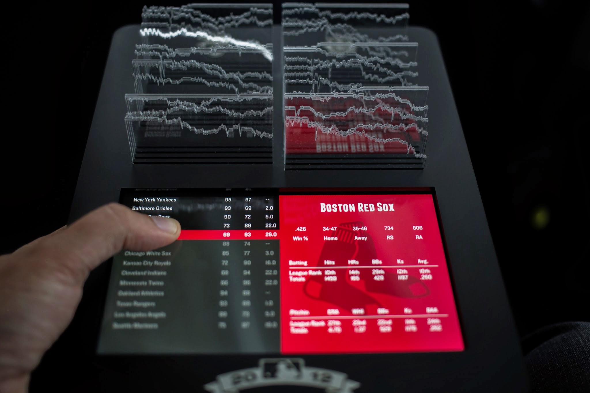
Baseball stats for an entire season created by Teehan+Lax labs as a combination of an interactive ipad app with an overlay of physical charts cut from acrylic. Depending on the current choice in the app, the edges of different charts get highlighted by the ipad.
Source: Teehan+Lax labs & vimeo.
Added by: Yvonne Jansen, sent by: Samuel Huron.
Category:
Active physical visualization
Tags:
baseball, digital fabrication, hybrid, laser cutting, line charts, tablet, temporal data