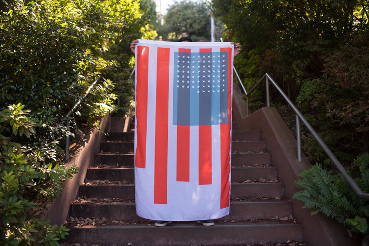
In this project, data related to the condition of American citizens is mapped to the number of stars, size of the bars, and size of the blue square on the American flag. The flag is presented as a dynamic entity that evolves over time:
State of the Union takes a set of metrics and visually transforms elements on the flag to represent their current state1. Over years or decades, citizens would be able to perceive shifts in the country as we get wealthier, healthier and live better lives—or not. In the case of the American flag here, meaning is driven by the condition of the citizens it represents rather than abstract notions of statehood or bygone colonies.
The stars represent each year of life expectancy. The blue field on which they sit stretches based on GDP per capita. The stripes are a sort of horizontal bar graph showing five different socioeconomic metrics: unemployment, divorce rate, homicide rate, school enrollment and gender salary ratios. In some cases, such as the unemployment rate, the stripe grows in an inverse relation to the metric2.
Source: Nadeem Haidary, State of the Union.


