Tag: 3d printing

1995 – San Diego TeleManufacturing Facility

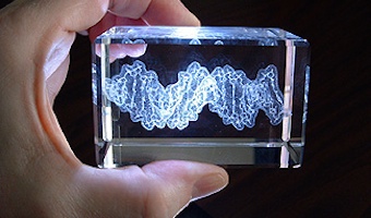
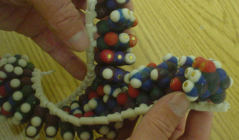
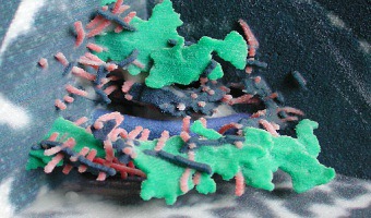
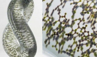
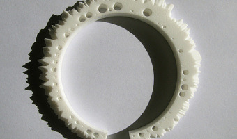
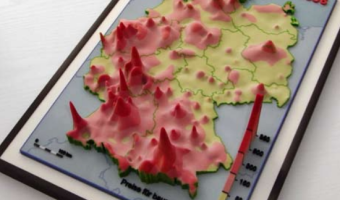
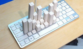
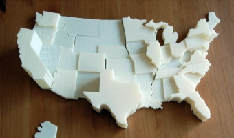
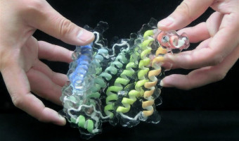
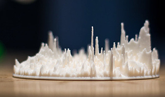
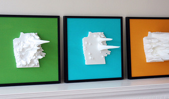
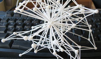
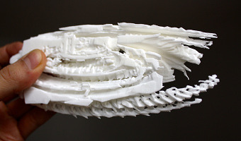
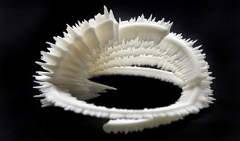
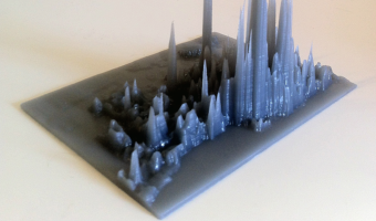
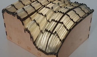
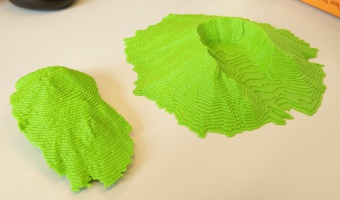
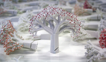
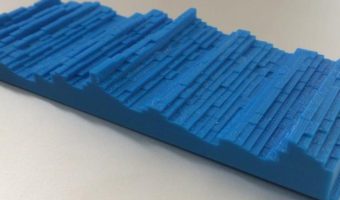
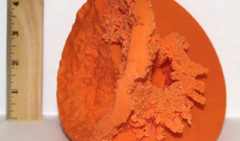
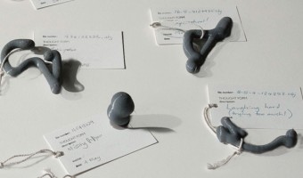
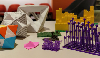
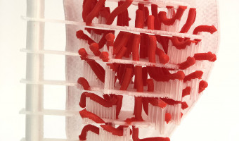
In 1995, Mike Bailey from the San Diego Supercomputer Center created the SDSC TeleManufacturing Facility to help scientists visualize their data in physical form. In 1997, the facility produced one of the first digitally-fabricated molecular models using laminated object manufacturing. The biochemists involved in the project got insights that they were not able to get from the on-screen 3D models, and concluded that: modern physical models are important tools that significantly extend the […]


2002 – Bathsheba Grossman's Crystal Engravings

Artist Bathsheba Grossman has been 3D printing mathematical surfaces as early as 1997. In 2002 she started to use subsurface laser engraving to produce 3D physical visualizations of data from astronomy, biology, and physics. Left image: a piece of DNA molecule. Right image: a 3D map of our nearby stars. The artist explains to us: This medium excels at imaging less structural data such as disconnected volumes, non-compact point clouds, and the convoluted strands of proteins. It works by […]

Added by: Pierre Dragicevic & Bathsheba Grossman. Category: Passive physical visualization  Tags: 3d printing, astronomy, biology, digital fabrication, math, physics, science, subsurface laser engraving


2004 – Cylinder: Early Sound Sculpture

Cylinder by Andy Huntington and Drew Allan may be one of the first digitally-fabricated sound sculptures. Also see our entry 2007 - Explosion of sound sculptures. Source: http://extraversion.co.uk/2003/cylinder/

Added by: Pierre Dragicevic, sent by: Fanny Chevalier. Category: Passive physical visualization  Tags: 3d printing, digital fabrication, sound, sound sculpture, temporal data


2004 – Scripps' Molecule Models

Since 2004 the Molecular Graphics Laboratory at the Scripps Research Institute has been making heavy use of 3D-printed full-color physical molecule models, some of which are articulated (left image), flexible (middle image), and even self-assembling (right image, see video). They also publish augmented reality systems that use those physical models. Also see our entry 1995 – SDSC TeleManufacturing Facility. Sources: Web Page: http://mgl.scripps.edu/projects/tangible_models Tommy Toy (2011) How […]


2004 – Full-Color 3D-Printed Scientific Visualizations

In 2004, the Visualization Research Lab from Brown University printed full-color 3D models of scientific visualizations. They published a poster on the topic where they discuss the technical challenges they faced. The printer used was a Zcorp Z406. Also see our entry 1995 – SDSC TeleManufacturing Facility. Source: http://vis.cs.brown.edu/areas/projects/rapid.html


2009 – Mitchell Whitelaw's Weather Sculptures

Weather data is another interesting choice for creating data jewelry. Above to the left is a bracelet created by Mitchell Whitelaw based on one year of weather data from Canberra. The right image shows a measuring cup made by the same artist, where each ring represents monthly average temperatures in Sydney over 150 years. Sources: Mitchell Whitelaw. Weather Bracelet (2009) Mitchell Whitelaw. Measuring Cup (2010)

Added by: Yvonne Jansen, sent by: Mitchell Whitelaw. Category: Passive physical visualization  Tags: 3d printing, data jewellery, digital fabrication, tableware, weather


2010 – Computer Glitches as 3D Objects

Glitch objects is a series of artworks by Tracy Cornish which transform two-dimensional visual results of computer glitches into three-dimensional objects by mapping properties of a visual glitch into 3D space. The left image shows glitch object 22, the right image shows glitch object 218. Computer glitches are the completely random, unpredictable and unexpected failures of digital systems. They are the result of approximated values and computational compensations for inaccessible information. […]

Added by: Yvonne Jansen, sent by: Todd Margolis. Category: Passive physical visualization  Tags: 3d printing, data sculpture


2010 – Thematic Maps of Germany

Physical cartographic visualizations built by geographer Wolf-Dieter Rase with a Z650 printer. Left: average prices for building lots in Germany in 2006. Middle: unemployment in Germany in 2006; The surface represent trends, the columns represent local deviations from the trends (magenta means higher, cyan means lower). Right: travel distance to airports. Source: Wolf-Dieter Rase (2012) Creating Physical 3D Maps Using Rapid Prototyping Techniques.

Added by: Pierre Dragicevic. Category: Passive physical visualization  Tags: 3d printing, cartographic


2011 – DIY United States Electoral Vote Map

This is a 3D scale replica of the United States, the state height corresponds to the number of electoral votes each state controls in a presidential election. Source: thing 11178 on thingiverse.com


2012 – A Soft and Transparent Handleable Protein Model

This report demonstrates the viability of a new handleable protein molecular model with a soft and transparent silicone body similar to the molecule’s surface. A full-color printed main chain structure embedded in the silicone body enables users to simultaneously feel the molecular surface, view through the main chain structure, and manually simulate molecular docking. The interactive, hands-on experience deepens the user’s intuitive understanding of the complicated 3D protein structure and […]

Added by: Pierre Dragicevic, sent by: Fanny Chevalier. Category: Enabling technology  Tags: 3d printing, chemistry, proteine model


2012 – Google Eye: Radial Visualization of Page Visits

During the Generator.x 3.0 workshop, interaction designer Andrej Boleslavský created a radial visualization of page visits where each day spans a specific angle of the ring, and the entire ring spans one year. Source: Andrej Boleslavský (2012) Google Eye.

Added by: Pierre Dragicevic, sent by: Mathieu Le Goc. Category: Passive physical visualization  Tags: 3d printing, digital fabrication, page visits, temporal data


2012 – Grand Old Party: Political Satire

American designer Matthew Epler shows how to build physical visualizations out of silicone using 3D printing and mold casting. He also shows how to use them to make political statements. Source: Matthew Epler (2012) Grand Old Party (video here).

Added by: Pierre Dragicevic, sent by: Fanny Chevalier. Category: Passive physical visualization  Tags: 3d printing, adult toy, digital fabrication, extruded 2d, moulding, opinion polls, politics, satire, silicone


2012 – Matthijs Klip's Data Sculptures

Left image: data sculpture by Dutch designer Matthijs Klip showing life expectancy of the Netherlands population. Each bar maps to an age; the bar's height represents life expectancy while its length represents the amount of people having that age. Right image: other designs by Matthijs Klip. Source: Matthijs Klip (2012) Physical Information Design.


2013 – Releases

The New-York-based design agency HUSH crafted a piece of custom software that generates digital, three dimensional visual forms based on the unique timbres and tonalities of individual voices. They asked 100 people to share their feelings about the end of 2013, and the beginning of 2014, in the form of a spoken “release.” Using the forms generated by their software they then created and analog printed a limited run of 100 posters (right image) that they sent to the people that inspired them […]

Added by: David Schwarz. Category: Passive physical visualization  Tags: 3d printing, sound, sound sculpture, voice


2013 – Doug McCune's Physical Maps

Doug McCune is a programmer turned artist, and he is obsessed with maps. In 2013, he got bored with screens and started to build physical thematic maps. He specializes in turning "horrible data" such as murders and natural disasters into beautiful objects. Above on the left is an artwork titled "stalagmite crime" that shows elevation maps of crime rates in San Francisco: narcotics-related crimes (green), prostitution (blue) and vehicle theft (orange). Sources: Doug McCune (2013) Physical Maps – […]

Added by: Pierre Dragicevic. Category: Passive physical visualization  Tags: 3d printing, cartographic, cartography, digital fabrication, maps


2013 – 3D Social Networks

Jeff Hemsley from Syracuse University explains how to create solid models of social networks using the statistical package R and a 3D printer. 3D node-link diagrams have been explored for a while due to their potential benefits. One is that any node-link diagram can be laid out in 3D without any link crossing. Some studies have also shown that in some cases 3D node-link diagrams are easier to read than 2D ones. However, 3D visualizations are generally hard to navigate and to perceive on regular […]

Added by: Pierre Dragicevic, sent by: Jeff Hemsley. Category: Passive physical visualization  Tags: 3d printing, digital fabrication, network, social network


2013 – Motion Structures: Videos as Space-Time Objects

Everardo Reyes-Garcia from Université Paris 13 turns video sequences into space-time shapes that can be 3D printed. The sculpture above represents 5 seconds of the opening theme of Game of Thrones. Also see our entry on Peter Jansen's sculptures. Source: Everardo Reyes-Garcia (2013) Motion Structures.

Added by: Pierre Dragicevic, sent by: Aurélien Tabard. Category: Physical model  Tags: 3d printing, digital fabrication, space-time cube, temporal data, video


2013 – Data Sculpture of Chicken Inbreeding

Ryo Sakai and Jan Aerts from the Bioinformatics/Data Visualization Lab at KULeuven created a data-driven sculpture representing inbreeding in a particular chicken. Each loop in the sculpture represents a chromosome. On the outside is a histogram of the heterozygosity of the DNA; the inside a histogram of the homozygosity in that region. These sculptures are part of the Cosmopolitan Chicken Project, and have been presented at the Art Biennale in Venice. Source: Text and images from Jan Aerts.

Added by: Pierre Dragicevic, sent by: Jan Aerts. Category: Passive physical visualization  Tags: 3d printing, bio-engineering, digital fabrication, dna, science


2013 – Very Pointy Elevation Map

Toronto-based startup DataAppeal, which develops Web apps for 3D geo-spatial data visualization, created this very pointy stalagmite-looking elevation map of GTA Transit volume in Toronto. Sources: Andy Kirk (2013) 3D Printing Capabilility via DataAppeal Maps. Candice So (2013) Data visualizations go from flat to 3D.


2013 – NYC High School Dropouts

Ben Kauffman and Sam Brenner created this visualization as part of the ITP program at the NYU Tisch School of the Arts. It is a combination of a 3D-printed relief map of New York City with beads where each bead represents one school location. Each bead on top of the relief map is connected to a string below whose length indicates the number of students who dropped out of that school. Source: More pictures, a video and all the details on the project can be found on their project page.

Added by: Yvonne Jansen, sent by: Ben Kauffman. Category: Passive physical visualization  Tags: 3d printing, cartographic


2013 – Solid Statistics

Left image: A 3D printed version of the "Forbes 2000" list showing the 240 largest companies, by Volker Schweisfurth. Market value is mapped to surface area, sales volume is mapped to volume, and the continent from which the company originates is mapped to color (America (blue), Europe (green), Asia (yellow)). The picture illustrates how a physical model of this 3D visualization gives a better impression of perspective than the printed perceptual cues in the original paper visualization. Right […]

Added by: Yvonne Jansen, sent by: Volker Schweisfurth. Category: Passive physical visualization  Tags: 3d printing, statistical data


2014 – 3D Interest Rate Surface

3D print of a yield curve surface with change in material to create grid lines; on matching laser cut box with light inside. Left axis is time (2006-2010), right axis is "term structure", i.e. interest rates for 1 month out to 120 months; height at any given point is the interest rate on that day for that time period. Data is from Bank of Canada, visualization and print is is by Richard Brath at Uncharted Software. Source: Richard Brath, 3D Canadian Yield Curve Surface 2006-2010 for 1 to 120 […]

Added by: Richard Brath. Category: Passive physical visualization  Tags: 3d printing, finance, surface, yield curve surface


2014 – Data Sculpture in the White House

Gilles Azzaro, a French digital artist and fab lab co-founder, created a sound sculpture of Obama's 2013 State of the Union Address where Obama mentions 3D printing as the next revolution in manufacturing. Azzaro's sculpture was exhibited in the White House in 2014 during the inauguration of the first White House Maker Faire. The sculpture is interactive: a movement sensor activates the system and a laser beam scans the 3D recording to reveal the President’s speech. See this video for an […]

Added by: Pierre Dragicevic, sent by: Christophe Hurter. Category: Passive physical visualization  Tags: 3d printing, president, sound sculpture


2014 – Mount Saint Helens - Pre and Post Eruption

Mount Saint Helens is an active volcano located in the north-west of the United States. In an eruption in 1980, the upper section of the volcano was destroyed, reducing the peak's elevation from 2950 m to 2549 m. This two-part 3D printed model of Mount Saint Helens visualizes the dramatic change that occurred over a very short period of time. The digital data for 3D printing and the white and red model were prepared by Drew Thompson, the green model was printed by Jeppe Vestergaard. Sources: […]

Added by: Juernjakob Dugge. Category: Physical model  Tags: 3d printing, cartographic, temporal visualization


2014 – Sound Bites

Sound Bites is the result of an experimental design practice. Four days of 24/7 ambient sound recordings resulted in 128 4-second intimate sound loops. Fast Fourier Transform frequency analysis and geometrical operations transformed time, frequency, and amplitude into X, Y and Z dimensions, forming 3D sonic shapes. These ‘disco donuts’ were 3D printed into 128 sound objects. Vacuum molded they formed the base to cast 128 unique chocolate objects. New rhythmic patterns were created, comprising […]


2014 – x.pose: a Wearable Dynamic Data Sculpture

x.pose is a dynamic wearable data sculpture that makes the collection of the wearer's location data visible in real-time in the physical world. From the project webpage: x.pose is a wearable data-driven sculpture that exposes a person's skin as a real-time reflection of the data that the wearer is producing. In the physical realm we can deliberately control which portions our bodies are exposed to the world by covering it with clothing. In the digital realm, we have much less control of what […]


2014 – Silver Ring Shaped by DNA Profile

PhD student Alireza Rezaeian designed a silver ring whose texture and shape is uniquely determined by the wearer's DNA profile. His article explains how data is mapped to physical form in a way that balances between legibility and aesthetics. Right image: bracelet-sized prototype. Also see our other entries on data jewellery. Source: Rezaeian, Alireza & Donovan, Jared (2014) Design of a tangible data visualization.

Added by: Pierre Dragicevic, sent by: Simon Stusak. Category: Passive physical visualization  Tags: 3d printing, data jewellery, dna, genetics


2014 – Data Crystals: Conglomerated World Stats

During his residency at Autodesk, artist Scott Kildall created crystal-looking data sculptures by turning world data such as city populations into small cubes laid out on an Earth globe, then running a force-directed algorithm that conglomerates them into a monolithic structure that can be 3D-printed. The image above shows the 2500 nuclear detonations in recorded history, two of which (the black dots) are the bombs dropped at Hiroshima and Nagasaki, the only ones used as weapons. Source: Scott […]


2014 – People Wood: Data Sculpture of Questionnaire Data

Manor House Development Trust, a charitable social enterprise centred in Hackney, commissioned Something & Son to create a sculpture to take pride of place in the new Redmond Community Centre at Woodbury Down in North-East Hackney. Something & Son approached Inition for help creating a crowd-sourced data sculpture featuring a forest of over 400 3D-printed trees, each corresponding to an individual’s answers to an online questionnaire. Source: Something & Son with Inition. People […]


2015 – U.S. Unemployment Rate 1948-2015

Visual journalist Jon Keegan created this quick chart using U.S. unemployment rate starting from January 1948 (the first year that the U.S. started to record the number) through the end October 2015. The long axis represents years from 1948-2015, and each column is made of of 12 chips, each representing one month's unemployment rate figure. The height of each chip represents the rate for that month. One can see a dramatic cliff start to rise up in the fall of 2008, as the global economic […]


2015 – Interregional Merchandise Trade

Trade data often show a network of money flows. Spreadsheets of such data are difficult to remember and hardly find their way to the long-term memory. The chosen intra- and intraregional WTO data of 2012 have been modeled and printed as a 3D data sculpture. It offers some fresh insights on flows, intraregional trade sizes, has some haptic quality and can be put on the table to accompany presentations and debates. Source: Volker Schweisfurth / MeliesArt (2015) Trade Data Materialized.

Added by: Volker Schweisfurth. Category: Passive physical visualization  Tags: 3d printing, network, trade, WTO


2015 – Solid Model of Stellar Winds

Scientists keep using solid models to help them better understand complex 3D data (here, an astrophysical simulation): They say this provides even more insight into what’s going on. “The ability to hold and inspect the 3-D printed models provides a new perspective on the WWIR’s geometry and an improved sense of the scale of the different structures,” they say. In particular, they say the model allows them to appreciate just how large the shockwave is compared to the stars and the distance […]

Added by: Pierre Dragicevic, sent by: Jean-Daniel Fekete. Category: Physical model  Tags: 3d printing, astronomy, digital fabrication, science, simulation


2015 – Data Necklace of Good Night SMS

Paul Heinicker, a master student in interaction design at the University of Applied Sciences Potsdam, created a data-driven necklace representing a long-distance relationship by sent "good night"-messages from him to his girlfriend. While visualising two years of message history, two diagonal opposing points of the rectangle constitute the starting points for both years. The ongoing sides in each case are coded to the days with and without good night SMS. In detail, the plain horizontal sides […]

Added by: Paul Heinicker. Category: Passive physical visualization  Tags: 3d printing, data jewellery, data sculpture, gift, sms


2016 – Thoughtforms: 3D-Printed Thoughts

Kellyann Geurts and In Dae Hwang, Monash University, give physical shape to thoughts by turning EEG data into solid objects. During three public events at Melbourne in 2016, she placed a mobile EEG device on volunteers and asked them to think of a memory or emotion of their choice. Their EEG output was translated in real time into a 3D shape they could see on a computer screen. Participants could then press a button to pause the shape and send it to a 3D printer. They were then invited to write […]

Added by: Pierre Dragicevic, sent by: Benjamin Bach. Category: Passive physical visualization  Tags: 3d printing, digital fabrication, EEG, thoughts


2016 – Housing Prices Ripping San Francisco Apart

This data sculpture depicts a map of housing prices in San Francisco. It’s a map of the city, torn at the seams. The height of each area represents the average price per square foot for recent home sales. Where neighboring areas are close in value they are connected, but if neighboring areas are too far from each other I allow them to split, tearing the city along its most severe economic divides. Also see our entry 2013 – Doug McCune’s Physical Maps. Sources: Doug McCune (2016) Sculpture of […]


2016 – Actuated Prism Map of Italy

This actuated prism map was created by Alessandro Masserdotti in the OpenDot Fablab in Milan, Italy, for the SOD16 meeting and invites people explicitly to Touch That Data. OpenDot Fablab (Milan) project with Arduino and 3D printing visualizes regional statistics changing the height of each region. In the picture there's the building count from the regional extracts. Sources: Open streetmap wiki, 2016. Video from a demo at OSMIT 2016.

Added by: Yvonne Jansen, sent by: Jason Dykes. Category: Active physical visualization  Tags: 3d printing, cartographic, digital fabrication, prism map


2016 – Motus Forma: People's Motions in a Shared Space

Motus Forma is a data sculpture by Brian Allen and Stephanie Smith that aggregates 10 hours of people movements in the lobby space at Pier 9. The 1300+ motion paths are piled up according to time. Also see our other entries on temporal data. Sources: Autodesk (2016) Motus Forma Instructables (2016) Motus Forma Photo by Pierre Dragicevic

Added by: Pierre Dragicevic. Category: Passive physical visualization  Tags: 3d printing, data sculpture, people, temporal data


2017 – Fabricating Physical Globe Visualizations

Geospatial datasets are too complex to easily visualize and understand on a computer screen. Combining digital fabrication with a discrete global grid system (DGGS) can produce physical models of the Earth for visualizing multiresolution geospatial datasets. This proposed approach includes a mechanism for attaching a set of 3D printed segments to produce a scalable model of the Earth. Two models have been produced that support the attachment of different datasets both in 2D and 3D format. Also […]

Added by: Hessam Djavaherpour. Category: Enabling technology  Tags: 3d printing, cartographic, digital fabrication, globe, rearrangeable


2017 – Green Berlin

Tangible data visualization of green areas and water in Berlin. "Green Berlin" is a living map showing parks and forests in Berlin. The green areas on the wooden map are laser cut, with moss growing through the holes. Source: Sebastian Meier, Green Berlin

Added by: Till Nagel. Category: Passive physical visualization  Tags: 3d printing, cartographic, moss, plants


2018 – Landscaper: 3D Printing and Assembling of Terrain Models

Landscape models of geospatial regions provide an intuitive mechanism for exploring complex geospatial information. However, the methods currently used to create these scale models require a large amount of resources, which restricts the availability of these models to a limited number of popular public places, such as museums and airports. Landscaper is a system for creating these physical models using an affordable 3D printer in order to make the creation of these models more widely […]

Added by: Hessam Djavaherpour. Category: Enabling technology  Tags: 3d printing, assembly, digital fabrication, terrain model


2018 – Solving the Shortest Route Problem with a 3D Printer

Christian Freksa, a professor of Cognitive Systems at the Department of Informatics at the University of Bremen, shows how a shortest route can be computed by 3D-printing the route network using flexible material, and then pulling apart the start and end nodes. The tight portion of the network immediately gives the shortest route. The right image shows an earlier version using strings. This idea was first proposed by mathematician George Minty in 1957, in a short letter to the editor of the […]

Added by: Pierre Dragicevic, sent by: Barbara Tversky. Category: Physical model  Tags: 3d printing, network, physical computation, route


2018 – Multimaterial Printing of Volumetric Scientific Visualizations

Researchers from MIT Media Lab and Harvard University have developed a method for accurately physicalizing scientific visualizations using multimaterial 3D printers: To fabricate an item on conventional 3D printers, one must make calculations regarding the object’s digital description, and then convert the resulting numeric description to geometric shapes which can be used to 3D print it. But the research team has developed a new technique to 3D print multimaterial data sets as physical […]

Added by: Pierre Dragicevic, sent by: Arnold Platon. Category: Enabling technology  Tags: 3d printing, multimaterial


2019 – Data Beyond Vision: Physicalizing Bookshop Data

[Data Beyond Vision] explores new ways of engaging with a dataset and the arguments and narratives behind it, in order to challenge the dominant paradigms of conventional screen-based data visualization. The project currently comprises: 3D printing a model of library member activity over time from the Shakespeare and Company Project juxtaposing documented activities from two sets of archival materials Folding paper forms of borrowing activity from the Shakespeare and Company Project surfacing […]

Added by: Rebecca Sutton Koeser & Pierre Dragicevic. Category: Passive physical visualization  Tags: 3d printing, digital humanities, kirigami, origami, weaving


2019 – Physicalizing Cardiac Blood Flow Data

Blood flow data from cardiac 4D Flow MRI (magnetic resonance imaging) holds much potential for research and diagnosis of flow-related diseases. However, understanding this data is quite challenging – after all, it is a volumetric vector field that changes over time. This paper proposes a novel slice-based physical model as a complementary method for visualizing the flow data. The design of this model respects the conventional method of viewing medical imagery (i.e., in cross-sections) but has […]