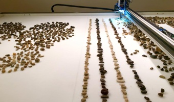
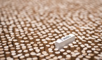
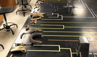
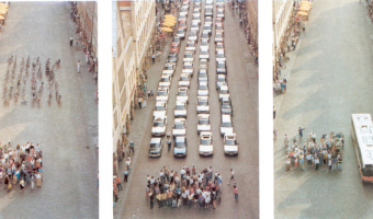
In 1901, biologist Charles Davenport "built" physical visualizations that show the distributions of features of objects and people. These visualizations were made out of the objects and the people themselves. The purpose was to explain the notion of statistical distribution to a lay audience. On the left image, seashells are piled up according to how many ribs they have. On the middle image, students are arranged in bins according to their height. On the right image, they are simply sorted. […]
1973 – Mazamet Ville Morte
In 1973, the French town of Mazamet had a population that closely matched the nationwide number of motor vehicule deaths across the previous year. A TV reporter decided to show all inhabitants lying on the floor to symbolize these deaths. Source: Marieaunet (2010) 1973 Mazamet ville morte.
1991 – Münster Congestion Visualization
In order to encourage bus use, in 1991 the city of Münster, Germany created a poster that compares the space taken by 72 bicycles (left), 72 cars (middle), and a bus (right). This idea is not new. For example, the city of London has made a very similar poster in 1965. Thanks to Will Stahl-Timmins for pointing this out. Sources: Benjamin Starr (2014) How Much Space Do Cars Take? Cyclists Demonstrate How Bicycles Flight Congestion Image from visualnews.com
2010 – Cookbook Arranges Ingredients into Physical Visualizations
In Sweden, IKEA gives away baking books where ingredients are arranged into physical visualizations. The photos are by Karl Kleiner. This idea is reminiscent of Ursus Wehrli's art projects. Sources: Niels-Peter Foppen (2010) Hembakat är Bäst. Via Iohanna Nicenboim's pinterest. Images from notcot.com.
2011 – Ursus Wehrli's Art of Clean Up
Ursus Wehrli, a Swiss comedian and artist, is known for his parodic art project called "Tidying up Art", where he rearranges well-known paintings in an orderly fashion (see his 2003 book and his 2006 TED Talk). In 2011, he started a project called "The Art of Clean Up" where he rearranges everyday objects and people. Also see our other entries on physical visualizations created by rearrangement. Sources: Maria Popova (2013) The Art of Cleanup: Ursus Wehrli Playfully Deconstructs and Reorders […]
2015 – Jller: A Robot Rearranges Pebbles by Geologic Age
Jller is a machine created by German artist Benjamin Maus and Czech artist Prokop Bartoníček that sorts pebbles from the German river Jller by their geologic age. To do this, Jller first analyzes an image of the stone it selects, extracting information like dominant color, color composition, lines, layers, patterns, grain, and surface texture. The machine then places the stones in alignment of age and type by sucking them into an industrial vacuum gripper and dropping them in the correct […]
2017 – Are you Sure you Want to Smoke?
Giacomo Flaim, a student in Communication Design at Politecnico of Milan, made a single-datum physical visualization out of 4,234 cigarette butts to convey the average annual cigarette consumption of an Italian smoker. Labels were added to indicate the reduction in life expectancy depending on the quantity smoked, from 10 minutes for a single cigarette to more than a month for the entire year. Sources: Giacomo Flaim (2017) Are you sure you want to smoke? (behance.net). Information is Beautiful […]
2018 – Phylogenetic Tree with Real Specimens
As part of a zoology class, evolutionary biologist Leo Smith created a phylogenetic tree of fishes where each leaf is an actual fish specimen. Also see our other entries on physical visualizations built by re-arranging physical items. Source: Leo Smith's tweet (29 April 2018).