Tag: water

1600 BC – Water Clocks

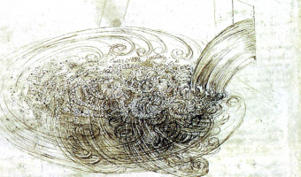
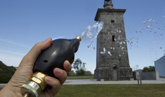
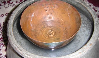
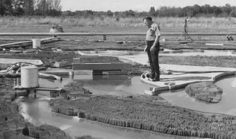
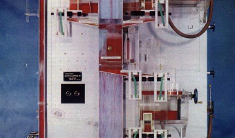
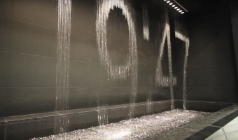
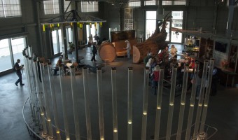
A water clock (or clepsydra) is an instrument where time is measured by regulating a flow of liquid. The oldest water clocks simply consisted of a pierced bowl placed in a larger pot filled with water (see left image, Persian artefact from 400 BC). These existed back in the 16th century BC. The passage of time was observed by counting how many times the bowl overflowed and its content had to be poured back in the larger pot. This was used for example in Persia to ensure fair irrigation […]

Added by: Pierre Dragicevic. Category: Measuring instrument  Tags: archaeology, water, water clock


1500 – Flow Visualization

Although today computer graphics is often used for doing flow visualization, a range of physical methods exist that can visualize flows in-place. Leonardo da Vinci was presumably one of the first to use these methods: Leonardo da Vinci (1452-1519) also developed techniques for observing the wind (by generating smoke in a tube and adding it to the wind at suitable points). Most important of all, he made actual experiments under controlled conditions. For this purpose, he used, among other […]

Added by: Pierre Dragicevic. Category: Measuring instrument  Tags: air, flow, science, smoke, water


1949 – Mississippi River Basin Model

As a response to devastating floods of the Mississippi river in the early 1900s, the US Army Corps of Engineers built a large-scale hydraulic model of the entire river system. The model, 2.5 times the size of Disneyland, allowed them to design better flood control infrastructures and to eventually save millions of dollars. In 1973, the physical model ceased to be used and was replaced by computer models. Nevertheless, mathematical equations still cannot capture all the complexity of river […]

Added by: Pierre Dragicevic, sent by: Wesley Willett. Category: Physical model  Tags: cartographic, hydraulic, physical computation, terrain model, walkable, water


1949 – Moniac: A Hydromechanical Machine to Teach Economics

The MONIAC or Phillips machine is a hydromechanical analog computer built to teach basic economical principles using colored water flowing in transparent pipes. The machine was built in 1951 after electrical-engineer-turned-economist William Phillips and his economist colleague Walter Newlyn realized that flows were used as a metaphor to teach economics, but have never been made physical. Phillips is also known for his eponymous curves. Several MONIACs were built, and a working one is […]

Added by: Pierre Dragicevic. Category: Physical model  Tags: economics, education, flows, hydraulic, liquid, physical computation, simulation, water


1957 – US Army Corps of Engineers San Francisco Bay Model

A working hydrodynamic model of San Francisco Bay and the surrounding waterways, with tides. It is still open to the public as a demonstration, although it is no longer used for research. Also see our related entry 1949 – Mississippi River Basin Model. Source: Wikipedia U.S. Army Corps of Engineers Bay Model.


1977 – Graphical Waterfall

   A graphical waterfall is a display where images are formed by water droplets falling from computer-controlled nozzles. It was invented in 1977 by Stephen Pevnick, an American artist. Graphical waterfalls can be used with regular lighting (as on the left video) or with a stroboscope (as on the right video), depending on the desired effect. It is unclear whether such devices have been already used to display data. Sources: Pevnick Design (2018), Invention of […]

Added by: Pierre Dragicevic. Category: Enabling technology  Tags: display, water


2003 – Pattern Recognition in a Bucket

Chrisantha Fernando and Sampsa Sojakka from the University of Sussex published a paper where they demonstrate that a bucket of water can carry out complex, parallel computations, and can even do simple speech recognition. Their setup called "liquid brain" consists in a transparent water tank suspended over an overhead projector and four LEGO motors. Input values are sent to the motors which vibrate the water. A camera then reads the watter ripples and sends the data to a simple perceptron. The […]


2011 – Can We Keep Up: Sponges Show Domestic Water Usage

Can We Keep Up is a a physical data visualisation that investigates the domestic need for water in cities all over the world. Source: infosthetics.com. Image from Hal Watts.

Added by: Yvonne Jansen, sent by: Romain Vuillemot. Category: Passive physical visualization  Tags: cartographic, data sculpture, sponge, water


2012 – Pulse Drip: Visualize Heartbeats with a Water Hose

Pulse Drip Interactive installation originally developed for Urdaibai Art 2012 in which the public can water the lawn at the Torre de Madariaga using a water hose with a heart rate sensor built-in. To participate, visitors take the hose wherever they want to water: by putting their index finger on a tiny sensor on the spray head, his or her pulse is detected and an automated electromechanical valve controls the water flow to match the beat of the participant's heart. The spray head is a […]

Added by: Karine Charbonneau. Category: Uncertain  Tags: biometrics, Pulse, water


2013 – Tidal Memory

Tidal Memory displays the evolving daily tide at full scale. Receiving live data from the oldest tide station in the western hemisphere, twenty-four water-filled glass columns function as a tidal clock and 24-hour sculptural archive; recording a full day of hourly tide levels starting at midnight. 26’L x 2.5’W x 10’H - Glass, stainless steel, water, custom electronics. Tidal Memory is permanently exhibited at the Exploratorium, San Francisco, CA. Source: Charles Sowers (creator), […]

Added by: Jeff Pettiross. Category: Active physical visualization  Tags: sea, tides, water


2014 – Water Works: Maps of the San Francisco Water Infrastructure

“Water Works” is a 3D data visualization and mapping of the water infrastructure of San Francisco. These consist of three large-scale 3D-printed sculptures, each generated by custom C++ code. The concept behind the project is to make visible a small portion of an invisible network of pipes underneath our feet. The three physical data visualizations are: "San Francisco Cisterns", “Imaginary Drinking Hydrants” and "Sewer Works". "Sewer Works" uses 60,000 data points from San Francisco sewers and […]


2015 – Wage Islands

The "Wage Islands" installation by Ekene Ijeoma makes clever use of water as a data query device. Wage Islands is an interactive installation which submerges a topographic map of NYC underwater to visualize where low-wage workers can afford to rent. Sources: Ekene Ijeoma: Wage Islands Huffington Post: Dazzling Interactive 3-D Artwork Visualizes The Tragic Affordable Housing Crisis In New York City Creators: Turning New York's Salary Gap into an Interactive Sculpture Design Boom: Wage islands […]

Added by: Cedric Honnet, sent by: Cheng Xu. Category: Active physical visualization  Tags: cartographic, digital fabrication, physical computation, water


2017 – Popsicles of Pollution

Students from New Taipei City collected samples from urban rivers, creeks and ports which they then froze in moulds and preserved in resin. ‘We hope when more people see this they can change their lifestyles,’ said one of the group. Source: Elle Hunt (2017) Popsicles of pollution: ice lollies highlight Taiwan's contaminated waterways.

Added by: Pierre Dragicevic. Category: Uncertain  Tags: food, indexical, pollution, water


2017 – Coral Reefs

This data sculpture made by three design students at the datafossil #3 workshop depicts the destruction of Australian coral reef since 1985 (in orange) together with the rise of ocean temperature (in gray). The Great Barrier Reef has been losing more and more of its area since the last 27 years. One of the biggest cause is coral bleaching due to global warming and more exactly to the rise of the temperature of ocean's water. Scientists say that the reef is going to keep deteriorate as fast […]

Added by: Alizée Parry & Pierre Dragicevic. Category: Passive physical visualization  Tags: coral, datafossil, global warming, sea, water, weather


2021 – Watermap: A Physical Live Weather Visualization

Without water, nothing organic exists. This water installation visualizes - symbolically - how rain brings the whole world to life. In a very tangible way of presenting and visualizing data, rain is represented by real drops of water. The installation features a black, wooden pedestal with a recessed world map filled with sand. Technically, the realization is done by a mini-computer, which evaluates live weather data and positions a water tank in an X-Y system above the world map. At places […]

Added by: Daniel Fischer. Category: Active physical visualization  Tags: weather, rain, water, sand, cartographic