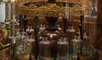
In 1850, British doctor and inventor George Merryweather built a barometer that uses live medicinal leeches to predict storms: The twelve leeches are kept in small bottles inside the device; when they become agitated by an approaching storm they attempt to climb out of the bottles and trigger a small hammer which strikes a bell. The likelihood of a storm is indicated by the number of times the bell is struck. The device, which Merryweather called the "tempest prognosticator", was shown at the […]
2006 – Nathalie Miebach's Woven Sculptures
Artist Nathalie Miebach created a range of beautiful woven sculptures out of weather data. Source: Nathalie Miebach. http://www.nathaliemiebach.com/weather.html (see TED Talk).
2009 – Windcuts: Wind Travels Captured on Wood
Windcuts is a physical information visualisation retelling the Helsinki wind's travels over five days, using wind sensor measurements from Helsinki, and wood and a CNC machine to cut it from there too. [...] The line's direction shows the wind's direction, the line's width shows the wind's speed - a more intense wind makes a bigger line - and the line's height shows the wind's temperature. Source: Miska Knapek (2012) Windcuts.
2009 – Mitchell Whitelaw's Weather Sculptures
Weather data is another interesting choice for creating data jewelry. Above to the left is a bracelet created by Mitchell Whitelaw based on one year of weather data from Canberra. The right image shows a measuring cup made by the same artist, where each ring represents monthly average temperatures in Sydney over 150 years. Sources: Mitchell Whitelaw. Weather Bracelet (2009) Mitchell Whitelaw. Measuring Cup (2010)
2010 – eCLOUD & airFIELD: Ambient Airport Visualizations
Left image: eCLOUD is an airport installation at the San Jose International Airport created by Dan Goods, Nik Hafermaas, and Aaron Koblin. It is made of many large LCD pixels laid out in 3D space whose opacity change as a function of weather. Right image: A similar installation called airFIELD was created by the same team two years later. It shows air traffic and is installed at the Hartsfield-Jackson Atlanta International Airport. For other examples of non-regular or 3D layouts of physical […]
2011 – Laser-Cut Time Series
Temperature measurements in Helsinki from May 2009 to May 2010. Each row is one week long. Source: Miska Knapek, see flickr photoset.
2012 – Point Cloud: A Dynamic Weather Sculpture
James Leng’s ‘Point Cloud‘ consists in a 3D wire structure materializing real-time weather information by moving and undulating. The wire structure is articulated by pistons activating wheels to deform the surface according to data. The structure could be articulated for other types of data than weather forecast. This structure represents a first attempt to build a physical 3D weather forecast system. The speed, smoothness, and direction of rotation are modulated to interpret a live feed of […]
2013 – Temperature Scarves and Afghans
On January 2013, Kristen Cooper Nutbrown from British Columbia had the idea to create a temperature scarf by knitting one row every day using a color that encodes the temperature of the day. At the end of the year, the scarf visualized local temperature readings for the whole year. Soon after Kristen pitched her idea, Arlene Cline, also from British Columbia, started to create a temperature afghan (a blanket of knitted or crocheted wool). Temperature scarves and afghans became quite popular in […]
2014 – WeatherWindow
WeatherWindow – wall art that shows weather forecasts in a simple, ambient, and unobtrusive way. This old, wooden window is a decorative piece when it's off. Turn it on, and it becomes alive and connected to the Internet. Suddenly, this 8-paned window communicates to the world, fetches weather predictions, and lights up each pane with soothing colors communicating the weather outlook. Source: Tim Dye (2014) WeatherWindow – An IOT Art Piece.
2014 – Rearrangeable Display of Ice Data
This 3d data visualization, created by Johannes Jacubasch and Judith Weda, shows sea ice levels from 1979 to 2012. The years are plotted on one axis and the months on the other axis, while the height of the wooden pieces shows the level of sea ice. This data visualization can be opened up at any year or month to view the data from up close. If you break the Y-axis it shows all the data from a particular year. If the X-axis is broken it shows ice levels of a particular month over all the years. […]
2015 – Summer in the City
The visualization explores the direct influence of weather and traffic volume on air pollution, comparing data of a 4-week period during summer 2015 in Lugano (Switzerland). Different colored laser cut plates fixed on wires represent daily data. As the wires are diagonally mounted on the structure, looking from different sides, they evidence either daily data or the evolution of the parameters. Source: Carola Bartsch (2015), Summer in the city
2015 – Physical Weather Display
Japanese Software engineer Ken Kawamoto invented the Tempescope, a device that displays weather forecasts or current weather physically. The Tempescope physically simulates weather forecasts via a wireless connection from a computer or a smartphone in real-time in order to get a better idea of what the actual weather is outside. Raining is simulated by water dripping down the box, temperature is represented by color-chaning LEDs and cloudiness is conveyed by a mist diffuser. Source: Dovas […]
2016 – Central Park NYC Temperatures
Seasonal plot of the monthly average temperature in Central Park NYC since 1869. The long axis is mapped to years, the other axis is mapped to months from January to December. Data sourced from the National Weather Service. Source: RoundTableRdDesign on shapeways.
2017 – Coral Reefs
This data sculpture made by three design students at the datafossil #3 workshop depicts the destruction of Australian coral reef since 1985 (in orange) together with the rise of ocean temperature (in gray). The Great Barrier Reef has been losing more and more of its area since the last 27 years. One of the biggest cause is coral bleaching due to global warming and more exactly to the rise of the temperature of ocean's water. Scientists say that the reef is going to keep deteriorate as fast […]
2021 – Watermap: A Physical Live Weather Visualization
Without water, nothing organic exists. This water installation visualizes - symbolically - how rain brings the whole world to life. In a very tangible way of presenting and visualizing data, rain is represented by real drops of water. The installation features a black, wooden pedestal with a recessed world map filled with sand. Technically, the realization is done by a mini-computer, which evaluates live weather data and positions a water tank in an X-Y system above the world map. At places […]