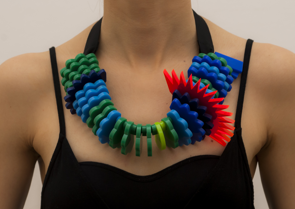
This necklace made by Stefanie Posavec and Miriam Quick shows one week of air quality data measured in the city of Sheffield. Each segment is a period of 6 hours, and its appearance conveys the concentration of particulate matter during that period of time. A low concentration yields a small, round, green segment. A high concentration yields a large, spiky, red segment.
Also see our entry 2014 - Data Clothing: Dresses Show Air Pollution.
Sources:
- Stefanie Posavec (2015) Air Transformed: Better with Data Society Commission.
- Photos by Stefanie Posavec.
Added by: Pierre Dragicevic, sent by: Maarten Lambrechts - Fanny Chevalier.
Category:
Passive physical visualization
Tags:
air pollution, air quality, data jewellery, data sculpture, digital fabrication

