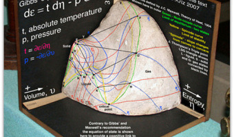
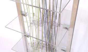
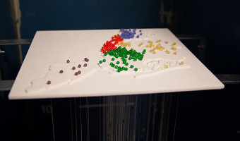
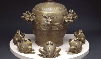
Tag: Yvonne Jansen

1979 – Planetenweg Uetliberg: The Solar System as a Hiking Path

Planetenweg Uetliberg is a 2h hiking path near Zurich in Switzerland. It enables people to experience the sizes and distances between the different main bodies in our solar system. The hike starts at the sun (image above). Following the path, a hiker visits the different main bodies at a scale of 1 : 1 billion (see overview included above), that is, 1 meter on the path corresponds to 1 million kilometers in space. The sun has a diameter of 1.39m. Venus has the size of a pinhead in comparison […]

Added by: Yvonne Jansen, sent by: Jason Dykes. Category: Physical model  Tags: solar system, walkable


2010 – Computer Glitches as 3D Objects

Glitch objects is a series of artworks by Tracy Cornish which transform two-dimensional visual results of computer glitches into three-dimensional objects by mapping properties of a visual glitch into 3D space. The left image shows glitch object 22, the right image shows glitch object 218. Computer glitches are the completely random, unpredictable and unexpected failures of digital systems. They are the result of approximated values and computational compensations for inaccessible information. […]

Added by: Yvonne Jansen, sent by: Todd Margolis. Category: Passive physical visualization  Tags: 3d printing, data sculpture


2011 – Manually Animated Graph of Scientific Data

Philadelphia-based multi-discipline artist Bradley Litwin built this physical chart that can be animated by turning a crank. It is the only manually-animated physical visualization we know of so far. It was commissionned by a pharmaceutical company, intended as an educational device for distributing to doctors. Bradley was kind enough to send us an image of the insides of the original prototype, "not quite as pretty as the final product", he says. His explanation: As the crank is turned, a […]

Added by: Yvonne Jansen & Pierre Dragicevic. Category: Passive physical visualization  Tags: animation, mechanical interaction, science


2013 – Walkable Age Pyramid

A walkable age pyramid of the German population. It was part of an exhibition on demographics by Atelier Brückner. The sculpture gives an impression how the distribution of age groups shifted between 1950 and 2010. For example, it shows how two world wars took out certain age groups and the lasting effect of the "Pillenknick" (the drop of birth rates due to the wide availability of "the pill"). Sources: Left photo: front view (time goes from the front to the back) picture taken by Michael […]

Added by: Yvonne Jansen. Category: Passive physical visualization  Tags: age pyramid, data sculpture, demographics, walkable


2014 – x.pose: a Wearable Dynamic Data Sculpture

x.pose is a dynamic wearable data sculpture that makes the collection of the wearer's location data visible in real-time in the physical world. From the project webpage: x.pose is a wearable data-driven sculpture that exposes a person's skin as a real-time reflection of the data that the wearer is producing. In the physical realm we can deliberately control which portions our bodies are exposed to the world by covering it with clothing. In the digital realm, we have much less control of what […]


2014 – TiltWatch: Physical Tilt Indicator For Shipping Goods

This ShockWatch tilt indicator can be attached to packages which must remain upright during transportation. If the packet is tilted to either side, the little balls move into the next chamber. The recipient can then later check the degree of tilting the packet experienced during transportation. The upper row indicates tilting to the left, the lower to the right. The ball in the round indicator moves in to the outer torus when the packet is turned over 180°. Source: ShockWatch, TiltWatch Plus […]

Added by: Yvonne Jansen, sent by: Maarten Lambrechts. Category: Measuring instrument  Tags: tilt indicator


2016 – Actuated Prism Map of Italy

This actuated prism map was created by Alessandro Masserdotti in the OpenDot Fablab in Milan, Italy, for the SOD16 meeting and invites people explicitly to Touch That Data. OpenDot Fablab (Milan) project with Arduino and 3D printing visualizes regional statistics changing the height of each region. In the picture there's the building count from the regional extracts. Sources: Open streetmap wiki, 2016. Video from a demo at OSMIT 2016.

Added by: Yvonne Jansen, sent by: Jason Dykes. Category: Active physical visualization  Tags: 3d printing, cartographic, digital fabrication, prism map


2018 – Steven Pinker explains Global Life Expectancy with Physical Line Charts

Bill Gates shared a short video featuring Steven Pinker on his Twitter feed with the comment People today are living longer, healthier, and happier lives than ever before. I asked @sapinker to explain why. At first glance it appears that line charts are digitally overlaid on the video. However, closeups and a light swaying of the graphs when Steven Pinker touches them, as well as the addition of another country towards the end of the video indicate that the graphs visible in this video are […]

Added by: Yvonne Jansen, sent by: Cedric Honnet. Category: Passive physical visualization  Tags: rearrangeable, storytelling


2021 – State of the World as Population Pyramids

The collection "State of the World" is composed of population pyramids and was created by Mathieu Lehanneur for the 2021 exhibition art basel - design miami. Each of the 100 sculptures encodes the population data of one country: age is encoded in rings from birth at the bottom to 100 years at the top; the width of each ring encodes the proportion of the population being of that age. each age pyramid reveals the particularities of a nation — the youth of chad, translated by the geometric […]

Added by: Yvonne Jansen, sent by: Loren Madsen. Category: Passive physical visualization  Tags: age pyramid, data sculpture, demographics, small multiple


2022 – Edo: A Participatory Physicalization of Food Impact

Edo is a participatory data physicalization meant to enable a small community to track the carbon impact of their dietary choices. Each type of food item is represented as a token, a disk, whose surface area encodes the carbon impact of a typical portion of that type of food (data source: Agribalyse). After a meal, one can add data by selecting tokens for all the types of food one just consumed. For example, a burger with fries would require a beef token, a bread token, a salad token, and a […]

Added by: Yvonne Jansen. Category: Passive physical visualization  Tags: participatory, carbon impact, sustainability, wood