Tag: Pierre Dragicevic

1930 – Mathematical Functions Embodied in Ballistic Cams

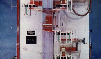
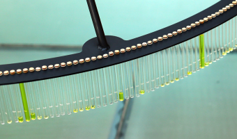
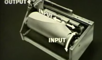
These cams are solid models of bivariate and univariate mathematical functions plotted in cylindric coordinates (left and middle images) and polar coordinates (right image). They were not meant to be visually examined, but were used in mechanical analog computers for aiming battleship guns during WWII. They were also called computing cams. Mechanical fire control aids started to be developed in the 1900s and and were still in use in the late 1980s. During WWII, they could solve multivariate […]

Added by: Pierre Dragicevic, sent by: Emmanuelle Beauxis-Aussalet & Yvonne Jansen. Category: Physical model  Tags: 
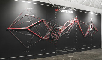
fire control, mathematical functions, physical computation


1949 – Moniac: A Hydromechanical Machine to Teach Economics

The MONIAC or Phillips machine is a hydromechanical analog computer built to teach basic economical principles using colored water flowing in transparent pipes. The machine was built in 1951 after electrical-engineer-turned-economist William Phillips and his economist colleague Walter Newlyn realized that flows were used as a metaphor to teach economics, but have never been made physical. Phillips is also known for his eponymous curves. Several MONIACs were built, and a working one is […]

Added by: Pierre Dragicevic. Category: Physical model  Tags: economics, education, flows, hydraulic, liquid, physical computation, simulation, water


1995 – Loren Madsen's Early Data Sculptures

Californian artist Loren Madsen has been making data sculptures since 1995 and still continues today. CPI / Cost of Living (left image) is the first of his series: A lamination is one year. Vertical axis is the Consumer Price Index (CPI) for food; the horizontal axis is the CPI for gasoline + electricity. The rising center line is the CPI for housing. The 'snout' is the 1960's when housing and food were cheap. The bulge above the snout is 1973---OPEC, gasoline lines, etc. Thereafter the cost of […]

Added by: Loren Madsen & Pierre Dragicevic. Category: Passive physical visualization  Tags: art, CPI, data, data sculpture, housing, income, information


1999 – World's Largest Solid Terrain Model

In 2006, a mysterious 900x700m solid terrain model with military facilities was discovered by a German Google Earth user next to the Chinese town of Huangyangtan. It was quickly identified as a 1:500 replica of a disputed area in Tibet between China and India 2400km away, with perfectly matching orientation. Chinese authorities claimed the model was built 7-8 years earlier as a tank training facility. It is unclear whether the right image represents the same model. Sources: Newswatch (2011) The […]

Added by: Pierre Dragicevic. Category: Physical model  Tags: cartographic, large-scale, military, pragmatic, terrain model, walkable


2011 – Manually Animated Graph of Scientific Data

Philadelphia-based multi-discipline artist Bradley Litwin built this physical chart that can be animated by turning a crank. It is the only manually-animated physical visualization we know of so far. It was commissionned by a pharmaceutical company, intended as an educational device for distributing to doctors. Bradley was kind enough to send us an image of the insides of the original prototype, "not quite as pretty as the final product", he says. His explanation: As the crank is turned, a […]

Added by: Yvonne Jansen & Pierre Dragicevic. Category: Passive physical visualization  Tags: animation, mechanical interaction, science


2013 – Examined Life: Giving Shape to Activities

Designer Alex Getty logged his daily activities for 40 days and turned them into data sculptures that look like colored paper origami. Source: Alex Getty (2013) The Examined Life

Added by: Pierre Dragicevic. Category: Passive physical visualization  Tags: activity data, origami, paper, self-logging


2013 – Loci: 3D Printed Sculptures of Your Flights

Loci by Andrew Spitz lets you easily create physical 3d arc diagrams based on your past flights, and may be soon be available through an iphone app. Source: Andrew Spitz (2013) Loci - 3D Printed Sculptures of Your Flights.


2013 – Turning Facebook Connections into Data Sculptures

An application created by SOFTlab and The Creators Project lets you turn your facebook social network into a beautiful crystal-like data sculpture. Sources: Kree8tiv via iohannan's pinterest. See the page on shapeways.

Added by: Pierre Dragicevic. Category: Passive physical visualization  Tags: data sculpture, remote fabrication, social network


2014 – Drip-By-Tweet: Each Vote is a Drop

Team of developers Domestic Data Streamers created a real-time physical visualization of votes for a graphic design contest. A person can vote for a specific piece by sending a tweet, after which the machine releases a drop of yellow liquid and sends it to the corresponding test tube. Source: Domestic Data Streamers.

Added by: Pierre Dragicevic. Category: Active physical visualization  Tags: liquid, participatory, streaming, tweets, votes


2014 – Data Strings: Physical Parallel Coordinates

During the SWAB International Contemporary Art Fair, the group of developers Domestic Data Streamers had the audience create a physical parallel coordinates visualization based on their demographic profile (social status, weight, etc.) and by answering a meaningless question on whether they choose a spoon or a fork. Source: Domestic Data Streamers (2014) Data Strings. They have a range of other interesting physical visualization projects on their Web page.

Added by: Pierre Dragicevic. Category: Passive physical visualization  Tags: demographic, nails, parallel coordinates, participatory, threads