Tag: Pierre Dragicevic

1900 – Modern Solid Terrain Modeling

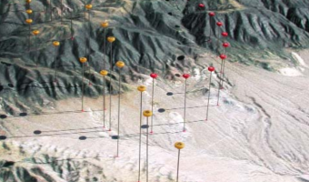
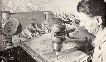
The Institute of Cartography ETH Zurich published a great review of past and present techniques for doing solid terrain modeling. Although terrain models are not physical visualizations in the strict sense, the techniques could be in principle used to convey data. Physical terrain models were already being built in 16th the century, and the review covers modern techniques from the early 20th century to today's digital fabrication. Source: Institute of Cartography ETH Zurich (2006) Terrain […]

Added by: Pierre Dragicevic. Category: Enabling technology  Tags: cartographic, cartography, terrain model, terrain modeling


2003 – Solid Terrain Model with Airplane Trajectory

A real case study involving the use of a physical 3D trajectory visualization on top of a 3D terrain model to analyze the causes of a plane crash. This case study is interesting in terms of cost-benefit analysis, since these models appear to be extremely time-consuming to build. The case study includes an informal comparison with animations: "The mock jurors later related that the physical model was easier to understand and it allowed them to discuss the issues with each other more easily than […]

Added by: Pierre Dragicevic. Category: Passive physical visualization  Tags: cartographic, litigation, plane crash, solid terrain model


2006 – Nathalie Miebach's Woven Sculptures

Artist Nathalie Miebach created a range of beautiful woven sculptures out of weather data. Source: Nathalie Miebach. http://www.nathaliemiebach.com/weather.html (see TED Talk).

Added by: Pierre Dragicevic, sent by: Fanny Chevalier. Category: Passive physical visualization  Tags: artistic, data sculpture, hand-made, weather


2007 – Global Cities: Elevation Maps of City Population

Large-scale physical density models where plywood forms represent the populations of 12 of the world’s major urban centres. Made by a team of designers and architects led by Professor Richard Burdett. Source: Eliza Williams (2007) Global Cities at Tate Modern. Right photo by Stefan Geens.

Added by: Pierre Dragicevic. Category: Passive physical visualization  Tags: cartographic, data sculpture, large-scale, population, walkable


2007 – Wable: Web Behavior Shown with a Dynamic Bar Chart

A dynamic bar chart visualizing one's online activity. From the company's website: The personal feeds from webapplications like Plazes, Flickr, and Last.fm tell much about the activity of an individual on the internet. In this project we aim to explore how you can visualize the changes of your web identity over time and create a physical link between your virtual and real identity. The interface consists of both a physical table and a web application. This direct feedback from your web identity […]


2008 – Andreas Fischers' Data Sculptures

Andreas Nicolas Fischer is a Berlin-based artist. Above are four of his 3-D data sculptures: Fundament (world GDP and derivatives volume) Indizes (finance data over time) A week in the life (cellphone communications) Reflection (FFT of a music piece). Source: http://anfischer.com via infosthetics.


2009 – Poly: Physical Bar Chart Showing Online Poll Data

Poly, a self-actuated bar chart which shows replies to online polls. Sources: Digit, London. Original polling website is down [Oct 2014]; check out an archived version instead.

Added by: Pierre Dragicevic. Category: Active physical visualization  Tags: data sculpture, online poll, self-actuated


2010 – Limbique: Brain Slices

A neuroscientific physical visualization made by an artist and a neuroscientist. Exhibited at the at the VisWeek 2011 art show. Source: David Paulsen and Pinar Yoldas. Photo by Samuel Huron.

Added by: Pierre Dragicevic. Category: Passive physical visualization  Tags: brain, science


2010 – Dynamic Bar Chart to Visualize One's Finances

A design project by Swedish designer Hampus Edström to help people keeping an overview of their financial situation. Sources: Hampus Edström, project presentation. Yanko Design blog.


2012 – General Motors' 3D LEGO Visualizations

LEGOs help business executives log and explore data. Sources: Mark Wilson (2012) How GM Is Saving Cash Using Legos As A Data Viz Tool. The Daily Drive (2012) GM Plays with Legos (Video).

Added by: Pierre Dragicevic, sent by: Fanny Chevalier. Category: Passive physical visualization  Tags: industry, interactive, LEGO, manual update, pragmatic visualization, rearrangeable