Tag: Pierre Dragicevic

1896 – James Ive's Mechanical Teaching Map

The boundaries of the United States transformed during the 19th century, often through violent means. Mapmaker James Ives created this mechanical map to help people, especially students, visualize these changes. Sources: Leventhal Map Center (2019) Tweet. Boston Rare Maps (2016) Fantastic mechanical map of United States territorial expansion. Video by the Leventhal Map Center.

Added by: Pierre Dragicevic, sent by: Jason Forrest. Category: Physical model  Tags: cartographic, mechanical interaction


1920 – Yakama Time Ball

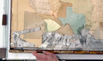
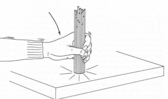
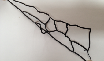
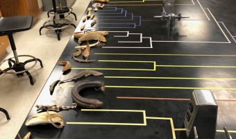
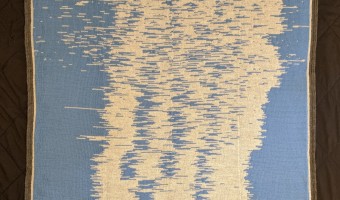
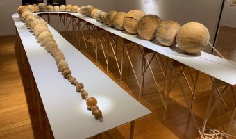
Women from the Yakama Native American tribe used strings of hemp as personal diaries. Each major event in their life was represented by a knot, a bead or a shell. This mnemonic device is called an Ititamat, or counting-the-days ball, or simply time ball. The first image shows an Ititamat created before 1920. On the second image, each string is a different Ititamat. The last image shows a 2003 replica. A young woman would use a time ball to record her courtship, marriage, and other experiences […]

Added by: Pierre Dragicevic. Category: Passive physical visualization  Tags: anthropology, preliterate, self-logging, social use


1984 – Dewdney's Analog Gadgets

Alexander Dewdney is a Canadian mathematician and computer scientist who authored the recreational mathematics column in the Scientific American magazine from 1984 to 1991, after Martin Gardner and Douglas Hofstadter. In 1984, he describes a number of imaginary analog computers he calls "Analog Gadgets", which can in principle solve computing problems instantly. The first one, shown on the left image, uses spaghetti to sort numbers. The second one uses strings to find the shortest path in a […]

Added by: Pierre Dragicevic, sent by: Michael McGuffin. Category: Physical model  Tags: physical computation


2017 – Popsicles of Pollution

Students from New Taipei City collected samples from urban rivers, creeks and ports which they then froze in moulds and preserved in resin. ‘We hope when more people see this they can change their lifestyles,’ said one of the group. Source: Elle Hunt (2017) Popsicles of pollution: ice lollies highlight Taiwan's contaminated waterways.

Added by: Pierre Dragicevic. Category: Uncertain  Tags: food, indexical, pollution, water


2018 – Anthropocene Footprints

Handmade physicalizations of Canada's greenhouse gas emissions, by Mieka West and Sheelagh Carpendale. Each object represents data from a specific year (1990, 2010, and projections to 2030). Initially meant to be smog masks, the designs evolved into strange and beautiful objects evoking indigeneous artefacts such as Native American dreamcatchers, Inca quipus and Polynesian genealogical instruments, and whose visual and material complexity is reminiscent of Nathalie Miebach’s Woven Sculptures. […]

Added by: Pierre Dragicevic. Category: Passive physical visualization  Tags: textile, greenhouse gas, hand-made, pollution, quipu


2018 – Solving the Shortest Route Problem with a 3D Printer

Christian Freksa, a professor of Cognitive Systems at the Department of Informatics at the University of Bremen, shows how a shortest route can be computed by 3D-printing the route network using flexible material, and then pulling apart the start and end nodes. The tight portion of the network immediately gives the shortest route. The right image shows an earlier version using strings. This idea was first proposed by mathematician George Minty in 1957, in a short letter to the editor of the […]

Added by: Pierre Dragicevic, sent by: Barbara Tversky. Category: Physical model  Tags: 3d printing, network, physical computation, route


2018 – Phylogenetic Tree with Real Specimens

As part of a zoology class, evolutionary biologist Leo Smith created a phylogenetic tree of fishes where each leaf is an actual fish specimen. Source: Leo Smith's tweet (29 April 2018). Related: Also see our other entries on physical visualizations built by re-arranging physical items.

Added by: Pierre Dragicevic, sent by: Mark Simpson. Category: Passive physical visualization  Tags: biology, rearrangement, tree


2019 – Sleep Blanket

A visualization of my son's sleep pattern from birth to his first birthday. Crochet border surrounding a double knit body. Each row represents a single day. Each stitch represents 6 minutes of time spent awake or asleep. Source: Seung Lee (2019) Twitter thread. Related: Also see our entry 2013 – Temperature Scarves and Afghans.

Added by: Pierre Dragicevic, sent by: Steffen (@s1effen). Category: Passive physical visualization  Tags: baby, data clothing, textile, self-logging, sleep


2019 – Hostile Terrain 94: Deaths at the US/Mexico Border

Prototype of a series of physical maps that will be exhibited across 94 cities worldwide in fall 2020. Each of the 3500 hand-written toe tags represents the recovered body of a migrant who died while crossing the US/Mexico border in the Sonoran Desert between 2000 and 2020. Coordinated by the Undocumented Migration Project (UMP). To learn more about UMP and the context of this map, listen to the Radiolab podcast series Border Trilogy. Sources: hostileterrain94.wordpress.com Left image from […]

Added by: Pierre Dragicevic, sent by: Luiz Augusto de Macêdo Morais. Category: Passive physical visualization  Tags: cartographic, deaths, migration, toe tag


2019 – New Worry Beads: Deaths from Terrorism

Worry Beads, one for every year from 1945 (closest in the pic), are scaled at one cc per human life. The volume of each is set by the number of terrorist-caused deaths for that year globally. The whole thing is about 40' long, the largest bead (2014) is 19" dia. There’s other material which hopefully makes clear that the #1 American fear, terrorist attack, is ridiculous. There’s another string of beads, 50" long, which shows terrorist deaths in the US. You’re more likely to be […]

Added by: Pierre Dragicevic, sent by: Loren Madsen. Category: Passive physical visualization  Tags: beads, deaths, terrorism