Tag: Pierre Dragicevic

1500 – Flow Visualization

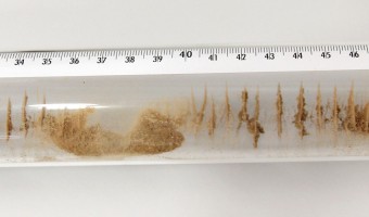
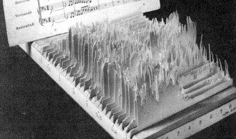
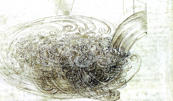
Although today computer graphics is often used for doing flow visualization, a range of physical methods exist that can visualize flows in-place. Leonardo da Vinci was presumably one of the first to use these methods: Leonardo da Vinci (1452-1519) also developed techniques for observing the wind (by generating smoke in a tube and adding it to the wind at suitable points). Most important of all, he made actual experiments under controlled conditions. For this purpose, he used, among other […]

Added by: Pierre Dragicevic. Category: Measuring instrument  Tags: air, flow, science, smoke, water


1866 – Kundt's Tube

Kundt's tube is an apparatus invented in 1866 by German physicist August Kundt for measuring the speed of sound. It mostly consists of a transparent tube of adjustable length with powder in it. Sound is produced at one end of the tube, and the tube's length is adjusted until the sound becomes louder, indicating the tube is at resonance and the sound forms a standing wave. The powder then accumulates at the nodes of the standing wave, where is no vibration. The wavelength of the sound can be […]

Added by: Pierre Dragicevic. Category: Measuring instrument  Tags: physics, science, sound


1960 – 3D Spectrogram

The object on the left may be one of the first sound sculptures. It appears in a 1960 book by German acoustician and musicologist Fritz Winckel (click on the middle image to see the full page). It is a physical 3D spectrogram showing a frequency analysis of an 8-second recording of Beethoven's Eighth Symphony. The left axis is frequency, the bottom/right axis is time, and the vertical axis is the strength of a particular frequency at a particular time. The figure caption uses the term […]

Added by: Pierre Dragicevic, sent by: Jill Hubley. Category: Passive physical visualization  Tags: music, science, sound, sound sculpture, spectrogram


1977 – Graphical Waterfall

   A graphical waterfall is a display where images are formed by water droplets falling from computer-controlled nozzles. It was invented in 1977 by Stephen Pevnick, an American artist. Graphical waterfalls can be used with regular lighting (as on the left video) or with a stroboscope (as on the right video), depending on the desired effect. It is unclear whether such devices have been already used to display data. Sources: Pevnick Design (2018), Invention of […]

Added by: Pierre Dragicevic. Category: Enabling technology  Tags: display, water


2013 – Pop-Up Infographics

In 2013, Italian graphic designer Elena Turtas crafted four books that convey data about sustainability using pop-up and movable paper mechanisms. Source: Elena Turtas (2014) The Four Books of Visualising Sustainability.


2015 – Rearrangeable Physical Map

Andrew Chard, an award-winning graduate student in architecture at Oxford Brookes, created this multi-layered wooden map where layers can be individually pulled out and rearranged. According to the object's legend, this map shows different cities on top of each other so that people can compare their structure. There is not much information available online but Andrew explained to us by e-mail: It was so long ago that I wouldn’t be able to remember the scale or locations I am afraid. Apart from […]

Added by: Pierre Dragicevic, sent by: Carmen Hull. Category: Physical model  Tags: cartographic, laser-cut, rearrangeable


2016 – Thoughtforms: 3D-Printed Thoughts

Kellyann Geurts and In Dae Hwang, Monash University, give physical shape to thoughts by turning EEG data into solid objects. During three public events at Melbourne in 2016, she placed a mobile EEG device on volunteers and asked them to think of a memory or emotion of their choice. Their EEG output was translated in real time into a 3D shape they could see on a computer screen. Participants could then press a button to pause the shape and send it to a 3D printer. They were then invited to write […]

Added by: Pierre Dragicevic, sent by: Benjamin Bach. Category: Passive physical visualization  Tags: 3d printing, digital fabrication, EEG, thoughts


2016 – Walkable Collaboration Network

Designer Dario Rodighiero created a large (15x15m) walkable visualization showing scientific relationships between researchers and laboratories at the ENAC school of EPFL in Switzerland. The visualization was printed on tarpaulin, a heavy covering employed for trucks. Two years before, Dario created a coauthorship network visualization for the Digital Humanities 2014 conference. He initially considered showing a large poster, but since sticking posters was not allowed at the conference center, […]

Added by: Pierre Dragicevic, sent by: Benjamin Bach. Category: Uncertain  Tags: collaboration, network, walkable


2017 – Street Debaters

Japanese designer Tomo Kihara invented a polling device that is both entertaining and profitable. Source: Tomo Kihara (2017) Street Debaters.

Added by: Pierre Dragicevic, sent by: Ryo Suzuki. Category: Uncertain  Tags: coins, homeless, participatory, polling


2018 – Multimaterial Printing of Volumetric Scientific Visualizations

Researchers from MIT Media Lab and Harvard University have developed a method for accurately physicalizing scientific visualizations using multimaterial 3D printers: To fabricate an item on conventional 3D printers, one must make calculations regarding the object’s digital description, and then convert the resulting numeric description to geometric shapes which can be used to 3D print it. But the research team has developed a new technique to 3D print multimaterial data sets as physical […]

Added by: Pierre Dragicevic, sent by: Arnold Platon. Category: Enabling technology  Tags: 3d printing, multimaterial