Tag: Pierre Dragicevic

1600 BC – Water Clocks

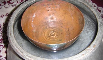
A water clock (or clepsydra) is an instrument where time is measured by regulating a flow of liquid. The oldest water clocks simply consisted of a pierced bowl placed in a larger pot filled with water (see left image, Persian artefact from 400 BC). These existed back in the 16th century BC. The passage of time was observed by counting how many times the bowl overflowed and its content had to be poured back in the larger pot. This was used for example in Persia to ensure fair irrigation […]

Added by: Pierre Dragicevic. Category: Measuring instrument  Tags: archaeology, water, water clock


500 BC – Pebble Voting

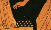
The earliest participatory visualizations were probably voting systems. Voting in Greece was introduced in the 5th century BC. Adult male citizens were invited to express their opinion by dropping a pebble in an urn: a white pebble meant "yes" and a black pebble meant "no". Sometimes two urns were used. The left image is a detail of a Greek wine cup from the 5th century BC, and is one of the earliest known depictions of the act of voting. The middle image is a modern reconstruction from a TV […]

Added by: Pierre Dragicevic. Category: Passive physical visualization  Tags: archaeology, democracy, greeks, participatory, voting


1200 – Pop-Up and Movable Books

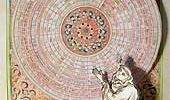
While gatefold mechanisms were already used in the 1100s, one of the first movable paper mechanisms was a volvelle created by Benedictine Monk Matthew Paris to calculate the dates of Christian holidays in his book Chronica Majorca (1236-1253, see left image above). Volvelles are paper discs or rings placed on top of each other that rotate around a string or rivet. Many other types of paper mechanisms have been invented since then, such as flaps, which were used in anatomy books starting from […]

Added by: Pierre Dragicevic, sent by: Benjamin Bach. Category: Enabling technology  Tags: anatomy, book, mechanical interaction, paper, pop-up


1787 – Chladni Plates

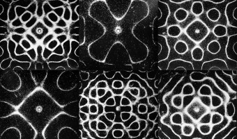
In 1787, German physicist and musician Ernst Chladni published a technique to visualize the modes of vibration of a rigid surface. Chladni's technique [...] consisted of drawing a bow over a piece of metal whose surface was lightly covered with sand. The plate was bowed until it reached resonance, when the vibration causes the sand to move and concentrate along the nodal lines where the surface is still, outlining the nodal lines. The patterns formed by these lines are what are now called […]

Added by: Pierre Dragicevic. Category: Measuring instrument  Tags: acoustics, embedded, physics, science, sound


1850 – Merryweather's Leech Barometer

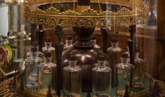
In 1850, British doctor and inventor George Merryweather built a barometer that uses live medicinal leeches to predict storms: The twelve leeches are kept in small bottles inside the device; when they become agitated by an approaching storm they attempt to climb out of the bottles and trigger a small hammer which strikes a bell. The likelihood of a storm is indicated by the number of times the bell is struck. The device, which Merryweather called the "tempest prognosticator", was shown at the […]

Added by: Pierre Dragicevic, sent by: Aurélien Tabard. Category: Measuring instrument  Tags: leeches, sonification, weather


1897 – Stop Motion Animation

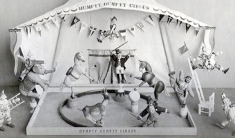
Stop motion animation is the frame-by-frame capture of (generally) inanimate objects which are manipulated by increments in order to produce the illusion of motion. It was first used in movies to produce magical effects. The first movie to use this technique was The Humpty Dumpty Circus (1897), where a toy circus of acrobats and animals comes to life (left image). With modern 3D computer graphics, stop motion animation has become largely obsolete, but remains occasionally used. A particularly […]

Added by: Pierre Dragicevic. Category: Enabling technology  Tags: stop motion animation


1965 – Stop Motion Animation of Physical 3D Map

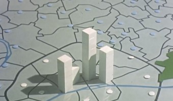
This educational movie from the 1960s uses physical bars and stop motion animation to show the evolution of population in the Paris area between 1801 and 1961. It was made between 1962 and 1967 by the Institut des Sciences Humaines Appliquées (ISHA) and the Centre de Mathématique Sociale et de Statistique (CMSS), in collaboration with the Laboratoire de Cartographie directed by Jacques Bertin. You can see the physical visualization from all sides by […]

Added by: Pierre Dragicevic. Category: Passive physical visualization  Tags: bar chart, cartographic, stop motion animation, storytelling


2012 – Stop & Frisk: Physical Data Filtering

Chilean designer Catalina Cortázar created a physical visualization showing the proportion of black, hispanic and white people searched by the New York police in 2010. Each of the three compartments stands for a race and contains an amount of powder proportional to the race's population in New York. When the object is turned upside down, the powder falls into an adjacent compartment except for coarser particles that do not make it through the holes and represent people stopped by the police. […]

Added by: Pierre Dragicevic, sent by: Alice Thudt. Category: Passive physical visualization  Tags: new-york, physical computation, police, powder, race


2014 – Data Sculpture in the White House

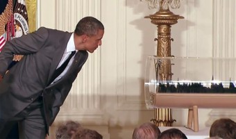
Gilles Azzaro, a French digital artist and fab lab co-founder, created a sound sculpture of Obama's 2013 State of the Union Address where Obama mentions 3D printing as the next revolution in manufacturing. Azzaro's sculpture was exhibited in the White House in 2014 during the inauguration of the first White House Maker Faire. The sculpture is interactive: a movement sensor activates the system and a laser beam scans the 3D recording to reveal the President’s speech. See this video for an […]

Added by: Pierre Dragicevic, sent by: Christophe Hurter. Category: Passive physical visualization  Tags: 3d printing, president, sound sculpture


2017 – Are you Sure you Want to Smoke?

Giacomo Flaim, a student in Communication Design at Politecnico of Milan, made a single-datum physical visualization out of 4,234 cigarette butts to convey the average annual cigarette consumption of an Italian smoker. Labels were added to indicate the reduction in life expectancy depending on the quantity smoked, from 10 minutes for a single cigarette to more than a month for the entire year. Sources: Giacomo Flaim (2017) Are you sure you want to smoke? (behance.net). Information is Beautiful […]

Added by: Pierre Dragicevic. Category: Passive physical visualization  Tags: cigarette, health, rearrangement, risk, single-datum, smoking