Tag: Pierre Dragicevic

1890 – Polynesian Genealogical Instrument

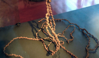
This artefact from the Marquesas Islands (French Polynesia) served as a memory aid for reciting genealogies during ceremonies. Each thread, made of woven coconut fiber, is a genealogical line and each knot is a generation. The genealogy goes back to the mythical origins of Earth, materialized by the oblong ball on top, made of wood (see left image). The date of the artefact is unknown. It was collected by Alphonse Long, French navy physician, while he was on duty in the Marquesas Islands […]

Added by: Pierre Dragicevic. Category: Passive physical visualization  Tags: anthropology, genealogy


1970 – Byron's Bender

In the early 1970's, crystallographer Byron Rubin invented a tool that bends wires to make proteins models. The tool was popular until the 1990s. Byron Rubin became an artist who builds large-scale molecular sculptures. Eric Martz and Eric Francoeur explain how such physical models yielded important scientific insights: An example illustrating the importance of models from Byron's Bender occurred at a scientific meeting in the mid 1970's. At this time, less than two dozen protein structures had […]

Added by: Pierre Dragicevic. Category: Enabling technology  Tags: chemistry, molecule, protein, science, steel


1973 – Mazamet Ville Morte

In 1973, the French town of Mazamet had a population that closely matched the nationwide number of motor vehicule deaths across the previous year. A TV reporter decided to show all inhabitants lying on the floor to symbolize these deaths. Source: Marieaunet (2010) 1973 Mazamet ville morte.

Added by: Pierre Dragicevic, sent by: Charles Nepote. Category: Passive physical visualization  Tags: deaths, participatory, people, rearrangement, single-datum


2013 – Doug McCune's Physical Maps

Doug McCune is a programmer turned artist, and he is obsessed with maps. In 2013, he got bored with screens and started to build physical thematic maps. He specializes in turning "horrible data" such as murders and natural disasters into beautiful objects. Above on the left is an artwork titled "stalagmite crime" that shows elevation maps of crime rates in San Francisco: narcotics-related crimes (green), prostitution (blue) and vehicle theft (orange). Sources: Doug McCune (2013) Physical Maps – […]

Added by: Pierre Dragicevic. Category: Passive physical visualization  Tags: 3d printing, cartographic, cartography, digital fabrication, maps


2014 – #Good vs. #Evil

A race is going on between two Twitter hashtags, materialized by two cars. The blue car represents #Good, the red car represents #Evil. Source: Patrick Keller (2014). I&IC Workshop #3 at ECAL: output > “Botcaves” / Networked Data Objects.

Added by: Pierre Dragicevic. Category: Active physical visualization  Tags: cars, robots, toys, tweets


2015 – Kohei Nakajima's Computing Tentacle

Kohei Nakajima and his colleagues argue that soft bodies are hard to control from a robotics perspective, but precisely because of their complex dynamics they can be used as information processing devices for solving hard computational problems. In a recent article they explain how they send inputs to a motor that wiggles a silicon tentacle, and read the system's output by sensing the arm's posture. I'm not entirely sure what's being calculated exactly, but the idea seems quite compelling. Also […]


2015 – Dan Gilbert's TV Ads

The famous psychology professor Dan Gilbert made a series of TV commercials for the insurance company Prudential, together with Ray Del Savio from Droga5 and Colin McConnell from Prudential. These TV commercials make a clever use of participatory physical visualizations to demonstrate and explain human biases in financial planning. Ribbon Experiment (left image): Dan Gilbert asks bystanders to estimate how much money they will need to retire. He then gives each of them a ribbon and asks them to […]

Added by: Pierre Dragicevic. Category: Passive physical visualization  Tags: participatory, storytelling, walkable


2015 – Multivariate Beer

Nathan Yau from flowingdata brewed four different types of beer based on county demographics. For example, he mapped population density to the total amount of hops, and race percentages to the type of hops used. He describes the process in detail on his web site, with R source code. The idea is reminiscent of Rohit Khot's TastyBeats shown at the CHI '14 conference, an installation that creates personalized energy drinks based on heart beat data. Sources: Nathan Yau (2015) Brewing Multivariate […]

Added by: Pierre Dragicevic. Category: Passive physical visualization  Tags: beer, data cuisine, demographics, food


2015 – London Eye Chart: A 135m Tall Donut Chart

One week before the UK general election of 2015, the design studio Bompas & Parr and Facebook turned the Ferris wheel of London into a giant donut chart of the political parties most discussed on Facebook. Blue stands for the Conservative Party and red stands for the Labour Party. Learn more. Sources: Bompas & Parr (2015) London Eye Chart. Photo by Bompas & Parr.

Added by: Pierre Dragicevic, sent by: Loren Madsen. Category: Passive physical visualization  Tags: large-scale, pie chart, politics, social networks


2015 – Physical Weather Display

Japanese Software engineer Ken Kawamoto invented the Tempescope, a device that displays weather forecasts or current weather physically. The Tempescope physically simulates weather forecasts via a wireless connection from a computer or a smartphone in real-time in order to get a better idea of what the actual weather is outside. Raining is simulated by water dripping down the box, temperature is represented by color-chaning LEDs and cloudiness is conveyed by a mist diffuser. Source: Dovas […]

Added by: Pierre Dragicevic & Jean Vanderdonckt, sent by: Lora Oehlberg. Category: Active physical visualization  Tags: weather