Tag: Yvonne Jansen

1871 – Thermodynamic Surfaces

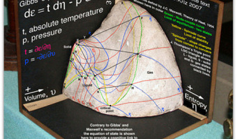
A physical visualization by Scottish physicist James Maxwell (left), constructed over the course of about seven months, from November 1874 to July 1875, based on the descriptions of thermodynamics surfaces described in two 1873 papers by American engineer Willard Gibbs. The molded shape depicts the geometry of the three-dimensional thermodynamic surface of the various states of existence of water: solid, liquid, orgas, shown on Cartesian coordinates of the entropy (x), volume (y), and energy […]

Added by: Yvonne Jansen, sent by: Fanny Chevalier. Category: Passive physical visualization  Tags: clay, Maxwell, science, thermodynamics, Thompson


2007 – Explosion of Sound Sculptures

In 2007-2008, sound became an endless source of inspiration for data sculptors. Examples include (images from left to right): Binaural by Daniel Widrig & Shajay Bhooshan (2007) Sound/Chair by Plummer Fernandez (2008) Sound Memory by Marius Watz (2008) Reflection by Andreas Nicolas Fischer & Benjamin Maus (2008) I Will Never Change by Us by Benga (2012) Microsonic Landscapes by Juan Manuel de J. Escalante (2012) The Shape of the Sound of the Shape of the Sound by Stephen Barrass (2012) […]

Added by: Pierre Dragicevic & Yvonne Jansen, sent by: Fanny Chevalier & Benjamin Bach. Category: Passive physical visualization  Tags: art, data sculpture, sound, sound sculpture, temporal data


2009 – Mitchell Whitelaw's Weather Sculptures

Weather data is another interesting choice for creating data jewelry. Above to the left is a bracelet created by Mitchell Whitelaw based on one year of weather data from Canberra. The right image shows a measuring cup made by the same artist, where each ring represents monthly average temperatures in Sydney over 150 years. Sources: Mitchell Whitelaw. Weather Bracelet (2009) Mitchell Whitelaw. Measuring Cup (2010)

Added by: Yvonne Jansen, sent by: Mitchell Whitelaw. Category: Passive physical visualization  Tags: 3d printing, data jewellery, digital fabrication, tableware, weather


2010 – Hans Rosling Adopts Physical Visualizations

Hans Rosling is famous worldwide for his fascinating speeches about population growth and income inequalities, notably his 2006 TED Talk where he debunks myths about the third world using animated charts. In 2010 he started to tell stories about data using physical visualizations. He started by stacking Ikea boxes, then switched to a variety familiar objects including pebbles, toy construction kits, fruit juice, snow balls and even toilet paper. Hans' son Ola Rosling is behind the technology […]

Added by: Pierre Dragicevic & Yvonne Jansen. Category: Passive physical visualization  Tags: LEGO, rearrangeable, storytelling, TED


2012 – PARM: Static Terrain Models with Projection

The PARM system is part of an ongoing research project at the University of Nottingham. A static physical relief model is augmented with top projection to display landscape details and to overlay with additional data visualizations. Sources: James Goulding's project page. Pristnall et al (2012). Projection Augmented Relief Models (PARM): Tangible Displays for Geographic Information.

Added by: Yvonne Jansen, sent by: Stuart Reeves. Category: Active physical visualization  Tags: cartographic, hybrid, solid terrain model, top projection


2013 – Network of the German Civil Code

A room-filling visualization by Oliver Bieh-Zimmert (Visual Telling) that illustrates the patterns of references within the German civil code. Each red thread stands for a reference to another paragraph. Source: you can find more info and images on the visual telling website.

Added by: Yvonne Jansen, sent by: Pierre Dragicevic & Benjamin Bach. Category: Passive physical visualization  Tags: network, room-sized, walkable


2013 – Season in Review: iPad + Physical Charts Show Baseball Stats

Baseball stats for an entire season created by Teehan+Lax labs as a combination of an interactive ipad app with an overlay of physical charts cut from acrylic. Depending on the current choice in the app, the edges of different charts get highlighted by the ipad. Source: Teehan+Lax labs & vimeo.

Added by: Yvonne Jansen, sent by: Samuel Huron. Category: Active physical visualization  Tags: baseball, digital fabrication, hybrid, laser cutting, line charts, tablet, temporal data


2013 – Layered 2D Plots

A series of stacked 2D plots showing changes in energy sources for different countries by PhD student Simon Stusak from University of Munich. All plots are cut from acrylic and hold together in one corner to facilitate alignment of the layers. The y-axis is mapped to countries, the x-axis to different energy sources, and the z-axis to time. Sources: Simon Stusak (2013) Physical Visualizations: An Exploration. Simon Stusak, Aurélien Tabard and Andreas Butz (2013) Can Physical Visualizations […]

Added by: Yvonne Jansen, sent by: Pierre Dragicevic. Category: Passive physical visualization  Tags: lasercut, rearrangeable, stacked 2D


2013 – NYC High School Dropouts

Ben Kauffman and Sam Brenner created this visualization as part of the ITP program at the NYU Tisch School of the Arts. It is a combination of a 3D-printed relief map of New York City with beads where each bead represents one school location. Each bead on top of the relief map is connected to a string below whose length indicates the number of students who dropped out of that school. Source: More pictures, a video and all the details on the project can be found on their project page.

Added by: Yvonne Jansen, sent by: Ben Kauffman. Category: Passive physical visualization  Tags: 3d printing, cartographic


2013 – Solid Statistics

Left image: A 3D printed version of the "Forbes 2000" list showing the 240 largest companies, by Volker Schweisfurth. Market value is mapped to surface area, sales volume is mapped to volume, and the continent from which the company originates is mapped to color (America (blue), Europe (green), Asia (yellow)). The picture illustrates how a physical model of this 3D visualization gives a better impression of perspective than the printed perceptual cues in the original paper visualization. Right […]

Added by: Yvonne Jansen, sent by: Volker Schweisfurth. Category: Passive physical visualization  Tags: 3d printing, statistical data