2012 Yeosu EXPO HYUNDAI MOTOR GROUP created by media artist group : Jonpasang. Hyper-Matrix is a kinetic landscape installation created for the Hyundai Motor Group Exhibition Pavilion in Korea, the 2012 Yeosu EXPO site. The installation consists of a specially made huge steel construction to support thousands of stepper motors that control 320x320mm cubes that project out of the internal facade of the building. The foam cubes are mounted to actuators that move them forward and back by the […]
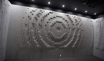
2012 Yeosu EXPO HYUNDAI MOTOR GROUP created by media artist group : Jonpasang. Hyper-Matrix is a kinetic landscape installation created for the Hyundai Motor Group Exhibition Pavilion in Korea, the 2012 Yeosu EXPO site. The installation consists of a specially made huge steel construction to support thousands of stepper motors that control 320x320mm cubes that project out of the internal facade of the building. The foam cubes are mounted to actuators that move them forward and back by the steppers, creating patterns across the three-sided display. Comprised of what at first appear to be three blank white walls, Hyper-Matrix installation quickly comes to life as thousands of individual cubic units forming a field of pixels begin to move, pulsate, and form dynamic images across the room, creating infinite number of possibilities in the vertical, 180 degree, landscape. In addition, as the boxes are arranged at only 5mm narrow intervals, the wall can also be a nice moving screen for the images projected on to it. Source: Jonpasang, Hypermatrix.