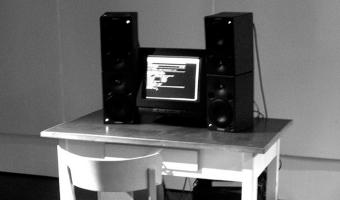
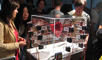
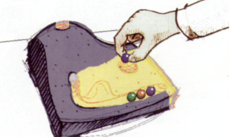
List of Physical Visualizations
and Related Artifacts
Active Physical Visualization

2002 – Lungs, Slave Labour

Lungs; Slave Labour by YoHa (Matsuko Yokokoji, Graham Harwood) was a database installation that was first produced for the exhibition “Making Things Public” at The Centre for Art and Media, (ZKM) Karlsruhe, Germany, curated by Bruno Latour, Peter Wiebel and Steve Dietz. The ZKM site first opened in 1997 in the historic monument of a former munitions factory, Deutschen Waffen und Munitionsfabriken A.G. Karlsruhe. The work reanimated the last breath of victims who were enslaved in the factory by […]

Added by: Graham Harwood. Category: Active physical visualization  Tags: sonification, air displacement, deaths


2008 – 100% City

Since 2008, the German theater group Rimini Protokoll organizes performances where they select 100 people in such a way that they form a representative sample of a given city, and then invites them on the stage. Each person briefly introduces themselves, after which everyone participates in a series of physical visualizations where each person takes the role of a data point. The first performance was titled 100% Berlin. Similar performances were then organized in 18 other cities between 2010 […]

Added by: Pierre Dragicevic. Category: Active physical visualization  Tags: city, participatory, people


2010 – Coal Fired Computers

In Coal Fired Computers, a one hundred year old, 17.5-ton showman’s steam engine powers a single computer with 1.5 tonnes of coal. Black lungs inflated every time the database record of a miner’s lung disease was shown on the computer monitors. The original work was produced over three days at Newcastle’s Discovery Museum, with groups of miner activists. The work was originally commissioned by AV Festival, Newcastle, UK and produced in partnership with Discovery Museum, Isis […]

Added by: Graham Harwood. Category: Active physical visualization  Tags: polution, disease, mining


2013 – Solar Radiation Dowsing Rod

The Solar Radiation Dowsing Rod is a device created for a space observatory that allows visitors to point it towards the sky and feel, through light, vibration and sound, the level of radiation coming from that direction. The rod enables people to perceive data only during interaction (as data is not encoded in the shape of the artifact, but rather experienced through it). ”[…] crossmodal data-driven artefacts that represent live data streams using haptic-auditory feedback. The motivation for […]

Added by: Vinicius Sueiro. Category: Active physical visualization  Tags: nonvisual, haptic-auditory, solar radiation


2019 – Anamorphic Data Spatialization

Data spatialization is a design technique through which data is used to create architectural spaces. It does not necessarily preserve the legibility of the represented data, but rather focuses on the spatial qualities that can be gained from the data. This research aims to introduce a method for the design of a data-driven pavilion that represents data spatially through catoptric (mirror-assisted) anamorphosis. In this work, a set of environmental datasets from North America–including […]

Added by: Hessam Djavaherpour. Category: Active physical visualization  Tags: anamorphosis, cartographic, Pavilion, public


2020 – Laina: Data Physicalization of Running Activity

Laina is a shape-changing art piece, presenting physicalized running routes over a delayed period of one or two days. Over this time, some of the pins on Laina are pushed out one by one, creating a data physicalization pattern corresponding to the mapping of the last running route. The length the pins come out represent a specific effort given at that point on the route. The metric related to the effort can be chosen by the user (e.g., pace, burned calories, heart rate). Laina adopts an […]

Added by: Carine Lallemand. Category: Active physical visualization  Tags: physical activity, running, shape-changing, exercise, sports


2020 – LOOP: Ambient Visualization of Personal Activity

   LOOP is a physical artifact that changes its shape according to the activity data of the owner, providing an abstract visualization. The artifact consists of eight rings, of which seven represent weekdays from small to large, and the outermost ring represents the step goal. When the owner is active, the ring representing the current weekday moves upwards and positions itself in relation to the step goal ring. LOOP was used to investigate how an alternative approach to representing […]


2020 – Econundrum: Visualizing the Climate Impact of Dietary Choices

Econundrum is a shared physical system, designed to visualize the carbon emissions as a result of dietary choices. People of a community can indicate on their phone what food types they ate that day, which will be visualized on the physical installation. Every disk represents the impact of one person, and its elevation indicates the level of impact: higher is fewer carbon emissions, lower is more carbon emissions. The highlighted food types visualize how the 'foodprint' of each person is […]


2021 – Watermap: A Physical Live Weather Visualization

Without water, nothing organic exists. This water installation visualizes - symbolically - how rain brings the whole world to life. In a very tangible way of presenting and visualizing data, rain is represented by real drops of water. The installation features a black, wooden pedestal with a recessed world map filled with sand. Technically, the realization is done by a mini-computer, which evaluates live weather data and positions a water tank in an X-Y system above the world map. At places […]

Added by: Daniel Fischer. Category: Active physical visualization  Tags: weather, rain, water, sand, cartographic


2024 – Monarch Butterfly Migration

A wall at IDEO Chicago that is an interactive system allowing the participant to view the size of the annual Monarch butterfly migration site in Mexico (the number maps to the amount of butterflies on the wall that have their wings open). This roughly maps to the population size of a given year. Sources: Instagram post with video: https://www.instagram.com/p/C8ckPxkP8VK/ Data from Monarch Watch

Added by: Dave Vondle. Category: Active physical visualization  Tags: ecology, butterflies