Tag: Active Physical Visualization

2008 – 100% City

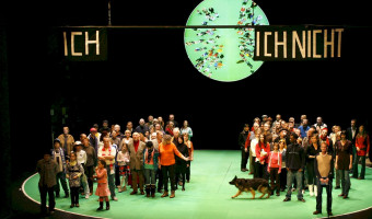
Since 2008, the German theater group Rimini Protokoll organizes performances where they select 100 people in such a way that they form a representative sample of a given city, and then invites them on the stage. Each person briefly introduces themselves, after which everyone participates in a series of physical visualizations where each person takes the role of a data point. The first performance was titled 100% Berlin. Similar performances were then organized in 18 other cities between 2010 […]

Added by: Pierre Dragicevic. Category: Active physical visualization  Tags: city, participatory, people


2013 – Tidal Memory

Tidal Memory displays the evolving daily tide at full scale. Receiving live data from the oldest tide station in the western hemisphere, twenty-four water-filled glass columns function as a tidal clock and 24-hour sculptural archive; recording a full day of hourly tide levels starting at midnight. 26’L x 2.5’W x 10’H - Glass, stainless steel, water, custom electronics. Tidal Memory is permanently exhibited at the Exploratorium, San Francisco, CA. Source: Charles Sowers (creator), […]

Added by: Jeff Pettiross. Category: Active physical visualization  Tags: sea, tides, water


2015 – Wage Islands

The "Wage Islands" installation by Ekene Ijeoma makes clever use of water as a data query device. Wage Islands is an interactive installation which submerges a topographic map of NYC underwater to visualize where low-wage workers can afford to rent. Sources: Ekene Ijeoma: Wage Islands Huffington Post: Dazzling Interactive 3-D Artwork Visualizes The Tragic Affordable Housing Crisis In New York City Creators: Turning New York's Salary Gap into an Interactive Sculpture Design Boom: Wage islands […]

Added by: Cedric Honnet, sent by: Cheng Xu. Category: Active physical visualization  Tags: cartographic, digital fabrication, physical computation, water


2016 – Dataponics: Human-Vegetal Play

“Dataponics: Human-Vegetal Play” maps human physical activity measured by a Fitbit to the amount of light and water fed to a potted plant. Also, the system measures the moisture in the growing hydroponic medium (in this case, expanded clay) that surrounds the plant’s roots, and plays different internet radio stations accordingly. Source: Cercos, R., Nash, A., Yuille, J., Goddard, W. (2016) Coupling quantified bodies: affective possibilities of self-quantification beyond the self

Added by: Robert Cercos. Category: Active physical visualization  Tags: plants, self-logging


2017 – Yellow Dust: Making Visible Particulate Matter in the Air

A three-dimensional water vapor canopy; Yellow Dust is a sensing and sensuous infrastructure that monitors, makes visible and partially remediates particulate matter in the air through variable clouds of yellow mist. Composed by Do It Yourself sensors and using off-the shelf construction systems, it aims to contribute to collective forms of making air pollution visible. In contrast to scientific and policy making versions of air monitoring, where the devices remain invisible and sensing only […]

Added by: HS. Category: Active physical visualization  Tags: air quality, pollution


2017 – Damião's Dataphys Project

A project that communicates information in a beautiful and unusual way. Using simple features, Evandro Damião a data intelligence professional from Brazil creates a project that allows even blind people to interact with graphics through audio, braille, acrylic and a lot of creativity. Visualization and physicalization are not the secrets to communicating data, they are only some aspects that must be transcended. Source: Evandro Damião (2017) The Dataphys Project. Related: Also see our entry […]

Added by: Evandro Damião Barbosa. Category: Active physical visualization  Tags: blind, hybrid, tablet


2018 – CairnFORM: a Physical Ring Chart Showing Renewable Energy Data

CairnFORM is a stack of expandable illluminated rings for display that can change of cylindrical shape (e.g., cone, double cone, bicone, cylinder, spheroid). CairnFORM can be used as a dynamic physical ring chart for encoding 360°-readable data: we use it for encoding forecast data about renewable energy availability in collective and public spaces, such as public places and workplaces. Source: Maxime Daniel, Guillaume Rivière, and Nadine Couture (2019) CairnFORM: a Shape-Changing Ring Chart […]


2018 – Living Map: Precipitation Visualized with Moss

Climate change is a very hot topic nowadays. We are facing extreme weather events more and more frequently. Unusual temperatures, excess rainfall or extremely strong winds, forest fires disrupt our habitual life. The LIVING MAP visualizes the change of summertime rainfall in Europe. A precipitation data comes from the European Environmental Agency. The data was derived using climate simulation model. It compares summer precipitation in the period 1971-2000 and 2071-2100. The simulation of […]

Added by: Sigitas Guzauskas. Category: Active physical visualization  Tags: cartographic, climate change, moss, plants, precipitation


2018 – The Long Run: Marble Runs Convey Cost of Health Care

An artwork that represents the cost of health care for different age groups, based on the time it takes for a marble to fall. Each of the 7 runs represents a different decade of life, and the length of the runs presents the average cost of care to the UK's National Health Service, for a person in that year of their life. Each run is constructed from medical equipment. It was commissioned by the British Medical Association and the British Medical Journal to mark the NHS's 70th Birthday on the 5 […]

Added by: Will Stahl-Timmins. Category: Active physical visualization  Tags: health, interactive, marble, marble run, timed


2018 – ON BRINK: Live Physicalization of the Bitcoin Blockchain

ON BRINK is a physical data visualisation of the Bitcoin blockchain: Adapting the mining metaphor, it encodes data on blocks appended to the chain in real-time. It produces piles of soil that relate in size to the number of transactions within a block, and displays six of them at a time on a continuous conveyor system, thus reflecting the human attention span given to a transaction on the blockchain: A transaction counts as confirmed after five blocks have been appended to its containing block. […]

Added by: Dustin Stupp. Category: Active physical visualization  Tags: bitcoin, blockchain, conveyor, installation, soil