Tag: Passive Physical Visualization

1991 – Münster Congestion Visualization

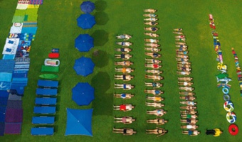
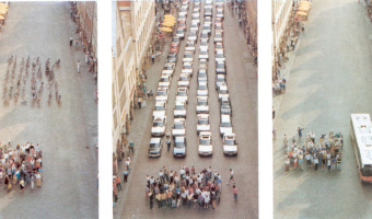
In order to encourage bus use, in 1991 the city of Münster, Germany created a poster that compares the space taken by 72 bicycles (left), 72 cars (middle), and a bus (right). This idea is not new. For example, the city of London has made a very similar poster in 1965. Thanks to Will Stahl-Timmins for pointing this out. Sources: Benjamin Starr (2014) How Much Space Do Cars Take? Cyclists Demonstrate How Bicycles Flight Congestion Image from visualnews.com

Added by: Pierre Dragicevic. Category: Passive physical visualization  Tags: city, participatory, people, rearrangement, traffic, transportation


1996 – Ned Kahn's Wind-Visualizing Facades

Since 1996, Nothern California artist Ned Kahn creates large-scale installations that visualize wind patterns. The left image shows Wind veil (2000), a facade of a parking garage covered with 80,000 small aluminum panels that are hinged to move freely in the wind. The right video shows Wind arbor (2011), a facade of a hotel lobby in Singapore covered with a cable net structure composed of a half a million hinged elements. Sources: List of Ned Kahn's wind sculptures on his website. David Mather […]

Added by: Pierre Dragicevic, sent by: Samuel Huron. Category: Passive physical visualization  Tags: embedded, facades, wind, wind sculpture, walkable


2010 – Computer Glitches as 3D Objects

Glitch objects is a series of artworks by Tracy Cornish which transform two-dimensional visual results of computer glitches into three-dimensional objects by mapping properties of a visual glitch into 3D space. The left image shows glitch object 22, the right image shows glitch object 218. Computer glitches are the completely random, unpredictable and unexpected failures of digital systems. They are the result of approximated values and computational compensations for inaccessible information. […]

Added by: Yvonne Jansen, sent by: Todd Margolis. Category: Passive physical visualization  Tags: 3d printing, data sculpture


2011 – Ursus Wehrli's Art of Clean Up

Ursus Wehrli, a Swiss comedian and artist, is known for his parodic art project called "Tidying up Art", where he rearranges well-known paintings in an orderly fashion (see his 2003 book and his 2006 TED Talk). In 2011, he started a project called "The Art of Clean Up" where he rearranges everyday objects and people. Sources: Maria Popova (2013) The Art of Cleanup: Ursus Wehrli Playfully Deconstructs and Reorders the Chaos of Life Chronicle Book (2013) Art of Clean Up Book Trailer (youtube […]

Added by: Pierre Dragicevic. Category: Passive physical visualization  Tags: art, participatory, people, rearrangement


2013 – Temperature Scarves and Afghans

On January 2013, Kristen Cooper Nutbrown from British Columbia had the idea to create a temperature scarf by knitting one row every day using a color that encodes the temperature of the day. At the end of the year, the scarf visualized local temperature readings for the whole year. Soon after Kristen pitched her idea, Arlene Cline, also from British Columbia, started to create a temperature afghan (a blanket of knitted or crocheted wool). Temperature scarves and afghans became quite popular in […]

Added by: Pierre Dragicevic, sent by: Andy South. Category: Passive physical visualization  Tags: data clothing, temperatures, textile, weather


2014 – Lego Senate

Built by Lance Ulanoff, this Lego representation tells the story of the 2014 US midterms. Red and blue Lego blocks represent the number of Democrat and Republican senate seats. The representation was updated over the evening of the election, as seats went to either Democratic or Republican candidates. Captions tell the story, indicating the time of seat wins and the names of senators. Source: Mashable, The Lego Senate: How the 2014 midterms played out, brick by brick

Added by: Jennifer Payne & Samuel Huron. Category: Passive physical visualization  Tags: LEGO, politics, stop motion animation, storytelling


2015 – Participatory Representation of Happiness

This 2015 physicalization was part of designer Stefan Sagmeister's exhibit on happiness. It contains a participatory representation of exhibition viewer's happiness, remiscent of Hans Haacke's MOMA poll (1970) and Lucy Kimball's participatory chart (2006). The units which make up the representation are gumballs, like Jennifer Payne's participatory representation (2014). Sources: Stefan Sagmeister (2015) The Happy Show Myles Constable (2015) The Happy Show asked "How Happy Are You? The results […]

Added by: Jennifer Payne. Category: Passive physical visualization  Tags: participatory


2015 – Jller: A Robot Rearranges Pebbles by Geologic Age

Jller is a machine created by German artist Benjamin Maus and Czech artist Prokop Bartoníček that sorts pebbles from the German river Jller by their geologic age. To do this, Jller first analyzes an image of the stone it selects, extracting information like dominant color, color composition, lines, layers, patterns, grain, and surface texture. The machine then places the stones in alignment of age and type by sucking them into an industrial vacuum gripper and dropping them in the correct […]

Added by: Pierre Dragicevic, sent by: Alice Thudt. Category: Passive physical visualization  Tags: age, geology, pebbles, rearrangement, robot


2016 – Housing Prices Ripping San Francisco Apart

This data sculpture depicts a map of housing prices in San Francisco. It’s a map of the city, torn at the seams. The height of each area represents the average price per square foot for recent home sales. Where neighboring areas are close in value they are connected, but if neighboring areas are too far from each other I allow them to split, tearing the city along its most severe economic divides. Sources: Doug McCune (2016) Sculpture of Housing Prices Ripping San Francisco Apart Abigail Cain […]


2016 – Motus Forma: People's Motions in a Shared Space

Motus Forma is a data sculpture by Brian Allen and Stephanie Smith that aggregates 10 hours of people movements in the lobby space at Pier 9. The 1300+ motion paths are piled up according to time. Sources: Autodesk (2016) Motus Forma Instructables (2016) Motus Forma Photo by Pierre Dragicevic Related: Also see our other entries on temporal data.

Added by: Pierre Dragicevic. Category: Passive physical visualization  Tags: 3d printing, data sculpture, temporal data