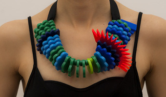
In his experiments with visualizing data from Tripit to look back at his own (and other people's) travel, Cemre Güngör came up with a new system to create data sculptures from one's travels over time. This work is of a particular interest, in that it shows an excellent example of how a physical visualization design process unfolds, with many questions unique to physicalization add up to the challenge of designing an effective visual representation, i.e., contrasting materials and treatments […]
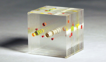
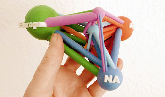
In his experiments with visualizing data from Tripit to look back at his own (and other people's) travel, Cemre Güngör came up with a new system to create data sculptures from one's travels over time. This work is of a particular interest, in that it shows an excellent example of how a physical visualization design process unfolds, with many questions unique to physicalization add up to the challenge of designing an effective visual representation, i.e., contrasting materials and treatments were done to embody varying representations and evoke different feelings from the viewer. The initial premise for Blip was to create a physical ‘lens’ into travel-related data. It should not be a literal representation of the data; it should not be immediately straightforward, but rather should reveal its nature to the viewer upon examination; it should enable the viewer to observe the dataset through different filters by looking at the object from different angles. Cemre's exploration started with a wood sculpture representing a timeline of flights longitudinally: Here, each flight is depicted as a wooden block shaped like an arc, where the volume of the block is proportional to the length of the flight (Figure 17). Blocks are ordered in a chronological fashion in the vertical axis, whereas the horizontal position is reflective of the longitudinal distance covered by the flight. Flights that cover small longitudinal distances appear as 'peaks', since making the area of those blocks proportional to flight length requires elongating them. There are computer-generated ripples on the surfaces of the curves to make it possible to visually differentiate flights of the same route that happen sequentially. However, the above representation "provided a meaningful visualization only from one angle, the top. Looking at the sculpture facing the blocks or from the side did not provide different insights.". Cemre moved on to transparent acrylic, as a support to "look into one's past". The first iteration using this medium was a depiction of great circle arcs followed by each flight. Blip’s choice of a transparent block as a moldable material was one of relevancy, for the material best represents the feeling of ‘looking into’ one's past. This form and substance facilitates observation from different angles. Top view showing the flight trajectories on a map. Side view showing one year of flight. While this design better alogned with Cemre's intent of enabling seeing the data from different angles, using a map as a support to plot the data was not fully satisfying to him: While I started off with visualizing itineraries on a map, I quickly realized that plotting flights on a map wasn’t translating to something that had emotional impact. After going through follow up designs (see thesis for details), Cemre shifted the main concept so as to move away from the visualization of the actual mecanics of travel. In the final design of Blip, data about the user and the nature of time spent on a trip also come into play. I abandoned the map in favor of an abstract representation that shows each trip in relative locations to home, and depicted their length and purpose. Here, the central circle represents home, and all colored circles correspond to a single trip. Colors depict the purpose of the trip (i.e., blue for "just business", green for "more business than leisure", orange for "more leisure than business", etc...), distance to the center is mapped to the distance from home. Each slice of the stack represent a month in the year. Sources: Cemre Güngör website : http://cem.re/cemre-gungor Cemre Güngör. Blip. A personal data sculpture. Masters' thesis. NYU’s Brooklyn Experimental Media Center. December 2011. Reverse Time Machine: Visualizing a Year Of Travel Data, by Amy Jackson • January 24, 2012. (tipit.com blog)
