Tag: Passive Physical Visualization

1970 – MoMA Poll: Participatory Bar Chart

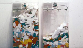
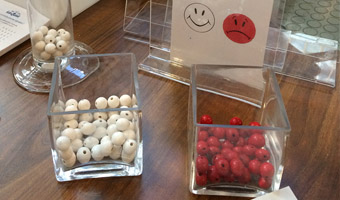
German-American artist Hans Haacke created a participatory physical bar chart as part of a 1970 exhibition at the Museum of Modern Art (MoMA). The audience expressed his opinion on the question "Would the fact that Governor Rockefeller has not denounced President Nixon's Indochina Policy be a reason for your not voting for him in November?". The left plexiglass box collected "Yes" answers, while the right box collected "No" answers. Rockefeller was running for re-election and was a major donor […]

Added by: Pierre Dragicevic. Category: Passive physical visualization  Tags: bar chart, participatory, politics


1987 – All the Submarines of the United States of America

This installation from American artist Chris Burden shows the 625 submarines of the US fleet from the late 1890s to the late 1980s. The cardboard models have been suspended at different heights to look like a school of fish. Sources: Found on Loren Madsen's lecture slides Art as Information – Information as Art. Wikipedia article on Chris Burden. Photo from Giorgia Valli, Grey Magazine. Related: Also see our other entries on single-datum physical visualizations.

Added by: Pierre Dragicevic. Category: Passive physical visualization  Tags: installation, single-datum, submarines, walkable


2008 – Psychogeographical Mapping: Travel Logging with LEGO bricks

American artist Cory Imig reconstructed the layout of the city of Savannah using LEGO bricks, and over the course of one month she added a colored brick every time she went to a particular place. Each color is a different day of the week. Source: Cory Imig (2008) Psychogeographical Mapping (see the section Documenting of her Web page for more data sculptures).

Added by: Pierre Dragicevic, sent by: Loren Madsen. Category: Passive physical visualization  Tags: data sculpture, LEGO, self-logging, temporal data, travels


2009 – Windcuts: Wind Travels Captured on Wood

Windcuts is a physical information visualisation retelling the Helsinki wind's travels over five days, using wind sensor measurements from Helsinki, and wood and a CNC machine to cut it from there too. [...] The line's direction shows the wind's direction, the line's width shows the wind's speed - a more intense wind makes a bigger line - and the line's height shows the wind's temperature. Source: Miska Knapek (2012) Windcuts.

Added by: Pierre Dragicevic, sent by: Miska Knapek. Category: Passive physical visualization  Tags: digital fabrication, Helskini, weather, wind, wooden


2010 – Cookbook Arranges Ingredients into Physical Visualizations

In Sweden, IKEA gives away baking books where ingredients are arranged into physical visualizations. The photos are by Karl Kleiner. This idea is reminiscent of Ursus Wehrli's art projects. Sources: Niels-Peter Foppen (2010) Hembakat är Bäst. Via Iohanna Nicenboim's pinterest. Images from notcot.com.

Added by: Pierre Dragicevic. Category: Passive physical visualization  Tags: cookbook, food, ingredients, rearrangement, recipes


2013 – Population Density Emerging from Walls

Two Yale architects created a room-sized physical visualization of world population density folded into itself: Hsiang and Mendis then turned that spatial visualization into a physical installation at the 2011 Chengdu Biennale in China. They modeled the population distribution of the entire world in a kind of inverted map that visitors could walk into, inside a 10-by-10-by-10 foot room, with North America on the ceiling, Asia on one wall, Africa on another (see also the little boy in the above […]

Added by: Pierre Dragicevic. Category: Passive physical visualization  Tags: cartographic, data sculpture, population density, walkable


2014 – District 5: Tube Charts Reveal Decline in Violence

California-based artist Loren Madsen, a long-time data sculptor (see our 1995 entry and our interview with him), created an outdoor sculpture where steel tubes show falling crime rates across eight crime categories over 30 years. The sculpture stands in front of a police station and jail in Chicago City. Sources: ​Healther Schultz (2015) California Sculptor Completes Commissioned Piece. Image courtesy of Loren Madsen. Also see Steven Pinker's TED Talk on the topic.

Added by: Pierre Dragicevic, sent by: Loren Madsen. Category: Passive physical visualization  Tags: crime, data sculpture, statistics, temporal data, situated, urban, steel


2014 – DIY Bertin Matrix

This wooden matrix is a large-scale replica of Jacques Bertin's reorderable physical matrices. It shows a subset of the World Value Survey, a series of questionnaires that assess people's moral values across countries and years. This physical visualization is interactive as row and columns can be manipulated, promoting engagement and collaboration. This 18x20 matrix was built by Mathieu Le Goc in the Fablab Digscope with Charles Perin and Romain Di Vozzo, on the occasion of the 25th birthday of […]


2015 – Data Necklace of Good Night SMS

Paul Heinicker, a master student in interaction design at the University of Applied Sciences Potsdam, created a data-driven necklace representing a long-distance relationship by sent "good night"-messages from him to his girlfriend. While visualising two years of message history, two diagonal opposing points of the rectangle constitute the starting points for both years. The ongoing sides in each case are coded to the days with and without good night SMS. In detail, the plain horizontal sides […]

Added by: Paul Heinicker. Category: Passive physical visualization  Tags: 3d printing, data jewellery, data sculpture, gift, sms, steel


2015 – Physical Customer Satisfaction Survey

Participatory physical bar charts at the exit of the Antell cafeteria at the University of Helsinki. White beads represent statisfied customers, red beads are unsatisfied ones. Source: Antell. Photo by Luana Micallef. Related: Also see similar contraptions by Hans Haacke (1970), Lucy Kimbell (2006), and Jennifer Payne (2014).

Added by: Pierre Dragicevic. Category: Passive physical visualization  Tags: bar chart, customer satisfaction, participatory