Tag: Passive Physical Visualization

1940s – Stedman's 3D Periodic Table

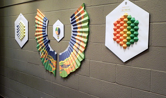
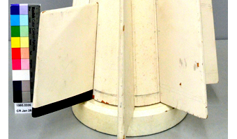
Dr. Don Stedman from the National Research Council Canada designed this 3-D periodic table in the 1940s. Stedman considered many factors and characteristics of the elements as he designed his models. While in this model all the usual groups of elements are found, changes from one group to another are also represented, and their origins are more easily understood. Stedman believed that his model gave more insight into “the orderly development and classification of the elements.” Source: Canada […]

Added by: Devon Elliott. Category: Passive physical visualization  Tags: chemistry, periodic table, science


1995 – Loren Madsen's Early Data Sculptures

Californian artist Loren Madsen has been making data sculptures since 1995 and still continues today. CPI / Cost of Living (left image) is the first of his series: A lamination is one year. Vertical axis is the Consumer Price Index (CPI) for food; the horizontal axis is the CPI for gasoline + electricity. The rising center line is the CPI for housing. The 'snout' is the 1960's when housing and food were cheap. The bulge above the snout is 1973---OPEC, gasoline lines, etc. Thereafter the cost of […]

Added by: Loren Madsen & Pierre Dragicevic. Category: Passive physical visualization  Tags: art, CPI, data, data sculpture, housing, income, information


2004 – Worry (Prayer) Beads

One bead = one year. Size of colored beads is proportional to number of terrorist-caused deaths. Black beads = no terrorist deaths. The largest bead is 2001. Also see Loren Madsen's earlier piece Tops (2001) featuring the same dataset, our entry 1995 – Loren Madsen’s Early Data Sculptures, and our interview with the artist. Sources: Loren Madsen


2011 – Manually Animated Graph of Scientific Data

Philadelphia-based multi-discipline artist Bradley Litwin built this physical chart that can be animated by turning a crank. It is the only manually-animated physical visualization we know of so far. It was commissionned by a pharmaceutical company, intended as an educational device for distributing to doctors. Bradley was kind enough to send us an image of the insides of the original prototype, "not quite as pretty as the final product", he says. His explanation: As the crank is turned, a […]

Added by: Yvonne Jansen & Pierre Dragicevic. Category: Passive physical visualization  Tags: animation, mechanical interaction, science


2013 – Punchcard Economy: Data Knitting

Punchcard Economy is a machine-knitted tapestry inspired by a 1856 banner advertising the Eight-hour day movement. The layer of visual noise shows today's departure from the eight-hour day philosophy. Working hours were collected from 116 participants, and each hour of work outside normal working hours was encoded as a color-inverted knit. A smaller version was made for the 2014 Data as Culture exhibition. Sources: Sam Meech (2013) Punchcard Economy. Explanation of the data encoding in this […]

Added by: Pierre Dragicevic, sent by: Adrian McEwen. Category: Passive physical visualization  Tags: digital fabrication, knitting, textile, working hours


2013 – Examined Life: Giving Shape to Activities

Designer Alex Getty logged his daily activities for 40 days and turned them into data sculptures that look like colored paper origami. Source: Alex Getty (2013) The Examined Life

Added by: Pierre Dragicevic. Category: Passive physical visualization  Tags: activity data, origami, paper, self-logging


2013 – Loci: 3D Printed Sculptures of Your Flights

Loci by Andrew Spitz lets you easily create physical 3d arc diagrams based on your past flights, and may be soon be available through an iphone app. Source: Andrew Spitz (2013) Loci - 3D Printed Sculptures of Your Flights.


2013 – Turning Facebook Connections into Data Sculptures

An application created by SOFTlab and The Creators Project lets you turn your facebook social network into a beautiful crystal-like data sculpture. Sources: Kree8tiv via iohannan's pinterest. See the page on shapeways.

Added by: Pierre Dragicevic. Category: Passive physical visualization  Tags: data sculpture, remote fabrication, social network


2014 – Physical Visual Sedimentation

This visualization created by Jennifer Payne and inspired by Samuel Huron's visual sedimentation was created from gumballs, an acrylic (plexiglass) box and adjustable foamcore bin dividers. Huron's work is inspired by the physical process of sedimentation. The above figures illustrate a participatory representation of hours of sleep for a university population, with different colours of gumballs representing different groups present on a university campus (i.e. blue gumballs for graduate […]

Added by: Jennifer Payne. Category: Passive physical visualization  Tags: participatory, visual sedimentation


2014 – Data Strings: Physical Parallel Coordinates

During the SWAB International Contemporary Art Fair, the group of developers Domestic Data Streamers had the audience create a physical parallel coordinates visualization based on their demographic profile (social status, weight, etc.) and by answering a meaningless question on whether they choose a spoon or a fork. Source: Domestic Data Streamers (2014) Data Strings. They have a range of other interesting physical visualization projects on their Web page.

Added by: Pierre Dragicevic. Category: Passive physical visualization  Tags: demographic, nails, parallel coordinates, participatory, threads