Tag: Passive Physical Visualization

1898 – Crookes' Vis Generatrix

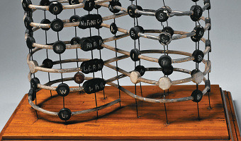
Model of Crookes’ "Vis Generatrix" made in 1898, built by his assistant, Gardiner. From: Proc. R. Soc. Lond. 63, 408. The vertical scale represents the atomic weight of the elements from H = 1 to Ur = 239. Missing elements are represented with a white circle. Similar elements appear underneath each other. With this model, Crookes was trying to visualize the hypothetical relationship between various elements in three dimensions. See all the other entries with the tag "periodic table" to see […]

Added by: Fanny Chevalier. Category: Passive physical visualization  Tags: chemistry, crooke, generatrix, periodic table


1898 – Tallies Used as Social Displays on Pacific Islands

In the 19th century, the Torres Strait Islanders did not have a numeral system and used sticks to keep counts. Sticks were tied to a string, forming a bundle (called kupe) that could be rolled and unrolled when needed. Kupes were typically used by men to keep track of their accomplishments, such as turtles caught in deep water, fishes speared, or adventures with women (as the one above). These physical visualizations were used as social displays, and big kupes were greatly prized. According to […]

Added by: Pierre Dragicevic. Category: Passive physical visualization  Tags: anthropology, preliterate, self-logging, social use, tally


2009 – Marcovici's Single-Datum Visualizations

Vienna artist Michael Marcovici created two physical visualizations that convey a single numerical value. The first one shows one billion dollar - the most expensive piece of art ever made, according to him (although these were actually miniature bills). The second one called Rolex Time Sand shows an entire lifetime worth of hourglass sand. For another single-datum physical visualization see our entry Ceramic Poppies to Commemorate Fallen Soldiers in WW1, and our entry on Chris Burden's […]

Added by: Pierre Dragicevic. Category: Passive physical visualization  Tags: concrete scale, large numbers, money, single-datum, time


2010 – Quipu of the Periodic Table

As a result of bringing together each pair of periods in a single function or binod, the author has found a new regular on the subject, which has been defined as a new quantum number, since the number of orders or regulations binod growth elements in the table, under the appearance of pairs of new types of quantum structures or periods whose organization responds to a simple mathematical function: a parable of the type Y = 4 X ^ 2 - In this case report: a) That the strings correspond to pairs […]

Added by: Fanny Chevalier. Category: Passive physical visualization  Tags: chemistry, periodic table, quipu


2011 – Jose Duarte's Handmade Visualization Toolkit

Colombian designer Jose Duarte wants to bring the DIY concept to data visualization. Using ordinary materials like balloons, tape and rubber balls, he has experimented with various visualization techniques from area charts to bubble graphs and ven diagrams in diverse scenarios as business, art, street interventions and even astronomy. To help people build physical visualizations he designed a physical toolkit he calls the Handmade visualization toolkit. Sources: Maria Popova (2011) Analog […]

Added by: Pierre Dragicevic. Category: Passive physical visualization  Tags: authoring, charts, hand-made, toolkit


2011 – Stephen Barrass' Physical Data Sonifications

Physical representations of data can target other senses than vision or touch. Stephen Barrass, one of the inventors of sonification in the late 90s and now at the University of Canberra, started to explore physical sonifications in 2011. He calls this principle Acoustic Sonification: Acoustic Sonifications are physical objects designed to make sounds that convey useful information about a dataset of some kind. Unlike other sonifications, they do not require a power supply, and the sounds are […]

Added by: Pierre Dragicevic, sent by: Yvonne Jansen. Category: Passive physical visualization  Tags: blood pressure, data jewellery, health, HRTF, sonification, sound, steel


2012 – Google Eye: Radial Visualization of Page Visits

During the Generator.x 3.0 workshop, interaction designer Andrej Boleslavský created a radial visualization of page visits where each day spans a specific angle of the ring, and the entire ring spans one year. Source: Andrej Boleslavský (2012) Google Eye.

Added by: Pierre Dragicevic, sent by: Mathieu Le Goc. Category: Passive physical visualization  Tags: 3d printing, digital fabrication, page visits, temporal data


2013 – 3D Social Networks

Jeff Hemsley from Syracuse University explains how to create solid models of social networks using the statistical package R and a 3D printer. 3D node-link diagrams have been explored for a while due to their potential benefits. One is that any node-link diagram can be laid out in 3D without any link crossing. Some studies have also shown that in some cases 3D node-link diagrams are easier to read than 2D ones. However, 3D visualizations are generally hard to navigate and to perceive on regular […]

Added by: Pierre Dragicevic, sent by: Jeff Hemsley. Category: Passive physical visualization  Tags: 3d printing, digital fabrication, network, social network


2014 – Data Clothing: Dresses Show Air Pollution

Laura Perovich explored the concept of data-driven clothes as part of her Master thesis at the MIT Media Lab. The fashion dresses above show the concentrations of 100 chemical contaminants measured in the air of a particular household (left image). Chemicals are mapped to small squares and relative concentration is mapped to square size. Squares are repeated to create lace patterns (right image shows the concentration of several factory-related pollutants). In her thesis Laura Perovich […]

Added by: Pierre Dragicevic, sent by: Yvonne Jansen. Category: Passive physical visualization  Tags: air pollution, data clothing, digital fabrication, environment, textile


2014 – Cosmos: Carbon Exchange Captured in a Wooden Ball

Artist duo Ruth Jarman and Joe Gerhardt created this two-meter spherical wooden sculpture located in a forest in England, and representing the take up and loss of carbon dioxide from the forest trees across one year. Watching the video, I was somehow expecting this sphere to roll at some point, but it did not happen. Source: Semiconductor (2014) Cosmos.

Added by: Pierre Dragicevic, sent by: Mathieu Le Goc. Category: Passive physical visualization  Tags: air pollution, carbon emission, data sculpture, digital fabrication, milling, sustainability, wooden