In the 19th century, the Torres Strait Islanders did not have a numeral system and used sticks to keep counts. Sticks were tied to a string, forming a bundle (called kupe) that could be rolled and unrolled when needed. Kupes were typically used by men to keep track of their accomplishments, such as turtles caught in deep water, fishes speared, or adventures with women (as the one above). These physical visualizations were used as social displays, and big kupes were greatly prized. According to […]
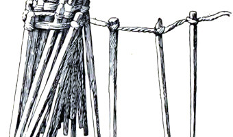
In the 19th century, the Torres Strait Islanders did not have a numeral system and used sticks to keep counts. Sticks were tied to a string, forming a bundle (called kupe) that could be rolled and unrolled when needed. Kupes were typically used by men to keep track of their accomplishments, such as turtles caught in deep water, fishes speared, or adventures with women (as the one above). These physical visualizations were used as social displays, and big kupes were greatly prized. According to Haddon (1912): These tallies are left entirely to a man's honour; a man may have doubts about the correctness of another's tally, but he would never dare single-handed to express an opinion doubting it. Sometimes a crowd may chaff a man whom they suspect of chearing and get him to confess that he was only 'gammoning'". Kupes have elements of self-logging, as well as using physical visualizations for social purposes (see our entries on SweatAtoms and Meshu.io). They were first reported by British biologist and anthropologist Alfred Cort Haddon after a 1898 expedition, but they are likely much older. Tallies were used all over the world and some of them are very old. The prehistoric artefacts found in the Blombos Cave in South Africa included a piece of ochre on which tally marks were seemingly made, as well as pierced shells that seem to have been strung on cord and worn. These artefacts date back from between c. 100,000 and 70,000 years. Sources: Alfred Cort Haddon (1912) Reports of the Cambridge Anthropological Expedition to Torres Straits, Volume 4. pp 262-263. Wikipedia. Alfred Cort Haddon. Wikipedia. Blombos Cave.
Added by: Pierre Dragicevic.
Category:
Passive physical visualization
Tags:
anthropology, preliterate, self-logging, social use, tally