Tag: Passive Physical Visualization

1945 – Electron Density Map and Molecular Model of Penicillin

Electron density map and model of Penicillin created by Dorothy Crowfoot Hodgkin in 1945 based on her work on X-ray crystallography. The Penicillin molecule was the first molecule whose structure was derived entirely from X-ray data. Dorothy Hodgkin later received the Nobel price for applying the same technique to determine the structure of the B12 molecule. Dorothy Hodgkin (1910-94) was awarded the prestigious and exclusive Order of Merit in 1965 to add to her 1964 Nobel Prize for ”her […]


1985 – Using the Physical to Explain the Virtual

In this 1985 video, Rick Becker from AT&T Bell Labs explains the concept of "dynamic graphics". Already in the early 70s, statisticians like John Tukey were starting to experiment with multidimensional data visualization on flat computers screens, including 3D data visualizations that could be interactively rotated to convey depth. This video shows how enthusiastic these people were to transition from the physical to the virtual. Nevertheless, it is interesting to see that Rick Becker felt […]

Added by: Pierre Dragicevic. Category: Passive physical visualization  Tags: 3d scatterplot, statistical graphics


2011 – Warning: Real Time Global Air Quality Display

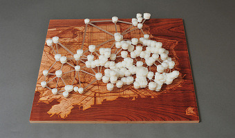
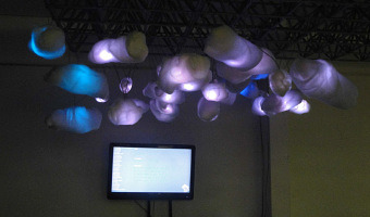
Warning - Real Time Global Air Quality Display is an installation of ambient display that receives data from the internet about the air quality in 30 cities in 5 continents. The installation of these data is dynamically displayed on a screen and a physical structure through a lighting system (LED) located in a public space. The motivations for this project are digital aesthetics of climate change created by Pold, (2010), that means artworks in digital art involving the issue of the environment […]


2011 – Adrien Segal's Data Furniture

Adrien Segal is an artist with a background in furniture design. She takes a data-driven approach where she uses data of natural events and environmental developments and transforms them into beautiful furniture. The choice of forms and materials conveys the origin of the data in an intriguing way. Left image: TRENDS IN WATER USE is a data sculpture that graphs national statistics of water usage in the United States over 50 years, from 1950 - 2000. The width of the canyon walls represent how […]

Added by: Yvonne Jansen. Category: Passive physical visualization  Tags: data sculpture, furniture


2013 – Line Charts of Cortisol Levels

This data sculpture created by Nilam Ram from the Studio|Lab team at Penn State University shows the evolution of cortisol levels for 34 people after they experienced a stressful situation. Source: Nilam Ram (2013) Cortisol Data Sculpture.


2013 – SweatAtoms: Physical Activity Sculptures

Rohit Ashok Khot is a PhD student at the Exertion Games Lab at RMIT University in Melbourne who studies how physical visualizations of self-logged physical activity data can enhance the experience of exercising and perhaps provide an incentive for exercising more. Sources: Khot et al (2013) SweatAtoms project page Khot et al (2014) Understanding Physical Activity through 3D Printed Material Artifacts

Added by: Pierre Dragicevic. Category: Passive physical visualization  Tags: physical exercise, self-logging


2014 – Building Visualizations with Tokens

Samuel Huron and his collaborators show how anyone can build their own visualizations by assembling physical tokens. Sources: Samuel Huron, Sheelagh Carpendale, Alice Thudt, Anthony Tang, Michael Mauerer (2014) Constructive Visualization (Web Page) Samuel Huron, Yvonne Jansen and Sheelagh Carpendale (2014) Constructing Visual Representations: Investigating the Use of Tangible Tokens (Web page)


2014 – Blaue Blumen: Handcrafted Offline Data Visualization of Population Density

Physical visualization of the population density of the world. Handcrafted with toothpicks and a styrofoam ball. Based on data taken from this map. Source: Ewa Tuteja, (http://tuteja.info/blaueblumen/)

Added by: Krasser Terror. Category: Passive physical visualization  Tags: cartographic, data sculpture, globe, hand-made


2014 – Water Works: Maps of the San Francisco Water Infrastructure

“Water Works” is a 3D data visualization and mapping of the water infrastructure of San Francisco. These consist of three large-scale 3D-printed sculptures, each generated by custom C++ code. The concept behind the project is to make visible a small portion of an invisible network of pipes underneath our feet. The three physical data visualizations are: "San Francisco Cisterns", “Imaginary Drinking Hydrants” and "Sewer Works". "Sewer Works" uses 60,000 data points from San Francisco sewers and […]


2014 – People Wood: Data Sculpture of Questionnaire Data

Manor House Development Trust, a charitable social enterprise centred in Hackney, commissioned Something & Son to create a sculpture to take pride of place in the new Redmond Community Centre at Woodbury Down in North-East Hackney. Something & Son approached Inition for help creating a crowd-sourced data sculpture featuring a forest of over 400 3D-printed trees, each corresponding to an individual’s answers to an online questionnaire. Source: Something & Son with Inition. People […]