Tag: Passive Physical Visualization

5500 BC – Mesopotamian Clay Tokens

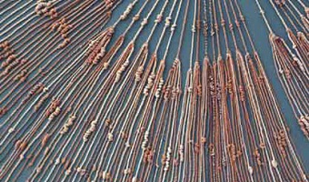
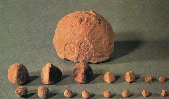
The earliest data visualizations were likely physical: built by arranging stones or pebbles, and later, clay tokens. According to an eminent archaeologist (Schmandt-Besserat, 1999): "Whereas words consist of immaterial sounds, the tokens were concrete, solid, tangible artifacts, which could be handled, arranged and rearranged at will. For instance, the tokens could be ordered in special columns according to types of merchandise, entries and expenditures; donors or recipients. The token system […]

Added by: Pierre Dragicevic. Category: Passive physical visualization  Tags: anthropology, archaeology, clay, mesopotamians, rearrangeable


2600 BC – Quipus

Quipus were complex assemblies of knotted ropes that were used in South America as a data storage device and played an important role in the Inca administration. Only a handful of specialists could use and decipher them. Their meaning mostly remains a mystery but it seems that color, relative position of knots, knot types and rope length were used to encode categorical and quantitative variables. The oldest known Quipu is 4600 years old. In the late 16th century quipus were still being used by […]

Added by: Pierre Dragicevic. Category: Passive physical visualization  Tags: anthropology, incas, knots, peru, quipu


1901 – Davenport's Physical Distributions

In 1901, biologist Charles Davenport "built" physical visualizations that show the distributions of features of objects and people. These visualizations were made out of the objects and the people themselves. The purpose was to explain the notion of statistical distribution to a lay audience. On the left image, seashells are piled up according to how many ribs they have. On the middle image, students are arranged in bins according to their height. On the right image, they are simply sorted. […]


1914 – Solid 3D Curves for Engineering

In his 1914 book, Brinton discusses various techniques for building solid models of three-dimensional charts and functions for the purposes of engineering, and uses the two designs above as examples. Although these don't look like they could be solid models, the text from Brinton's book suggests they are. The first one (left) is made of plaster and shows the characteristics of a light bulb. The second (right) is made of cardboard and shows the results of tests of a fan. The two artifacts are […]

Added by: Pierre Dragicevic. Category: Passive physical visualization  Tags: 3d curves, engineering, industry, technology


1970 – 3D Sankey Diagram

This physical 3D Sankey diagram shows complex energy flows and was created in the 70s by the Center for Strategic & International Studies (CSIS). Little information is available about it. It seems to be composed of five layers of transparent sheet, with four additional layers running perpendicularly. Physical size unknown. Source: Energy Education References Wiki. Energy Flow Diagrams 1949-2009.

Added by: Pierre Dragicevic. Category: Passive physical visualization  Tags: energy, Sankey diagram


2010 – Data Sculptures in Class

The two data sculptures above have been created by undergraduate students as part of a design class given by Andrew Vande Moere at the University of Sydney. A 2010 article he coauthored with Stephanie Patel (link below) provides many other examples of these. Andrew Vande Moere has published several articles on data sculptures since 2008. Sources: Andrew Vande Moere and Stephanie Patel (2010) The Physical Visualization of Information: Designing Data Sculptures in an Educational Context. Also see […]

Added by: Pierre Dragicevic. Category: Passive physical visualization  Tags: data sculptures, education


2010 – Hans Rosling Adopts Physical Visualizations

Hans Rosling is famous worldwide for his fascinating speeches about population growth and income inequalities, notably his 2006 TED Talk where he debunks myths about the third world using animated charts. In 2010 he started to tell stories about data using physical visualizations. He started by stacking Ikea boxes, then switched to a variety familiar objects including pebbles, toy construction kits, fruit juice, snow balls and even toilet paper. Hans' son Ola Rosling is behind the technology […]

Added by: Pierre Dragicevic & Yvonne Jansen. Category: Passive physical visualization  Tags: LEGO, rearrangeable, storytelling, TED


2012 – Dynamic Network Sculpture

A physical space-time cube representation of cultural heritage data. Source: Florian Windhager, Eva Mayr. Cultural Heritage Cube: A conceptual framework for visual exhibition exploration. IV '12.

Added by: Yvonne Jansen, sent by: Florian Windhager & Benjamin Bach. Category: Passive physical visualization  Tags: network data, space-time cube, temporal data


2012 – Rearrangeable 3D Bar Chart

A modular physical visualization like this rearrangeable 3D bar chart allows people to sort, filter, compare and examine data by direct physical manipulation. Sources: Yvonne Jansen and Pierre Dragicevic (2013) An Interaction Model for Visualizations Beyond the Desktop. Also see Yvonne Jansen's PhD dissertation on Physical and Tangible Information Visualization (2014)

Added by: Pierre Dragicevic. Category: Passive physical visualization  Tags: bar chart, rearrangeable


2012 – Putting Physical Visualizations to the Test

These physical bar charts, showing the evolution of country indicators over time, were used to conduct the first empirical study showing that physical visualizations can outperform their on-screen counterparts for data retrieval tasks. Sources: Yvonne Jansen, Pierre Dragicevic and Jean-Daniel Fekete (2013) Evaluating the Efficiency of Physical Visualizations. Related: Also see Yvonne Jansen's PhD dissertation on Physical and Tangible Information Visualization (2014).

Added by: Pierre Dragicevic. Category: Passive physical visualization  Tags: bar chart, study