Tag: Passive Physical Visualization

1907 – Pin Maps

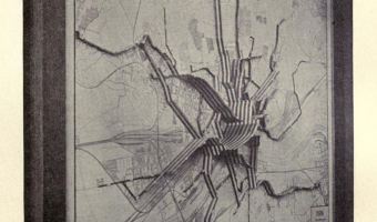
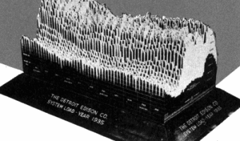
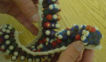
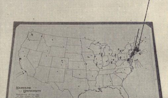
Left image: residence of Harvard students 6 years after their graduation (1907); made with beads, pins and wires. Middle image: Sources of the 3,000 first letters of appeal sent to Mrs. E. H. Harriman (1912); eight different kinds of pins were used to represent different kinds of appeals. Right image: collection of pins and beads made for maps. Sources: Willard Cope Brinton (1914) Graphic Methods for Presenting Facts pp. 227-253. John Krygier (2010) A Discourse on Map Pins and Pinnage. New York […]

Added by: Pierre Dragicevic. Category: Passive physical visualization  Tags: cartographic, pin map, tactile map


1913 – Frankfurt Streetcar Load

Strips of woods glued on top of each other convey the average number of passengers carried between two stops. Each strip corresponds to 4,000 passengers. Shown at the 1913 International building trade exhibition in Leipzig. Source: Willard Cope Brinton (1914) Graphic Methods for Presenting Facts pp 224-226.

Added by: Pierre Dragicevic. Category: Passive physical visualization  Tags: Brinton, cartographic


1935 – 3D Visualizations of Power Consumption

A large 3D physical visualization made by the Detroit Edison Company showing electricity consumption for the year 1935, with a slice per day and each day split into 30 min intervals. Two other examples from different Edison electricity companies are discussed in Brinton's book. These physical visualizations seem to have been used to better anticipate power demands. Sources: Willard Cope Brinton (1939) Graphic Presentation pp 354-355. Howard A. Spielman (2006) "Virtual Reality" Circa 1935. […]

Added by: Yvonne Jansen & Pierre Dragicevic, sent by: Samuel Huron. Category: Passive physical visualization  Tags: Brinton, electricity consumption, temporal data


1992 – Tactile Infographics

In 1994 the American Printing House for the Blind publishes a short guidebook explaining how to convey infographics for the blind using tactile graphics (first and second images). Most of it is inspired by a 1992 book by Polly Edman. Although it's not clear when were the first tactile infographics created, (non-thematic) tactile maps already existed in the 1910s (right image). Sources: APH (American Printing House for the Blind), Inc. (1994) Tactile Graphics Starter Kit. Polly Edman (1992) […]

Added by: Pierre Dragicevic. Category: Passive physical visualization  Tags: accessibility, blind, cartographic, tactile graphics


2004 – Scripps' Molecule Models

Since 2004 the Molecular Graphics Laboratory at the Scripps Research Institute has been making heavy use of 3D-printed full-color physical molecule models, some of which are articulated (left image), flexible (middle image), and even self-assembling (right image, see video). They also publish augmented reality systems that use those physical models. Sources: Web Page: http://mgl.scripps.edu/projects/tangible_models Tommy Toy (2011) How Arthur Olson's Molecular Graphics Lab at Scripps is Using […]


2004 – Full-Color 3D-Printed Scientific Visualizations

In 2004, the Visualization Research Lab from Brown University printed full-color 3D models of scientific visualizations. They published a poster on the topic where they discuss the technical challenges they faced. The printer used was a Zcorp Z406. Source: http://vis.cs.brown.edu/areas/projects/rapid.html Related: Also see our entry 1995 – SDSC TeleManufacturing Facility.


2005 – Time-Evolving Scatterplot

Unemployment rate plotted against inflation for 8 countries over 10 years. Every layer represents a year and each country is a wire of a different color. This physical visualization was built by Tim Dwyer for his PhD dissertation. His goal was to experimentally compare a 3D and a 2D data representation, and he used a physical object to emulate a perfect 3D display. Source: Tim Dwyer (2005) Two and a Half Dimensional Visualisation of Relational Networks. PhD Dissertation.

Added by: Pierre Dragicevic. Category: Passive physical visualization  Tags: hand-made, temporal data, user study


2008 – Rearrangeable Wooden Model of Brain Scan

A selection of MRI data glued on 60 wooden blocks which allow to physically dig into cross sections, by Neil Fraser. More details on infosthetics. Source: infosthetics.com.

Added by: Yvonne Jansen. Category: Passive physical visualization  Tags: brain, dynamic, rearrangeable, science


2010 – Limbique: Brain Slices

A neuroscientific physical visualization made by an artist and a neuroscientist. Exhibited at the at the VisWeek 2011 art show. Source: David Paulsen and Pinar Yoldas. Photo by Samuel Huron.

Added by: Pierre Dragicevic. Category: Passive physical visualization  Tags: brain, science


2011 – DataCoaster: Data-Driven Toys

DataCoaster is a re-imagining of the classic waiting room toy. But instead of arbitrarily loopy lines, DataCoaster's lines are generated by data, essentially transforming a simple, kinetic toy into a graph of information. If you're interested in getting one of these for your data, have a look at the source for this entry and contact Bobby - he is planning to offer this service. Source: Bobby Genalo. DataCoaster.

Added by: Yvonne Jansen, sent by: Bobby Genalo. Category: Passive physical visualization  Tags: toy