Tag: Passive Physical Visualization

2003 – Solid Terrain Model with Airplane Trajectory

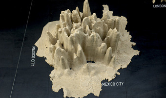
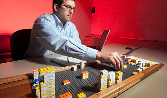
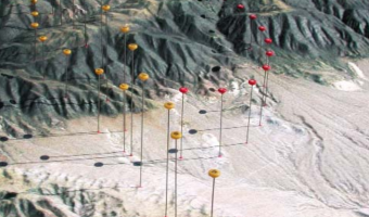
A real case study involving the use of a physical 3D trajectory visualization on top of a 3D terrain model to analyze the causes of a plane crash. This case study is interesting in terms of cost-benefit analysis, since these models appear to be extremely time-consuming to build. The case study includes an informal comparison with animations: "The mock jurors later related that the physical model was easier to understand and it allowed them to discuss the issues with each other more easily than […]

Added by: Pierre Dragicevic. Category: Passive physical visualization  Tags: cartographic, litigation, plane crash, solid terrain model


2006 – Nathalie Miebach's Woven Sculptures

Artist Nathalie Miebach created a range of beautiful woven sculptures out of weather data. Source: Nathalie Miebach. http://www.nathaliemiebach.com/weather.html (see TED Talk).

Added by: Pierre Dragicevic, sent by: Fanny Chevalier. Category: Passive physical visualization  Tags: artistic, data sculpture, hand-made, weather


2007 – Global Cities: Elevation Maps of City Population

Large-scale physical density models where plywood forms represent the populations of 12 of the world’s major urban centres. Made by a team of designers and architects led by Professor Richard Burdett. Source: Eliza Williams (2007) Global Cities at Tate Modern. Right photo by Stefan Geens.

Added by: Pierre Dragicevic. Category: Passive physical visualization  Tags: cartographic, data sculpture, large-scale, population, walkable


2009 – In-Formed: More Data-Driven Tableware

Another data-driven tableware, this time conveying world statistics. The fork on the image shows calories consumption for the US and three other countries. Source: Nadeem Haidary.

Added by: Yvonne Jansen, sent by: Fanny Chevalier. Category: Passive physical visualization  Tags: data sculpture, tableware, world statistics


2010 – Relational Ornaments: Networks Shown with Textile

Textile art based on the network maps of Valdis Krebs. Gundega Strautmane, a Latvian textile artist and designer, visualizes social and physical networks in a show called Relational Ornaments. The networks are created using various sized pins to depict nodes and threads connecting them to show relationships. Bringing visualization into the tactile world lends it a weight not able to be achieved on a computer screen. It allows the viewer to pause, spend time with the information, feel it, sense […]

Added by: Jean-Daniel Fekete, sent by: Fanny Chevalier. Category: Passive physical visualization  Tags: network data, textile


2011 – Can We Keep Up: Sponges Show Domestic Water Usage

Can We Keep Up is a a physical data visualisation that investigates the domestic need for water in cities all over the world. Source: infosthetics.com. Image from Hal Watts.

Added by: Yvonne Jansen, sent by: Romain Vuillemot. Category: Passive physical visualization  Tags: cartographic, data sculpture, sponge, water


2011 – DIY United States Electoral Vote Map

This is a 3D scale replica of the United States, the state height corresponds to the number of electoral votes each state controls in a presidential election. Source: thing 11178 on thingiverse.com


2012 – General Motors' 3D LEGO Visualizations

LEGOs help business executives log and explore data. Sources: Mark Wilson (2012) How GM Is Saving Cash Using Legos As A Data Viz Tool. The Daily Drive (2012) GM Plays with Legos (Video).

Added by: Pierre Dragicevic, sent by: Fanny Chevalier. Category: Passive physical visualization  Tags: industry, interactive, LEGO, manual update, pragmatic visualization, rearrangeable