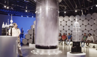
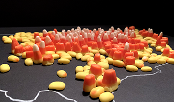
Tag: Passive Physical Visualization

2016 – Wait for the Oil Drop!

In this museum installation, four tons of (possibly fake) oil dramatically drop into a three-meter-tall glass tube in four seconds, showcasing the vast quantities of oil Kuwait produces. The liquid is pumped back up and dropped again every five minutes. The inscription on the tube reads: Wait for the oil drop! Every second of every day, Kuwait produces this much oil. This installation is part of the Ahmed Al Jaber Oil & Gas Exhibition, a permanent exhibition located in Al Ahmadi, Kuwait, […]

Added by: Pierre Dragicevic, sent by: Arnaud Prouzeau. Category: Passive physical visualization  Tags: single-datum, oil, flow, liquid, museum


2017 – Modern Dowry: Visualizing One's Debt and Assets in the Shape of a Teapot

Data materialization is a workflow developed to create 3D objects from data-informed designs. Building upon traditional metalwork and craft, and new technology’s data visualization with generative art, this workflow expresses conceptually relevant data through 3D forms which are fabricated in traditional media. The process allows for the subtle application of data in visual art, allowing the aesthetic allure of the art object or installation to inspire intellectual intrigue. This entry […]

Added by: Ann McNamara. Category: Passive physical visualization  Tags: tableware, debt, silver, copper


2018 – Materialism

In the Materialism series, the Dutch duo Studio Drift takes apart technological objects and use cubes and prisms to convey the raw materials they are made of. Although those data sculptures are conceptually physical rearrangements (see our other entries on physical rearrangements), the artists actually weigh the different components and create the prisms from scratch using new material. This new material often only looks like the original material due to practical constraints. Left image: […]

Added by: Pierre Dragicevic, sent by: Estelle Carciofi. Category: Passive physical visualization  Tags: rearrangement


2019 – The 100-Year Climate Yarn

The 100 Year Climate Yarn is a large, crocheted Data-Art wall-hanging which tracks the daily maximum temperatures in Adelaide, South Australia over a 100 year period from 1920 to 2020. Textile Artist Sandra Lepore worked with Energy & Climate Specialist Heather Smith to plan the work using colours carefully selected to emphasise extreme temperatures. Sources: www.facebook.com/myclimateyarn/ www.instagram.com/myclimateyarn/ Related: Also see our entry 2013 – Temperature Scarves and Afghans […]

Added by: Sandra Lepore. Category: Passive physical visualization  Tags: data clothing, temperatures, textile, weather


2020 – Ownership: Occlusions, Night Terrors, and Pernicious Doubt

This series of bronzes visualizes 2020 data on gun ownership in America. Pernicious Doubt Access to a gun increases the risk of suicidal death by 3 times. Occlusions Carrying a gun makes the bearer 4 times more likely to be killed in an aggressive encounter than without a gun. Night Terrors Women are 5 times more likely to be killed in acts of domestic abuse when their partner owns a gun. Source: Matthew Mosher. Ownership: Occlusions, Night Terrors, and Pernicious Doubt. Related: Also see our […]

Added by: Matthew Mosher. Category: Passive physical visualization  Tags: crime, gun violence, bronze


2020 – Data Badges

   A physical conference badge that participants create themselves during an event by assembling tokens on a wearable canvas. The process is guided by an instruction sheet that helps translate the tokens to various professional characteristics. Sources: Tweet from Andre Vande Moere. Georgia Panagiotidou, Sinem Gorucu, Andrew Vande Moere (2020) Data Badges: Making an Academic Profile Through a DIY Wearable Physicalization. Related: Also see our entries on data jewellery and data […]

Added by: Georgia Panagiotidou. Category: Passive physical visualization  Tags: badge, situated


2021 – Map of Corn Production Using Candy Corn

The prompt for the 27th day of the 2021 #30DayMapChallenge was ‘heatmap.’ I looked at corn production in the US - just the lower 48. The data is from USGS and it was made with 3 bags of candy corn. Source: Jill Hubley Related: Also see our other entries on visualizations made of food.

Added by: Jill Hubley. Category: Passive physical visualization  Tags: cartographic, data cuisine, food, corn


2022 – Making with Data: Book Cover

Making with Data is a physical data-driven papercraft sculpture that serves as the cover of the book, “Making with Data: Physical Design and Craft in a Data Driven World.” The paper waves of the piece reflect the undulating word counts of each of the book’s 24 chapters. Each of these chapters tells the story behind the creation of a physical object, space, or experience that represents data — with the artists and designers who crafted the piece explaining the unique and creative process through […]

Added by: Samuel Huron. Category: Passive physical visualization  Tags: book, paper, horizon plot


2022 – Physical Map of Arctic Sea Ice

Sea ice is frozen ocean water that is most commonly found near the poles in the Arctic Ocean and Southern ocean around Antarctica. Sea ice plays a critical role in regulating the ocean circulation, thereby influencing the global climate. Abnormal melting of sea ice brought forth by warming temperatures leads to changes in global climate making it important to study the fluctuations in the sea ice extant. Scientists use different methods to study sea ice which include observations and climate […]

Added by: Nihanth Cherukuru. Category: Passive physical visualization  Tags: cartographic, climate change, sea ice, teaching, 3D printing


2022 – Edo: A Participatory Physicalization of Food Impact

Edo is a participatory data physicalization meant to enable a small community to track the carbon impact of their dietary choices. Each type of food item is represented as a token, a disk, whose surface area encodes the carbon impact of a typical portion of that type of food (data source: Agribalyse). After a meal, one can add data by selecting tokens for all the types of food one just consumed. For example, a burger with fries would require a beef token, a bread token, a salad token, and a […]

Added by: Yvonne Jansen. Category: Passive physical visualization  Tags: participatory, carbon impact, sustainability, wood