Tag: Passive Physical Visualization

1968 – Grace Hopper's Nanoseconds

Grace Hopper, a computer scientist and US Navy Rear Admiral, used wire to visualise very short durations of time in computing. Each wire is cut to the maximum distance that light or electricity can travel in a nanosecond, one billionth of a second. She wanted programmers to understand 'just what they're throwing away when they throw away a millisecond', and describes using them to help military commanders understand why signals take so long to relay via satellite.
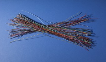
 This lecture was given at MIT […]

Added by: Kim Plowright. Category: Passive physical visualization  Tags: wire, physics, science, single-datum, light


2016 – Woven Chronicles

Woven Chronicle is a cartographic wall drawing that, in the artist’s words, represents “the global flows and movements of travelers, migrants, and labor.” Kallat uses electrical wires—some of which are twisted to resemble barbed wire—to create the lines, which are based on her meticulous research of transnational flows. Wire is an evocative and contradictory material: it operates as both a conduit of electricity, used to connect people across vast distances, and as a weaponized obstacle, such […]

Added by: Santiago Ortiz. Category: Passive physical visualization  Tags: art, cartographic, migration, network, wires


2017 – CNC-Milled Wood Visualization of a Studio's Energy Usage

"How might we make data more tangible, persuasive, and persistent?" This was the challenge I posed to myself during my internship at IDEO Chicago. My answer is an artistic exploration made tangible through different design disciplines: data design, industrial design, and electrical engineering. The data for this exploration is the energy usage of the Chicago studio during 2015. An algorithm created with Grasshopper, a visual programming language, turned unfiltered data into a three-dimensional […]

Added by: Nicolas Stark. Category: Passive physical visualization  Tags: energy consumption, wood


2018 – The 20 Year Gap

This data physicalization is an art installation that represents the difference in disability-free life expectancy* and overall life expectancy for different areas in the UK, thereby highlighting the unequal health conditions in the country. Each area is represented by a hanging thread. On each thread a red bottle corresponds to disability-free life expectancy while the blue bottle represents overall life expectancy. The title of the artwork refers to the finding that in the UK there is gap of […]

Added by: Petra Isenberg. Category: Passive physical visualization  Tags: art, installation


2019 – Data Beyond Vision: Physicalizing Bookshop Data

[Data Beyond Vision] explores new ways of engaging with a dataset and the arguments and narratives behind it, in order to challenge the dominant paradigms of conventional screen-based data visualization. The project currently comprises: 3D printing a model of library member activity over time from the Shakespeare and Company Project juxtaposing documented activities from two sets of archival materials Folding paper forms of borrowing activity from the Shakespeare and Company Project surfacing […]

Added by: Rebecca Sutton Koeser & Pierre Dragicevic. Category: Passive physical visualization  Tags: 3d printing, digital humanities, kirigami, origami, weaving, paper


2019 – Physical Violin Plot

A physical violin plot created by sculptor and psychology researcher Hunter Brown. See related entries also using clay here. Source: Tweet from Julia Strand (@juliafstrand), June 12, 2019.

Added by: Pierre Dragicevic, sent by: Steve Haroz. Category: Passive physical visualization  Tags: clay, statistics


2019 – Data Earrings of Country Happiness

This data jewellery displays data the happiness of its citizens and potentially contributing factors. One earring encodes the proportion of a countries GDP as a stacked bar chart with categories: service, agriculture, and industry. Towards the top a circle encodes the overall happiness rank of a country's citizens. Source: Jang Lee: https://janglee.myportfolio.com/happiness-x-gdp Related: Also see our other entries on data jewelleries.

Added by: Petra Isenberg. Category: Passive physical visualization  Tags: data jewellery


2020 – COVID-19 Deaths as Nails

An art installation in the Cathedral of Schwäbisch Gmünd (Germany) shows COVID-19 deaths as nails hammered into wooden cubes. More nails are added as the number of deaths increase. The text down the steps says "Fürchtet euch nicht", meaning "do not be afraid". Sources: Tweet from Friedrich Hart (@mxfh), Dec 9, 2020. SWR (2020) Schwäbisch Gmünd: 13.000 Nägel für Coronaopfer. Related: Also see our other entries on single-datum physical visualizations and on conveying deaths.

Added by: Pierre Dragicevic, sent by: Friedrich Hart. Category: Passive physical visualization  Tags: covid-19, deaths, nails, people, single-datum


2021 – State of the World as Population Pyramids

The collection "State of the World" is composed of population pyramids and was created by Mathieu Lehanneur for the 2021 exhibition art basel - design miami. Each of the 100 sculptures encodes the population data of one country: age is encoded in rings from birth at the bottom to 100 years at the top; the width of each ring encodes the proportion of the population being of that age. each age pyramid reveals the particularities of a nation — the youth of chad, translated by the geometric […]

Added by: Yvonne Jansen, sent by: Loren Madsen. Category: Passive physical visualization  Tags: age pyramid, data sculpture, demographics, small multiple


2021 – Walkable Bar Chart

A bar chart conveying two quantities, one of which is clearly larger. The activists and artists at the Respect New Haven rally yesterday offered this stunning graphic to visualize Yale's $32 Billion endowment compared to its paltry $13 million contribution to the city of New Haven...a FRACTION of the taxes it would pay if properly assessed. Source: Tweet from Davarian L. Baldwin. Related: Also see our other entries on walkable physical visualizations.

Added by: Pierre Dragicevic & Yvonne Jansen, sent by: Benjamin Bach. Category: Passive physical visualization  Tags: walkable, city, politics, taxes, bar chart, street, paint