Tag: Passive Physical Visualization

1900 – Pearson and Lee's Height Correlation Chart

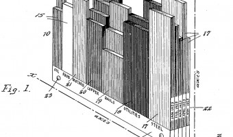
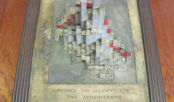
The physical model on the left is a bivariate histogram showing the correlation between the heights of fathers (horizontal axis) and sons ("vertical" axis). This data was famously collected by Karl Pearson and Alice Lee between 1893 and 1898. The physical visualization is thought to have been constructed around this time period or soon after, possibly under the supervision of Pearson. It is kept at the Department of Statistical Science, University College London, founded by Pearson in 1911. I […]

Added by: Pierre Dragicevic, sent by: Richard Chandler. Category: Passive physical visualization  Tags: correlation, distribution, science, statistics


1926 – Karsten's Tridimensional Chart

American economist and statistician Karl G. Karsten patented a method for creating physical visualizations of temporal data by stacking two-dimensional plates, each representing a time period. Each of the plates shown above is a variable-width column chart representing the state of the stock market at the end of a particular month. Each bar is a type of stock, where the height of the bar encodes the stock price and its width encodes volumes of sales. Each month, a new layer is added. Seen from […]

Added by: Pierre Dragicevic, sent by: RJ Andrews. Category: Passive physical visualization  Tags: rearrangeable, stock market, temporal data


2017 – CNC-Milled Wood Visualization of a Studio's Energy Usage

"How might we make data more tangible, persuasive, and persistent?" This was the challenge I posed to myself during my internship at IDEO Chicago. My answer is an artistic exploration made tangible through different design disciplines: data design, industrial design, and electrical engineering. The data for this exploration is the energy usage of the Chicago studio during 2015. An algorithm created with Grasshopper, a visual programming language, turned unfiltered data into a three-dimensional […]

Added by: Nicolas Stark. Category: Passive physical visualization  Tags: energy consumption, wood


2017 – Data Sculpture of Latin American Apprehensions

This piece is a physical matrix representing recorded data on Latin American migrants traveling to the United States between the years 2011 and 2014. It was constructed as a conceptual study into using sculpture and tangibility as an alternative form of expressing empirical data. Even though apprehensions do not account for those who make it through to the U.S. or those who were killed or gone missing, apprehensions still shed light on important migration patterns over time. Each column […]

Added by: Sadie Prego, sent by: Sadie Prego. Category: Passive physical visualization  Tags: apprehensions, migration


2018 – The 20 Year Gap

This data physicalization is an art installation that represents the difference in disability-free life expectancy* and overall life expectancy for different areas in the UK, thereby highlighting the unequal health conditions in the country. Each area is represented by a hanging thread. On each thread a red bottle corresponds to disability-free life expectancy while the blue bottle represents overall life expectancy. The title of the artwork refers to the finding that in the UK there is gap of […]

Added by: Petra Isenberg. Category: Passive physical visualization  Tags: art, installation


2018 – Harassment Plants

Harassment Plants is a situated physicalization exhibited in a Brazilian city to represent stories of harassment experienced by women in a public lakeside. Each vase represents a different category of harassment and contains glyphs that represent cases of harassment. The color in the middle of the vase corresponds to the type of harassment, which is also represented by the same color in one of the beads. Each glyph is composed of a rod — whose length represents the time of the day the […]

Added by: Luiz Morais. Category: Passive physical visualization  Tags: glyph, hand-made, plants, sexual harassment, situated


2019 – Data Earrings of Country Happiness

This data jewellery displays data the happiness of its citizens and potentially contributing factors. One earring encodes the proportion of a countries GDP as a stacked bar chart with categories: service, agriculture, and industry. Towards the top a circle encodes the overall happiness rank of a country's citizens. Source: Jang Lee: https://janglee.myportfolio.com/happiness-x-gdp Related: Also see our other entries on data jewelleries.

Added by: Petra Isenberg. Category: Passive physical visualization  Tags: data jewellery


2019 – Perpetual Plastic

Winner of the National Geographic and Sky Ocean Ventures Ocean Plastic Innovation Challenge [This project] highlights the scope of the plastic problem (in terms of amount produced as well as its fate) and the transformation of plastic over its lifetime, using beach debris as a salient example. The situated, participatory data installation approach extends abstract displays of numbers towards a more gripping form of ‘data visceralization.’ The direct link to beach clean-up activities suggests […]

Added by: Petra Isenberg. Category: Passive physical visualization  Tags: Environment, Situated, Pollution


2019 – Physicalizing Cardiac Blood Flow Data

Blood flow data from cardiac 4D Flow MRI (magnetic resonance imaging) holds much potential for research and diagnosis of flow-related diseases. However, understanding this data is quite challenging – after all, it is a volumetric vector field that changes over time. This paper proposes a novel slice-based physical model as a complementary method for visualizing the flow data. The design of this model respects the conventional method of viewing medical imagery (i.e., in cross-sections) but has […]


2021 – Personal Data Physicalizations in Class

      Images created by students to represent their personal data. Refer to the publication below for image attributions. I describe the results of implementing a personal data physicalization assignment in an information visualization course for senior undergraduate and graduate students in computer science and software engineering. By collecting data about themselves and representing this data in physical forms, students were able to i) learn about data visualization, ii) […]

Added by: Charles Perin. Category: Passive physical visualization  Tags: teaching, personal data, physicalization, education