Tag: Passive Physical Visualization

500 BC – Pebble Voting

The earliest participatory visualizations were probably voting systems. Voting in Greece was introduced in the 5th century BC. Adult male citizens were invited to express their opinion by dropping a pebble in an urn: a white pebble meant "yes" and a black pebble meant "no". Sometimes two urns were used. The left image is a detail of a Greek wine cup from the 5th century BC, and is one of the earliest known depictions of the act of voting. The middle image is a modern reconstruction from a TV […]

Added by: Pierre Dragicevic. Category: Passive physical visualization  Tags: archaeology, democracy, greeks, participatory, voting


1965 – Stop Motion Animation of Physical 3D Map

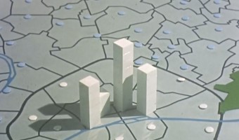
This educational movie from the 1960s uses physical bars and stop motion animation to show the evolution of population in the Paris area between 1801 and 1961. It was made between 1962 and 1967 by the Institut des Sciences Humaines Appliquées (ISHA) and the Centre de Mathématique Sociale et de Statistique (CMSS), in collaboration with the Laboratoire de Cartographie directed by Jacques Bertin. You can see the physical visualization from all sides by […]

Added by: Pierre Dragicevic. Category: Passive physical visualization  Tags: bar chart, cartographic, stop motion animation, storytelling


2012 – Stop & Frisk: Physical Data Filtering

Chilean designer Catalina Cortázar created a physical visualization showing the proportion of black, hispanic and white people searched by the New York police in 2010. Each of the three compartments stands for a race and contains an amount of powder proportional to the race's population in New York. When the object is turned upside down, the powder falls into an adjacent compartment except for coarser particles that do not make it through the holes and represent people stopped by the police. […]

Added by: Pierre Dragicevic, sent by: Alice Thudt. Category: Passive physical visualization  Tags: new-york, physical computation, police, powder, race


2014 – Data Sculpture in the White House

Gilles Azzaro, a French digital artist and fab lab co-founder, created a sound sculpture of Obama's 2013 State of the Union Address where Obama mentions 3D printing as the next revolution in manufacturing. Azzaro's sculpture was exhibited in the White House in 2014 during the inauguration of the first White House Maker Faire. The sculpture is interactive: a movement sensor activates the system and a laser beam scans the 3D recording to reveal the President’s speech. See this video for an […]

Added by: Pierre Dragicevic, sent by: Christophe Hurter. Category: Passive physical visualization  Tags: 3d printing, president, sound sculpture


2017 – Green Berlin

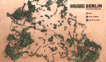
Tangible data visualization of green areas and water in Berlin. "Green Berlin" is a living map showing parks and forests in Berlin. The green areas on the wooden map are laser cut, with moss growing through the holes. Source: Sebastian Meier, Green Berlin

Added by: Till Nagel. Category: Passive physical visualization  Tags: 3d printing, cartographic, moss, plants


2017 – The All Too Evident Ashtray

The ATEA is an ashtray made of concrete. It carries data about smoking habits & lung cancer in the United States between 1975 and 2014, split by gender. The data is encoded in concentric bubbles/half spheres, where the distance to the center shows lung cancer prevalence by year. The bubble diameters display the average number of cigarettes smoked per day during that particular year. The causal relationship between smoking and cancer is well researched and known for decades, so there’s […]

Added by: Michael Stanka. Category: Passive physical visualization  Tags: ashtray, data object, deaths, risk, smoking


2017 – Are you Sure you Want to Smoke?

Giacomo Flaim, a student in Communication Design at Politecnico of Milan, made a single-datum physical visualization out of 4,234 cigarette butts to convey the average annual cigarette consumption of an Italian smoker. Labels were added to indicate the reduction in life expectancy depending on the quantity smoked, from 10 minutes for a single cigarette to more than a month for the entire year. Sources: Giacomo Flaim (2017) Are you sure you want to smoke? (behance.net). Information is Beautiful […]

Added by: Pierre Dragicevic. Category: Passive physical visualization  Tags: cigarette, health, rearrangement, risk, single-datum, smoking


2017 – CO2 Emissions Shown with Balloons

The installation shows a representative selection of twenty countries and their CO2 emissions in 2014. Every orange beach ball equals 100 billion tonnes of carbon dioxide. The values refer to combustion of fossil fuels and production of cement. This work was created by Mario Klemm and José Ernesto Rodriguez in the context of the course « Data objects » with Prof. Boris Müller at University of Applied Science, Potsdam. Source: original post by Mario Klemm. Related: Also see our other entries on […]


2017 – Animals Tracking

We wanted te show the difference of scale made by animals that were tracked including mankind depending on their needs. The result is a group of transparent disks with different sizes representing the employed path and its length during 24h for each subject. Sources: Noémie Duval, Timothé Gourdin, Simon Le Roux et Quentin Lambert Jérôme Héno, Matthias Rischewski and Louis Eveillard (2017) Workshop datafossil #3 Related: Also see other projects from the datafossil #3 workshop.

Added by: Quentin Lambert. Category: Passive physical visualization  Tags: animals, datafossil, gps, tracking


2018 – Steven Pinker explains Global Life Expectancy with Physical Line Charts

Bill Gates shared a short video featuring Steven Pinker on his Twitter feed with the comment People today are living longer, healthier, and happier lives than ever before. I asked @sapinker to explain why. At first glance it appears that line charts are digitally overlaid on the video. However, closeups and a light swaying of the graphs when Steven Pinker touches them, as well as the addition of another country towards the end of the video indicate that the graphs visible in this video are […]

Added by: Yvonne Jansen, sent by: Cedric Honnet. Category: Passive physical visualization  Tags: rearrangeable, storytelling