The left image is a map that shows the differences in alcohol consumption across Finland, as well as typical local food. The right image shows the number of immigrants in Finland by nationality (rice for the Chinese, salmon for the Swedish). Many other examples of edible physical visualizations can be found on the Data Cuisine web site. Data Cuisine is a series of workshops organized by Moritz Stefaner and prozessagenten. Seven workshops took place so far, the first one was in Helsinki in 2012. […]
The left image is a map that shows the differences in alcohol consumption across Finland, as well as typical local food. The right image shows the number of immigrants in Finland by nationality (rice for the Chinese, salmon for the Swedish). Many other examples of edible physical visualizations can be found on the Data Cuisine web site. Data Cuisine is a series of workshops organized by Moritz Stefaner and prozessagenten. Seven workshops took place so far, the first one was in Helsinki in 2012. According to an online article: The workshop invites participants to translate local data into culinary creations, turning arid numbers into sensually 'experienceable' matter. Participants chose their topics, investigate related data, shop for comestible ingredients and under the guidance of chefs, they learn how to create dishes that will not only be delicious but also act as entry points to discussions about local issues that range from emigration to criminality, suicide rate, unemployment, sexuality or science funding. Sources: Moritz Stefaner and prozessagenten (2012) Data Cuisine. Régine Debatty (2014) Data Cuisine, food as data expression. Moritz Stefaner and Susanne Jaschko (2016) Data Cuisine (talk)
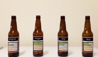
Added by: Pierre Dragicevic, sent by: Romain DiVozzo.
Category:
Passive physical visualization
Tags:
cartographic, data cuisine, edible, food, world stats