Tag: Data Jewellery

1700 – Wearable Abacus from the Qing Dynasty

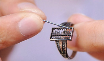
A functioning abacus ring from the Qing Dynasty (1644-1912), exhibited at the Cheng Dawei Abacus Museum in Huangshan City, China. Steve Mann mentions it as an early form of wearable "computer": Here is a "computer" (an abacus) and since it is a piece of jewelry (a ring), it is wearable. Such devices have existed for centuries, but do not successfully embody Humanistic Intelligence. In particular, because the abacus is task-specific, it does not give rise to what we generally mean by "wearable […]

Added by: Samuel Huron. Category: Other  Tags: abacus, computing, wearables, data jewellery


2004 – Worry (Prayer) Beads

One bead = one year. Size of colored beads is proportional to number of terrorist-caused deaths. Black beads = no terrorist deaths. The largest bead is 2001. Also see Loren Madsen's earlier piece Tops (2001) featuring the same dataset, our entry 1995 – Loren Madsen’s Early Data Sculptures, and our interview with the artist. Sources: Loren Madsen


2014 – Silver Ring Shaped by DNA Profile

PhD student Alireza Rezaeian designed a silver ring whose texture and shape is uniquely determined by the wearer's DNA profile. His article explains how data is mapped to physical form in a way that balances between legibility and aesthetics. Right image: bracelet-sized prototype. Source: Rezaeian, Alireza & Donovan, Jared (2014) Design of a tangible data visualization. Related: Also see our other entries on data jewellery.

Added by: Pierre Dragicevic, sent by: Simon Stusak. Category: Passive physical visualization  Tags: 3d printing, data jewellery, dna, genetics


2015 – Touching Air: Necklace Shows Air Pollution

This necklace made by Stefanie Posavec and Miriam Quick shows one week of air quality data measured in the city of Sheffield. Each segment is a period of 6 hours, and its appearance conveys the concentration of particulate matter during that period of time. A low concentration yields a small, round, green segment. A high concentration yields a large, spiky, red segment. Sources: Stefanie Posavec (2015) Air Transformed: Better with Data Society Commission. Photos by Stefanie Posavec. Related: […]

Added by: Pierre Dragicevic, sent by: Maarten Lambrechts & Fanny Chevalier. Category: Passive physical visualization  Tags: air pollution, air quality, data jewellery, data sculpture, digital fabrication


2015 – Data Necklace of Good Night SMS

Paul Heinicker, a master student in interaction design at the University of Applied Sciences Potsdam, created a data-driven necklace representing a long-distance relationship by sent "good night"-messages from him to his girlfriend. While visualising two years of message history, two diagonal opposing points of the rectangle constitute the starting points for both years. The ongoing sides in each case are coded to the days with and without good night SMS. In detail, the plain horizontal sides […]

Added by: Paul Heinicker. Category: Passive physical visualization  Tags: 3d printing, data jewellery, data sculpture, gift, sms


2017 – Wearable Self

Wearable Self is a collection of data jewelry which is Jiyeon Kang's master's thesis project at Parsons School of Design. South Korean designer Jiyeon Kang transformed a year of self-tracking data (e.g. daily steps) gathered by Fitbit and iPhone Health into personalized fashion items that can hold and wear. Through laser cut and 3d printing with different materials, the designer creates customizable fashion items generated by users' self-data, aiming to make self-tracking data more meaningful […]


2019 – Data Earrings of Country Happiness

This data jewellery displays data the happiness of its citizens and potentially contributing factors. One earring encodes the proportion of a countries GDP as a stacked bar chart with categories: service, agriculture, and industry. Towards the top a circle encodes the overall happiness rank of a country's citizens. Source: Jang Lee: https://janglee.myportfolio.com/happiness-x-gdp Related: Also see our other entries on data jewelleries.

Added by: Petra Isenberg. Category: Passive physical visualization  Tags: data jewellery


2021 – The Flood Necklace

The “Flood Necklaces” embeds flood history data of the river Loire in the city of Orleans. Each ball of clay is sized according to the water heights measured on flood scales between 1800 and 2003, in the city of Orleans. Data is from the Region Centre-Val-de-Loire (DREAL), for floods between 1804 and 2003. The biggest flood recorded happened in 1866, and impacted most rivers and regions of France. It was such a major event that a report to the Emperor has been written to estimate the damages […]

Added by: Anne-Laure Fréant. Category: Passive physical visualization  Tags: data jewellery, flood, Loire river, ceramics, necklace


2024 – Climate Bracelet

A handmade bead bracelet visualizing temperature changes in Arkhangelsk city over several decades. Inspired by the Warming Stripes method, each 2 rows encodes a year: red beads for warmer-than-average years, blue for cooler ones. The project involved translating historical climate data into bead colors and weaving them into a tangible artifact—a physical timeline of local global warming. Related: Also see our entry 2013 – Temperature Scarves and Afghans, as well as our entries about data […]

Added by: Natalia Kiseleva. Category: Passive physical visualization  Tags: data jewellery, weather, temperatures, beads, hand-made