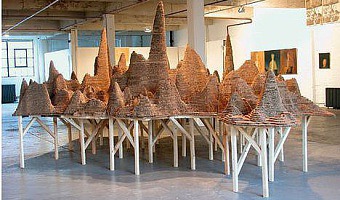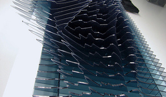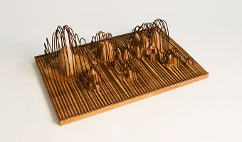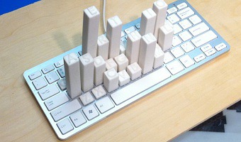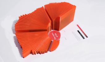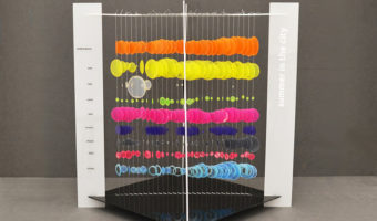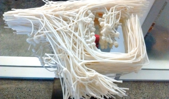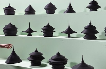
Californian artist Loren Madsen has been making data sculptures since 1995 and still continues today. CPI / Cost of Living (left image) is the first of his series: A lamination is one year. Vertical axis is the Consumer Price Index (CPI) for food; the horizontal axis is the CPI for gasoline + electricity. The rising center line is the CPI for housing. The 'snout' is the 1960's when housing and food were cheap. The bulge above the snout is 1973---OPEC, gasoline lines, etc. Thereafter the cost of […]
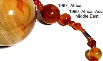
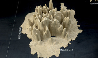
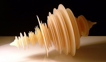
Californian artist Loren Madsen has been making data sculptures since 1995 and still continues today. CPI / Cost of Living (left image) is the first of his series: A lamination is one year. Vertical axis is the Consumer Price Index (CPI) for food; the horizontal axis is the CPI for gasoline + electricity. The rising center line is the CPI for housing. The 'snout' is the 1960's when housing and food were cheap. The bulge above the snout is 1973---OPEC, gasoline lines, etc. Thereafter the cost of most everything kept rising. On the right image, 6,000,000,000 monkeys, a 20-meter long data sculpture built in 1999 showing the evolution in the world population from 10,000 BCE to today. Also see our entries on Loren Madsen's later work 2004 – Worry (Prayer) Beads, 2014 – District 5, 2018 – New Worry Beads, and our interview with him. Sources: Loren Madsen, CPI / cost of living. Click Next to browse his later creations. Also check out his slides Information as Art. They show many great examples of data art, mostly paintings but also a few data sculptures.
Added by: Loren Madsen & Pierre Dragicevic.
Category:
Passive physical visualization
Tags:
art, CPI, data, data sculpture, housing, income, information