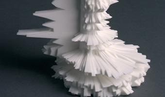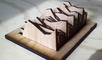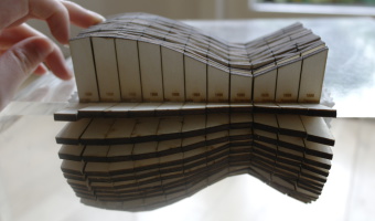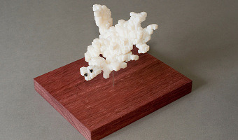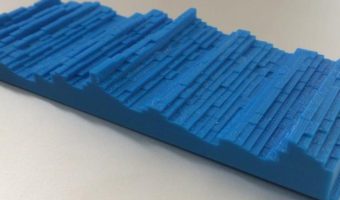
Csuri's wooden sculpture Numeric Milling is one of the few early computer sculptures created with a computer-driven milling machine... This work made use of the Bessel function to generate the surface. The computer program then generated a punched tape to represent the coordinate data. Included were instructions to a 3-axis, continuous path, numerically controlled milling machine. Sources: Csuri Project: Plotter Drawing, 1966 - 1970: Numeric Milling Photo of Numeric Milling Sculpture courtesy […]
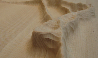
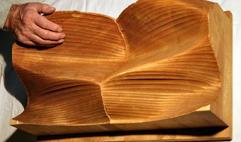
Csuri's wooden sculpture Numeric Milling is one of the few early computer sculptures created with a computer-driven milling machine... This work made use of the Bessel function to generate the surface. The computer program then generated a punched tape to represent the coordinate data. Included were instructions to a 3-axis, continuous path, numerically controlled milling machine. Sources: Csuri Project: Plotter Drawing, 1966 - 1970: Numeric Milling Photo of Numeric Milling Sculpture courtesy of Charles Csuri
Added by: Matthew Lewis.
Category:
Enabling technology
Tags:
digital fabrication, mathematical functions, milling, punch cards, wood