Tag: Environment

2013 – Pop-Up Infographics

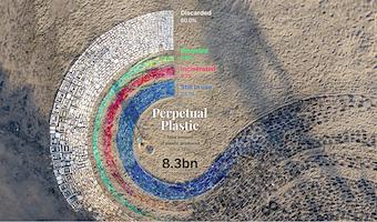
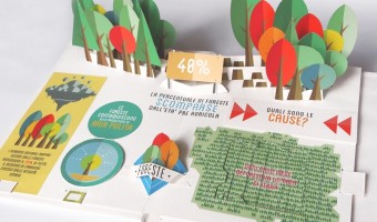
In 2013, Italian graphic designer Elena Turtas crafted four books that convey data about sustainability using pop-up and movable paper mechanisms. Source: Elena Turtas (2014) The Four Books of Visualising Sustainability.


2014 – Data Clothing: Dresses Show Air Pollution

Laura Perovich explored the concept of data-driven clothes as part of her Master thesis at the MIT Media Lab. The fashion dresses above show the concentrations of 100 chemical contaminants measured in the air of a particular household (left image). Chemicals are mapped to small squares and relative concentration is mapped to square size. Squares are repeated to create lace patterns (right image shows the concentration of several factory-related pollutants). In her thesis Laura Perovich […]

Added by: Pierre Dragicevic, sent by: Yvonne Jansen. Category: Passive physical visualization  Tags: air pollution, data clothing, digital fabrication, environment, textile


2015 – Climate Datascapes

Artist Tali Weinberg is working since 2015 on extensive series of textile data-art documenting heat waves, water color variations, average temperatures, etc. On her website you can discover the dozen different pieces from the “Climate Datascape” series, as well as other data projects. I translate climate data from the National Oceanic and Atmospheric Administration into abstracted landscapes and waterscapes, materializing the data with plant-derived fibers and dyes and […]

Added by: Anne-Laure Fréant. Category: Passive physical visualization  Tags: textile, weaving, climate, environment, hand-made


2015 – Summer in the City

The visualization explores the direct influence of weather and traffic volume on air pollution, comparing data of a 4-week period during summer 2015 in Lugano (Switzerland). Different colored laser cut plates fixed on wires represent daily data. As the wires are diagonally mounted on the structure, looking from different sides, they evidence either daily data or the evolution of the parameters. Source: Carola Bartsch (2015), Summer in the city


2017 – CO2 Emissions Shown with Balloons

The installation shows a representative selection of twenty countries and their CO2 emissions in 2014. Every orange beach ball equals 100 billion tonnes of carbon dioxide. The values refer to combustion of fossil fuels and production of cement. This work was created by Mario Klemm and José Ernesto Rodriguez in the context of the course « Data objects » with Prof. Boris Müller at University of Applied Science, Potsdam. Source: original post by Mario Klemm. Related: Also see our other entries on […]


2019 – Perpetual Plastic

Winner of the National Geographic and Sky Ocean Ventures Ocean Plastic Innovation Challenge [This project] highlights the scope of the plastic problem (in terms of amount produced as well as its fate) and the transformation of plastic over its lifetime, using beach debris as a salient example. The situated, participatory data installation approach extends abstract displays of numbers towards a more gripping form of ‘data visceralization.’ The direct link to beach clean-up activities suggests […]

Added by: Petra Isenberg. Category: Passive physical visualization  Tags: Environment, Situated, Pollution