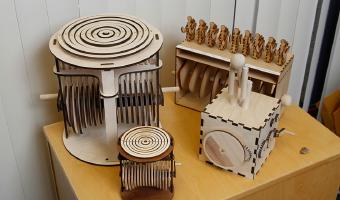
David Schneider is Chair of the Department of Microbiology and Immunology at the Stanford School of Medicine. Known by colleagues as a highly creative researcher, he has produced a wide range of data sculptures since the 2010s, including metal jewelry, animated mechanical wooden models, 3D-printed plastic objects, stained-glass works, and kinetic sculptures. Each of his data sculptures is inspired by his research, particularly his efforts to understand and visually represent patterns of […]
David Schneider is Chair of the Department of Microbiology and Immunology at the Stanford School of Medicine. Known by colleagues as a highly creative researcher, he has produced a wide range of data sculptures since the 2010s, including metal jewelry, animated mechanical wooden models, 3D-printed plastic objects, stained-glass works, and kinetic sculptures. Each of his data sculptures is inspired by his research, particularly his efforts to understand and visually represent patterns of infection and recovery in diseases such as malaria. He has also started teaching a course in scientific animation.
“I think these sculptures show the cyclical nature of infections better than any graph I’ve been able to use previously,” Schneider said. “But I still have to figure out how to publish these things. The journals always want flat pictures. We have to find a way to get around that.”
Sources:
Mark Hanlon (2017) Data Sculptor: Stanford professor creates art from the numbers (video). Bruce Goldman (2018) Infectious-disease expert explains data via sculptures, contraptions. David Schneider, phasecurveblog – Making portable sculptures from complex data. Related: Also see our other entries on mechanical interaction and data jewellery.
Added by: Anne-Laure Fréant.
Category:
Active physical visualization
Tags:
science, mechanical interaction, immunology, microbiology, data jewellery