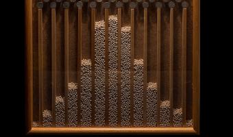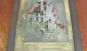
The physical model on the left is a bivariate histogram showing the correlation between the heights of fathers (horizontal axis) and sons ("vertical" axis). This data was famously collected by Karl Pearson and Alice Lee between 1893 and 1898. The physical visualization is thought to have been constructed around this time period or soon after, possibly under the supervision of Pearson. It is kept at the Department of Statistical Science, University College London, founded by Pearson in 1911. I […]
The physical model on the left is a bivariate histogram showing the correlation between the heights of fathers (horizontal axis) and sons ("vertical" axis). This data was famously collected by Karl Pearson and Alice Lee between 1893 and 1898. The physical visualization is thought to have been constructed around this time period or soon after, possibly under the supervision of Pearson. It is kept at the Department of Statistical Science, University College London, founded by Pearson in 1911. I (Pierre) learned about this model after seeing a more recent model in the archives of the collection of solid mathematical models at the Institut Henri Poincaré (right image). A label said "Model Prepared by Dept. of Statistics, University College London". I then wrote to Professor Richard Chandler, current chair of the statistics department, to ask if he had more information about this model. He replied soon after: Thank you for your message below. This is interesting … I have never seen this particular model before, but the labelling looks very similar to some exhibits that were prepared for an event at the Royal Statistical Society in (I think) the 1980s. I arrived at UCL in 1994: at that time there were some people in the department who had been involved in that event. Unfortunately they are no longer with us, so I can’t provide any further information. I can, however, speculate that the model you’re showing is a cardboard copy of a much older one that was prepared at the end of the 19th century, probably under the supervision of Karl Pearson. We still have this. I found this particular model in my desk drawer when I first arrived at UCL: it was broken into a very large number of pieces, but I had it restored. It is quite a nice piece of 19th-century data visualisation, I think! Upon closer examination, the newer model does not show the same dataset as the older model. The following R code replicates the older model exactly, confirming that it shows the original dataset from Pearson and Lee: library(dplyr) library(HistData) library(plot3D) d = HistData::PearsonLee %>% filter(par == "Father" & chl == "Son") %>% reshape2::acast(parent~child, value.var="frequency") plot3D::hist3D(z = d[nrow(d):1,], col="white", border="black", shade=0.2, phi=60, theta=0) Sources: Pearson, K., & Lee, A. (1903). On the Laws of Inheritance in Man: I. Inheritance of Physical Characters. Left photo kindly sent by Richard Chandler. Right photo taken by Pierre Dragicevic during a visit kindly organized by Alba Málaga and guided by François Apéry.
