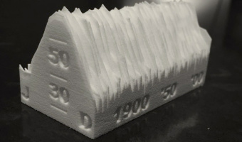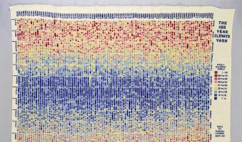
On January 2013, Kristen Cooper Nutbrown from British Columbia had the idea to create a temperature scarf by knitting one row every day using a color that encodes the temperature of the day. At the end of the year, the scarf visualized local temperature readings for the whole year. Soon after Kristen pitched her idea, Arlene Cline, also from British Columbia, started to create a temperature afghan (a blanket of knitted or crocheted wool). Temperature scarves and afghans became quite popular in […]
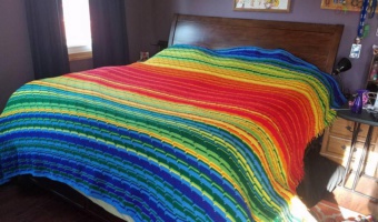
On January 2013, Kristen Cooper Nutbrown from British Columbia had the idea to create a temperature scarf by knitting one row every day using a color that encodes the temperature of the day. At the end of the year, the scarf visualized local temperature readings for the whole year. Soon after Kristen pitched her idea, Arlene Cline, also from British Columbia, started to create a temperature afghan (a blanket of knitted or crocheted wool). Temperature scarves and afghans became quite popular in the knitting community, and several tutorials exist on how to make them. The temperature scarf on the left photo above is from ravelry.com user SleepyEyes (completed 31 Dec 2014). The afghan on the right is from Sharon MacDermaid (completed 31 Dec 2016). The popularity of temperature scarves rose again in 2017 with the Tempestry Project, a reaction to Trump's hostility toward climate science. Sources: Kristen Cooper Nutbrown (2013) Knitting!: My Year in Temperatures -Scarf- (archived version) Kristen Cooper Nutbrown (2013) My Year in Temperatures -Scarf- on ravelry.com (archived version) Arlene Cline (2013) temperature afghan-c (archived version) Michael Sellick (2017) Temperature Afghan (tutorial with video) Left photo from SleepyEyes (2014) (archived version), right photo posted on facebook and twitter by Ellen Bacca (2017), shows a creation by Sharon MacDermaid. Related: Also see our other entries on data clothing, textile and weather.
Added by: Pierre Dragicevic, sent by: Andy South.
Category:
Passive physical visualization
Tags:
data clothing, temperatures, textile, weather