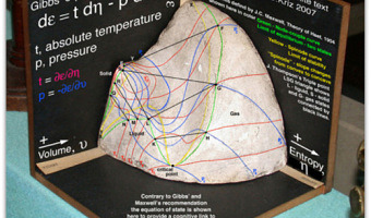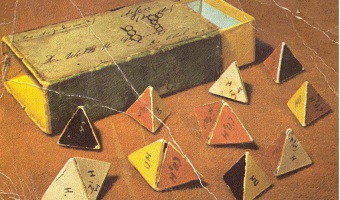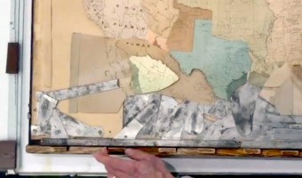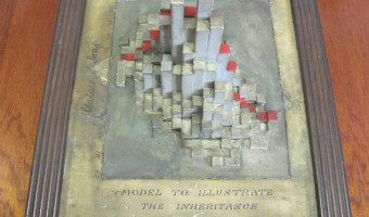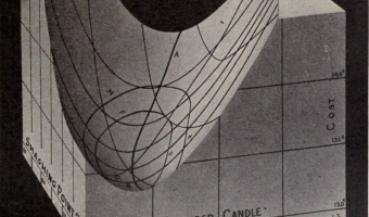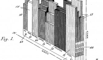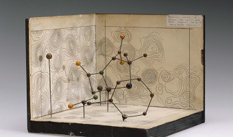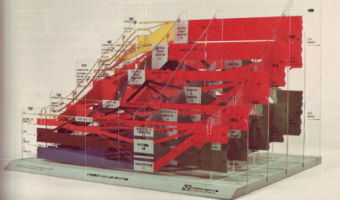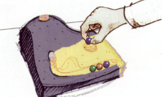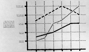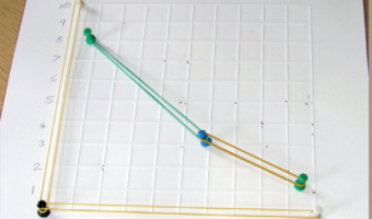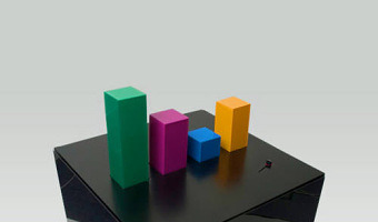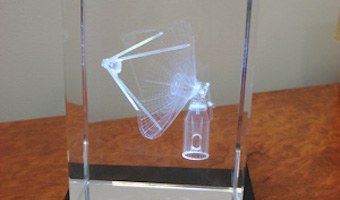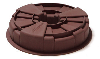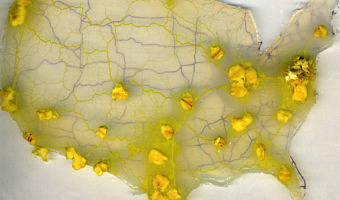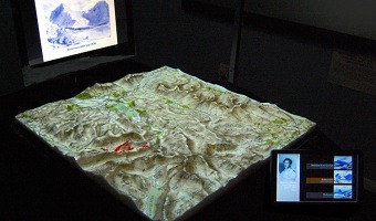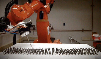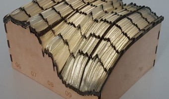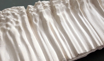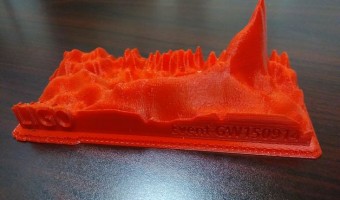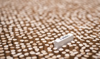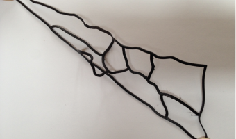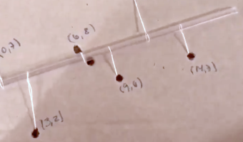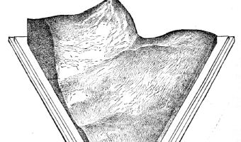
Robert Henry Thurston was an American engineer and inventor who created solid models of 3D surfaces for engineering purposes. The left image is an engraving of a physical visualization he created in 1875 and described in a 1877 article, which shows the strength of different alloys of copper, zinc, and tin. Any location on the triangle corresponds a specific proportion of each of the three metals, while the height at this location encodes the measured strength of the alloy. Excerpt from his […]
Robert Henry Thurston was an American engineer and inventor who created solid models of 3D surfaces for engineering purposes. The left image is an engraving of a physical visualization he created in 1875 and described in a 1877 article, which shows the strength of different alloys of copper, zinc, and tin. Any location on the triangle corresponds a specific proportion of each of the three metals, while the height at this location encodes the measured strength of the alloy. Excerpt from his article:
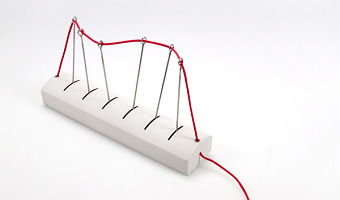
The result of an investigation, such as has just been described, may be very beautifully exhibited to the eye by making a model of the surface thus determined. In carrying out these researches the writer has found the following plan perfectly satisfactory:
Lay out a triangle, as above described, upon a surface of sheet brass. At the points at which determinations have been made, erect wires of which the lengths have been made carefully proportional to the ordinates of the representative surface at those points, screwing them firmly, or otherwise fixing them, in their places. When all the wires are in place and are found to be of the exact length required, place bits of board along the outside to form the boundaries of the triangle, and pour in plaster of Paris until the wires are all covered. When the plaster has set, remove the boards and carefully cut away the upper part of the plaster, working carefully down to the tops of the wires, just exposing their points. The surface thus produced is a model of the strength, or other quality represented, of all the alloys.
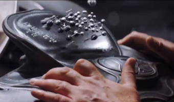
Mr. M. I. Coster has prepared for the writer such a model of the cohesive strength of the alloys of the three metals, copper, zinc, and tin, as determined for the United States Board appointed to test metals, and a photograph has been taken from which the engraving, figure 3, has been made.
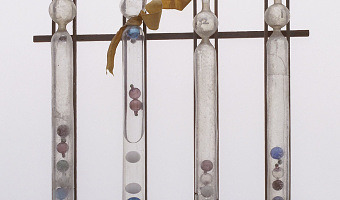
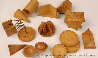
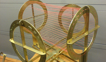
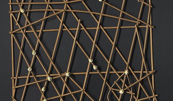
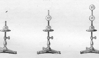
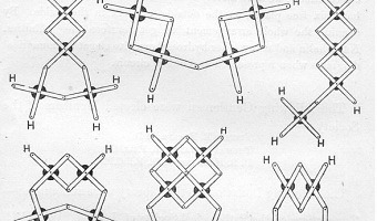
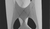
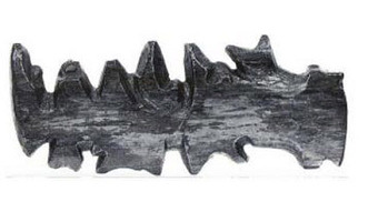
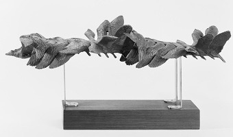
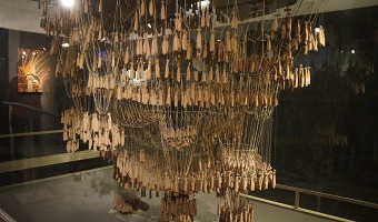
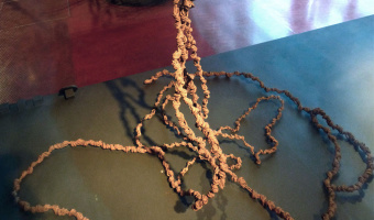
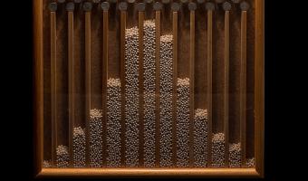
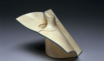
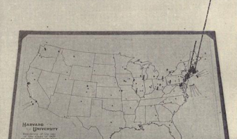
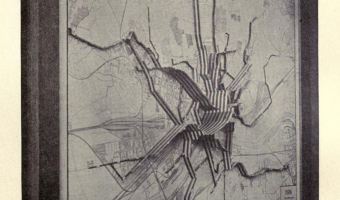
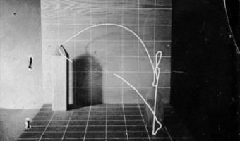
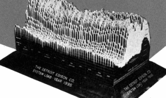
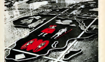
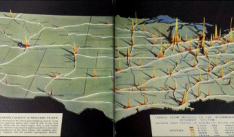
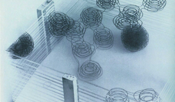
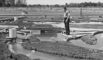
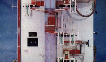
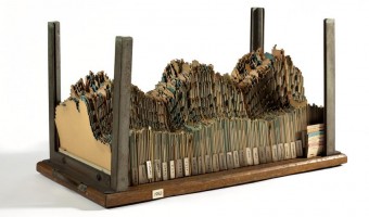
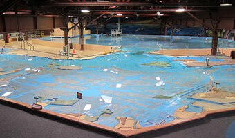
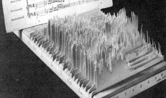
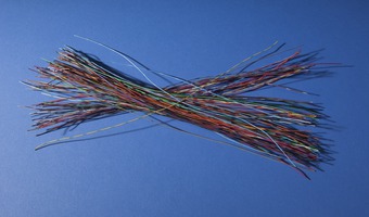
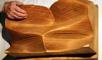
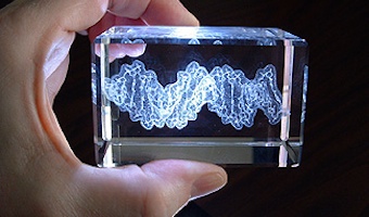
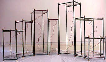
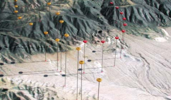
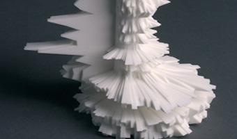
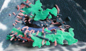
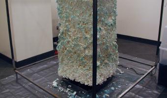
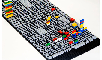
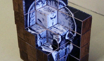
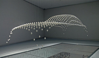
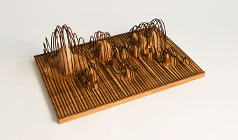
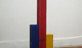
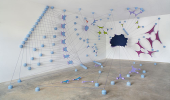
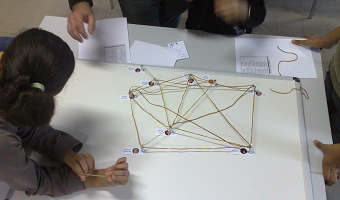
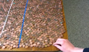
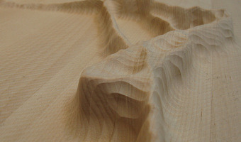
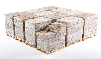
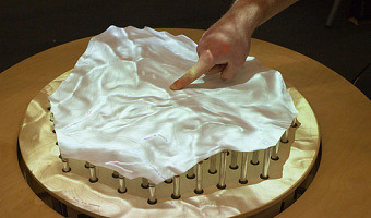
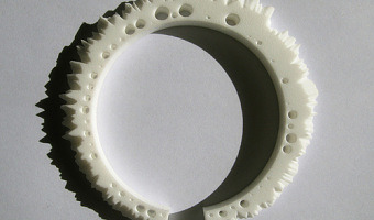
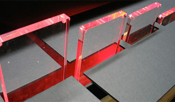
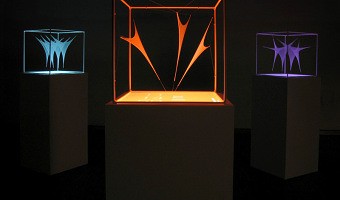
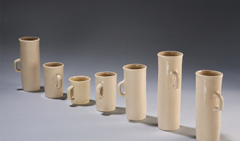
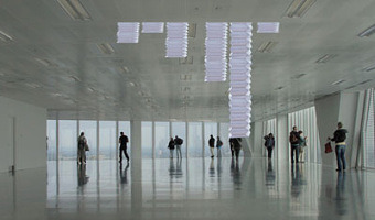
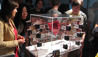
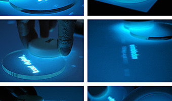
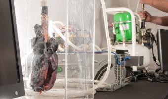
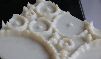
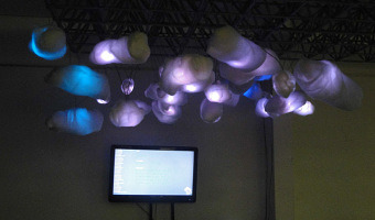
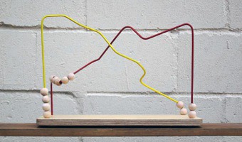
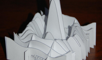
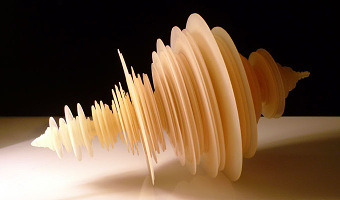
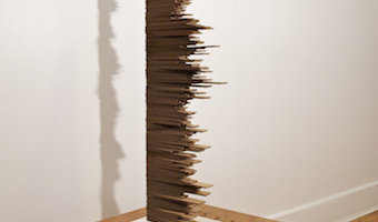
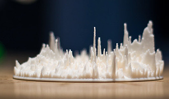
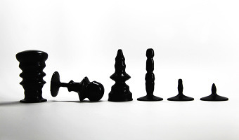
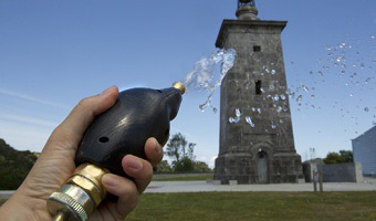
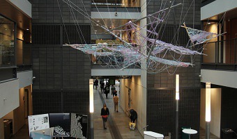
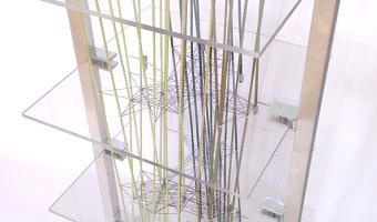
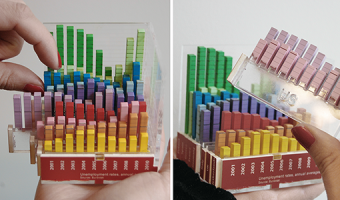
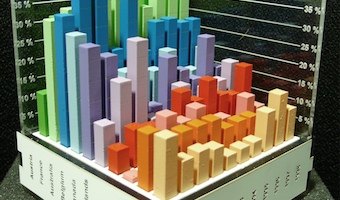
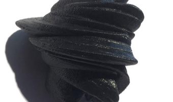
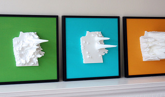
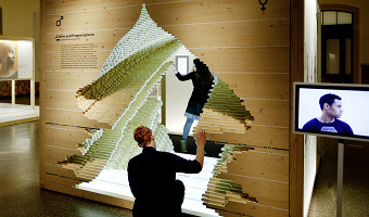
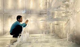
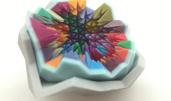
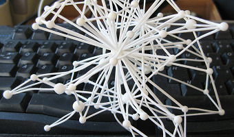
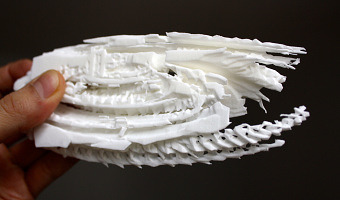
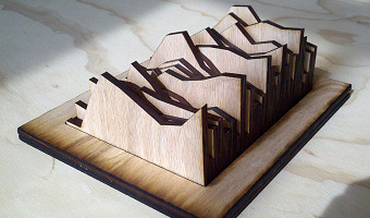
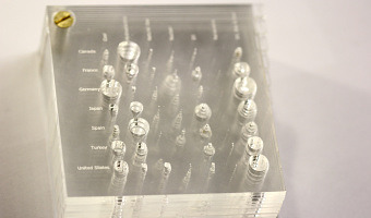
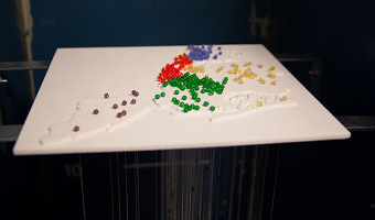
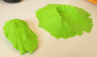
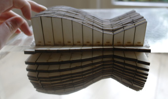
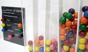
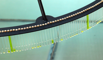
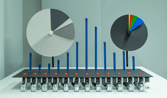
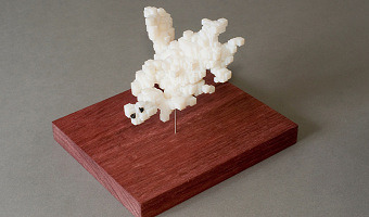
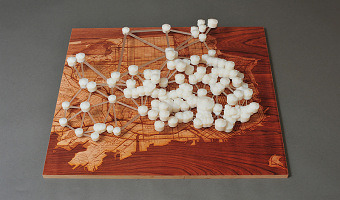
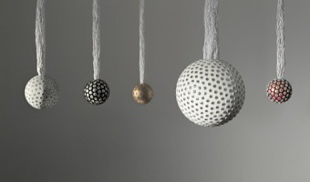
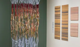
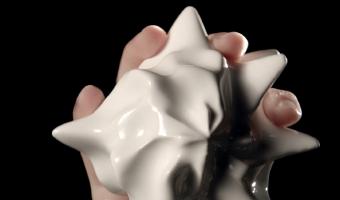
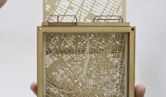
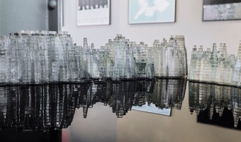
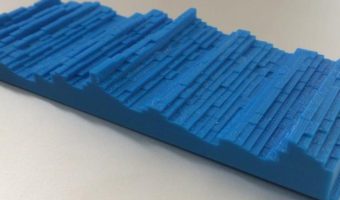
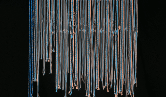
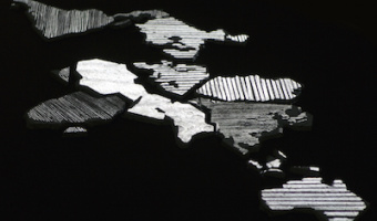
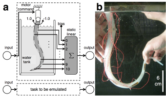
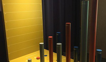
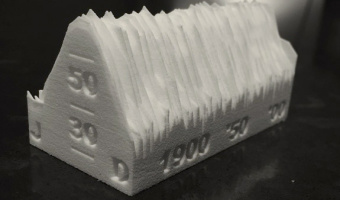
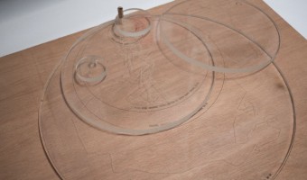
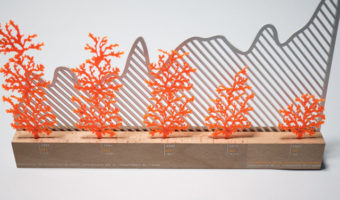
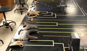
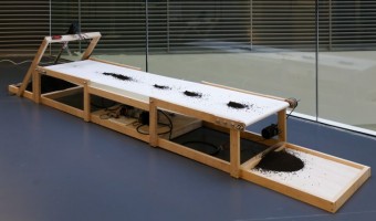
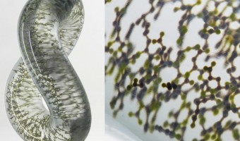
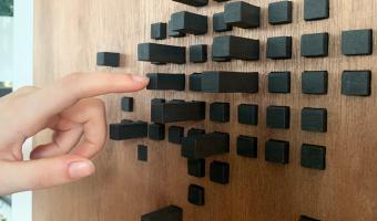
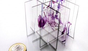
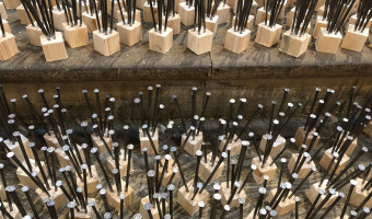
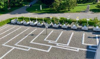
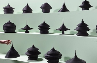
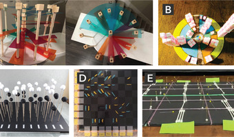
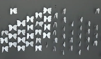
In 1898, Thurston published another article where he describes four more examples of physical 3D surfaces he calls “glyptic models” or “relief-models”, designed by himself and his colleagues (see other images). He focuses on steam engine engineering, his domain of expertise. He explains how physical 3D surfaces (and also 2D graphs) give an overview of the properties (maxima, minima) of a function but can be also used for interpolation and thus help find minima and maxima without having to perform many measurements.
Sources:
Robert Henry Thurston (1877) On a New Method of Planning Researches and of Representing to the Eye the Results of Combination of three or more Elements in Varying Proportions. In Proceedings for the American Association for the Advancement of Science. pp. 114–120 (left image can be found on p. 119). Robert Henry Thurston (1898) Graphic Diagrams and Glyptic Models. In Transactions of the American Society of Mechanical Engineers. pp. 514–550 (images can be found on pp. 520, 529, 531, 540, 544). Wikipedia, Robert Henry Thurston. Wikipedia, Ternary Plot. Related: also see our entries 1871 – Thermodynamic Surfaces and 1914 – Solid 3D Curves for Engineering.