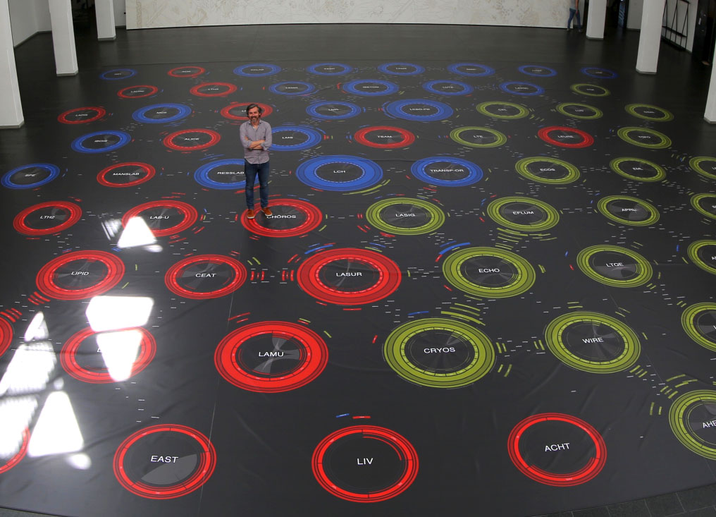
Designer Dario Rodighiero created a large (15x15m) walkable visualization showing scientific relationships between researchers and laboratories at the ENAC school of EPFL in Switzerland. The visualization was printed on tarpaulin, a heavy covering employed for trucks.
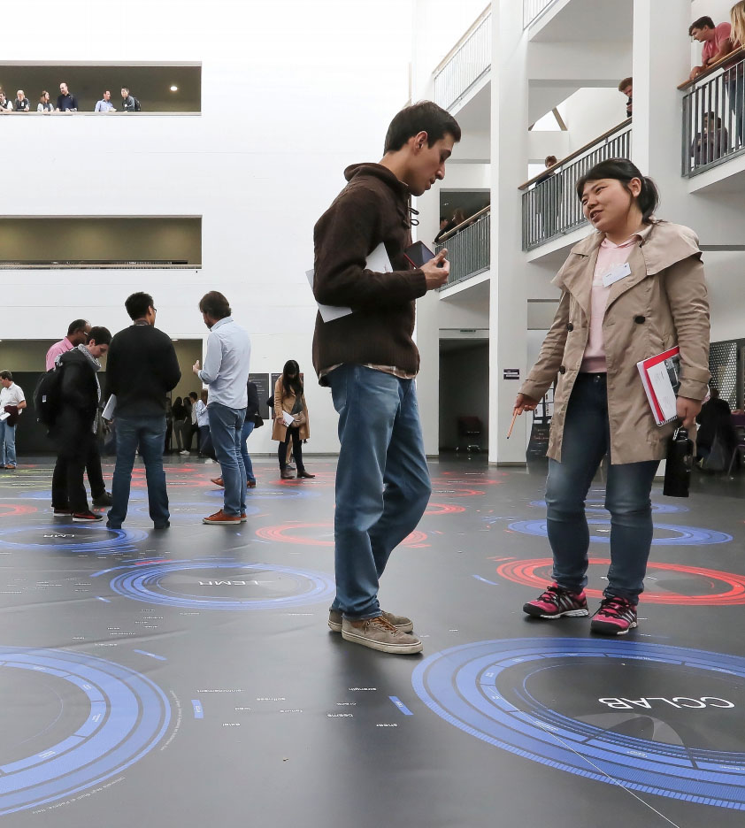
Two years before, Dario created a coauthorship network visualization for the Digital Humanities 2014 conference. He initially considered showing a large poster, but since sticking posters was not allowed at the conference center, he decided to create a six-meter wide carpet instead.
Also see our other entries on walkable information artefacts.
Sources:
- Dario Rodighiero (2016) The world’s largest data visualization.
- Dario Rodighiero (2018) Printing Walkable Visualizations.
- Images from Dario Rodighiero's paper.
Added by: Pierre Dragicevic, sent by: Benjamin Bach.
Category:
Uncertain
Tags:
collaboration, network, walkable