This is a chronological gallery of physical visualizations and related artifacts, maintained by Pierre Dragicevic and Yvonne Jansen. Thanks to our contributors. If you know of another interesting physical visualization, submit it!
This list currently has 424 entries.
Follow us on social media to get notified of new entries:


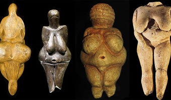
30000 BC – The Very First Sculptures
While data sculptures date back from the 1990s, the very first sculptures were Venus figurines: A Venus figurine is any Upper Paleolithic statuette portraying a woman with exaggerated physical features. The oldest ones are about 35,000 years old. Also see V.S. Ramachandran on the peak shift principle in art. Sources: Wikipedia article on Venus figurines. Left image from ancient-origins.net

20000 BC – Ishango Bone
Before the earliest unambiguous numbers in Mesopotamia, there are earlier hints of prehistoric numbers. One is a 25,000-year-old bone from Ishango, a site on a river that flows into Lake Mwitanzige, part of the so-called headwaters of the Nile. This artifact bears three rows of marks that are divided into groups by wider spacing. The groups on the first row suggest the prime numbers between ten and twenty in ascending order; those of the second row suggest adding and subtracting one from ten and twenty, and those of the third row suggests halving and doubling, but inconsistently. These groupings seem unlikely to have been produced by chance, and scholars have speculated that they show the prehistoric development of complex mathematical concepts. However, as notations, the marks are unbundled and thus cumbersome, a trait that is difficult to reconcile with the notion they represent complex mathematical concepts. The artifact also has a piece of quartz affixed to one end, suggesting it may have been an engraving tool. The marks on a second bone from the same site are not mathematically interesting. This evidence is ultimately inconclusive for prehistoric numbers.
Sources:
Overmann, K.A. (2025). The Ishango Bone Cultural Number Systems. Interdisciplinary Contributions to Archaeology. Springer, Cham. Wikipedia Ishango Bone Wikipedia Tally Stick Related: Also see our other entries on archaeological artefacts.
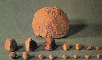
5500 BC – Mesopotamian Clay Tokens
The earliest data visualizations were likely physical: built by arranging stones or pebbles, and later, clay tokens. According to an eminent archaeologist (Schmandt-Besserat, 1999): "Whereas words consist of immaterial sounds, the tokens were concrete, solid, tangible artifacts, which could be handled, arranged and rearranged at will. For instance, the tokens could be ordered in special columns according to types of merchandise, entries and expenditures; donors or recipients. The token system thus encouraged manipulating data by abstracting all possible variables. (Harth 1983. 19) [...] No doubt patterning, the presentation of data in a particular configuration, was developed to highlight special items (Luria 1976. 20). " Clay tokens suggest that physical objects were used to externalize information, support visual thinking and enhance cognition way before paper and writing were invented. Sources: Denise Schmandt-Besserat (1999) Tokens: The Cognitive Significance. Denise Schmandt-Besserat (1996) How Writing Came About. Image taken from en.finaly.org (photo Denise Schmandt-Besserat)
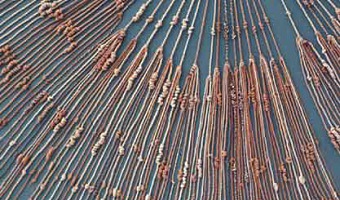
2600 BC – Quipus
Quipus were complex assemblies of knotted ropes that were used in South America as a data storage device and played an important role in the Inca administration. Only a handful of specialists could use and decipher them. Their meaning mostly remains a mystery but it seems that color, relative position of knots, knot types and rope length were used to encode categorical and quantitative variables. The oldest known Quipu is 4600 years old. In the late 16th century quipus were still being used by Peruvians until the Roman Catholic church decreed they were "the devil's work" and had most of them destroyed. Sources: Paul Beynon-Davies (2009) Significant Threads. Dead Media Archive Peruvian Quipu. K. Kris Hirst. South America's Oldest Writing System. Left image from https://courses.cit.cornell.edu/quipu/, right image from Beynon-Davies (2009).
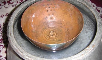
1600 BC – Water Clocks
A water clock (or clepsydra) is an instrument where time is measured by regulating a flow of liquid. The oldest water clocks simply consisted of a pierced bowl placed in a larger pot filled with water (see left image, Persian artefact from 400 BC). These existed back in the 16th century BC. The passage of time was observed by counting how many times the bowl overflowed and its content had to be poured back in the larger pot. This was used for example in Persia to ensure fair irrigation practices. This basic system has been improved upon many times across different continents, yielding more precise measurements and eliminating the need for manually resetting the mechanism. The second and third image show the largest water clock ever made, built by French physicist-turned-artist Bernard Gitton in 1988. It is more than 9 meters tall and shows the current hour and minute. Sources: Wikipedia article on water clocks. Holmes (2016) Object of Intrigue: Ancient Persian Water Clocks. English (2012) Inspiration: The Water Clocks of Bernard Gitton. Wikipedia article Water clock (Indianapolis). Left image from Wikimedia commons, middle image by youtube user Michael Shen, right image by youtube user Ryan Schade.
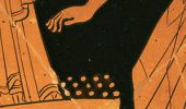
500 BC – Pebble Voting
The earliest participatory visualizations were probably voting systems. Voting in Greece was introduced in the 5th century BC. Adult male citizens were invited to express their opinion by dropping a pebble in an urn: a white pebble meant "yes" and a black pebble meant "no". Sometimes two urns were used. The left image is a detail of a Greek wine cup from the 5th century BC, and is one of the earliest known depictions of the act of voting. The middle image is a modern reconstruction from a TV documentary. Secret voting was also in use, but it is unclear how (perhaps using "a contraption to obscure the urn into which a voter was placing his hand"). By the mid-4th century BC, a more elaborate method of secret voting was introduced based on bronze ballots whose difference could only be felt by touch. In the 19th century, freemasons and fraternities started to use ballot boxes to decide who should be included in the group or who should be expelled (see right image). The boxes had a small opening where each member would covertly insert a white marble to mean "yes", or a black marble (or black cube) to mean "no". After everyone voted, the box was opened so that all members could immediately see the results. Sometimes a single black marble or cube was sufficient to reject a proposition or an applicant, yielding the expression "blackballing". Sources: Annelisa Stephan (2012) Voting with the Ancient Greeks. Agath.gr (2011) The Verdict. Paul Bessel (1999) Masonic Balloting. Wikipedia article of Blackballing. First image from the iris. Second image from the youtube channel HISTORY. Right image from the Merchantville Lodge #119.

150 BC – Greek Orrery
An orrery is a mechanical model of the solar system. The left image shows the Antikythera, the oldest known orrery. The middle image shows a virtual reconstruction. The right image shows a contemporary orrery. The Antikythera mechanism is an ancient analog computer designed to predict astronomical positions and eclipses. It was recovered in 1900–01 from the Antikythera wreck, a shipwreck off the Greek island of Antikythera. The instrument was designed and constructed by Greek scientists and has been dated between 150 to 100 BC. After the knowledge of this technology was lost at some point in antiquity, technological artifacts approaching its complexity and workmanship did not appear again until the 14th century, when mechanical astronomical clocks began to be built in Western Europe. Sources: Wikipedia. Antikythera. NOVA documentary on the Antikythera. Wikipedia. Orrery. Middle image: Massimo Mogi Vicentini (2012) The Antikhytera Celestial Machine: fragments of genius from a legendary science. Right image by Zeamon.
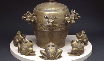
132 – Chinese Seismoscope
A seismoscope is a qualitative indicator of seismic activity -- as opposed to seismographs which show quantitative data, typically through line graphs. The oldest known seismoscope is Chinese and dates backs from 132. It was a large bronze device that dropped a ball into a bronze container (one of the eight frogs on the image above) every time an earthquake was detected, thus producing a loud sound. The direction of the earthquake could then be examined by looking at the container in which the ball was dropped. In AD 132, Zhang Heng of China's Han dynasty invented the first seismoscope (by the definition above), which was called Houfeng Didong Yi (translated as, "instrument for measuring the seasonal winds and the movements of the Earth"). The description we have, from the History of the Later Han Dynasty, says that it was a large bronze vessel, about 2 meters in diameter; at eight points around the top were dragon's heads holding bronze balls. When there was an earthquake, one of the mouths would open and drop its ball into a bronze toad at the base, making a sound and supposedly showing the direction of the earthquake. On at least one occasion, probably at the time of a large earthquake in Gansu in AD 143, the seismoscope indicated an earthquake even though one was not felt. The available text says that inside the vessel was a central column that could move along eight tracks; this is thought to refer to a pendulum, though it is not known exactly how this was linked to a mechanism that would open only one dragon's mouth. The first ever earthquake recorded by this seismograph was supposedly somewhere in the east. Days later, a rider from the east reported this earthquake. Sources: Text from Wikipedia. Pictures from sciencemuseum.org.uk Related: Also see our entry 1992 – Durrell Bishop's Marble Answering Machine.
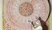
1200 – Pop-Up and Movable Books
While gatefold mechanisms were already used in the 1100s, one of the first movable paper mechanisms was a volvelle created by Benedictine Monk Matthew Paris to calculate the dates of Christian holidays in his book Chronica Majorca (1236-1253, see left image above). Volvelles are paper discs or rings placed on top of each other that rotate around a string or rivet. Many other types of paper mechanisms have been invented since then, such as flaps, which were used in anatomy books starting from the 16th century (see second image above, 17th century, and third image, undated). Only in the 19th century did movable books started to be used for entertainment purposes and for children. Ellen G.K. Rubin (aka the pop-up lady) has a rich website and a must-watch talk about the history of pop-up and movable books. For a modern example of a pop-up book used to convey data, see our entry 2013 - Pop-Up Infographics. Sources: Ellen G.K. Rubin, Pop-up Lady Website. Mugdha Kale, Pop-Up Design. E.D.W. Lynch (2011) Animated Anatomies, An Exhibition of Antique Medical Pop-Up Books. (with link to a video) Left and middle image from popuplady.com, right image from laughingsquid.com.
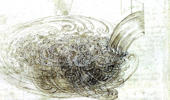
1500 – Flow Visualization
Although today computer graphics is often used for doing flow visualization, a range of physical methods exist that can visualize flows in-place. Leonardo da Vinci was presumably one of the first to use these methods: Leonardo da Vinci (1452-1519) also developed techniques for observing the wind (by generating smoke in a tube and adding it to the wind at suitable points). Most important of all, he made actual experiments under controlled conditions. For this purpose, he used, among other things, a tank containing water mixed with fine millet, through which he moved solids, observing the flow past them. Leonardo wrote: “The movement of water within water proceeds like that of air within air.“ The left image shows a drawing from Leonardo da Vinci. The remaining images show more modern methods involving the use of die, cotton tufts, and colored smoke. Sources: Peter Freymuth (1993) Flow visualization in fluid mechanics. Review of scientific instruments. William E. Boeing Department of Aeronautics and Astronautics (2016) Flow Visualization. Pat Hanrahan (2004) Self-Illustrating Phenomena. Willett et al. (2016) Embedded Data Representations. Images from (left to right) Uppsala Universitet, Dryden Flight Research Center NASA, Joe Pappas and Dick Oldfield, and NASA Langley Research Center.
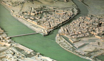
1500 – Plans-Reliefs
The first terrain/city models date back from the 16th century and were created for military purposes. Left image: a plan-relief of Bayonne, created by Sébastian Vauban (1633–1707), a famous fortification engineer of King Louis XIV. Right image: a plan-relief of Grenoble from 1848. These scale models were highly prized for the tactical advantage they brought, and they were also shown around for dissuasive purposes. “Il y a un relief de Namur dans les Tuileries, je vous demanderai d'avoir la complaisance d'y venir avec moi. Je vous ferai toucher au doigt et à l'œil tous les défauts de cette place, qui sont en bon nombre [...].” There is a relief of Namur in the Tuileries, I would ask you to kindly come with me. I will make you touch with your finger and your eye all the defects of this place, which are in good number. — Vauban's letter to Le Pelletier, president of the constituent assembly (1695). “Le Moniteur parle d'un plan de la Suisse, du feu général Pfiffer. Faites examiner ce plan, et, s'il est meilleur que celui que j'ai acheté dernièrement, faites-le acheter et transporter à Paris. Comme il est possible que nous ayons encore la guerre, il n'y a point de meilleure carte que ces plans en relief.” The Monitor speaks about a map of Switzerland, from the late general Pfiffer. Have this map examined, and if it is better than the one I bought recently, have it bought and transported to Paris. Since it is possible that we may still have war, there is no better map than these relief maps. — Napoléon's letter to Maréchal Berthier (1805). Sources: Institute of Cartography and Geoinformation, ETH Zurich (2006-2015) www.terrainmodels.com Yvonne Jansen (2014) Physical and Tangible Information Visualization. Robert-Max Antoni (1992-2000) Vocabulaire illustré de l'Art urbain - Relief Model. Napoléon I (1858) Correspondance de Napoléon 1er. Wikipedia Plan-relief de Grenoble. Left image from www.terrainmodels.com, right image from Jean-Pierre Dalbéra (Flickr). Related: Also see our entry on modern solid terrain modeling.
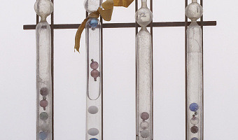
1660 – Galileo Thermometer
A Galileo thermometer consists of a set of floaters immersed in a clear liquid (typically ethanol) inside a sealed glass tube. Today a floater is typically a glass sphere containing a colored liquid and to which is attached a metallic temperature tag. The composition of a floater is irrelevant, its overall density just needs to be calibrated to a certain value and remain stable. Floaters being made of glass and metal, their volume - and therefore density - is largely unaffected by temperature. But when temperature rises, the ethanol around expands significantly. When its density matches the density of a particular floater, that floater will move at the middle of the tube, thereby indicating the current temperature. The remaining floaters will move at the bottom or at the top. Despite its name, the Galileo thermometer was not invented by Italian physicist Galileo (1564−1642), but by the Florentine scientific society Accademia del Cimento two decades after his death (left image). The Accademia del Cimento was founded in 1657 by Grand Duke Ferdinando II de' Medici (former student of Galileo) and his brother Prince Leopoldo, in order to attract scientists to Florence for mutual study. It was the first scientific organization founded for the sole purpose of making scientific experiments. Its motto was Probando e Reprobando, i.e., "testing and retesting". They created a number of scientific instruments before being demised in 1667. Galileo thermometers are now built and sold all over the world for decoration purposes (right image). Galileo did invent a thermoscope (a thermometer without a numeric scale) in the early 1600s, but it was very rudimentary, did not employ floaters, and was affected by atmospheric pressure. This instrument was an important invention but bore no resemblance to what is now called the Galileo thermometer. Nonetheless, it is clear that Galileo's inventions and writings greatly influenced the Academia del Cimento. Sources: Peter Loyson (2012) Galilean Thermometer Not So Galilean. Wikipedia article on the Galileo thermometer. Wikipedia article on Accademia del Cimento. Left image from the museo galileo website. Right image from Wikipedia.
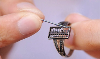
1700 – Wearable Abacus from the Qing Dynasty
A functioning abacus ring from the Qing Dynasty (1644-1912), exhibited at the Cheng Dawei Abacus Museum in Huangshan City, China. Steve Mann mentions it as an early form of wearable "computer": Here is a "computer" (an abacus) and since it is a piece of jewelry (a ring), it is wearable. Such devices have existed for centuries, but do not successfully embody Humanistic Intelligence. In particular, because the abacus is task-specific, it does not give rise to what we generally mean by "wearable computer". For example, its functions and purpose (algorithms, applications, etc.) can't be reconfigured (programmed) by the end user while wearing it. In short, "wearable computer" means more than the sum of its parts i.e. more than just "wearable" and "computer". Made with beads of a silver ring abacus of 1.2 centimeter long and 0.7 centimeter wide, dating back to Chinese Qing Dynasty (1616-1911 BC [sic]) Sources: ChinaCulture.org (2010) The Story of the Chinese Abacus. Steve Mann (2014) Wearable Computing, in The Encyclopedia of Human-Computer Interaction, 2nd Ed.
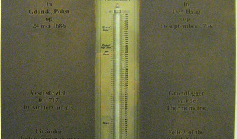
1714 – Mercury Thermometer
The mercury thermometer was invented by Dutch physicist Daniel Gabriel Fahrenheit in 1714. It consists of a narrow glass tube with a bulb at the bottom, containing mercury. The volume of mercury changes with temperature; mercury is driven out of the bulb and up the tube as the temperature rises. Sources: Wikipedia article on Mercury-in-glass thermometer Image Credit: Donar Reiskoffer, Wikimedia Commons

1750 – Physical Splines
You may not realize that splines were once physical things. In an era prior to CAD and large-format printing, when draftsmen needed to lay out full-sized curves—for boatbuilding, airplane manufacturing and the like—this is how they did it. To be clear, the “spline” is the actual strip of wood being bent and held in place. The things holding it in place are called spline weights, or colloquially, “ducks” or “whales.” They weigh about five pounds apiece.
Physical splines may date back from the 1700s:
The classical “spline”, a wooden beam which is used to draw smooth curves, was probably invented then. The earliest available mention of a “spline” seems to be from 1752.
It’s unclear when ducks (spline weights) started being used. There is an extensive demonstration of ducks by a naval architect, starting at 20:35 in this video: https://www.youtube.com/watch?v=6n14fiLLyDQ&t=1234s.
Sources:
First quote from Rain Noe (2016) When Splines Were Physical Objects. (archived version) Second quote from Gerald Farin (2002) A History of Curves and Surfaces in CAGD. (archived version) Photo by Rain Noe.
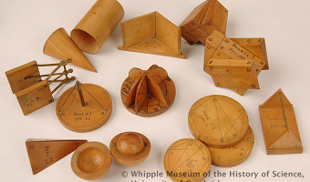
1750 – George Adams' Solid Geometry Models
During the 18th century, instrument maker George Adams built and sold solid 3D geometric models as educational complements to the 2D images found in Euclid's Elements of Geometry. As argued by a 18th-century author: It is almost as necessary as in mechanics, to exhibit the objects, whose qualities are to be taught; and to call in the joint assistance of the hands and eyes. According to the Whipple Museum of the History of Science, authors were already experimenting with paper models soon after the very first English edition of Euclid in 1570. But in contrast with chemistry, the use of physical models has never become widespread in geometry. Sources: Mike Rich (2006) Wooden geometric models made by George Adams. Image by the Whipple Museum.
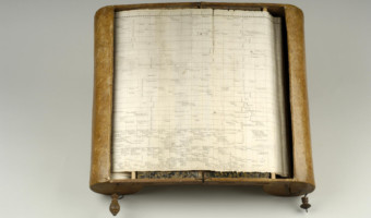
1753 – Barbeu-Dubourg's Machine Chronologique
Before Joseph Priestley published his famous timelines, Frenchman Jacques Barbeu-Dubourg built a 16-meter long timeline showing 140 years of world history, which can be mechanically scrolled and folded for transport. Not a physical visualization but maybe the first “interactive” timeline representation in history. Seen in a talk by Catherine Plaisant. Sources: Stephen Boyd Davis (2009) The First Modern Timeline? Stephen Ferguson (1991) The 1753 Carte Chronographique by Jacques Barbeu Du Bourg. Photos from Rare Book Division, Department of Rare Books and Special Collections, Princeton University Library.
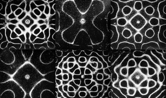
1787 – Chladni Plates
In 1787, German physicist and musician Ernst Chladni published a technique to visualize the modes of vibration of a rigid surface. Chladni's technique [...] consisted of drawing a bow over a piece of metal whose surface was lightly covered with sand. The plate was bowed until it reached resonance, when the vibration causes the sand to move and concentrate along the nodal lines where the surface is still, outlining the nodal lines. The patterns formed by these lines are what are now called Chladni figures. Chladni was inspired by early experiments by Robert Hooke who discovered the phenomenon in 1680, using flour instead of sand. This technique is still in use today to design acoustic instruments, with the difference that a loudspeaker is generally used instead of a bow. In the 1960s, Hans Jenny, a Swiss physician and natural scientist carried many experiments using sand, dust and fluids, and founded an mystical discipline called Cymatics based on exploring these phenomena. Sources: Wikipedia - Ernst Chladni Hans Jenny (1970) Cymatics - Bringing Matter To Life With Sound (movie) Left image by Chris Smith
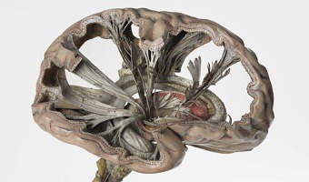
1820 – Papier-Mâché Anatomical Models
Left image: As part of its 2014 exhibition entitled Mind Maps: Stories from Psychology, the London Science Museum showcased this very accurate and intricate papier-mâché brain model from 1900 that shows path of nerve fibers. French physician Louis Thomas Jerôme Auzoux developed this technique around 1820 due to the shortage of human cadavers and wax models to study human anatomy. He was inspired by papier-mâché dolls that were common at the time. His models became popular in schools, universities and hospitals, and many of them could be taken apart for educational purposes (right image). Sources: Tweet from the London Science Museum (2014). Also see their exhibition page (now closed). Discover Magazine. Papier-Mâché Brain (1801-1850). Wikipedia page on Louis Thomas Jérôme Auzoux. Céline Poirier's pinterest page on Auzoux. Regis Olry. Wax, Wooden, Ivory, Cardboard, Bronze, Fabric, Plaster, Rubber and Plastic Anatomical Models: Praiseworthy Precursors of Plastinated Specimens. J Int Soc Plastination Vol 15, No 1: 30-35, 2000. Danica Marković and Bojana Marković. Development of Anatomical Models – Chronology. Acta Medica Medianae 2010, Vol.49(2).
1839 – Théodore Olivier's String Models
Between 1839 and 1853 the French mathematician Théodore Olivier created string models to teach and demonstrate descriptive geometry, some of which could be manipulated. He was a student of French mathematician Gaspard Monge, who invented descriptive geometry and was already illustrating his ideas with rudimentary string models. Photo above: intersection of two cylinders. Sources: Nicholas Mee (2013) Strings, Surfaces and Physics. Photo above taken in the Musée des Arts et Métiers in Paris, see flickr set. Other models at exposed at the Canada Science and Technology Museum (but not in such a good shape!), see flickr set.
1850 – Merryweather's Leech Barometer
In 1850, British doctor and inventor George Merryweather built a barometer that uses live medicinal leeches to predict storms: The twelve leeches are kept in small bottles inside the device; when they become agitated by an approaching storm they attempt to climb out of the bottles and trigger a small hammer which strikes a bell. The likelihood of a storm is indicated by the number of times the bell is struck. The device, which Merryweather called the "tempest prognosticator", was shown at the 1851 Great Exhibition in London. Merryweather tried to convince the British government to make use of his design, but "it was thought to be impractical, since the leeches needed to be fed once a month and have their water changed every five days". The efficacy of the device is yet unproven. The original device was lost, but several replicas were made. The images above show a replica from 1951 currently exhibited at the Whitby museum. Sources: Wikipedia - Tempest prognosticator. Natasha Frost (2017) The Rise and Fall of the Leeches Who Could Predict the Weather. Left image: The Guardian; middle image: atlasobscura.com; right image: Wikipedia.
1862 – De Chancourtois' Telluric Screw
The French geologist Alexandre-Émile Béguyer de Chancourtois was the first scientist to see the periodicity of elements when they were arranged in order of their atomic weights. Credited with being the original discoverer of the periodicity of elements and the originator of the three-dimensional method of element arrangement and representation. He drew the elements as a continuous spiral around a metal cylinder divided into 16 parts. The atomic weight of oxygen was taken as 16 and was used as the standard against which all the other elements were compared. Tellurium was situated at the centre, prompting vis tellurique, or telluric screw. Despite de Chancourtois' work, his publication attracted little attention from chemists around the world. The reason being that De Chancourtois's original diagram was left out of the publication, making the paper hard to comprehend. The paper also dealt mainly with geological concepts, and did not suit the interests of many chemistry experts. It was not until 1869 that Dmitri Mendeleyev's periodic table attracted attention and gained widespread scientific acceptance. The original (unique) telluric screw is now hosted at the museum de l'École des Mines. Sources: Jacques Touret "Dans l'ombre de ses maîtres", Travaux Du comité Français d'histoire de la géologie - Troisième série - T.XX (2006) Science and Society picture library All periodic tables website Wikipedia article on Alexandre-Émile Béguyer de Chancourtois
1862 – Marshall Islands Stick Charts
These physical visualizations show ocean swell patterns, and were built by native Micronesians from the Marshall Islands to facilitate canoe navigation. They were memorized before trips. The Western world remained unaware of the existence of these artifacts until 1862. The photo above is a stick chart from 1974. Straight sticks represent regular currents and waves, curved sticks represent ocean swells, and seashells represent atolls and islands. Sources: Wikipedia. Marshall Islands Stick Charts. Photo above from the National Library of Australia.
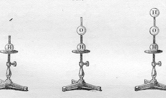
1865 – Hofmann's Croquet Ball Models
August Wilhelm Hofmann was the first to introduce physical representations of molecules into lectures during his Friday Evening Discourses presentation "On the Combining Power of Atoms" at London's Royal Institution of Great Britain in . He introduced a colored set of four croquet balls to represent atoms (hydrogen, oxygen, chlorine and nitrogen), implanted with a fixed number of sticks corresponding to each atom's valence. Thus we distinguish the chlorine atom as univalent, the atom of oxygen as bivalent, that of nitrogen as trivalent, and lastly the carbon atom as quadrivalent. - this I believe I can show you by a very simple contrivance. I will on this occasion, with your permission, select my illustration from that most delightful of games croquet. Let the croquet balls represent our atoms, and let us distinguish the atoms of different elements by different colours. The white balls are hydrogen, the green ones chlorine atoms; the atoms of fiery oxygen are red, those of nitrogen, blue; the carbons atoms, lastly, are naturally represented by black balls. But we have, in addition, to exhibit the different combining powers of these atoms. This we accomplish by screwing into the balls a number of metallic arms (tubes and pins), which correspond respectively to the combining powers of the atoms represented, and which, while constituting an additional feature of distinction, enable us at the same time to join the balls and to rear in this manner a kind of mechanical structures in imitation of the atomic edifices to be illustrated." (Extracts from Proceedings of the Royal Institution, 4, 401-430) Interestingly, while physical representations, Hofmann had the models built so that they were two-dimensional representations of molecules. It's only in the mid 70s that 3-dimensional models emerged. Sources: J. Michael McBride Models and Structural Diagrams in the 1860s Wikipedia August Wilhelm von Hofmann
1866 – Kundt's Tube
Kundt's tube is an apparatus invented in 1866 by German physicist August Kundt for measuring the speed of sound. It mostly consists of a transparent tube of adjustable length with powder in it. Sound is produced at one end of the tube, and the tube's length is adjusted until the sound becomes louder, indicating the tube is at resonance and the sound forms a standing wave. The powder then accumulates at the nodes of the standing wave, where is no vibration. The wavelength of the sound can be determined by measuring the distance between nodes. Using the c = λf formula, sound speed (c) can then be determined from the wavelength (λ) and the frequency (f) of the sound. The image above shows a modern implementation. Today, Kundt's tube is mostly used for educational or for artistic purposes. Sources: Wikipedia, Kundt's tube. Photo from uranmaschine.de. Related: Also see our entry 1787 – Chladni Plates.
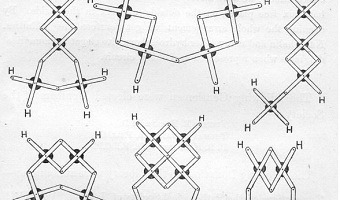
1866 – Dewar's Brass Strip Models
Mechanical arrangement adapted to illustrate structure in the non-saturated hydrocarbons by the chemist James Dewar. The model is made of bars, clamped together so as to allow free motion. In order to make the combination look like an atom, a thin round disc of blackened brass can be placed under the central nut. At the ends of the arms are holes to connect one carbon atom with another by means of a nut. The structure at the bottom right of his figure is now called "Dewar benzene". I bring before the Society a simple mechanical arrangement adapted to illustrate structure in the non-saturated hydrocarbons. This little device is the mechanical representative of Dr. C. Brown's well-known graphic notation. A series of narrow thin bars of brass of equal length are taken, and every two of the bars clamped in the centre by a nut, so as to admit of free motion the one on the other. Such a combination represents a single carbon atom with its four places of attachment. In order to make the combination look like an atom, a thin round disc of blackened brass can be placed under the central nut. At the ends of the arms are holes to connect one carbon atom with another by means of a nut. The filling up of the places of attachment may be effected by slipping on the arms round discs of brass having a groove attached, and placing the symbol of the chemical element on the round projection. A carbon atom would then look like the following diagram. By J. Dewar, Esq. (from Proceedings of the Royal Society of Edinburgh, VI, Session 1866-67, pp. 82-86) Dewar sent Kekulé his brass strip molecular modeling kit in 1866, and Kekulé used it to hypothesize possible molecular structures for compunds. In 1867, Kekulé used Dewar's models to come up with a reasonable (by today's standards) structure for mesitylene (1,3,5-trimethylbenzene, C9H12). Note that in the drawing, little dots appear in in the middle of some of the bonds. They appear because the drawings are of a real model, and the various atoms were screwed together at the dots. Also note that the acetone molecules in the model appear not to be symmetrical, with one C-C bond bent and the other one straight. However, the bent bond is only an illusion created by the flatness of the paper; in Kekuleé's 3-D model, all of the C-C bonds are straight. James Deward is famous for his Researches in low temperature phenomena. See [3] to learn more. Sources: J. Michael Mc Bride Models and Structural Diagrams in the 1860s J. Dewar, Esq., Proceedings of the Royal Society of Edinburgh, VI, Session 1866-67, pp. 82-86 Today in Science History website
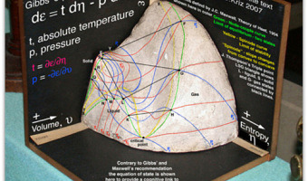
1871 – Thermodynamic Surfaces
A physical visualization by Scottish physicist James Maxwell (left), constructed over the course of about seven months, from November 1874 to July 1875, based on the descriptions of thermodynamics surfaces described in two 1873 papers by American engineer Willard Gibbs. The molded shape depicts the geometry of the three-dimensional thermodynamic surface of the various states of existence of water: solid, liquid, orgas, shown on Cartesian coordinates of the entropy (x), volume (y), and energy (z) of the body. Maxwell constructed it in Cambridge and famously sent it to Gibbs in 1875 as a gift of appreciation for his graphical work. Similarly, James Thomson constructed a plaster pressure-volume-temperature plot (right) in 1871, based on data for carbon dioxide collected by Thomas Andrews. Source: Hmolpedia. Maxwell’s Thermodynamic Surface.
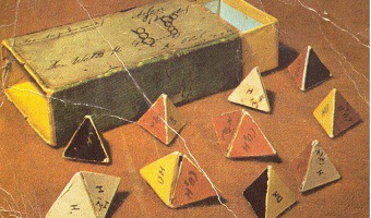
1875 – Van't Hoff's Molecular Paper Models
Van’t Hoff disseminated his stereochemical ideas to leading chemists of the day by sending them 3-D paper models of tetrahedral molecules, like these now housed in the Leiden Museum. There might be some difficulty in following my reasoning. I felt this myself, and I have made use of cardboard figures to facilitate the representation. Not wanting to require too much of the reader I will gladly send him the complete collection of all these objects Sources: Van der Spek, Trienke M. Selling a Theory: The Role of Molecular Models in JH van't Hoff's Stereochemistry Theory. Annals of science 63.02 (2006): 157-177. Gross Ari, Form and Function: Seeing, Knowing, and Reasoning with Diagrams in the Practice of Science, 2013. PhD Thesis. University of Toronto Chemical Heritage Foundation website Image courtesy O. Bertrand Ramsay

1876 – Kelvin's tide predictor
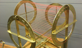
In 1876-1878, Baron Lord Kelvin builds his harmonic analyzer and tide predictor machines. The harmonic analyzer broke down complex harmonic, or repeating, waves into the simpler waves that made them up. The tide predictor machine could calculate the time and height of the ebb and flood tides for any day of the year.
Sources:
Luigi M Bianchi (2003) Lecture 20: Analog vs Digital. Photo from Allison Marsh (2024) https://spectrum.ieee.org/tide-predictions.
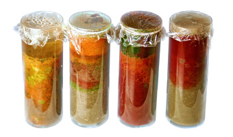
1880 – Winogradsky Columns
The Winogradsky column, invented by Sergei Winogradsky, consists in a transparent cylinder for analyzing microbial life by observing how the metabolism of micro-organisms evolve over time in stratified layers. By producing a small closed ecosystem, the column enables observing how bacteria can survive by providing a temporal and spatial visualization of layers such as in ecology, microbiology. Sources: The Microbiome of Your Gut Winogradsky Column—Microbial Evolution in a Bottle S. Kuznetsov, W. Harrigan-Anderson, H. Faste, S.E. Hudson, E. Paulos, Community engagements with living sensing systems, Proceedings of the 9th ACM Conference on Creativity & Cognition C&C'2013, ACM Press, pp. 213-222.
1880 – Klein's Mathematical Plaster Models
In the 19th century, mathematicians became interested in the question how mathematical functions look like. Felix Klein, a German mathematician, had several of such physical models in his lab in Göttingen, and popularized them in America when he brought a boatload to the World's Fair in Chicago in 1893. The photo above shows a model of a Clebsch surface from 1880, designed and presumably built by Adolf Weiler, Klein's grad student. It is kept today at the University of Göttingen. Sources: Photo by Jonathan Chertok. Joshua Batson, This Is What Math Equations Look Like in 3-D, Wired (2014) Göttingen University Clebsch's diagonal surface (thanks to Alba Marina Málaga Sabogal for sending us this reference).
1885 – Ammassalik Wooden Maps
These three-dimensional maps were carved by inuits from the Ammassalik Fjord in Greenland, and used as eyes-free guides for sailing. The left one shows coastline, the right one shows a sequence of offshore islands. These inuit communities had had no direct contact with Europeans before a Danish explorer met them in 1885 and was shown the wooden maps. Sources: Bill Buxton (2007). Sketching User Experiences. page 36. Wikipedia. Ammassalik wooden maps.
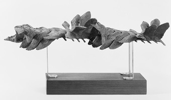
1887 – Marey's Movement Sculptures
Bronze sculpture showing the phases of the flight of birds, created by French scientist Étienne-Jules Marey in 1887 based on photographs. Étienne-Jules Marey was a pioneer in the study of dynamic phenomena and invented a variety of scientific and medical instruments, photography techniques, and temporal visualization methods. A wealth of information is available about him online. Sources: Russel Naughton (2007) Aviation and Aeromodeling History - Étienne-Jules Marey (1830 - 1904). Wikipedia article on Etienne-Jules Marey. Marey (1890) Psychologie du mouvement - Le vol des oiseaux. Left image from www.histoire-image.org. Right image from Russell Naughton. Related: Also see our entry on Peter Jansen's movement sculptures, inspired by his work.
1889 – Gaudí's Hanging Chain Models
Spanish Catalan architect Antoni Gaudí disliked drawings and prefered to explore some of his designs — such as the unfinished Church of Colònia Güell and the Sagrada Família — using scale models made of chains or weighted strings. It was long known that an optimal arch follows an inverted catenary curve, i.e., an upside-down hanging chain. Gaudí's upside-down physical models took him years to build but gave him more flexibility to explore organic designs, since every adjustment would immediately trigger the "physical recomputation" of optimal arches. He would turn the model upright by the way of a mirror placed underneath or by taking photographs. Sources: memetician (2007) A different kind of string theory: Antoni Gaudi. Rafael Gomez-Moriana (2012) Gaudí’s hanging chain models: parametric design avant la lettre? Frank Derville (2012) Gaudi's models - Why Gaudi realized one of Viollet le Duc's ideals. Wikipedia article on Catenary. Left image by KK Clark, Right image by memetician.
1890 – Polynesian Genealogical Instrument
This artefact from the Marquesas Islands (French Polynesia) served as a memory aid for reciting genealogies during ceremonies. Each thread, made of woven coconut fiber, is a genealogical line and each knot is a generation. The genealogy goes back to the mythical origins of Earth, materialized by the oblong ball on top, made of wood (see left image). The date of the artefact is unknown. It was collected by Alphonse Long, French navy physician, while he was on duty in the Marquesas Islands between 1882 and 1891. Such objects are rare and poorly studied. This one was acquired by the Musée du quai Branly in 2012 for 73,000€. Sources: Photos taken in May 2015 at the Musée du quai Branly (see label). Musée du quai Branly, Rapport d'activité 2012. Pierrick Moritz (2012) Le musée du quai Branly préempte deux objets des Îles Marquises chez Christie's.
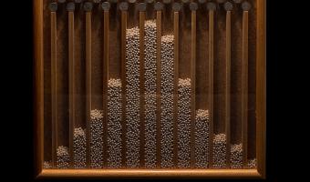
1893 – Galton Board
The galton board (named after and invented by Sir Francis Galton) is a physical device consisting of a vertical board with rows of interleaved pegs. The board illustrates the central limit theorem, by showing that beads dropped onto the pegs in the middle at the top end up in bins at the bottom approximately following a normal distribution, with most beads staying close to the middle.
Sources:
Wikipedia Article on the Galton Board. Photo by Matemateca (IME/USP)/Rodrigo Tetsuo Argenton, CC-BY-SA 4.0 on Wikimedia Commons.
1896 – James Ive's Mechanical Teaching Map
The boundaries of the United States transformed during the 19th century, often through violent means. Mapmaker James Ives created this mechanical map to help people, especially students, visualize these changes. Sources: Leventhal Map Center (2019) Tweet. Boston Rare Maps (2016) Fantastic mechanical map of United States territorial expansion. Video by the Leventhal Map Center.
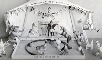
1897 – Stop Motion Animation
Stop motion animation is the frame-by-frame capture of (generally) inanimate objects which are manipulated by increments in order to produce the illusion of motion. It was first used in movies to produce magical effects. The first movie to use this technique was The Humpty Dumpty Circus (1897), where a toy circus of acrobats and animals comes to life (left image). With modern 3D computer graphics, stop motion animation has become largely obsolete, but remains occasionally used. A particularly appealing example is the "Bears on Stairs" video made in 2014 by the creative agency DBLG (video on the right), where a computer model of a bear was 3D-printed in many different poses to create a surprisingly smooth stop motion animation. For an example of how stop motion animation can be used for telling stories about data, see our entry 1965 - Stop Motion Animation of Physical 3D Map. Sources: Wikipedia, Stop Motion. Burgett (2014) ‘Bears On Stairs’ Is a Ridiculously Smooth Stop Motion Animated Video. Left image from youtube user teamrandom21. Right image from DBLG.
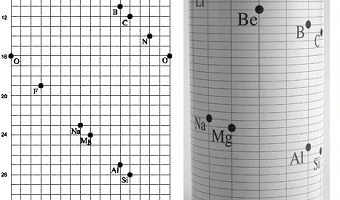
1898 – Crookes' Vis Generatrix
Model of Crookes’ "Vis Generatrix" made in 1898, built by his assistant, Gardiner. From: Proc. R. Soc. Lond. 63, 408. The vertical scale represents the atomic weight of the elements from H = 1 to Ur = 239. Missing elements are represented with a white circle. Similar elements appear underneath each other. With this model, Crookes was trying to visualize the hypothetical relationship between various elements in three dimensions. See all the other entries with the tag "periodic table" to see other historical examples. Sources: Handbook on the Physics and Chemistry of Rare Earths, Volume 41 page 45. "Types of graphic classifications of the elements. III. Spiral, helical, and miscellaneous charts." Journal of Chemical Education 11, no. 5 (1934): 288. Principles of General Chemistry, made available by Andy Schmitz (lardbucket.org). Chapter 7 - The Periodic Table and Periodic Trends
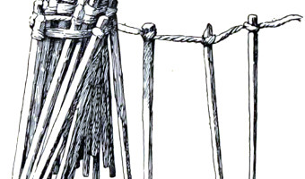
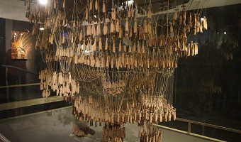
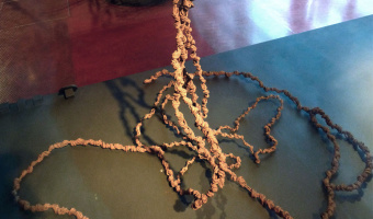
1898 – Tallies Used as Social Displays on Pacific Islands
In the 19th century, the Torres Strait Islanders did not have a numeral system and used sticks to keep counts. Sticks were tied to a string, forming a bundle (called kupe) that could be rolled and unrolled when needed. Kupes were typically used by men to keep track of their accomplishments, such as turtles caught in deep water, fishes speared, or adventures with women (as the one above). These physical visualizations were used as social displays, and big kupes were greatly prized. According to Haddon (1912): These tallies are left entirely to a man's honour; a man may have doubts about the correctness of another's tally, but he would never dare single-handed to express an opinion doubting it. Sometimes a crowd may chaff a man whom they suspect of chearing and get him to confess that he was only 'gammoning'". Kupes have elements of self-logging, as well as using physical visualizations for social purposes (see our entries on SweatAtoms and Meshu.io). They were first reported by British biologist and anthropologist Alfred Cort Haddon after a 1898 expedition, but they are likely much older. Tallies were used all over the world and some of them are very old. The prehistoric artefacts found in the Blombos Cave in South Africa included a piece of ochre on which tally marks were seemingly made, as well as pierced shells that seem to have been strung on cord and worn. These artefacts date back from between c. 100,000 and 70,000 years. Sources: Alfred Cort Haddon (1912) Reports of the Cambridge Anthropological Expedition to Torres Straits, Volume 4. pp 262-263. Wikipedia. Alfred Cort Haddon. Wikipedia. Blombos Cave.
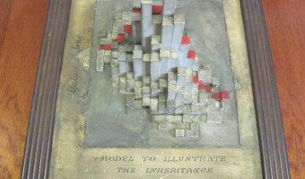
1900 – Pearson and Lee's Height Correlation Chart
The physical model on the left is a bivariate histogram showing the correlation between the heights of fathers (horizontal axis) and sons ("vertical" axis). This data was famously collected by Karl Pearson and Alice Lee between 1893 and 1898. The physical visualization is thought to have been constructed around this time period or soon after, possibly under the supervision of Pearson. It is kept at the Department of Statistical Science, University College London, founded by Pearson in 1911. I (Pierre) learned about this model after seeing a more recent model in the archives of the collection of solid mathematical models at the Institut Henri Poincaré (right image). A label said "Model Prepared by Dept. of Statistics, University College London". I then wrote to Professor Richard Chandler, current chair of the statistics department, to ask if he had more information about this model. He replied soon after: Thank you for your message below. This is interesting … I have never seen this particular model before, but the labelling looks very similar to some exhibits that were prepared for an event at the Royal Statistical Society in (I think) the 1980s. I arrived at UCL in 1994: at that time there were some people in the department who had been involved in that event. Unfortunately they are no longer with us, so I can’t provide any further information. I can, however, speculate that the model you’re showing is a cardboard copy of a much older one that was prepared at the end of the 19th century, probably under the supervision of Karl Pearson. We still have this. I found this particular model in my desk drawer when I first arrived at UCL: it was broken into a very large number of pieces, but I had it restored. It is quite a nice piece of 19th-century data visualisation, I think! Upon closer examination, the newer model does not show the same dataset as the older model. The following R code replicates the older model exactly, confirming that it shows the original dataset from Pearson and Lee: library(dplyr) library(HistData) library(plot3D) d = HistData::PearsonLee %>% filter(par == "Father" & chl == "Son") %>% reshape2::acast(parent~child, value.var="frequency") plot3D::hist3D(z = d[nrow(d):1,], col="white", border="black", shade=0.2, phi=60, theta=0) Sources: Pearson, K., & Lee, A. (1903). On the Laws of Inheritance in Man: I. Inheritance of Physical Characters. Left photo kindly sent by Richard Chandler. Right photo taken by Pierre Dragicevic during a visit kindly organized by Alba Málaga and guided by François Apéry.
1900 – Crum Brown's Mathematical Surface
Model by Alexander Crum Brown (1838-1922) of a half-twist mathematical surface, featuring a non-Euclidean so-called Klein bottle, c. 1900. Sources: Photo from the Science Museum, London, textual description courtesy of Klaus Hentschel. For more, see Klaus Hentschel (2014): Visual Cultures in Science, Technology and Medicine, pp. 96ff. and pl. XIV.
1900 – Modern Solid Terrain Modeling
The Institute of Cartography ETH Zurich published a great review of past and present techniques for doing solid terrain modeling. Although terrain models are not physical visualizations in the strict sense, the techniques could be in principle used to convey data. Physical terrain models were already being built in 16th the century, and the review covers modern techniques from the early 20th century to today's digital fabrication. Source: Institute of Cartography ETH Zurich (2006) Terrain modeling website - Production techniques.
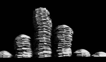
1901 – Davenport's Physical Distributions
In 1901, biologist Charles Davenport "built" physical visualizations that show the distributions of features of objects and people. These visualizations were made out of the objects and the people themselves. The purpose was to explain the notion of statistical distribution to a lay audience. On the left image, seashells are piled up according to how many ribs they have. On the middle image, students are arranged in bins according to their height. On the right image, they are simply sorted. Charles Davenport's research on eugenics may be controversial. Nevertheless, his explanation of statistical distributions has a clear pedagogical value. His examples also show that spatial arrangement is a key feature of data visualizations, and that a good spatial arrangement can augment cognition even without the use of abstract mappings and encodings. Source: Davenport (1901) The Statistical Study of Evolution.

1905 – Rubens Tube
A Rubens tube, also known as a standing wave flame tube, or simply flame tube, is a physics apparatus for demonstrating acoustic standing waves in a tube. Invented by German physicist Heinrich Rubens in 1905, it graphically shows the relationship between sound waves and sound pressure, as a primitive oscilloscope. Today, it is used only occasionally, typically as a demonstration in physics education.
The middle image shows materials scientist Anna Ploszajski blowing a trumpet into a Rubens tube. See full YouTube video.
The right image shows a 2D Rubens tube, also called a pyro board. See full YouTube video.
Sources:
Quote from the Wikipedia article on the Rubens tube. Left image from shop.wf-education.com. Middle image: still from a 2023 YouTube video by The Royal Institution. Right image: still from a 2014 YouTube video by Veritasium. Related: Also see our entries 1866 – Kundt’s Tube and 1787 – Chladni Plates.
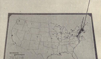
1907 – Pin Maps
Left image: residence of Harvard students 6 years after their graduation (1907); made with beads, pins and wires. Middle image: Sources of the 3,000 first letters of appeal sent to Mrs. E. H. Harriman (1912); eight different kinds of pins were used to represent different kinds of appeals. Right image: collection of pins and beads made for maps. Sources: Willard Cope Brinton (1914) Graphic Methods for Presenting Facts pp. 227-253. John Krygier (2010) A Discourse on Map Pins and Pinnage. New York Times (1912) 6,000 Letters Beg $267,000,000 of Mrs. E. H. Harriman.
1913 – Frankfurt Streetcar Load
Strips of woods glued on top of each other convey the average number of passengers carried between two stops. Each strip corresponds to 4,000 passengers. Shown at the 1913 International building trade exhibition in Leipzig. Source: Willard Cope Brinton (1914) Graphic Methods for Presenting Facts pp 224-226.
1914 – Solid 3D Curves for Engineering
In his 1914 book, Brinton discusses various techniques for building solid models of three-dimensional charts and functions for the purposes of engineering, and uses the two designs above as examples. Although these don't look like they could be solid models, the text from Brinton's book suggests they are. The first one (left) is made of plaster and shows the characteristics of a light bulb. The second (right) is made of cardboard and shows the results of tests of a fan. The two artifacts are undated. Source: Brinton (1914) Graphic Methods for presenting facts, pp 335-337.
1915 – Wire Models of Factory Worker Movements
3D wire models of hand motion paths (or chronocyclegraphs) created by Frank Gilbreth, a pioneer in the study of motion in the workplace. In his 1917 book, Gilbreth explains how he created these solid models from time-lapse photographs, and how useful they are to study and teach human motion. Left image: Wire model of foreman on drill press. This shows “positioning” in the midst of “transporting.” Right image: First photograph of wire models showing one man's progress of learning paths of least waste. These wires represent the paths of the left hand of a manager on a drill press, - a machine which he had not touched for twenty-five years. Sources: Régine Debatty (2012) The Chronocyclegraph. Everardo Reyes-Garcia (2014) Explorations in Media Visualization. Frank Bunker Gilbreth (1917) Applied motion study; a collection of papers on the efficient method to industrial preparedness. Left image from Régine Debatty, right image from archive.org.

1920 – Yakama Time Ball
Women from the Yakama Native American tribe used strings of hemp as personal diaries. Each major event in their life was represented by a knot, a bead or a shell. This mnemonic device is called an Ititamat, or counting-the-days ball, or simply time ball. The first image shows an Ititamat created before 1920. On the second image, each string is a different Ititamat. The last image shows a 2003 replica. A young woman would use a time ball to record her courtship, marriage, and other experiences using a system of knots and beads that only she could decipher. As she grew older, a woman might have several time balls with which to share her life story or keep those memories private. When she passed on, they were buried with her. The ball of twine grew in size as time passed and as events occurred. The women would sometimes divide the twine into 25-year lengths to make it more manageable. When the women were very old, they could use the knots and beads of their time balls to recall not only what happened in their lives but when the events occurred. They could easily recount when their children were born, when they moved away, and other major experiences. Sources: Helen H. Schuster (1990) The Yakima. pp. 33-35. Lone Grey Squirrel (2007) Time Ball. Marjanović D., Štorga M., Škec S., Bojčetić N., Pavković N. (2018) Data Objects: Design Principles for Data physicalization. First image from the Cooper Hewitt Smithsonian Design Museum. Second image from Schuster's book (ibid). p. 35. Third image from ideiasdefora.com. Artefact exhibited in the Smithsonian Museum of the American Indian, Washington D. C. Related: Also see our entry on Torres Strait Islanders tallies and on the Polynesian Genealogical Instrument.
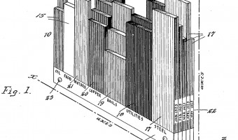
1926 – Karsten's Tridimensional Chart
American economist and statistician Karl G. Karsten patented a method for creating physical visualizations of temporal data by stacking two-dimensional plates, each representing a time period. Each of the plates shown above is a variable-width column chart representing the state of the stock market at the end of a particular month. Each bar is a type of stock, where the height of the bar encodes the stock price and its width encodes volumes of sales. Each month, a new layer is added. Seen from above, this 3D visualization becomes a 2D stacked bar chart showing volumes of sales across time. Karl G. Karsten wrote a book entitled Charts And Graphs in 1925, where he discusses physical visualizations used in engineering. Many of these were previously discussed in John Peddle's 1910 book The construction of graphical charts and Willard Cope Brinton's 1914 book Graphic Methods for Presenting Facts. Source: Karl G. Karsten (1926) Tridimensional Chart. US Patent. Related: Also see our entries 1935 – 3D Visualizations of Power Consumption and 1951 – Electricity Generated or Demanded.
1930 – Mathematical Functions Embodied in Ballistic Cams
These cams are solid models of bivariate and univariate mathematical functions plotted in cylindric coordinates (left and middle images) and polar coordinates (right image). They were not meant to be visually examined, but were used in mechanical analog computers for aiming battleship guns during WWII. They were also called computing cams. Mechanical fire control aids started to be developed in the 1900s and and were still in use in the late 1980s. During WWII, they could solve multivariate calculus problems in real-time. While cams were used for hard-coded functions, gears were used for arithmetic calculations and other specialized devices were used for multiplication and differential calculus. The design of these analog computers is clearly explained in the video and PDFs linked below. The oldest known mechanical analog computer is from 150BC (see our entry greek orrery). Cams were already used in 300BC to control automata, and were further developed in the 13th century by polymath Ismail al-Jazari. Sources: US Navy (1953) Basic Mechanisms in Fire Control Computers (Video). US Navy (1944) Basic Fire Control Mechanisms (PDF files). Sean Gallagher (2014) Gears of war: When mechanical analog computers ruled the waves. Wikipedia articles on Rangekeepers, Cams, and al-Jazari.
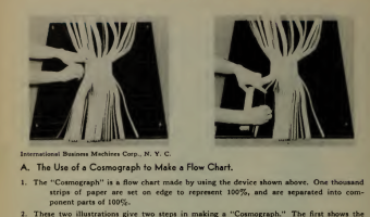
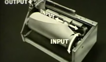
1933 – IBM's Cosmograph
The left image above shows a physical flow chart (Sankey diagram) made of 1000 sheets of paper. It was not meant to be directly read, but to be photographed (see right image). The physical apparatus, called Cosmograph, allowed people without graphic skills to easily produce nice-looking Sankey diagrams. It was copyrighted by IBM in 1933 and sold for $50. Sources: Willard Cope Brinton (1939) Graphic Presentation, p. 78. Jim Strickland (2012) Cosmograph? What's a Cosmograph?
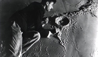
1934 – Hayward's Moon Model
Illustrator and model-maker Roger Hayward (1899-1979) working on a model of the lunar surface for the Griffith Planetarium, 1934. Sources: Kevin Kidney (2009) Mr. Hayward's Moon Model. Photo from Keven Kidney's blog, textual description courtesy of Klaus Hentschel. For more, see Klaus Hentschel (2014): Visual Cultures in Science, Technology and Medicine, pp. 217-226.
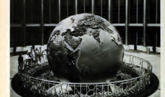
1934 – Ford's Globe
A large rotating relief globe showing Ford company's industrial sites around the word, exhibited at the Chicago World's Fair in 1934. Sources: Willard Cope Brinton (1939) Graphic Presentation, p. 160. The Henry Ford Blog (2013) Ford at the Fair. More photos from the Henry Ford Online Collection.
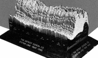
1935 – 3D Visualizations of Power Consumption
A large 3D physical visualization made by the Detroit Edison Company showing electricity consumption for the year 1935, with a slice per day and each day split into 30 min intervals. Two other examples from different Edison electricity companies are discussed in Brinton's book. These physical visualizations seem to have been used to better anticipate power demands. Sources: Willard Cope Brinton (1939) Graphic Presentation pp 354-355. Howard A. Spielman (2006) "Virtual Reality" Circa 1935. Related: Also see our entry 1951 - Electricity Generated or Demanded.
1939 – Map of Great Britain's Marine Trade
A physical World map made of copper and glass showing the size of Great Britain's merchant marine and the main trade routes as 9,000 miniature ship models. Exhibited at the New York World Fair in 1939. Sources: Willard Cope Brinton (1939) Graphic Presentation, p. 207. Life Magazine (1939) New York Opens the Gates to the World of Tomorrow. Vol. 6, No. 20, May 15 1939.
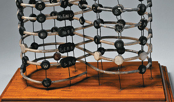
1940s – Stedman's 3D Periodic Table
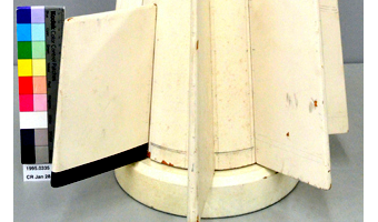
Dr. Don Stedman from the National Research Council Canada designed this 3-D periodic table in the 1940s. Stedman considered many factors and characteristics of the elements as he designed his models. While in this model all the usual groups of elements are found, changes from one group to another are also represented, and their origins are more easily understood. Stedman believed that his model gave more insight into “the orderly development and classification of the elements.” Source: Canada Science and Technology Museum, CSTMC/SMSTC – 1995.0335
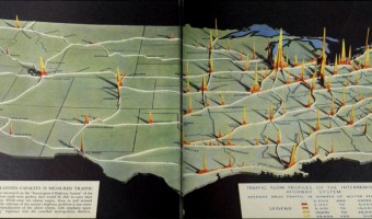
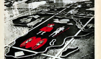
1941 – Traffic Flow Profiles of the Interregional Highway System
2D area diagrams encoding average daily traffic as height and color are set up along their respective highways on a background map of the US. Background map seems to be a cut-out wooden panel; area diagrams potentially cardboard, or also wood veneer. Source: In: Fortune, June 194, pp. 94-95. Original by-line reads "Map by PRA. Photograph by Richard Carver Wood". PRA is presumably the Public Roads Administration (cf. https://en.wikipedia.org/wiki/Federal_Highway_Administration#History). Accessed via https://archive.org/details/fortune23aprluce/page/94 (Last visit: 30 April 2019)

1943 – Dymaxion Map & Folding Globe
“Also know as the “Dymaxion Map,” the Fuller Projection Map is the only flat map of the entire surface of the Earth which reveals our planet as one island in one ocean, without any visually obvious distortion of the relative shapes and sizes of the land areas, and without splitting any continents. It was developed by R. Buckminster Fuller.
All flat world map representations of the spherical globe contain some amount of distortion either in shape, area, distance or direction measurements. On the well-known Mercator world map, Greenland appears to be three times its relative globe size and Antarctica appears as a long thin white strip along the bottom edge of the map. Even the popular Robinson Projection, now used in many schools, still contains a large amount of area distortion with Greenland appearing 60 percent larger than its relative globe size.”
Fuller’s view was that given a way to visualize the whole planet with greater accuracy, we humans will be better equipped to address challenges as we face our common future aboard Spaceship Earth.
The word Dymaxion, Spaceship Earth and the Fuller Projection Map are trademarks of the Buckminster Fuller Institute. All rights reserved."
Source: Buckminster Fuller Institute
Related: Also see our other entries on physical globes and maps.
1945 – Electron Density Map and Molecular Model of Penicillin
Electron density map and model of Penicillin created by Dorothy Crowfoot Hodgkin in 1945 based on her work on X-ray crystallography. The Penicillin molecule was the first molecule whose structure was derived entirely from X-ray data. Dorothy Hodgkin later received the Nobel price for applying the same technique to determine the structure of the B12 molecule. Dorothy Hodgkin (1910-94) was awarded the prestigious and exclusive Order of Merit in 1965 to add to her 1964 Nobel Prize for ”her determinations by X-ray techniques of the structures of important biochemical substances”. The Order of Merit is a group of 24 individuals of great achievement in the fields of the arts, learning, literature and science. Hodgkin was only the second woman to be part of the exclusive group - the first was Florence Nightingale. Sources: Hodgkin, Dorothy Crowfoot: The X-ray analysis of complicated molecules. Nobel Lecture, December 11, 1964. Image source: Science Museum, London. Blog of the Science Museum, London.
1947 – Dorothy Hodgkin's Electron Density Contours
Nobel prize winning crystallographer Dorothy Crowfoot Hodgkin created another physical visualization in the mid 1940's, showing part of the structure of penicillin. An original of this artifact is in the Oxford Museum of the History of Science. This technique recently inspired artist Angela Palmer for her glass portraits. Sources: Lachlan Michael and David Cranswicka (2008) Busting out of crystallography's Sisyphean prison: from pencil and paper to structure solving at the press of a button: past, present and future of crystallographic software development, maintenance and distribution. Oxford Museum of the History of Science. Model of the Structure of Penicillin, by Dorothy Hodgkin, Oxford, c. 1945.
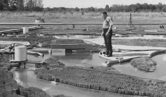
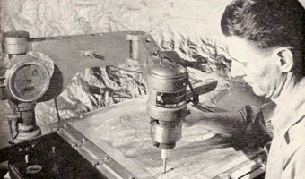
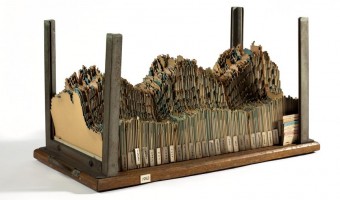
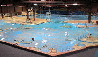
1949 – Mississippi River Basin Model
As a response to devastating floods of the Mississippi river in the early 1900s, the US Army Corps of Engineers built a large-scale hydraulic model of the entire river system. The model, 2.5 times the size of Disneyland, allowed them to design better flood control infrastructures and to eventually save millions of dollars. In 1973, the physical model ceased to be used and was replaced by computer models. Nevertheless, mathematical equations still cannot capture all the complexity of river dynamics, and physical models (albeit smaller) continue to be used by hydraulic engineers. Sources: 99 Percent Invisible Podcast (2016) America’s Last Top Model. Wikipedia (2016) Mississippi River Basin Model. Left image from 99 percent invisible, right image from Wikipedia.
1949 – Moniac: A Hydromechanical Machine to Teach Economics
The MONIAC or Phillips machine is a hydromechanical analog computer built to teach basic economical principles using colored water flowing in transparent pipes. The machine was built in 1951 after electrical-engineer-turned-economist William Phillips and his economist colleague Walter Newlyn realized that flows were used as a metaphor to teach economics, but have never been made physical. Phillips is also known for his eponymous curves. Several MONIACs were built, and a working one is permanently displayed at the Economics Department of Cambridge University. Sources: Bissell (2007) The Moniac: A Hydromechanical Analog Computer of the 1950s. The museum of the Reserve Bank of New Zealand also has a working MONIAC and a Youtube video explaining it. Image from fulltable.com. Morgan & Boumans (1998) The Secrets Hidden by Two-Dimensionality: Modelling the Economy as a Hydraulic System. The original article by the creator of the machine: Philips (1950) Mechanical Models in Economic Dynamics.
1951 – Electricity Generated or Demanded
A 3D chart made out of a jagged cardboard for each year representing generated electricity and demand over time. Three-dimensional chart used by Central Electricity Generating Board planners, c.1954. Consists of about 300 cards with square-cut stepped edges in an enclosure of chrome steel uprights, mounted on a wooden base, with a handle at each end. Data represented from October 1951 to April 1954. An early example of 3D data visualisation [...] Sources: Alice Cliff and Jenny Rinkinen (2018) Visualising electricity demand: use and users of a 3D chart from the 1950s. (CC-BY-NC-SA) Photos: The Board of Trustees of the Science Museum (link) Related: Also see our entry 1935 - 3D Visualizations of Power Consumption.
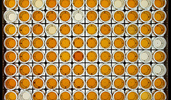
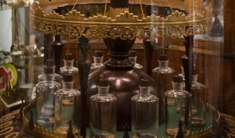
1951 – Microtiter Plates
A microtiter plate is an array of chemical test tubes called "wells", invented in 1951 by a Hungarian medical doctor. They are used in a variety of experimental designs, most typically biochemistry assays. The picture above is an example of a colorimetric assay result. Most of the time, they are not directly interpreted visually, as in this example, but are instead put into a plate reader that measure light transmission in each well and converts it to a numerical result. See an example catalog from a vendor. Liquid handlers make it possible to create these visualizations automatically. Sources: The text above is adapted from an e-mail by Jon Hill. Picture from Gould and Lashomb (2005) Bacterial Leaf Scorch of Shade Trees. Wikipedia (2013) Microtiter plate. Also see this blog post on how chemical reactions can be used to create bar charts.
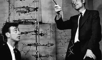
1953 – Watson and Crick's 3D Model of DNA
In 1953, James Watson and Francis Crick suggested what is now accepted as the first correct double-helix model of DNA structure in the journal Nature. Their double-helix, molecular model of DNA was then based on a single X-ray diffraction image taken by Rosalind Franklin and Raymond Gosling in May 1952, as well as the information that the DNA bases are paired. Experimental evidence supporting the Watson and Crick model was published in a series of five articles in the same issue of Nature. Of these, Franklin and Gosling's paper was the first publication of their own X-ray diffraction data and original analysis method that partially supported the Watson and Crick model; this issue also contained an article on DNA structure by Maurice Wilkins and two of his colleagues, whose analysis supported their double-helix molecular model of DNA. In 1962, after Franklin's death, Watson, Crick, and Wilkins jointly received the Nobel Prize in Physiology or Medicine. Sources: Image from thehistoryblog.com. Text from Wikipedia.
1957 – US Army Corps of Engineers San Francisco Bay Model
A working hydrodynamic model of San Francisco Bay and the surrounding waterways, with tides. It is still open to the public as a demonstration, although it is no longer used for research. <em>Source:</em> Wikipedia <a href="https://en.wikipedia.org/wiki/U.S._Army_Corps_of_Engineers_Bay_Model">U.S. Army Corps of Engineers Bay Model</a>. Related: Also see our related entry 1949 – Mississippi River Basin Model.

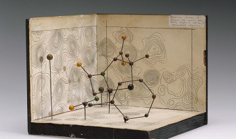
1957 – Proteine Visualizations
Left image: The very first physical model of a protein (myoglobin) built by crystallographer John Kendrew in 1957 using plasticine. The image is from a 1958 Nature article, for a more recent photo see here. In 1960 Kendrew completed a higher-resolution skeletal model known as the "forest of rods". The model was 2-meter wide, made of brass, and supported with 2,500 vertical rods, making it barely legible. Colored clips were attached to the rods to visualize electron density. See photos here and here. Middle image: Biochemist Max Perutz working on a model of hemoglobin similar to the "forest of rods", completed in 1968. Hemoglobin is made of 10,000 atoms. Perutz and Kendrew shared the 1962 Nobel Prize in Chemistry for working out the structure of those giant molecules. Right image: A visualization device built by biochemist Fred Richards in 1968 and known as the "optical comparator", the "Richards Box" or "Fred's Folly". This device taller than a person used a half-silvered mirror to optically combine a wireframe physical protein model with electron density maps. Sources: Eric Martz and Eric Francoeur (1997-2004) History of Visualization of Biological Macromolecules. Michael L. Connolly (1996) Molecular Surfaces: A Review Jeremy Norman's History of Science.com Online Bookshop Emily Candela (2012) Assembling an aesthetic. Protopedia entry on Frederic Richards Video interview wit Max Perutz (see 14:20 to see one of the physical models and hear him talk about how physical models affected the way he looked at his work).
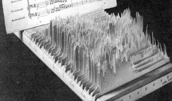
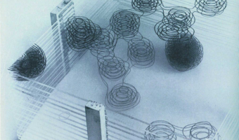
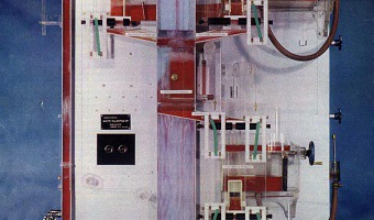
1960 – 3D Spectrogram
The object on the left may be one of the first sound sculptures. It appears in a 1960 book by German acoustician and musicologist Fritz Winckel (click on the middle image to see the full page). It is a physical 3D spectrogram showing a frequency analysis of an 8-second recording of Beethoven's Eighth Symphony. The left axis is frequency, the bottom/right axis is time, and the vertical axis is the strength of a particular frequency at a particular time. The figure caption uses the term "sonagram", which is how spectrograms were called back in the 1960s. This term originates from the first audio spectrometer called the "Sona-Graph" and commercialized in 1951. The figure caption also uses the unit "kcps" which means kilocycles per second, and is now called kilohertz (kHz). Winckel's book provides no information about the origin of the physical spectrogram, and does not explain how it was built. Nowadays 3D spectrograms are frequently rendered on computers. The video on the right shows an animated 3D spectrogram. Sources: Fritz Winckel (1967) Music, Sound and Sensation: A Modern Exposition, p.76. The original 1960 book is in German, but the scan available on archive.org does not feature the image. Nathan Pieplow (2009) A Brief History of Spectrograms. Wikipedia, Cycle per second.
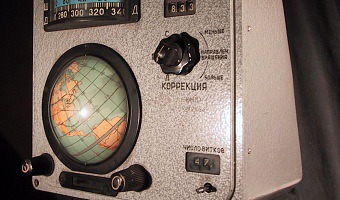
1961 – Voskhod Spacecraft 'Globus' IMP navigation instrument
This device was the location indicator for Russian spacecrafts from the world's first manned spaceflight by Yuri Gagarin, 12 April 1961, until 2002. It contains a mechanical computer and a physical globe which rotated to always display the point on earth exactly underneath the spacecraft, or, alternatively, the point where the spacecraft would land if the re-entry rockets where fired at that exact moment. The numbered bullets on the globe in the third picture indicate radio communication centers linked to mission control in Moscow. Source: Wikipedia.
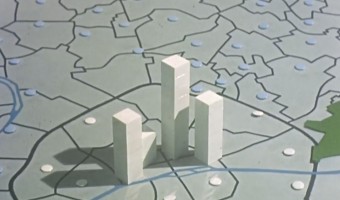
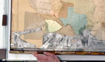
1965 – Stop Motion Animation of Physical 3D Map
This educational movie from the 1960s uses physical bars and stop motion animation to show the evolution of population in the Paris area between 1801 and 1961. It was made between 1962 and 1967 by the Institut des Sciences Humaines Appliquées (ISHA) and the Centre de Mathématique Sociale et de Statistique (CMSS), in collaboration with the Laboratoire de Cartographie directed by Jacques Bertin. You can see the physical visualization from all sides by jumping at 18:40 in the video. Sources: Film provided by the Archives Nationales and digitized by us. CAMS (2015) Histoire du CAMS.
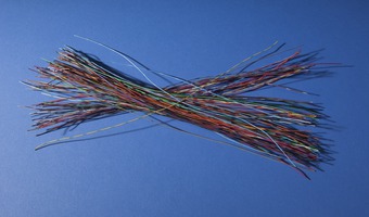
1968 – Grace Hopper's Nanoseconds
Grace Hopper, a computer scientist and US Navy Rear Admiral, used wire to visualise very short durations of time in computing. Each wire is cut to the maximum distance that light or electricity can travel in a nanosecond, one billionth of a second. She wanted programmers to understand 'just what they're throwing away when they throw away a millisecond', and describes using them to help military commanders understand why signals take so long to relay via satellite.
This lecture was given at MIT Lincoln Laboratory on 25 April 1985 (video above); she used the short wires as a visual teaching method from the late 60s. A bundle of her nanosecond wires are in the Smithsonian Museum (left photo above).
From the Smithsonian Collection Website, under a CC0 license:
This bundle consists of about one hundred pieces of plastic-coated wire, each about 30 cm (11.8 in) long. Each piece of wire represents the distance an electrical signal travels in a nanosecond, one billionth of a second. Grace Murray Hopper (1906–1992), a mathematician who became a naval officer and computer scientist during World War II, started distributing these wire "nanoseconds" in the late 1960s in order to demonstrate how designing smaller components would produce faster computers.
The "nanoseconds" in this bundle were among those Hopper brought with her to hand out to Smithsonian docents at a March 1985 lecture at NMAH. Later, as components shrank and computer speeds increased, Hopper used grains of pepper to represent the distance electricity traveled in a picosecond, one trillionth of a second (one thousandth of a nanosecond).Reference: Kathleen Broome Williams, Grace Hopper: Admiral of the Cyber Sea, Annapolis, MD: Naval Institute Press, 2004.
Grace Hopper (1906-1992) was one of the first programmers of the Harvard Mark I computer, and invented compilers and machine independant programming languages, which underpin most of modern computing. She earned a Ph.D. in mathematics from Yale University and was a professor of mathematics at Vassar College before joining the Navy reserves during World War II. She was behind the development of COBOL in the 1960s; was the first person to use the phrase 'bug' for programming faults, and was posthumously given the Presidential Medal of Freedom in 2016. [Biography summarised from Wikipedia]
1968 – Charles Csuri's Numeric Milling Sculpture
Csuri's wooden sculpture Numeric Milling is one of the few early computer sculptures created with a computer-driven milling machine... This work made use of the Bessel function to generate the surface. The computer program then generated a punched tape to represent the coordinate data. Included were instructions to a 3-axis, continuous path, numerically controlled milling machine. Sources: Csuri Project: Plotter Drawing, 1966 - 1970: Numeric Milling Photo of Numeric Milling Sculpture courtesy of Charles Csuri
1968 – Jacques Bertin's Reorderable Matrices
The reorderable matrix is a physical device developed in the mid 1960s by French cartographer Jacques Bertin for exploring and presenting tabular data. Bertin designed several reorderable physical matrices he called Dominos, each with a different size and visual encoding. The first three images above show a small, medium, and large version. A rod mechanism allowed unlocking either rows or columns for reordering. The dominos were part of a general method of “graphic information processing”, extensively described by Bertin in a relatively poorly-known 1977 book. This method stems from his progressive realization that, while maps and charts are traditionally drawn once for all, “mobile images” can be freely manipulated to reveal patterns. Thus he recognized the importance of interactivity three decades before information visualization. Bertin physically implemented five types of “interactive” visualizations: the family of curves (line charts on transparent paper sheets that can be superimposed) the image file (stacked cards with a visual index) the collection of maps (rearrangeable small multiples) the collection of ordered tables (rearrangeable paper tables), and finally the reorderable matrix. For Bertin, the reorderable matrix was by far the most powerful tool. His method required that numerical data be collected on a paper table to start with. Then, values were converted into discrete steps, again on a paper table (7 to 11 different steps depending on the Domino version). Then, the physical matrix was assembled by choosing among a collection of physical cells that encode different ranges of values. Afterwards, the matrix was reordered to reveal patterns, which could take a long time. Finally, meaningful groups were identified and named. The result was then photographied or photocopied, and the final image was used as a figure in the scientific publication, enriched with a legend and caption. The first video (fourth image above) shows a reorderable matrix being used. The second video is an educational video explaing the method to a large audience (English subtitles are available). Bertin's method of data analysis, while time-consuming, remained popular for a while and underwent several computer adaptations. Sources: Jacques Bertin (1969) Graphique et mathématique : généralisation du traitement graphique de l'information. Jacques Bertin (1977) La graphique et le traitement graphique de l'information. Jacques Bertin (1981 translation). Graphics and Graphic Information Processing. Charles Perin, Pierre Dragicevic, and Jean-Daniel Fekete (2014) Revisiting Bertin Matrices: New Interactions for Crafting Tabular Visualizations. Serge Bonin (1998) Le développement de la graphique de 1967 à 1997. Gilles Palsky (2003) L'esprit des cartes, pp. 99-100. The first photo was taken during Jacques Bertin's 2005 interview by Jean-Daniel Fekete, Nathalie Henry and Jean-Baptiste Labrune. The second photo is from Archives Nationales. The third photo is from Bertin's book "la Graphique et le traitement graphique de l'information", captured from these slides by Torsten Möller. The two videos are 8-mm movies borrowed from the Archives Nationales and digitized by us. You can find photos of Jacques Bertin showing one of his matrices in the flickr photo set by Jean-Baptiste Labrune. Also see Jean-Daniel Fekete's interview on Jacques Bertin by Enrico Bertini, our interview by Data Stories where we demo a simplified version of Bertin's matrix made by Innar Liiv, and the Web page of Bertifier which has a comprehensive bibliography on the topic.
1970 – Byron's Bender
In the early 1970's, crystallographer Byron Rubin invented a tool that bends wires to make proteins models. The tool was popular until the 1990s. Byron Rubin became an artist who builds large-scale molecular sculptures. Eric Martz and Eric Francoeur explain how such physical models yielded important scientific insights: An example illustrating the importance of models from Byron's Bender occurred at a scientific meeting in the mid 1970's. At this time, less than two dozen protein structures had been solved. David Davies brought a Bender model of an immunoglobulin Fab fragment, and Jane and David Richardson brought a Bender model of superoxide dismutase. While comparing these physical models at the meeting, they realized that both proteins use a similar fold, despite having only about 9% sequence identity. This incident was the first recognition of the occurrence of what is now recognized as the immunoglobulin superfamily domain in proteins that are apparently unrelated by sequence. The insight was published in a paper entitled "Similarity of three-dimensional structure between the immunoglobulin domain and the copper, zinc superoxide dismutase subunit" ( Richardson et al., J. Mol. Biol. 102:221-235, 1976). Sources: Byron Rubin. molecularsculpture.com. Eric Martz and Eric Francoeur (1997-2004) History of Visualization of Biological Macromolecules. Left image from molecularsculpture.com. Right image from The Journal of Biocommunication. Related: Also see the more recent DIWire device by Pensalabs.
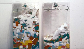
1970 – MoMA Poll: Participatory Bar Chart
German-American artist Hans Haacke created a participatory physical bar chart as part of a 1970 exhibition at the Museum of Modern Art (MoMA). The audience expressed his opinion on the question "Would the fact that Governor Rockefeller has not denounced President Nixon's Indochina Policy be a reason for your not voting for him in November?". The left plexiglass box collected "Yes" answers, while the right box collected "No" answers. Rockefeller was running for re-election and was a major donor and board member at the museum. He tried to have the piece removed the next day but without success. For more recent examples of participatory bar charts, see our entry on Lucy Kimbell's inverted participatory bar charts and our entry on Jennifer Payne's physical visual sedimentation. Sources: Found on Loren Madsen's lecture slides Art as Information - Information as Art. Graham Budgett MoMA Poll - Hans Haacke. Wikipedia article on Hans Haacke. Hans Haacke (2009) Lessons learned. Left photo from Irmgard Emmelhainz, right photo from language.cont3xt.net.
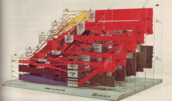
1970 – 3D Sankey Diagram
This physical 3D Sankey diagram shows complex energy flows and was created in the 70s by the Center for Strategic & International Studies (CSIS). Little information is available about it. It seems to be composed of five layers of transparent sheet, with four additional layers running perpendicularly. Physical size unknown. Source: Energy Education References Wiki. Energy Flow Diagrams 1949-2009.
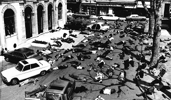
1973 – Mazamet Ville Morte
In 1973, the French town of Mazamet had a population that closely matched the nationwide number of motor vehicule deaths across the previous year. A TV reporter decided to show all inhabitants lying on the floor to symbolize these deaths. Source: Marieaunet (2010) 1973 Mazamet ville morte.

1977 – Graphical Waterfall
A graphical waterfall is a display where images are formed by water droplets falling from computer-controlled nozzles. It was invented in 1977 by Stephen Pevnick, an American artist. Graphical waterfalls can be used with regular lighting (as on the left video) or with a stroboscope (as on the right video), depending on the desired effect. It is unclear whether such devices have been already used to display data. Sources: Pevnick Design (2018), Invention of the Graphical Waterfall®. Wikipedia, Stephen Pevnick.
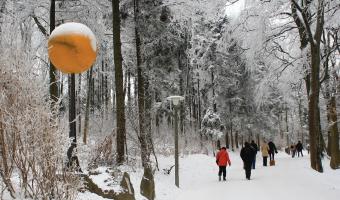
1979 – Planetenweg Uetliberg: The Solar System as a Hiking Path
Planetenweg Uetliberg is a 2h hiking path near Zurich in Switzerland. It enables people to experience the sizes and distances between the different main bodies in our solar system. The hike starts at the sun (image above). Following the path, a hiker visits the different main bodies at a scale of 1 : 1 billion (see overview included above), that is, 1 meter on the path corresponds to 1 million kilometers in space. The sun has a diameter of 1.39m. Venus has the size of a pinhead in comparison (it’s embedded in the rock in small window to the right of the panel).
Sources:
Wikipedia: Planetenweg Uetliberg [German only]. The images showing the sun and venus were taken by Roland Zh and made available via wikimedia. See here for the sun and here for venus
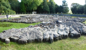
1979 – Great Polish Map of Scotland
The "Great Polish Map of Scotland" is a 50 x 40 m concrete terrain model of Scotland. It was built by a Polish sergeant who stationed in Scotland during WWII and ended up living there. It is claimed to be the world's largest terrain model, although the Chinese built a 900 x 700 m model in 1999. Source: Atlas Obscura. Great Polish Map of Scotland.

1980 – People on a Giant World Map
The World Game Workshop used a giant (basketball court size) world map to display population growth, distribution, and density, energy use, food and a host of other global variables and problems. 100 people were placed on the map, located where humanity is currently in the world, each one representing 1% of the global population. They were then placed in charge of their region and given the responsibility of solving the world’s problems.
Sources:
Post by Medard Gabel, Executive Director, World Game Institute, Global Solutions Lab. Images from https://designsciencelab.com/worldgame-2-0/. (archived version) Related: Also see our other entries on physical visualizations made of people.
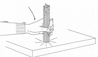
1984 – Dewdney's Analog Gadgets
Alexander Dewdney is a Canadian mathematician and computer scientist who authored the recreational mathematics column in the Scientific American magazine from 1984 to 1991, after Martin Gardner and Douglas Hofstadter. In 1984, he describes a number of imaginary analog computers he calls "Analog Gadgets", which can in principle solve computing problems instantly. The first one, shown on the left image, uses spaghetti to sort numbers. The second one uses strings to find the shortest path in a graph. The third one uses nails and a rubber band to find the convex hull. The last one illustrated here uses soap bubbles to solve the Steiner tree problem. Dewdney admits that most of these ideas were not new and were "part of computer science folklore, passed around by word of mouth and rarely described in the literature". His Scientific American article and a book he later wrote in 1993 helped popularize the ideas. These analog gadgets were only thought experiments and were never meant to be put into actual use. Still, before digital computers took over, analog computers were used to solve real problems such as the control of battleship guns. Sources: A. K. Dewney (1984) Computer recreations - On the spaghetti computer and other analog gadgets for problem solving. Scientific American. June 1984, Volume 250, Issue 6. pp. 19--26. A. K. Dewdney (1993) Analog Computation - Spaghetti Computers, in The (New) Turing Omnibus–66 Excursions in Computer Science. pp. 223--229. First three images from the 1993 book, last image from the 1984 magazine article. Related: Also see our other entries on physical computation, including Christian Freksa's use of a 3D printer to solve the shortest path problem.
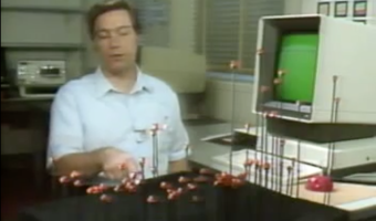
1985 – Using the Physical to Explain the Virtual
In this 1985 video, Rick Becker from AT&T Bell Labs explains the concept of "dynamic graphics". Already in the early 70s, statisticians like John Tukey were starting to experiment with multidimensional data visualization on flat computers screens, including 3D data visualizations that could be interactively rotated to convey depth. This video shows how enthusiastic these people were to transition from the physical to the virtual. Nevertheless, it is interesting to see that Rick Becker felt the need to build a physical model to explain 3D scatterplots. Later in the video, he also uses a paper cube model to explain scatterplot matrices. Sources: Becker and McGill (1985) Dynamic Displays of Data. AT&T Bell Laboratories's video library. See video on youtube See other videos.
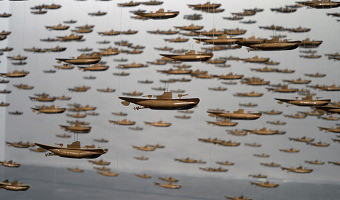
1987 – All the Submarines of the United States of America
This installation from American artist Chris Burden shows the 625 submarines of the US fleet from the late 1890s to the late 1980s. The cardboard models have been suspended at different heights to look like a school of fish. Sources: Found on Loren Madsen's lecture slides Art as Information – Information as Art. Wikipedia article on Chris Burden. Photo from Giorgia Valli, Grey Magazine. Related: Also see our other entries on single-datum physical visualizations.
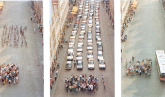
1991 – Münster Congestion Visualization
In order to encourage bus use, in 1991 the city of Münster, Germany created a poster that compares the space taken by 72 bicycles (left), 72 cars (middle), and a bus (right). This idea is not new. For example, the city of London has made a very similar poster in 1965. Thanks to Will Stahl-Timmins for pointing this out. Sources: Benjamin Starr (2014) How Much Space Do Cars Take? Cyclists Demonstrate How Bicycles Flight Congestion Image from visualnews.com
1992 – Durrell Bishop's Marble Answering Machine
In 1992, Durrell Bishop, then a student at the Royal College of Art, came up with an original answering machine design that is considered as one of the first tangible user interfaces (TUIs). The machine spits out a marble each time an incoming voice message is recorded. The order of the marbles indicates the order in which the messages arrived. Messages can be played back by putting a marble in a small dent. If the message is for somebody else it can be placed on a small dish to the side that can be labeled with names of different persons. The telephone itself also has a small receptor area for the marbles and by placing a message there, the original caller gets called back. See the video. Sources: Yvonne Jansen (2014) Physical and Tangible Information Visualization, p.12. R. Polynor (1995) The Hand that Rocks the Cradle. Left image from DocStock, right image by Matt Jones.
1992 – Tactile Infographics
In 1994 the American Printing House for the Blind publishes a short guidebook explaining how to convey infographics for the blind using tactile graphics (first and second images). Most of it is inspired by a 1992 book by Polly Edman. Although it's not clear when were the first tactile infographics created, (non-thematic) tactile maps already existed in the 1910s (right image). Sources: APH (American Printing House for the Blind), Inc. (1994) Tactile Graphics Starter Kit. Polly Edman (1992) Tactile Graphics. First and second image from the Tactile Graphics Starter Kit. Right image: Library of Congress, Map of Europe, for Blind (thanks to Evan Tachovsky for digging this out).
1993 – Slumber: Brainwave Weaving
Slumber was a multi-year gallery installation/performance by artist Janine Antoni. From the website description: Performance with loom, yarn, bed, nightgown, EEG Machine and artist’s REM reading. Antoni transforms the fleeting act of dreaming into a sculptural process. Between 1994 and 2000, the artist slept in the bed while an electroencephalograph machine recorded her eye movement. During the day, Antoni would sit at the loom and weave shreds of her nightgown in the pattern of her REM. The patterns were woven into the blanket that covered the artist as she slept at night. In developing Slumber, the artist researched dreams from the vantage of mythology, art history, psychoanalysis, and science. Through her performance, she uses mythology to reinterpret the scientific. As Antoni discusses – “Science had made a machine for the body to make a drawing. I love the idea that if art comes from the unconscious, then this particular drawing is coming straight from the unconscious onto the page without an intercession of the conscious mind.” Source: http://www.janineantoni.net/slumber/
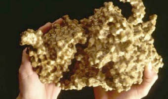
1995 – San Diego TeleManufacturing Facility
In 1995, Mike Bailey from the San Diego Supercomputer Center created the SDSC TeleManufacturing Facility to help scientists visualize their data in physical form. In 1997, the facility produced one of the first digitally-fabricated molecular models using laminated object manufacturing. The biochemists involved in the project got insights that they were not able to get from the on-screen 3D models, and concluded that: modern physical models are important tools that significantly extend the understanding of protein assembly available from modern three-dimensional computer graphical analysis. Later, the TeleManufacturing Facility moved to Oregon State University, still under the direction of Mike Bailey. It was renamed the Center for Visualization Prototypes, then the Center for 3D Hardcopy. It now employs a ZCorp Z406 3D printer. The center has fabricated more than 1,000 physical models, helping scientists from many different disciplines visualize their data. Images from left to right: molecular docking, ripple model, waterless globe with exaggerated relief, human head, different mathematical curvatures on identical surface shapes. Sources: Bailey et al (1998). The use of solid physical models for the study of macromolecular assembly. Kathy A. Svitil (1998). A Touch of Science. Bailey (2005). Layered manufacturing for scientific visualization. (free author version) Bailey (2005). Center for 3D Hardcopy.
1995 – Loren Madsen's Early Data Sculptures
Californian artist Loren Madsen has been making data sculptures since 1995 and still continues today. CPI / Cost of Living (left image) is the first of his series: A lamination is one year. Vertical axis is the Consumer Price Index (CPI) for food; the horizontal axis is the CPI for gasoline + electricity. The rising center line is the CPI for housing. The 'snout' is the 1960's when housing and food were cheap. The bulge above the snout is 1973---OPEC, gasoline lines, etc. Thereafter the cost of most everything kept rising. On the right image, 6,000,000,000 monkeys, a 20-meter long data sculpture built in 1999 showing the evolution in the world population from 10,000 BCE to today. Also see our entries on Loren Madsen's later work 2004 – Worry (Prayer) Beads, 2014 – District 5, 2018 – New Worry Beads, and our interview with him. Sources: Loren Madsen, CPI / cost of living. Click Next to browse his later creations. Also check out his slides Information as Art. They show many great examples of data art, mostly paintings but also a few data sculptures.
1996 – Ned Kahn's Wind-Visualizing Facades
Since 1996, Nothern California artist Ned Kahn creates large-scale installations that visualize wind patterns. The left image shows Wind veil (2000), a facade of a parking garage covered with 80,000 small aluminum panels that are hinged to move freely in the wind. The right video shows Wind arbor (2011), a facade of a hotel lobby in Singapore covered with a cable net structure composed of a half a million hinged elements. Sources: List of Ned Kahn's wind sculptures on his website. David Mather (2009). An aesthetic of turbulence: the works of Ned Kahn. Tech Insider (2016) These mind-blowing installations make buildings ripple.
1997 – Level: Hans Hemmert's Same-Height Shoes
“Level” (1997), Styrodur/rubber/Velcro/measuring device, 50 pairs of platform shoes with heights of 5-43 cm, installation view at Galerie Gebauer Berlin, © Hans Hemmert and VG Bild Kunst. Guests to this installation picked out shoes that brought them all to the height of two meters. The blue height of the shoes served as a physicalization of the height disparities around the room. Sources: Hans Hemmert (1997) Personal Absurdities, Galerie Gebauer Berlin 1997. Interview With Hans Hemmert, 2018 Art Sometimes Imitates Life, This Time Art Imitates Height, Artiholics.com

1999 – Jonathan Chertok's Mathematical Plaster Models
Since 1999, independent researcher and architect Jonathan Chertok has been digitally reconstructing and 3D-printing historical plaster models from 19th-century mathematical model collections, originally hand-crafted in the 1860s and cataloged in early 20th-century German sources. His work focuses in particular on the Klein-Schilling collection, many of whose originals are housed in European institutions such as the University of Göttingen and the Institut Henri Poincaré in Paris.
Chertok’s “1.0 phase” involved a series of digitally modeled and 3D-printed reproductions presented at ACM SIGGRAPH 2008, including classic surfaces such as the Clebsch diagonal cubic, recreated using a combination of mesh-based mathematical modeling and NURBS-based CAD design. The left photo shows 3D-printouts of the Clebsch surface he made in 2004–2005. Chertok’s current “2.0 phase” aims to document and produce over 100 additional models, including forms only fully formulated in the late 20th century. This work is informed by archival research, field visits, historical photography, and computational scripting. The right photo shows some of the models he printed so far.
This long-term effort is both a digital preservation project and a contemporary reinterpretation of early mathematical visualization. Chertok’s aim is to revive these artifacts as part of a global cultural patrimony, while exploring their potential use in STEM education, exhibition design, and interactive learning tools. He is currently seeking collaborators—particularly from academic or curatorial backgrounds—to help him organize, document, and publicize the project as he prepares for a second exhibition phase and possible online release.
Sources:
Most of the information and the two photos come from a personal correspondence with Jonathan Chertok. Jonathan D. Chertok (2008) Artifacts of research: on singularities. ACM SIGGRAPH 2008 new tech demos. Joshua Bateson (2014) This Is What Math Equations Look Like in 3-D. Wired Article for which Jonathan Chertok provided photos. The Phillips Collection (2015) Man Ray–Human Equations. Exhibition about Man Ray featuring some of Chertok’s physical models. Elkadi, Mourrain, and Piene (2006). Algebraic Geometry and Geometric Modeling. Book that mentions Chertok’s work on p.120. Tobies and Pakis. Felix Klein: Visions for mathematics, applications, and education. Briefly mentions Chertok’s work on p.175. Related: Also see our entry 1880 – Klein’s Mathematical Plaster Models
1999 – World's Largest Solid Terrain Model
In 2006, a mysterious 900x700m solid terrain model with military facilities was discovered by a German Google Earth user next to the Chinese town of Huangyangtan. It was quickly identified as a 1:500 replica of a disputed area in Tibet between China and India 2400km away, with perfectly matching orientation. Chinese authorities claimed the model was built 7-8 years earlier as a tank training facility. It is unclear whether the right image represents the same model. Sources: Newswatch (2011) The mystery of Huangyangtan. Left image from regmedia.co.uk, right image from web.duke.edu.
2000 – A Shape Display Appears in a Movie
An imaginary ultra high-resolution 2.5D shape display appears in the 2000 movie X-Men. The rendering and animations are visually quite appealing. Notice how impossible overhangs appear at 0:27 (the bridge) and 0:33 (the torch of the Statue of Liberty). Source: 20th Century Fox (2000) X-Men. Related: This movie scene has prompted a company to design and build an actuated solid terrain model for military customers, see our entry 2004 – XenoVision Mark III. Also see our entry 2009 – Leithinger’s Interactive Shape Displays for a much lower-resolution but ultra fast and highly interactive version.
2000 – Kanban Boards
A Kanban board is a task management tool where sticky notes representing work items are moved across a board to reflect their state of advancement. The simplest form has three states: to do, in progress, and done (left image). A Kanban board provides a visual overview over all work items that makes it possible to rapidly spot time management issues, such as too many items in progress. Although software versions exist, many people prefer Kanban boards to be physical. Several recent blog posts (links below) discuss the benefits of physical Kanban boards, e.g., they are 1) always available and visible, unavoidable; 2) flexible and expressive, easy to customize; 3) easy and engaging to use - moving items forward can be rewarding; 4) in teams, can promote engagement, encourage conversations, create a spirit of common purpose. Drawbacks include the absence of support for synchronization at a distance, history management, constraint enforcement, post-processing and calculations, and they only provide a finite working space. Hybrid solutions like JimFlow (2012) are commercialized that try to combine the best of both worlds. Hybrid boards (although not Kanban) have also been explored in the field of tangible user interfaces, e.g., by Jacob et al. (2002). Sources: Wikipedia article on the Kanban Board. Nilesh R Arora (2001) Kanban Guide - Demand Scheduling for Lean Manufacturing, p.11. Arnaldo Pellini (2011) Personal Kanban and two simple rules to manage knowledge work. Siddharta Govindaraj (2011) 5 Reasons Why Physical Boards Are Better Than Electronic Boards. Cheryl Hammond (2013) Kanban boards: physical or virtual? Patrick Wied (2014) Getting physical with Productivity - A simple, yet powerful approach. Left image by Patrick Wied. Right image by Chris Huffman.
2000 – Graph Boards
Mathematics and geometry are often taught to blind students using a cork board with raised grid lines, push pins and rubber bands. The right image shows a teacher explaining the use of the Graphic Aid for Mathematics, a physical kit sold by the American Printing House for the Blind. Date of invention unknown. Sources: Suzan Osterhaus (2001) Teaching Math to Visually Impaired Students. Youtube video series explaining the traditional cork board: APH Graph Board with Susan Osterhaus. McGookin et al. (2010) Clutching at Straws: Using Tangible Interaction to Provide Non-Visual Access to Graphs.
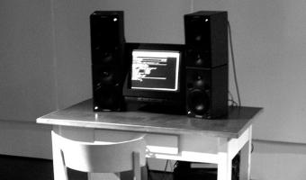
2002 – Lungs, Slave Labour
Lungs; Slave Labour by YoHa (Matsuko Yokokoji, Graham Harwood) was a database installation that was first produced for the exhibition “Making Things Public” at The Centre for Art and Media, (ZKM) Karlsruhe, Germany, curated by Bruno Latour, Peter Wiebel and Steve Dietz. The ZKM site first opened in 1997 in the historic monument of a former munitions factory, Deutschen Waffen und Munitionsfabriken A.G. Karlsruhe. The work reanimated the last breath of victims who were enslaved in the factory by calculating their vital lung capacity and again releasing the same volume of air into the exhibition space through a set of speakers.
Source: Matsuko Yokokoji and Graham Harwood (2011) Lungs. (archived version)

2002 – LED Cubes
While volumetric displays have a long history dating back from the 1910s and are still an active topic of research, the improvement and democratization of LED technology made it possible for anyone to build low-resolution volumetric displays by arranging many LEDs in a 3D matrix. Today, hundreds of video tutorials and demos of LED cubes can be found on YouTube (the left image is from a 2021 tutorial). Perhaps one of the earliest people to come up with the idea was artist Todd Holoubek, who built a LED cube back in 2002 (right image). In an email, he tells us:
The led cube was a collaboration between James Clar, Cindy Jeffers, Danielle Lee, and myself.
It was a final project in the spring 2002. We had seen nothing like it. The inspirations were 2D led art from the likes of Jim Campbell and the emergence of 3D visualization technologies which were becoming popularized through Siggraph and the mainstream media.
This was a little before the maker movement, on-line information about leds and led technology was very scarce. We did the best we could with the skills we had.
Sources:
Todd Holoubek (2002) LED Cube v1 Quote from Todd Holoubek in an email from April 2018 Left image: Dave Rowntree (2021) Big RGB LED cube you can built too Right image: Todd Holoubek, see first link above.
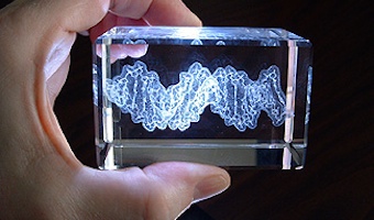
2002 – Bathsheba Grossman's Crystal Engravings
Artist Bathsheba Grossman has been 3D printing mathematical surfaces as early as 1997. In 2002 she started to use subsurface laser engraving to produce 3D physical visualizations of data from astronomy, biology, and physics. Left image: a piece of DNA molecule. Right image: a 3D map of our nearby stars. The artist explains to us: This medium excels at imaging less structural data such as disconnected volumes, non-compact point clouds, and the convoluted strands of proteins. It works by projecting intersecting Nd:YAG laser beams into clear glass, concentrating enough energy at the intersection to create a microfracture that is precisely located within the glass. The laser is then pulsed and moved; a typical image might contain from 100,000 to several million marks. The art of the medium is in regulating position and density of the marks so that bright lines and points are produced, as well as surfaces of varying translucency, without concentrating marks so closely as to over stress the glass and produce larger fractures. Sources: http://www.bathsheba.com (2002 version). http://crystalprotein.com
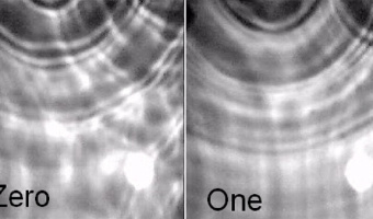
2003 – Pattern Recognition in a Bucket
Chrisantha Fernando and Sampsa Sojakka from the University of Sussex published a paper where they demonstrate that a bucket of water can carry out complex, parallel computations, and can even do simple speech recognition. Their setup called "liquid brain" consists in a transparent water tank suspended over an overhead projector and four LEGO motors. Input values are sent to the motors which vibrate the water. A camera then reads the watter ripples and sends the data to a simple perceptron. The paper shows that the system is able to distinguish between utterances of the words "zero" and "one" with much higher accuracy than a perceptron alone. Sources: Chrisantha Fernando and Sampsa Sojakka (2003) Pattern Recognition in a Bucket. Left image from Fernando and Sojakka's paper, right image from a slide deck by Ben Jones, Dov Stekal, Jon Rowe, and Chrisantha Fernando. Related: Also see our entry on Kohei Nakajima’s Computing Tentacle and our other entries on physical computation.
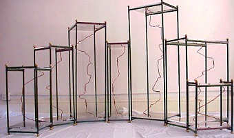
2003 – Time Pieces: Physical Space-Time Cubes
Artist Marilynn Taylor created seven three-dimensional maps (one for each day of the week) in which time is the z-axis and a copper wire shows how she moved across the city during the day. Source: Maryline Taylor (2003) Time pieces - Mapping the time and space of place (2003 version).
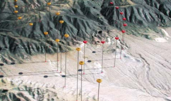
2003 – Solid Terrain Model with Airplane Trajectory
A real case study involving the use of a physical 3D trajectory visualization on top of a 3D terrain model to analyze the causes of a plane crash. This case study is interesting in terms of cost-benefit analysis, since these models appear to be extremely time-consuming to build. The case study includes an informal comparison with animations: "The mock jurors later related that the physical model was easier to understand and it allowed them to discuss the issues with each other more easily than the animation." The company who builds these models, STM, uses a milling machine and a 3D inkjet printer. Source: Terrain Modeling, Inc. (2013) Case Study: Aviation Accident Litigation (also see 2003 brochure).
2003 – Mount Fear: Elevation Map of Crime Rates
A 3D map of East London where elevation represents the rate of violent crimes between 2002 & 2003. Corrugated cardboard, 145h x 540w x 425d cm. Source: Abigail Reynolds. Mount Fear East London.
2004 – Worry (Prayer) Beads
One bead = one year. Size of colored beads is proportional to number of terrorist-caused deaths. Black beads = no terrorist deaths. The largest bead is 2001. Also see Loren Madsen's earlier piece Tops (2001) featuring the same dataset, our entry 1995 – Loren Madsen’s Early Data Sculptures, and our interview with the artist. Sources: Loren Madsen
2004 – Of All the People in All the World: Stats with Rice
Since around 2004 the British group of artists Stan’s Cafe is creating data landscapes all over the world by mapping each grain of rice to a person in order to convey various statistics such as city populations or deaths in the holocaust. The size and theme of the show change depending on the location. The largest one involved 104 tons of rice. Rice is weighted manually in small quantities and manually poured over piles. This labor-intensive process is part of the show.
Sources:
Stan's Cafe (2006) Of All People In All The World. Mike Kirshner (2005) Factory Work. Photos from (left to right) The Telegraph, Flickr user Emidot, Flickr user Sparks68.
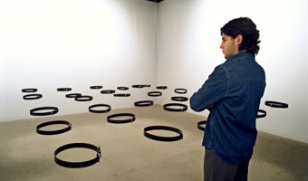
2004 – Array of Belts Visualize Public Presence
Standards and Double Standards is an interactive installation that consists of 10 to 100 fastened belts that are suspended at waist height from stepper motors on the ceiling of the exhibition room. Controlled by a computerized tracking system, the belts rotate automatically to follow the public, turning their buckles slowly to face passers-by. When several people are in the room their presence affects the entire group of belts, creating chaotic patterns of interference. Non-linear behaviours emerge such as turbulence, eddies and relatively quiet regions. One of the aims of this piece is to visualize complex dynamics, turning a condition of pure surveillance into an unpredictable connective system. The piece creates an "absent crowd" using a fetish of paternal authority: the belt. Source: Rafael Lozano-Hemmer http://lozano-hemmer.com/standards_and_double_standards.php

2004 – Synaptic Caguamas: Visualize Cellular Automata
Synaptic Caguamas is a kinetic sculpture consisting of a motorized Mexican "cantina" bar table with 30 "Caguama"-sized beer bottles (1-litre each). The bottles spin on the table with patterns generated by cellular automata algorithms that simulate the neuronal connections in the brain. Every few minutes the bottles are reset automatically and seeded with new initial conditions for the algorithm, so that the movement patterns are never repeated. This kinetic sculpture is a primitive and absurd attempt to make tangible the mathematics of recollection and thought. Source: Rafael Lozano-Hemmer. Synaptic Caguamas (2004).

2004 – Cylinder: Early Sound Sculpture
Cylinder by Andy Huntington and Drew Allan may be one of the first digitally-fabricated sound sculptures. Source: http://extraversion.co.uk/2003/cylinder/ Related: Also see our entry 2007 - Explosion of sound sculptures.
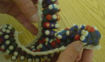
2004 – Scripps' Molecule Models
Since 2004 the Molecular Graphics Laboratory at the Scripps Research Institute has been making heavy use of 3D-printed full-color physical molecule models, some of which are articulated (left image), flexible (middle image), and even self-assembling (right image, see video). They also publish augmented reality systems that use those physical models. Sources: Web Page: http://mgl.scripps.edu/projects/tangible_models Tommy Toy (2011) How Arthur Olson's Molecular Graphics Lab at Scripps is Using 3D Printing and Augmented Reality to Design Better Drugs. Alexandre Gillet et al (2004) Computer-Linked Autofabricated 3D Models For Teaching Structural Biology. Related: Also see our entry 1995 – SDSC TeleManufacturing Facility.
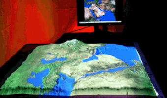
2004 – XenoVision Mark III: A Dynamic Solid Terrain Model
The XenoVision Mark III Dynamic Sand Table by the company Xenotran is a self-reconfigurable solid terrain model with military applications. There is little information on this device but it seems well ahead of its time. Michael Schmitz and coauthors explain how this high-resolution shape display with 7000 actuators was originally inspired by a scene from the X-Men movie (see our entry 2000 – A Shape Display Appears in a Movie). Sources: Directions Magazine (2004) Interview with Xenotran Founder, Dr.Derrick Page. Images by Xenotran.
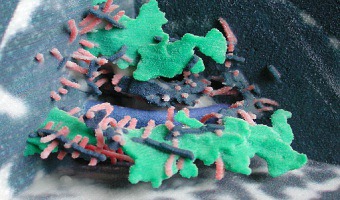
2004 – Full-Color 3D-Printed Scientific Visualizations
In 2004, the Visualization Research Lab from Brown University printed full-color 3D models of scientific visualizations. They published a poster on the topic where they discuss the technical challenges they faced. The printer used was a Zcorp Z406. Source: http://vis.cs.brown.edu/areas/projects/rapid.html Related: Also see our entry 1995 – SDSC TeleManufacturing Facility.
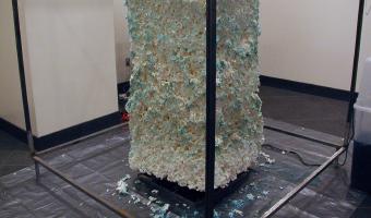
2005 – Email Erosion: First Data Sculpture?
Although there are older data sculptures (see our entry 1995 – Loren Madsen’s Early Data Sculptures), this installation from artist Ethan Ham may have been the first artifact to be called a data sculpture.
In 2005, Andrew Vande Moere, a Design Professor and author of the now discontinued data visualization blog infosthetics, described the installation as:
an art installation that automatically creates physical data sculptures, using spam & e-mail as data to trigger the sculpting process. the installation contains robot—like mechanisms that function like a flat-bed plotter, squirting water to dissolve sections of a large block of biodegradable (starch-based) styrofoam. each of the bots is associated with an email address, which triggers to either move or squirt water, depending on an algorithm that uses the email’s content as input data.
I emailed Ethan Ham to ask for more explanations and he responded:
It’s been a while, but I believe what the sculpture would do is take the email’s raw data, convert it to a numeric representation, and then use that number to drive an action (rotate sculpture, raise/lower sprayer, spray).
So according to Robert Kosara (archived version), this installation is a data-driven artifact but not a visualization in the pragmatic sense.
Sources:
Ethan Ham (2006) Email Erosion. (archived version) Pierre Dragicevic and Yvonne Jansen (2017) Data Physicalization Wiki, Terminology First quote by Andrew Vande Moere (2005) email erosion Second quote and high-res photos from Ethan Ham, sent in a personal e-mail in August 2024.
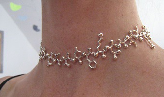
2005 – Molecular Jewellery
Raven Hanna got her PhD in biochemistry in 2000, and five years later, she became an artist and started to create jewelry based on molecular structures in order to communicate science through art. Image above: endorphine necklace. Sources: Raven Hanna www.madewithmolecules.com (see 2005 version) Leigh Krietsch Boerner (2010) Profile: Molecular Jewelry Design

2005 – Time-Evolving Scatterplot
Unemployment rate plotted against inflation for 8 countries over 10 years. Every layer represents a year and each country is a wire of a different color. This physical visualization was built by Tim Dwyer for his PhD dissertation. His goal was to experimentally compare a 3D and a 2D data representation, and he used a physical object to emulate a perfect 3D display. Source: Tim Dwyer (2005) Two and a Half Dimensional Visualisation of Relational Networks. PhD Dissertation.
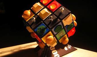
2005 – Tactile Rubik’s Cubes
An online article compares several different designs for tactile Rubik's Cubes created between 2005 and 2010. Left image: different objects on the outside of the cube give each side a different feel. Right image: laser-cut shapes. Source: Smithsonian magazine.
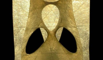
2006 – Clebsch Cubic Surface
A 90 cm tall Clebsch bicubic surface hand made in resin and fiber. It includes all lines lying inside the surface. Also see our entry 1880 – Klein’s Mathematical Plaster Models for an earlier version made of plaster. Sources: Cayetano Ramirez. obratano.com (alternative website) Cayetano Ramirez (2006) Creation process for the transparent Clebsch surface.
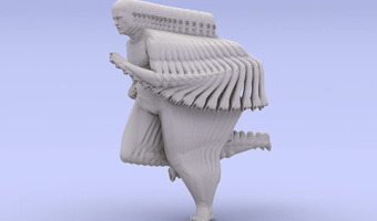
2006 – Peter Jansen's Movement Sculptures
Dutch artist Peter Jansen creates sculptures of moving characters by merging successive snapshots into a single monolithic object. These are not physical visualizations as they do not display data, but the technique could certainly inspire the creation of physical visualizations for complex temporal data. The idea of merging time slices is reminiscent of the pioneering work of Étienne-Jules Marey in the 1880s on chronophotography. See our entry on Marey's movement sculptures. Source: Peter Jansen (2006) Human Motions.
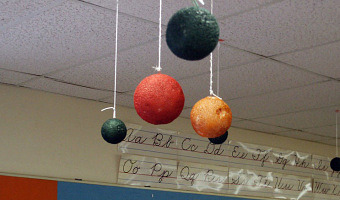
2006 – RoomQuake: Earthquake Visualization for the Classroom
Styrofoam balls hung from classroom ceiling representing the epicenters (location), magnitudes (diameter and color), and depths (length of the string) of a series of simulated earthquakes in a fifth grade classroom. Source: Tom Moher (2006) Embedded Phenomena: Supporting Science Learning with Classroom-sized Distributed Simulations.
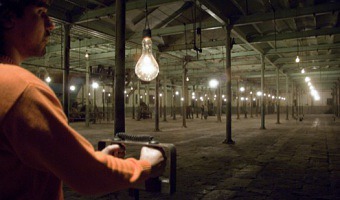
2006 – Pulse Room: Light Bulbs Show Heart Beats
Pulse Room is an interactive installation featuring one to three hundred clear incandescent light bulbs, 300 W each and hung from a cable at a height of three metres. The bulbs are uniformly distributed over the exhibition room, filling it completely. An interface placed on a side of the room has a sensor that detects the heart rate of participants. When someone holds the interface, a computer detects his or her pulse and immediately sets off the closest bulb to flash at the exact rhythm of his or her heart. The moment the interface is released all the lights turn off briefly and the flashing sequence advances by one position down the queue, to the next bulb in the grid. Each time someone touches the interface a heart pattern is recorded and this is sent to the first bulb in the grid, pushing ahead all the existing recordings. At any given time the installation shows the recordings from the most recent participants. Source: Rafael Lozano-Hemmer http://lozano-hemmer.com/pulse_room.php
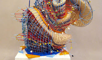
2006 – Nathalie Miebach's Woven Sculptures
Artist Nathalie Miebach created a range of beautiful woven sculptures out of weather data. Source: Nathalie Miebach. http://www.nathaliemiebach.com/weather.html (see TED Talk).
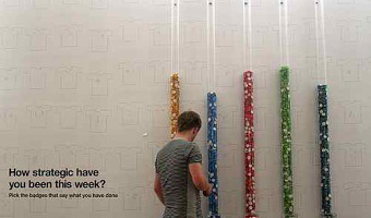
2006 – Inverted Participatory Bar Charts
Participatory physical visualization where people pick badges from tanks to vote. A lower bar means more votes. Source: Lucy Kimbell (2006). Physical Bar Charts.
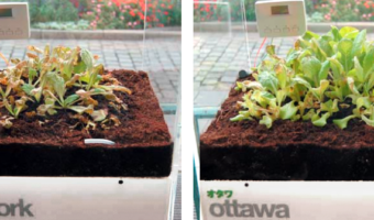
2007 – Garden of Eden
Garden of Eden consists of eight lettuces, each of which is enclosed in its own air-tight plexiglas box and represents a major city. The concencration of ozone in each box is controlled in real-time to reflect the current pollution level in the city. Sources: Thorsten Kiesl, Harald Moser, and Timm-Oliver Wilks (2007) Garden of Eden (web page) Thorsten Kiesl, Harald Moser, and Timm-Oliver Wilks (2007) Garden of Eden (paper)
2007 – Wavefunction: Visualize Public Presence in Waves
Wavefunction is a kinetic sculpture comprised of fifty to one hundred Charles and Ray Eames moulded chairs (designed in 1948) and placed in a regular array of rows, facing the entrance to the exhibition space. When someone approaches the work, a computerised surveillance system detects their presence and the closest chairs automatically begin to lift off the ground, creating the crest of a wave that then spreads over the whole room. A system of electromechanical pistons raises each chair forty centimetres from the ground. The pistons are controlled by a computer that runs the mathematics of fluid dynamics, thus making the waves interfere with each other, creating turbulence or becoming calm, just like real water. Rafael Lozano-Hemmer http://lozano-hemmer.com/wavefunction.php
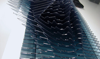
2007 – Explosion of Sound Sculptures
In 2007-2008, sound became an endless source of inspiration for data sculptors. Examples include (images from left to right): Binaural by Daniel Widrig & Shajay Bhooshan (2007) Sound/Chair by Plummer Fernandez (2008) Sound Memory by Marius Watz (2008) Reflection by Andreas Nicolas Fischer & Benjamin Maus (2008) I Will Never Change by Us by Benga (2012) Microsonic Landscapes by Juan Manuel de J. Escalante (2012) The Shape of the Sound of the Shape of the Sound by Stephen Barrass (2012) Spectral Density Estimation by Andreas Nicolas Fischer (2013) Nightingale Bird Song by Yanying Huang (2014)
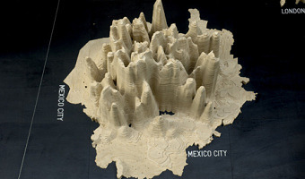
2007 – Global Cities: Elevation Maps of City Population
Large-scale physical density models where plywood forms represent the populations of 12 of the world’s major urban centres. Made by a team of designers and architects led by Professor Richard Burdett. Source: Eliza Williams (2007) Global Cities at Tate Modern. Right photo by Stefan Geens.
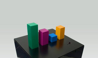
2007 – Wable: Web Behavior Shown with a Dynamic Bar Chart
A dynamic bar chart visualizing one's online activity. From the company's website: The personal feeds from webapplications like Plazes, Flickr, and Last.fm tell much about the activity of an individual on the internet. In this project we aim to explore how you can visualize the changes of your web identity over time and create a physical link between your virtual and real identity. The interface consists of both a physical table and a web application. This direct feedback from your web identity is customizable and can be connected to any RSS feed. Update: What you see is the first prototype version of Wable. We are currently building version 2 so keep an eye on our blog or sign up below to find out when it's released and ready for sale. Source: Physical Interaction Lab (2007). Wable.

2008 – Idea of a tree
The idea of a tree is an autonomous production process which combines natural input with a mechanical process. Solely driven by solar energy, it translates the intensity of the sun through a mechanical apparatus into one object a day. The outcome reflects the various sunshine conditions that occur during this day. Like a tree the object becomes a three dimensional recording of its process and time of creation.
Source: mischer’traxler studio (2008) The idea of a tree – a semi-autonomous machine combining natural input with a mechanical process.

2008 – Diary of Happiness
Diary of happiness was a large-scale installation created by Jean-Michel Othoniel for his solo show in Miami in 2008.
Jean-Michel Othoniel’s solo show in Miami features a large-scale installation entitled Diary of Happiness: a gigantic abacus measuring 2.20 m high by 4.50 m long, with each Murano glass bead representing a day of the year.
Created for the occasion, this work is intended to slow down time by counting down the days like a rosary. It is also a questioning of lost paradises and an invitation to the search for happiness. The abacus frame is black on one side and white on the other. At the start of the year, all the pearls are placed on the dark side, and it’s up to us to turn them day by day to the light side, making each year unique.
Source: Jean-Michel Othoniel (2008) Diary of Happiness.
2008 – 100% City
Since 2008, the German theater group Rimini Protokoll organizes performances where they select 100 people in such a way that they form a representative sample of a given city, and then invites them on the stage. Each person briefly introduces themselves, after which everyone participates in a series of physical visualizations where each person takes the role of a data point. The first performance was titled 100% Berlin. Similar performances were then organized in 18 other cities between 2010 and 2019. Left image: response to the question: "who was born in Berlin?" (show 100% Berlin). Right image: response to the question: "how much did you spend yesterday?" (show 100% Paris). Sources: Jörn Hurtienne (2018) Possibilities of Human Data Embodiment: 100% City. Rimini Protokoll 100% City. Wikipedia (2020) Rimini Protokoll. Left photo by Rimini Protokoll (source). Right photo also by Rimini Protokoll (1:03:18 in this video). Related: Also see our other entries on participatory physical visualizations.
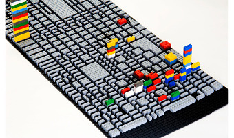
2008 – Psychogeographical Mapping: Travel Logging with LEGO bricks
American artist Cory Imig reconstructed the layout of the city of Savannah using LEGO bricks, and over the course of one month she added a colored brick every time she went to a particular place. Each color is a different day of the week. Source: Cory Imig (2008) Psychogeographical Mapping (see the section Documenting of her Web page for more data sculptures).
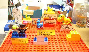
2008 – Bug Tracking with LEGO Bricks
Takeshi Kakeda explains how to use LEGO bricks for bug tracking. Source: Takeshi Kakeda (2008) Tangible Bug Tracking using LEGO bricks. Agile 2008 conference.
2008 – Activity Logging with LEGO Bricks
A visualization and logging method for personal work activity. Every tower is a day of the week. A layer is one working hour, horizontally subdivided in four quarters of an hour. Different colors are different projects. The constant availability of this interface makes it easier to log personal activity data on-the-fly, before entering it in a PIM software (an automatic method involving computer vision is being considered). Source: Michael Hunger (2008) On LEGO Powered Time-Tracking. Blog post.
2008 – Rearrangeable Wooden Model of Brain Scan
A selection of MRI data glued on 60 wooden blocks which allow to physically dig into cross sections, by Neil Fraser. More details on infosthetics. Source: infosthetics.com.
2008 – BMW Kinetic Sculpture
The Kinetic Sculpture is a metaphorical translation of the process of form-finding in art and design. 714 metal spheres, hanging from thin steel wires attached to individually-controlled stepper motors and covering the area of six square meters, animate a seven minute long mechatronic narrative. In the beginning, moving chaotically, then evolving to several competing forms that eventually resolve to the finished object, the kinetic sculpture creates an artistic visualisation of the process of form-finding in different variations. Source: Art+Com. Kinetic Scultpture (2008)
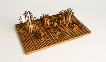
2008 – Andreas Fischers' Data Sculptures
Andreas Nicolas Fischer is a Berlin-based artist. Above are four of his 3-D data sculptures: Fundament (world GDP and derivatives volume) Indizes (finance data over time) A week in the life (cellphone communications) Reflection (FFT of a music piece). Source: http://anfischer.com via infosthetics.
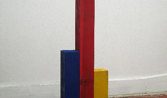
2008 – Joshua Callaghan's Physical Charts
Joshua Callaghan has created various extruded 2-D charts. Source: http://www.joshuacallaghan.com/Graphs.htm
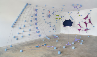
2008 – Justin Stewart's Data Sculptures
A 3-D graph and a time series visualization. Source: http://thesocietypages.org/graphicsociology/tag/r-justin-stewart/
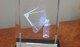
2008 – Scientific Visualization in Crystal
Paul Bourke proposes to use sub-surface laser engraving for communicating about scientific findings at conferences. He also has seminar slides and a poster discussing the use of 3D-printed models. Source: Paul Bourke (2008) Presenting Scientific Visualisation Results as 3D Crystal Engravings.
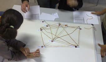
2008 – Kids Reconstruct Harry Potter's Social Network
At the 2008 science fair (fête de la science), the Aviz group had kids build physical node-link diagrams of Harry Potter's social network using magnets and rubber bands. Source: Aviz. http://www.aviz.fr/old/fetedelascience08/
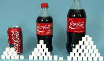
2009 – How Much Sugar do you Consume?
Nutrition labels are often difficult to apprehend: when you drink a can of coke, you consume 39g of sugar, but how much is that? In order to increase consumer's awareness of how much sugar they ingest when eating and drinking, several campains have used a physical visualization using actual sugar cubes and sugar grains to represent the sugar content in food. Many examples can be found online (search for "sugar stacks" and "rethink your drink"). It is unclear when these representations started. Both representations are examples of concrete scales, that use concrete objects to represent a complex measure (see [3] for more information). Also see this video. Sources: Left image from Sugar stacks (2009). Right image from Nutrition Post (2012). Fanny Chevalier, Romain Vuillemot, Guia Gali (2013) Concrete Scales: A Practical Framework for the Visual Depiction of Complex Measures.
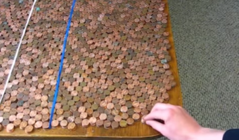
2009 – Federal Budget Explained with 10,000 Pennies
Political Math (formerly called 10000Pennies on the Youtube channel) is a blogger who criticizes the US policy using stats and low-tech physical visualizations. His first 2009 video titled "Obama Budget Cuts Visualization" (left image) got 1.7 million views. Coins, but also bills, water or whisky stand for units of money or jobs. A video often ends with a dramatic action where the blogger cuts a penny in two, overturns a gallon container, spills hundreds of coins from a table, freezes water, or drinks a shot of whisky. Sources: Political Math's Videos. Political Math Blog.
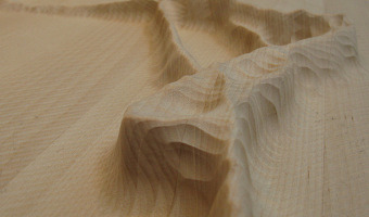
2009 – Windcuts: Wind Travels Captured on Wood
Windcuts is a physical information visualisation retelling the Helsinki wind's travels over five days, using wind sensor measurements from Helsinki, and wood and a CNC machine to cut it from there too. [...] The line's direction shows the wind's direction, the line's width shows the wind's speed - a more intense wind makes a bigger line - and the line's height shows the wind's temperature. Source: Miska Knapek (2012) Windcuts.
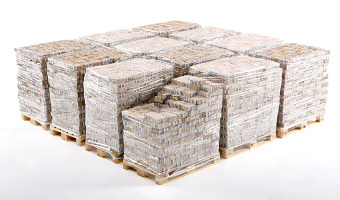
2009 – Marcovici's Single-Datum Visualizations
Vienna artist Michael Marcovici created two physical visualizations that convey a single numerical value. The first one shows one billion dollar - the most expensive piece of art ever made, according to him (although these were actually miniature bills). The second one called Rolex Time Sand shows an entire lifetime worth of hourglass sand. For another single-datum physical visualization see our entry Ceramic Poppies to Commemorate Fallen Soldiers in WW1, and our entry on Chris Burden's submarines (1989). Sources: Michael Marcovici via visualizing.org. The artpieces are undated but an online search bring back to 2009. http://memim.com/michael-marcovici.html Also see Fanny Chevalier and al's infovis article on visually conveying extreme magnitudes and unfamiliar units.
2009 – Leithinger's Interactive Shape Displays
Daniel Leithinger, PhD student at MIT MediaLab and his colleagues, are studying interaction with shape displays. The team designed two impressive shape displays made of arrays of ultra-fast motorized pins. Relief (2009-2010, first row above) is made of 120 motorized pins on top of which can be added a rubber sheet and a projected image. Each pin can be addressed individually and senses user input like pulling and pushing. In 2011, the team extends Relief (later renamed Recompose, second row above) with a depth camera, allowing users to interact with it through mid-air gestures. inFORM (2013, last row above) is a higher-resolution version made of 900 motorized pins (30 x 30). Leithinger and his colleagues use it to demonstrate a range of features and use case scenarios, including the exploration of physical visualizations. Sources: Leithinger et al (2009) Relief project page. Scientific publication here (2010). Lakatos et al (2011) Recompose project page. Scientific publications here (2011) and here (2011). Leithinger et al (2013) InFORM project page. Scientific publications here (2013) and here (2014).
2009 – Mitchell Whitelaw's Weather Sculptures
Weather data is another interesting choice for creating data jewelry. Above to the left is a bracelet created by Mitchell Whitelaw based on one year of weather data from Canberra. The right image shows a measuring cup made by the same artist, where each ring represents monthly average temperatures in Sydney over 150 years. Sources: Mitchell Whitelaw. Weather Bracelet (2009) Mitchell Whitelaw. Measuring Cup (2010)
2009 – Centograph: Dynamic Bar Charts Show Keyword Popularity
Ten actuated bar charts that show the popularity of keywords of interest in news articles over time, made by the company Tinker from London. A separate search interface is provided on a regular desktop computer and sends queries to the Google News Archive. It is permanently installed in the St Paul's School for Boys Computing Department in London. Sources: infosthetics Tinker London
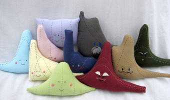
2009 – Distribution Plushies
A commercial offer for a set of 10 plush distributions. Although not formally physical visualizations, they could in principle encode actual data. Source: web shop
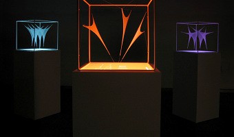
2009 – DataMorphose: Animated Sails
DataMorphose is an interactive installation which projects various data streams into real space and visualizes it three-dimensionally. Information is represented by spanned and moving sails directly in the room. Source: Christiane Keller (2009). Data Morphose.
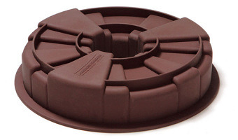
2009 – S-XL CAKE: Irregular Cake Mold
A cake mold that creates pieces of cake in different sizes. Although not a physical visualization, it could in principle encode data. Source: Ding 3000 via Infosthetics.com.

2009 – In-Formed: More Data-Driven Tableware
Another data-driven tableware, this time conveying world statistics. The fork on the image shows calories consumption for the US and three other countries. Source: Nadeem Haidary.
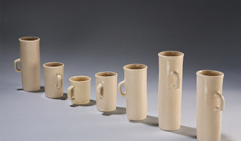
2009 – Form Follows Data: Tableware
This set of tableware by designer Iohanna Pani conveys personal statistical data. Source: designboom
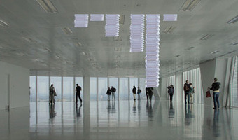
2009 – Poly: Physical Bar Chart Showing Online Poll Data
Poly, a self-actuated bar chart which shows replies to online polls. Sources: Digit, London. Original polling website is down [Oct 2014]; check out an archived version instead.
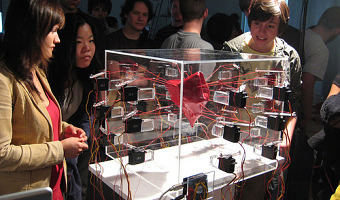
2009 – Pulse: Animated Heart Shows Sentiments
pulse is a live-visualization of recent emotional expressions, written on private weblog communities like blogger.com. Weblog entries are compared to a list of emotions, which refers to Robert Plutchik’s seminal book Psychoevolutionary Theory of Emotion published in 1980. Plutchik describes eight basic human emotions in his book: joy, trust, fear, surprise, sadness, disgust, anger, and anticipation. He developed a diagram in which these eight emotions, together with their weakened and amplified counterparts, form a three dimensional cone, consisting of 24 areas. The cone is the basic form of pulse, which can enlarge in the 24 directions of the different emotions. Each time an emotion tag, or a synonym of it, is found in a recent blog entry, the shape-shifting object transforms itself in such a way that the new volume represents a piece of the overall current emotional condition of surfers on the Internet. Source: Markus Kison (2009). Pulse.
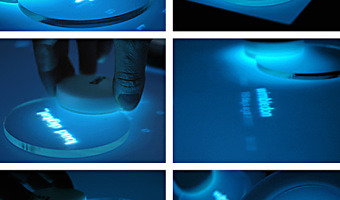
2009 – Virtual Gravity: Giving Physical Weight to Data
Virtual gravity is an interface between digital and analog world. With the aid of analog carriers, virtual terms can be taken up and transported from a loading screen to an analog scale. The importance and popularity of these terms (data base: Google Insights for Search), outputted as a virtual weight, can be weighed physically and compared. Therefore impalpable, digital data get an actual physical existence and become a sensually tangible experience. Source: Silke Hilsing (2010) via fubiz
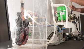
2010 – Coal Fired Computers
In Coal Fired Computers, a one hundred year old, 17.5-ton showman’s steam engine powers a single computer with 1.5 tonnes of coal. Black lungs inflated every time the database record of a miner’s lung disease was shown on the computer monitors. The original work was produced over three days at Newcastle’s Discovery Museum, with groups of miner activists. The work was originally commissioned by AV Festival, Newcastle, UK and produced in partnership with Discovery Museum, Isis Arts and The Calouste Gulbenkian Foundation. In collaboration with Jean Demars, the work was a response to the displacement of coal production to distant lands like India and China after the UK miners’ strike in 1984/85.
Coal Fired Computers took as it starting point 19th century technologies of power, in particular Charles Parson’s 1884 steam turbines, coal and their relationship to Newcastle and retired miners . The work was also produced to coincide with the 25th anniversary of the UK miners’ strike to focus on our increasing use of coal embedded in our technologies.
The work employed a steam engine to electrically power a single computer that displayed the records from two contentious databases: one held on the servers of a law firm soliciting claims for lung disease against the UK government; the other from the UK government itself. The databases – miners’ claims for those who contracted Chronic Obstructive Pulmonary Disease (COPD) since 1952 and those miners that have died in mining accidents since 1700 – triggered compressed air to inflate two sets of diseased lungs. Miners’ activists, some of whom had contracted COPD, helped staff and run the contraption, while talking to the public about our relationships with coal and globalisation. They also displayed an archive of publications on the topic they had amassed.
Source: Matsuko Yokokoji and Graham Harwood (2010) Coal Fired Computers. (archived version)

2010 – Analog Stepless Gear Indicator
Some e-bikes with stepless shifting gear are equipped with a cute analog indicator. From the user manual:
Controlling the ratio of the N360 is simply a matter of rotating the shifter grip. The shifter display indicates ratio as a simple graphic; a hill for slower speeds and a flat for faster speeds. Since there are no fixed gears, the exact ratio is determined by your comfort level.
This indicator was introduced by the US-based NuVinci company in 2010. In 2018, the company was rebranded to Enviolo as part of a bankruptcy restructuring.
Sources:
Wikipedia, NuVinci continuously variable transmission NuVinci (2010) NuVinci N360’s Owner Manual (archived version). This manual shows that the 2010 model already had the analog display. The previous model from 2007 (N171 owner’s manual, archived version) did not. Photo from Anonymous (2014), Test Ride: 2014 Novara Gotham. Video from the FoldingBike YouTube channel.
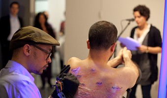
2010 – and Counting... Tattoo of War Casualties
Wafaa Bilal’s brother, Haji, was killed by a missile at a checkpoint in their hometown of Kufa, Iraq in 2004. Bilal feels the pain of both American and Iraqi families who have lost loved ones in the war, but the deaths of Iraqis like his brother are largely invisible to the American public. and Counting… addresses this double standard as Bilal turns his own body — in a 24-hour live performance — into a canvas, his back tattooed with a borderless map of Iraq covered with one dot for each Iraqi and American casualty near the cities where they fell. The 5,000 dead American soldiers are represented by red dots (permanent visible ink), and the 100,000 Iraqi casualties are represented by dots of green UV ink, seemingly invisible unless under black light. During the performance people from all walks of life read off the names of the dead.
Also, Bilal is asking each visitor to donate $1 which will go to the group Rally for Iraq, to fund scholarships for Americans and Iraqis who lost parents in the war. Based on official numbers of casualties, one dollar for each would mean $105,000 in scholarship money. Source: Wafaa Bilal (2010) and Counting…

2010 – Computer Glitches as 3D Objects
Glitch objects is a series of artworks by Tracy Cornish which transform two-dimensional visual results of computer glitches into three-dimensional objects by mapping properties of a visual glitch into 3D space. The left image shows glitch object 22, the right image shows glitch object 218. Computer glitches are the completely random, unpredictable and unexpected failures of digital systems. They are the result of approximated values and computational compensations for inaccessible information. Unlike bugs or faulty programming which can be tracked back to errors in code, glitches are fleeting and are often the result of untraceable truncated data streams or rounded values. “Artifacts” in digital media refer to an undesired alteration in data introduced through a digital process of representation. Within broader culture, artifacts are precious objects made or given shape by human beings. Glitch Objects explore this semantic relationship through a series of rapid prototype sculptures. Using source glitches as found objects of digital culture, Glitch Objects were generated by mapping 2-dimensional malfunctions into 3-dimensional forms. These artifacts shift digital information into the physical realm - turning digital rubbish into delicate art objects. Glitch Objects are part of an ongoing research inquiry that explores the potential for glitches to be employed as an entry point into the critique of post-digital culture. Source: Tracy Cornish, Glitch Objects.
2010 – Cookbook Arranges Ingredients into Physical Visualizations
In Sweden, IKEA gives away baking books where ingredients are arranged into physical visualizations. The photos are by Karl Kleiner. This idea is reminiscent of Ursus Wehrli's art projects. Sources: Niels-Peter Foppen (2010) Hembakat är Bäst. Via Iohanna Nicenboim's pinterest. Images from notcot.com.
2010 – Retweet Ripples
Interpreting tweets as droplets on an imaginary fluid surface, Karsten Schmidt and his colleagues created a 3D printed abstract visualization of tweets and their retweets forming ripple patterns. The visualization is created by first executing a Twitter search (here: "Justin Bieber") to create the initial droplets shown in the center of each ring. For each search result they then recursively executed secondary Twitter searches for retweets to create more droplets and used these to form clusters. Popular tweets with more retweets so form bigger ripples and the elevation of each point in the resulting rings is an indication of how often these re-tweets themselves have been propagated. The visualization started out purely in 2D using the toxiclibs Verlet physics engine to create a force-directed, self-organizing layout. The final step before 3D printing was then to freeze the simulation state and convert the 2D particle positions into a 3D terrain mesh. This 1-day project was developed during a workshop taught at HEAD Geneva in October 2010. Source: Karsten Schmidt - Flickr Set
2010 – Quipu of the Periodic Table
As a result of bringing together each pair of periods in a single function or binod, the author has found a new regular on the subject, which has been defined as a new quantum number, since the number of orders or regulations binod growth elements in the table, under the appearance of pairs of new types of quantum structures or periods whose organization responds to a simple mathematical function: a parable of the type Y = 4 X ^ 2 - In this case report: a) That the strings correspond to pairs of periods or binod and knots are double for items with orbital s (in red), six nodes for p in orange, 10 yellow d knots and 14 knots for green f . b) That in each binod or rope, appear regularly in pairing mode or dual, new quantum or orbital structures, such as moving from within the orbital previous binod. See also the entry on Peruvian Quipus, and all entries with the tag "periodic table" for historical examples of physical representations of the periodic table. Sources: Ing. Julio Antonio Gutiérrez Samanez (2010) Khipu de la tabla periodica de los elementos químicos. The internet database of periodic tables.
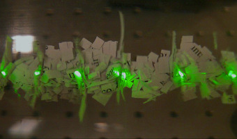
2010 – Dust Serenade: Sound Waves Materialized
'Dust Serenade' is a reenactment of an acoustic experiment done by German physicist August Kundt. Inspired by the Chladni's famous sand figures visualizing sound waves in solid materials, Kundt devised an experiment for visualizing longitudinal sound waves through fine lycopodium dust; a setup that would allow him to measure the speed of sound in different gases. Kundt was a strong believer in experimental methods over purely theoretical inquiry in a time when the disciplines of theoretical and experimental physics started to diverge. 'Dust Serenade' intends to remind us the materiality of sound. Tubes filled with scraps of words and letters--cut-up theory--interact with sound waves and turn into figures of dust. Here, visitors can modulate the frequency of the sound emitted by moving a rod and create different harmonic sound effects. As sound waves figure, refigure, and disfigure the text, we invite visitors to rethink about the tension between their theoretical knowledge and the sensory experience. Source: http://dustserenade.net/ Related: Also see our entry 1866 – Kundt’s Tube.
2010 – Data Sculptures in Class
The two data sculptures above have been created by undergraduate students as part of a design class given by Andrew Vande Moere at the University of Sydney. A 2010 article he coauthored with Stephanie Patel (link below) provides many other examples of these. Andrew Vande Moere has published several articles on data sculptures since 2008. Sources: Andrew Vande Moere and Stephanie Patel (2010) The Physical Visualization of Information: Designing Data Sculptures in an Educational Context. Also see other articles on data sculptures by Andrew Vande Moere.
2010 – Hans Rosling Adopts Physical Visualizations
Hans Rosling is famous worldwide for his fascinating speeches about population growth and income inequalities, notably his 2006 TED Talk where he debunks myths about the third world using animated charts. In 2010 he started to tell stories about data using physical visualizations. He started by stacking Ikea boxes, then switched to a variety familiar objects including pebbles, toy construction kits, fruit juice, snow balls and even toilet paper. Hans' son Ola Rosling is behind the technology and scenography used in his talks. Both strongly believe in the pedagogical power of physical visualizations. Hans Rosling told us that: physical props reach the mind of a large part of the public because thats how you represent data in daily life at the kitchen table, at the cafe and in the bar. Click on the links below to see the full videos (same order as the images above): Hans Rosling's TED talk (2010) Global population growth, box by box. Via infosthetics. Herbert Reininger (2012) Hans Rosling's shortest TED talk. SVT (2012) Hans Rosling i SVT Agenda (in Swedish). The Guardian (2013) Population growth and climate change explained by Hans Rosling. Hans Rosling (2013) Mariam Claeson, Hans Rosling and René Loewenson at Global Health. BBC Newsnight (2013) Hans Rosling on the consequences of population growth. Wingspan Productions (2013) Don't Panic (at 25 min). Hans Rosling (2014) Will saving poor children lead to overpopulation?. Karolinska Institutet (2014) Bill Gates and Hans Rosling debate the end of extreme poverty (at 29 min). Gapminder Foundation (2014) Hans Rosling's Demographic Party Trick #1. BBC Newsnight (2015) Hans Rosling on global income disparity (and snowballs). Gapminder (2015) How many are rich and how many are poor? Gapminder (2015) Where do people live? Gapminder (2015) The rapid growth of the world population, when will it slow down? Thanks to Fernanda Drumond and Ola Rosling from the Gapminder Foundation for sending us some of the videos.
2010 – Thematic Maps of Germany
Physical cartographic visualizations built by geographer Wolf-Dieter Rase with a Z650 printer. Left: average prices for building lots in Germany in 2006. Middle: unemployment in Germany in 2006; The surface represent trends, the columns represent local deviations from the trends (magenta means higher, cyan means lower). Right: travel distance to airports. Source: Wolf-Dieter Rase (2012) Creating Physical 3D Maps Using Rapid Prototyping Techniques.
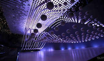
2010 – Shanghai Spheres
For the 2010 World Expo at Shanghai, Japanese firms ADK and Murayama and Las-Vegas firm Fisher Technical Services, Inc. created an array of 1,008 15cm diameter actuated spheres, each suspended by its own micro winch. The show does not include data visualizations. Kinetic sculptures made of arrays of suspended spheres abound. An early one is Joe Gilbertson's (2007). More recent ones include Kinetic Rain (2012) and Triptych (2014). Also check 2008 – BMW Kinetic Sculpture on this list. Source: taittowers.com.
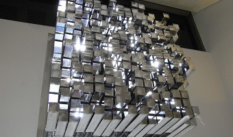
2010 – Headspace: Array of Actuated Bars
Artist Geoffrey Drake-Brockman created Headspace, a matrix of 256 motorized bars (total size 150 x 150 x 80cm) to display the faces of over 700 schoolchildren. Not a data visualization, but could be used as such. Source: Geoffrey Drake-Brockman (2010). http://www.drake-brockman.com.au/
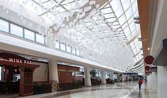
2010 – eCLOUD & airFIELD: Ambient Airport Visualizations
Left image: eCLOUD is an airport installation at the San Jose International Airport created by Dan Goods, Nik Hafermaas, and Aaron Koblin. It is made of many large LCD pixels laid out in 3D space whose opacity change as a function of weather. Right image: A similar installation called airFIELD was created by the same team two years later. It shows air traffic and is installed at the Hartsfield-Jackson Atlanta International Airport. Sources: eCloud project (2010) airFIELD sculpture (2012) Related: For other examples of non-regular or 3D layouts of physical pixels, also see Brygg Ullmer's Strata/ICC system (2010), Rémi Brun's kinematic LED sculptures (2012), and LED cubes.
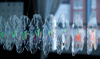
2010 – Limbique: Brain Slices
A neuroscientific physical visualization made by an artist and a neuroscientist. Exhibited at the at the VisWeek 2011 art show. Source: David Paulsen and Pinar Yoldas. Photo by Samuel Huron.
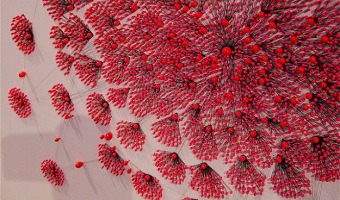
2010 – Relational Ornaments: Networks Shown with Textile
Textile art based on the network maps of Valdis Krebs. Gundega Strautmane, a Latvian textile artist and designer, visualizes social and physical networks in a show called Relational Ornaments. The networks are created using various sized pins to depict nodes and threads connecting them to show relationships. Bringing visualization into the tactile world lends it a weight not able to be achieved on a computer screen. It allows the viewer to pause, spend time with the information, feel it, sense it in a more holistic way. Source: Gundega Strautmane. Photos from Flickr and PInterest.
2010 – Dynamic Bar Chart to Visualize One's Finances
A design project by Swedish designer Hampus Edström to help people keeping an overview of their financial situation. Sources: Hampus Edström, project presentation. Yanko Design blog.
2010 – Keyboard Frequency Sculpture
A 3D bar chart on top of a keyboard which shows the frequency of each letter in the alphabet. Source: Michael Knuepfel. Keyboard Frequency Sculpture.
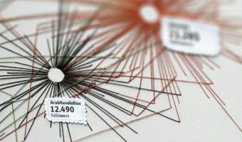
2011 – Digital Arab Spring
Twitter-networks were used by the citizens of the North African states to communicate and organize during the Arab Spring. The virtuality of a computer network becomes tactile and palpable here, like the virtual organization led to actual protests in the streets. The purpose of this data visualisation is to illustrate a magazine-cover and spread and was created as part of an academic graphic design programme. Sources: René Rieger, Digital Arab Spring. Gestalten Blackboard entry (2012).
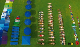
2011 – Ursus Wehrli's Art of Clean Up
Ursus Wehrli, a Swiss comedian and artist, is known for his parodic art project called "Tidying up Art", where he rearranges well-known paintings in an orderly fashion (see his 2003 book and his 2006 TED Talk). In 2011, he started a project called "The Art of Clean Up" where he rearranges everyday objects and people. Sources: Maria Popova (2013) The Art of Cleanup: Ursus Wehrli Playfully Deconstructs and Reorders the Chaos of Life Chronicle Book (2013) Art of Clean Up Book Trailer (youtube video) Ursus Werhli (2006) Tidying up art (TED Talk) Images from cosmichouse.com, imgur.com, and design-milk.com Related: Also see our other entries on physical visualizations created by rearrangement.

2011 – Sleep Patterns
Laurie Frick's Pokey Red is a physical visualization of sleep data over a month. Frick makes an interesting use of the physical support: in her visualization, periods of sleep of a lesser interest (light sleep) are folded up, giving more importance to the periods of quality sleep (coloured rectangles), while remaining integral part of the visualization. "Pokey Red" 12 in x 12 in, cut paper, watercolor and ink. Based on a month of sleep data, with the light sleep (aka trash sleep) periods folded up out of the way, and only deep, REM and awake periods remain. 2011 Source: Laurie Frick (2011) Pokey Red
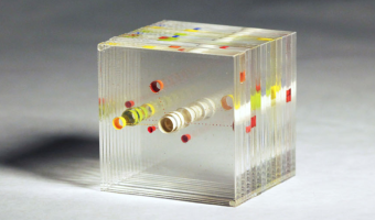
2011 – Blip: A Year of Travel
In his experiments with visualizing data from Tripit to look back at his own (and other people's) travel, Cemre Güngör came up with a new system to create data sculptures from one's travels over time. This work is of a particular interest, in that it shows an excellent example of how a physical visualization design process unfolds, with many questions unique to physicalization add up to the challenge of designing an effective visual representation, i.e., contrasting materials and treatments were done to embody varying representations and evoke different feelings from the viewer. The initial premise for Blip was to create a physical ‘lens’ into travel-related data. It should not be a literal representation of the data; it should not be immediately straightforward, but rather should reveal its nature to the viewer upon examination; it should enable the viewer to observe the dataset through different filters by looking at the object from different angles. Cemre's exploration started with a wood sculpture representing a timeline of flights longitudinally: Here, each flight is depicted as a wooden block shaped like an arc, where the volume of the block is proportional to the length of the flight (Figure 17). Blocks are ordered in a chronological fashion in the vertical axis, whereas the horizontal position is reflective of the longitudinal distance covered by the flight. Flights that cover small longitudinal distances appear as 'peaks', since making the area of those blocks proportional to flight length requires elongating them. There are computer-generated ripples on the surfaces of the curves to make it possible to visually differentiate flights of the same route that happen sequentially. However, the above representation "provided a meaningful visualization only from one angle, the top. Looking at the sculpture facing the blocks or from the side did not provide different insights.". Cemre moved on to transparent acrylic, as a support to "look into one's past". The first iteration using this medium was a depiction of great circle arcs followed by each flight. Blip’s choice of a transparent block as a moldable material was one of relevancy, for the material best represents the feeling of ‘looking into’ one's past. This form and substance facilitates observation from different angles. Top view showing the flight trajectories on a map. Side view showing one year of flight. While this design better alogned with Cemre's intent of enabling seeing the data from different angles, using a map as a support to plot the data was not fully satisfying to him: While I started off with visualizing itineraries on a map, I quickly realized that plotting flights on a map wasn’t translating to something that had emotional impact. After going through follow up designs (see thesis for details), Cemre shifted the main concept so as to move away from the visualization of the actual mecanics of travel. In the final design of Blip, data about the user and the nature of time spent on a trip also come into play. I abandoned the map in favor of an abstract representation that shows each trip in relative locations to home, and depicted their length and purpose. Here, the central circle represents home, and all colored circles correspond to a single trip. Colors depict the purpose of the trip (i.e., blue for "just business", green for "more business than leisure", orange for "more leisure than business", etc...), distance to the center is mapped to the distance from home. Each slice of the stack represent a month in the year. Sources: Cemre Güngör website : http://cem.re/cemre-gungor Cemre Güngör. Blip. A personal data sculpture. Masters' thesis. NYU’s Brooklyn Experimental Media Center. December 2011. Reverse Time Machine: Visualizing a Year Of Travel Data, by Amy Jackson • January 24, 2012. (tipit.com blog)
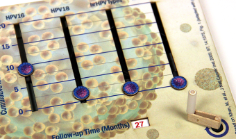
2011 – Manually Animated Graph of Scientific Data
Philadelphia-based multi-discipline artist Bradley Litwin built this physical chart that can be animated by turning a crank. It is the only manually-animated physical visualization we know of so far. It was commissionned by a pharmaceutical company, intended as an educational device for distributing to doctors. Bradley was kind enough to send us an image of the insides of the original prototype, "not quite as pretty as the final product", he says. His explanation: As the crank is turned, a series of radial cams is driven around, each with a profile, derived from the data points along four different indices. The cams actuate cam-followers, which extend to indicators on the corresponding linear, Y axis of the display. The position of the cams is also geared to an elapsed time display, which is the X axis of the graph. Source: Bradley Litwin. Related: If you like cams, also see our entry on ballistic cams from the 1950s.
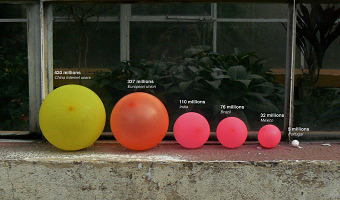
2011 – Jose Duarte's Handmade Visualization Toolkit
Colombian designer Jose Duarte wants to bring the DIY concept to data visualization. Using ordinary materials like balloons, tape and rubber balls, he has experimented with various visualization techniques from area charts to bubble graphs and ven diagrams in diverse scenarios as business, art, street interventions and even astronomy. To help people build physical visualizations he designed a physical toolkit he calls the Handmade visualization toolkit. Sources: Maria Popova (2011) Analog Infoviz: Handmade Visualization Toolkit. Jose Duarte's Flickr photostream. Jose Duarte's Website www.handmadevisuals.com. All images by Jose Duarte.
2011 – Stephen Barrass' Physical Data Sonifications
Physical representations of data can target other senses than vision or touch. Stephen Barrass, one of the inventors of sonification in the late 90s and now at the University of Canberra, started to explore physical sonifications in 2011. He calls this principle Acoustic Sonification: Acoustic Sonifications are physical objects designed to make sounds that convey useful information about a dataset of some kind. Unlike other sonifications, they do not require a power supply, and the sounds are interactively produced in real time through physical interaction with the object. The image on the top shows his recent Hypertension Singing Bowl (2013), a singing bowl that has been digitally shaped from a year of blood pressure readings, and 3D printed in stainless steel. Its pitch and timbre are a function of the recorded data. The second row shows earlier explorations: to the left is the HRTF Medaillon (2011). The dataset consists of two HRTFs measured on a dummy head. A Head Related Transfer Function (HRTF) characterizes how a particular ear receives sound from different points in space. Because each ear is uniquely shaped its HRTF is also unique. One side of the medallion shows data from the left ear, while the other side shows data from the right ear. This design was initially not meant to produce sounds. The next image shows an iteration (2012) where HRTF data has been used to create bells of different shapes and acoustic qualities. Although differences in shape between the left and right bells are hardly visible, the pitch and timbre they produce can be compared against each other, and with the "null bell" in the middle. Sources: Stephen Barrass (2014) discusses and demos his different designs on youtube. Stephen Barrass (2011) HRTF Medaillon. Stephen Barrass (2012) Digital Fabrication of Acoustic Sonifications. Stephen Barrass (2012) Acoustic Sonification (you can hear the HRTF bells there). Jane (2013) Interview: Stephen Barrass and his Singing Bowls. Stephen Barrass (2014) The Hypertension Singing Bowl: Research Through Design in Acoustic Sonification. Stephen Barrass (2014) Acoustic Sonification of Blood Pressure in the Form of a Singing Bowl. All images by Stephen Barrass. Video by Umwe Bejo.
2011 – Tape Recorders: Time-Measuring Tapes
Rows of motorised measuring tapes record the amount of time that visitors stay in the installation. As a computerised tracking system detects the presence of a person, the closest measuring tape starts to project upwards. When the tape reaches around 3 meters high it crashes and recoils back. Each hour, the system prints the total number of minutes spent by the sum of all visitors. Commissioned by the Museum of Contemporary Art, Sydney Source: Rafael Lozano-Hemmer http://lozano-hemmer.com/tape_recorders.php
2011 – Warning: Real Time Global Air Quality Display
Warning - Real Time Global Air Quality Display is an installation of ambient display that receives data from the internet about the air quality in 30 cities in 5 continents. The installation of these data is dynamically displayed on a screen and a physical structure through a lighting system (LED) located in a public space. The motivations for this project are digital aesthetics of climate change created by Pold, (2010), that means artworks in digital art involving the issue of the environment as a theme and the concept of eco-visualization curated by Holmes (2007) that can be defined as animations controlled by data that show any kind of environmental information in real-time. Source: Rodrigo Medeiros. Warning - Real Time Global Air Quality Display (video)
2011 – Adrien Segal's Data Furniture
Adrien Segal is an artist with a background in furniture design. She takes a data-driven approach where she uses data of natural events and environmental developments and transforms them into beautiful furniture. The choice of forms and materials conveys the origin of the data in an intriguing way. Left image: TRENDS IN WATER USE is a data sculpture that graphs national statistics of water usage in the United States over 50 years, from 1950 - 2000. The width of the canyon walls represent how much water is used. Each river or tributary represents a specific category of water use based on the USGS report; Thermoelectric Power, Irrigation, Industrial, Public Supply, Domestic, and Mining/Aquaculture/Livestock/Rural (combined). The shape of the canyon as seen from above is derived from a map of the Colorado River in its entirety (Thermoelectric) and it’s main tributary, the Green River (Irrigation), as well as three smaller tributaries - accounting for all water (fresh and saline) withdrawn in the United States each day: 408,000 million gallons. Right image: SNOW WATER EQUIVALENT CABINET is a data sculpture illustrating snowpack measurements recorded at Ebbetts Pass in the Sierra Nevadas of California. Sourcing SNOTEL data archived on the National Water and Climate Center's website, 31 total water years of data are represented, from 1980 - 2010. The height of each drawer layer is relative to the annual total precipitation by year. The sculpted plywood front is a three dimensional graph of the amount of water in the snow-pack at any given time during the water year, showing specifically the first snowfall, peak amount of water, and final snowmelt as changes occur from year to year. The size of each drawer is directly related to the amount of water in the snowpack, the smaller the drawer the less water stored, and the less storage space available in the drawer. Check out the artist's website linked under sources for details of the data mappings used and the construction process. Sources: Adrien Segal. Project page for Trends in Water Use (2011). Adrien Segal. Instructable for Trends in Water Use. Adrien Segal. Project page for Snow Water Equivalent Cabinet (2011).
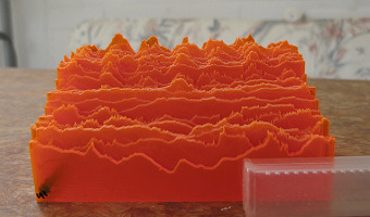
2011 – Laser-Cut Time Series
Temperature measurements in Helsinki from May 2009 to May 2010. Each row is one week long. Source: Miska Knapek, see flickr photoset.
2011 – David Bowen's Sea Wave Replicators
Top: Tele-present water by David Bowen is an actuated surface controlled by wires and servo-motors that replicates sea wave patterns measured in real time in a remote location. Bottom: Underwater is a larger-scale version created by the same author. Sources: David Bowen (2011) Tele-present water series. David Bowen (2012) Underwater series.
2011 – DataCoaster: Data-Driven Toys
DataCoaster is a re-imagining of the classic waiting room toy. But instead of arbitrarily loopy lines, DataCoaster's lines are generated by data, essentially transforming a simple, kinetic toy into a graph of information. If you're interested in getting one of these for your data, have a look at the source for this entry and contact Bobby - he is planning to offer this service. Source: Bobby Genalo. DataCoaster.
2011 – Can We Keep Up: Sponges Show Domestic Water Usage
Can We Keep Up is a a physical data visualisation that investigates the domestic need for water in cities all over the world. Source: infosthetics.com. Image from Hal Watts.
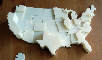
2011 – DIY United States Electoral Vote Map
This is a 3D scale replica of the United States, the state height corresponds to the number of electoral votes each state controls in a presidential election. Source: thing 11178 on thingiverse.com
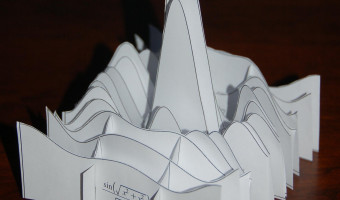
2011 – Paper Models of 3D Plots
Paul DeMarco from Maplesoft explains how to slice up 3D plots to build solid paper models. Source: Mapleprimes
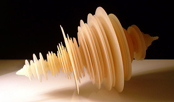
2011 – Tōhoku Japanese Earthquake Sculpture
A data sculpture by Luke Jerram that depicts nine minutes of seismographic readings during the 9.0 earthquake. Source: Gizmodo. Photo by Luke Jerram.
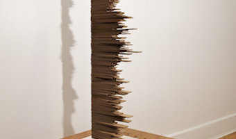
2011 – From Over Here: News Trends
"From Over Here" is a physical representation of articles from the New York Times from 1992-2010. Each card represents a month of articles about, or related to Ireland. The people and topics mentioned in the articles are etched on each card. Sources: Paul May, From Over Here, March 2011. infosthetics. Flickr album by Paul May - paulmay.org.
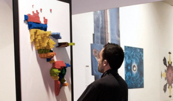
2011 – LEGO Prism Maps
Prism maps showing migration patterns between the Americas. Each Lego brick represents 10.000 people. Source: Samuel Granados. Lego Cartograms (via FlowingData and infosthetics).
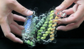
2012 – A Soft and Transparent Handleable Protein Model
This report demonstrates the viability of a new handleable protein molecular model with a soft and transparent silicone body similar to the molecule’s surface. A full-color printed main chain structure embedded in the silicone body enables users to simultaneously feel the molecular surface, view through the main chain structure, and manually simulate molecular docking. The interactive, hands-on experience deepens the user’s intuitive understanding of the complicated 3D protein structure and elucidates ligand binding and protein–protein interactions. Sources: Masaru Kawakamia (2012) A soft and transparent handleable protein model. TCT Magazine (2012) Transparent, handleable 3D printed molecular models. Left photo by Masaru Kawakami, published by TCT Magazine. Related: Also see our entry 2004 – Scripps’ Molecule Models or all our entries on chemistry.
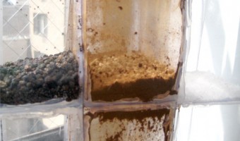
2012 – Stop & Frisk: Physical Data Filtering
Chilean designer Catalina Cortázar created a physical visualization showing the proportion of black, hispanic and white people searched by the New York police in 2010. Each of the three compartments stands for a race and contains an amount of powder proportional to the race's population in New York. When the object is turned upside down, the powder falls into an adjacent compartment except for coarser particles that do not make it through the holes and represent people stopped by the police. Sources: Catalina Cortázar (2012) Stop & Frisk – Data Visualization. Photos by Catalina Cortázar.
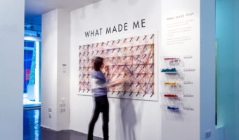
2012 – What made me
An interactive public installation where visitors could engage by picking coloured strings corresponding to feelings, inspirations, thoughts or influences that make the person they are today, and link these strings to words on the wall to make a path visualizing associated concepts tied to each of these feelings, inspirations, thoughts and influences. WHAT MADE ME was designed by Dorota Grabkowska and Kuba Kolec for the Birmingham Made Me Design Expo (15-22 June 2012) at the Mailbox, Birmingham. Commissioned by the Idea Birmingham and Birmingham City University, the installation was created to provide an interactive experience for visiting members of the public. The project was based around a concept of information visualisation in a form of a large scale, complex data map, generated by visitors themselves. The aim of the project was to explore what shapes the people of Birmingham by asking them these five simple questions: What made you Think? What made you Create? What made you Angry? What made you Happy? What made you Change? Each question was assigned to a different colour and could be answered by connecting relevant words together with a coloured thread. Almost a hundred words were displayed alphabetically in a grid, giving the participants a wide choice of possible answers. Through this visual language, the participants were able to share their feelings, influences, thoughts and inspirations, which made them who they are today. Over the course of the week, a multi-layered visual data map has been created, concluding the Birmingham Made Me Design Expo. The project has won the Most Original Exhibit Award at the Birmingham Made Me Design Awards 2012. Sources: Dorota Grabkowska's website: http://www.grabkowska.com/?p=326 Behance blog : https://www.behance.net/gallery/4419469/WHAT-MADE-ME-Interactive-Public-Installation
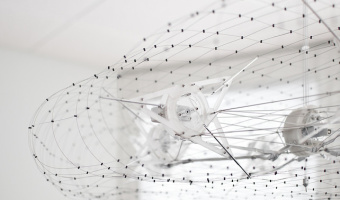
2012 – Point Cloud: A Dynamic Weather Sculpture
James Leng’s ‘Point Cloud‘ consists in a 3D wire structure materializing real-time weather information by moving and undulating. The wire structure is articulated by pistons activating wheels to deform the surface according to data. The structure could be articulated for other types of data than weather forecast. This structure represents a first attempt to build a physical 3D weather forecast system. The speed, smoothness, and direction of rotation are modulated to interpret a live feed of weather data. Instead of displaying static values of temperature, humidity, or precipitation, Point Cloud performs the data, dynamically shifting between stability and turbulence, expansion and contraction. It re-introduces weather conditions as a permanently variable state, and creates a visceral experience in our interactions with weather. Source: James Leng, Point Cloud.
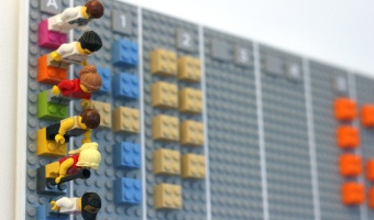
2012 – Bit Planner - LEGO calendar
Vitamins studio created The Bit Planner, an elegant wall mounted time and resource planner made entirely of Lego bricks. In this tangible calendar, each gray row represents a month, and each gray rectangle represents a week, and everyone in the group has their own line in the calendar (see left image). Projects are associated to different colors, and each LEGO block corresponds to half a day spent working on a project. While entirely tangible, the Bit Planner can be synched with an online, digital calendar by taking a photo of the wall mounted display. See the presentation video for more details. More photos can also be found on the Bit Planner website. Source: Bit Planner website.
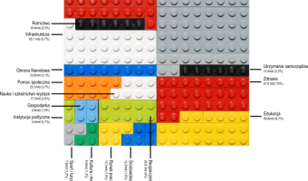
2012 – Poland Budget Presented with LEGO Bricks
An area chart created with LEGO bricks. Each colour presents a single domain in the 2011 Polish budget. Source: Przemyslaw Biecek (2012) SmarterPoland.
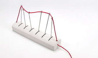
2012 – Pulse: Tangible Line Graph
Pulse is a tangible line graph. It is composed of a string whose position is changed with six servo motors. By tilting the device, one can change between three information feeds. Pulse was created by designers Jon McTaggert and Christian Ferrara. Source: Christian Ferrara and Jon McTaggert, cargocollective.com/Pulse
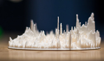
2012 – Google Eye: Radial Visualization of Page Visits
During the Generator.x 3.0 workshop, interaction designer Andrej Boleslavský created a radial visualization of page visits where each day spans a specific angle of the ring, and the entire ring spans one year. Source: Andrej Boleslavský (2012) Google Eye.
2012 – Grand Old Party: Political Satire
American designer Matthew Epler shows how to build physical visualizations out of silicone using 3D printing and mold casting. He also shows how to use them to make political statements. Source: Matthew Epler (2012) Grand Old Party (video here).
2012 – Data Cuisine
The left image is a map that shows the differences in alcohol consumption across Finland, as well as typical local food. The right image shows the number of immigrants in Finland by nationality (rice for the Chinese, salmon for the Swedish). Many other examples of edible physical visualizations can be found on the Data Cuisine web site. Data Cuisine is a series of workshops organized by Moritz Stefaner and prozessagenten. Seven workshops took place so far, the first one was in Helsinki in 2012. According to an online article: The workshop invites participants to translate local data into culinary creations, turning arid numbers into sensually 'experienceable' matter. Participants chose their topics, investigate related data, shop for comestible ingredients and under the guidance of chefs, they learn how to create dishes that will not only be delicious but also act as entry points to discussions about local issues that range from emigration to criminality, suicide rate, unemployment, sexuality or science funding. Sources: Moritz Stefaner and prozessagenten (2012) Data Cuisine. Régine Debatty (2014) Data Cuisine, food as data expression. Moritz Stefaner and Susanne Jaschko (2016) Data Cuisine (talk)
2012 – Slime Mold Imitates the United States Interstate System
Can a slime mold solve the traveling salesman problem without a digital computer? From the article's abstract: The plasmodium phase of Physarum polycephalum is a champion amongst living creatures used in laboratory prototypes of future and emergent computing architectures. A wide range of problems from computational geometry and logic can be solved by this cellular slime mold. A typical way to perform a computation with the slime mold is to represent a problem’s data as a spatial configuration of nutrients and allow the slime mold to span the nutrients with its protoplasmic network. The architecture of the network represents a solution to the problem. We use a similar approach and exploit foraging behavior of P. polycephalum to imitate the formation of the United States transport network in laboratory conditions. Major urban areas are represented with rolled oats, the plasmodium is inoculated in one urban area, we wait until all oat flakes are colonized by the plasmodium, and then the protoplasmic network developed by the plasmodium is analyzed. The slime mold’s networks are compared with the interstate network and the networks are analyzed in terms of proximity graphs. Source: Andrew Adamatzky and Andrew Ilachinski (2012) Slime Mold Imitates the United States Interstate System.
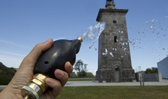
2012 – Pulse Drip: Visualize Heartbeats with a Water Hose
Pulse Drip Interactive installation originally developed for Urdaibai Art 2012 in which the public can water the lawn at the Torre de Madariaga using a water hose with a heart rate sensor built-in. To participate, visitors take the hose wherever they want to water: by putting their index finger on a tiny sensor on the spray head, his or her pulse is detected and an automated electromechanical valve controls the water flow to match the beat of the participant's heart. The spray head is a custom-made handle with a built-in heartbeat sensor, a rechargeable battery, a radio transmitter and an Arduino processor. Source: Rafael Lozano-Hemmer http://lozano-hemmer.com/pulse_drip.php
2012 – Chaotic Flow: Abstract Flow Visualization of Copenhagen Bike Traffic
Biking is the transport form of choice in Copenhagen, Denmark. The city is equipped with generous bike lanes and the municipality put up counters at some check points to get a better estimate of the thousands of cyclists coming through every hour. Tobias Lukassen, Halfdan Hauch Jensen and Johan Bichel Lindegaard from Illutron Collaborative Interactive Art Studio used this data to create the above depicted abstract visualization of the city's bike traffic for the 4S / EASST joint conferences in Copenhagen 2012. Using water pumps, compressed air and 1000 meters of PVC tubing we designed a sculpture that simulates the flow of bike traffic through the streets and pathways of Copenhagen. Presenting the real data in an abstract form. Source: Tobias Lukassen, Halfdan Hauch Jensen and Johan Bichel Lindegaard. Chaotic Flow (2012).
2012 – Large-Scale Drone Swarm
Floating spheres again, but this time there is no wire. An outdoor demonstration of 49 quadrocopters in a synchronized motion, by Ars Electronica Futurelab and Ascending Technologies GmbH. Sources: The Blaze (2012) Also watch another demonstration involving 20 small quadrocopters indoors by the GRASP Lab at the University of Pennsylvania (2012).
2012 – Dynamic Network Sculpture
A physical space-time cube representation of cultural heritage data. Source: Florian Windhager, Eva Mayr. Cultural Heritage Cube: A conceptual framework for visual exhibition exploration. IV '12.
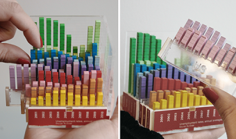
2012 – Rearrangeable 3D Bar Chart
A modular physical visualization like this rearrangeable 3D bar chart allows people to sort, filter, compare and examine data by direct physical manipulation. Sources: Yvonne Jansen and Pierre Dragicevic (2013) An Interaction Model for Visualizations Beyond the Desktop. Also see Yvonne Jansen's PhD dissertation on Physical and Tangible Information Visualization (2014)
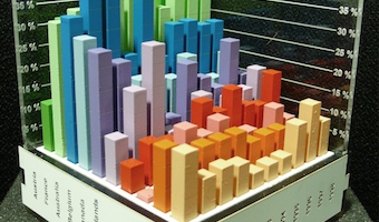
2012 – Putting Physical Visualizations to the Test
These physical bar charts, showing the evolution of country indicators over time, were used to conduct the first empirical study showing that physical visualizations can outperform their on-screen counterparts for data retrieval tasks. Sources: Yvonne Jansen, Pierre Dragicevic and Jean-Daniel Fekete (2013) Evaluating the Efficiency of Physical Visualizations. Related: Also see Yvonne Jansen's PhD dissertation on Physical and Tangible Information Visualization (2014).
2012 – Matthijs Klip's Data Sculptures
Left image: data sculpture by Dutch designer Matthijs Klip showing life expectancy of the Netherlands population. Each bar maps to an age; the bar's height represents life expectancy while its length represents the amount of people having that age. Right image: other designs by Matthijs Klip. Source: Matthijs Klip (2012) Physical Information Design.
2012 – PARM: Static Terrain Models with Projection
The PARM system is part of an ongoing research project at the University of Nottingham. A static physical relief model is augmented with top projection to display landscape details and to overlay with additional data visualizations. Sources: James Goulding's project page. Pristnall et al (2012). Projection Augmented Relief Models (PARM): Tangible Displays for Geographic Information.
2012 – Meshu.io: Data Jewellery you can Order Online
A company lets you enter in cities you've been to and generates a physical mesh to order as a necklace, earrings, or cufflinks. Source: http://meshu.io/
2012 – Thesis LEGO Board
A design exploration of LEGO-based physical visualizations for project management by educational scientist Daniel K. Schneider. Sources: Daniel K. Schneider (2012) Lego-compatible thesis project board. Edutech Wiki. Daniel K. Schneider (2015) Poster presentation from the EIAH'15 conference (the paper, the actual poster)
2012 – All Possible Photons: Steel Feynman Diagrams
These are stainless steel sculptures of Feynman diagrams created by Edward Tufte. They are currently (opening Sep 12, 2012) exhibited at Edward Tufte's gallery in Chelsea. Source: Edward Tufte. All possible photons - The conceptual and cognitive art of feynman diagrams.
2012 – Emoto: Projection Augmented Heatmaps of Twitter Data
The core of the installation is a physical data sculpture consisting of 17 objects, each representing all Tweets we have collected during one day of the Olympics. Mapped onto this physical sculpture we have then projected individual heat maps for the most interesting themes we have identified while observing emoto during the Games. Users were able to navigate through these themes using an interactive controller and thus explore our archive. Source: Moritz Stefaner, Drew Hemment & Studio NAND. Emoto.
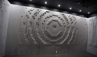
2012 – Hypermatrix: Animated Matrix-Walls
2012 Yeosu EXPO HYUNDAI MOTOR GROUP created by media artist group : Jonpasang. Hyper-Matrix is a kinetic landscape installation created for the Hyundai Motor Group Exhibition Pavilion in Korea, the 2012 Yeosu EXPO site. The installation consists of a specially made huge steel construction to support thousands of stepper motors that control 320x320mm cubes that project out of the internal facade of the building. The foam cubes are mounted to actuators that move them forward and back by the steppers, creating patterns across the three-sided display. Comprised of what at first appear to be three blank white walls, Hyper-Matrix installation quickly comes to life as thousands of individual cubic units forming a field of pixels begin to move, pulsate, and form dynamic images across the room, creating infinite number of possibilities in the vertical, 180 degree, landscape. In addition, as the boxes are arranged at only 5mm narrow intervals, the wall can also be a nice moving screen for the images projected on to it. Source: Jonpasang, Hypermatrix.
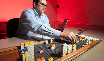
2012 – General Motors' 3D LEGO Visualizations
LEGOs help business executives log and explore data. Sources: Mark Wilson (2012) How GM Is Saving Cash Using Legos As A Data Viz Tool. The Daily Drive (2012) GM Plays with Legos (Video).

2013 – Sonic Sculptures
Sonic Sculptures is a project by Blair Neal for visualizing the FFT data of songs and generating 3D printable files. A custom piece of software takes in real-time audio and generates shapes (spirals/loops/flat planes) that can be exported as files that can be 3D printed as a keepsake that captures the low/mid/high range of sound. Meant to be a physical artifact of someone’s favorite song.
Source: Blair Neal (2015) Sonic Sculptures. (archived version)
Related: Also see our other entries on sound sculptures and more generally on sound.
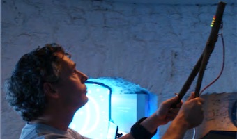
2013 – Solar Radiation Dowsing Rod
The Solar Radiation Dowsing Rod is a device created for a space observatory that allows visitors to point it towards the sky and feel, through light, vibration and sound, the level of radiation coming from that direction.
The rod enables people to perceive data only during interaction (as data is not encoded in the shape of the artifact, but rather experienced through it).
”[…] crossmodal data-driven artefacts that represent live data streams using haptic-auditory feedback. The motivation for creating these artefacts was to offer casual users the opportunity to interact with data that would normally only be explored by experts, with the aim of stimulating curiosity, intrigue and awareness. […] created in collaboration with Blackrock Castle Observatory, Cork, Ireland and the Irish National Space Centre.” (Hogan & Hornecker, 2013)
Sources:
Hogan, T. (2017). Data and Dasein — A Phenomenology of Human-Data Relations [Bauhaus-Universität Weimar]. https://doi.org/10.25643/bauhaus-universitaet.2905 Hogan, T., & Hornecker, E. (2013). In touch with space: Embodying live data for tangible interaction. Proceedings of the 7th International Conference on Tangible, Embedded and Embodied Interaction, 275–278. https://doi.org/10.1145/2460625.2460671 H3 & Solar Radiation Dowsing Rod. (n.d.). Retrieved August 12, 2021, from https://vimeo.com/47537809
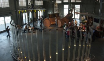
2013 – Tidal Memory
Tidal Memory displays the evolving daily tide at full scale. Receiving live data from the oldest tide station in the western hemisphere, twenty-four water-filled glass columns function as a tidal clock and 24-hour sculptural archive; recording a full day of hourly tide levels starting at midnight. 26’L x 2.5’W x 10’H - Glass, stainless steel, water, custom electronics. Tidal Memory is permanently exhibited at the Exploratorium, San Francisco, CA. Source: Charles Sowers (creator), http://charlessowers.com/tidal-memory
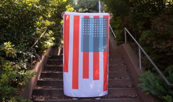
2013 – State Of The Union
In this project, data related to the condition of American citizens is mapped to the number of stars, size of the bars, and size of the blue square on the American flag. The flag is presented as a dynamic entity that evolves over time: State of the Union takes a set of metrics and visually transforms elements on the flag to represent their current state1. Over years or decades, citizens would be able to perceive shifts in the country as we get wealthier, healthier and live better lives—or not. In the case of the American flag here, meaning is driven by the condition of the citizens it represents rather than abstract notions of statehood or bygone colonies. The stars represent each year of life expectancy. The blue field on which they sit stretches based on GDP per capita. The stripes are a sort of horizontal bar graph showing five different socioeconomic metrics: unemployment, divorce rate, homicide rate, school enrollment and gender salary ratios. In some cases, such as the unemployment rate, the stripe grows in an inverse relation to the metric2. Source: Nadeem Haidary, State of the Union.
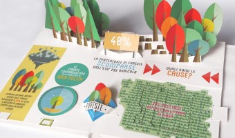
2013 – Pop-Up Infographics
In 2013, Italian graphic designer Elena Turtas crafted four books that convey data about sustainability using pop-up and movable paper mechanisms. Source: Elena Turtas (2014) The Four Books of Visualising Sustainability.
2013 – Temperature Scarves and Afghans
On January 2013, Kristen Cooper Nutbrown from British Columbia had the idea to create a temperature scarf by knitting one row every day using a color that encodes the temperature of the day. At the end of the year, the scarf visualized local temperature readings for the whole year. Soon after Kristen pitched her idea, Arlene Cline, also from British Columbia, started to create a temperature afghan (a blanket of knitted or crocheted wool). Temperature scarves and afghans became quite popular in the knitting community, and several tutorials exist on how to make them. The temperature scarf on the left photo above is from ravelry.com user SleepyEyes (completed 31 Dec 2014). The afghan on the right is from Sharon MacDermaid (completed 31 Dec 2016). The popularity of temperature scarves rose again in 2017 with the Tempestry Project, a reaction to Trump's hostility toward climate science. Sources: Kristen Cooper Nutbrown (2013) Knitting!: My Year in Temperatures -Scarf- (archived version) Kristen Cooper Nutbrown (2013) My Year in Temperatures -Scarf- on ravelry.com (archived version) Arlene Cline (2013) temperature afghan-c (archived version) Michael Sellick (2017) Temperature Afghan (tutorial with video) Left photo from SleepyEyes (2014) (archived version), right photo posted on facebook and twitter by Ellen Bacca (2017), shows a creation by Sharon MacDermaid. Related: Also see our other entries on data clothing, textile and weather.
2013 – 3D Spherical Visualization with Aural Sonification
Evan Atherton created a LED-based 3D ball rendering visual effects from sound while diffusing the music through small cones of the device. This has been produced with a high-resolution 3D printer. LumiGeek developed an application to control the device, such as for playing music. Independently of that usage, the device could be envisioned to produce 3D spherical visualisation, a promising area according to the references below, both mathematically and interactively. Sources: Michael Gorman, 3D printed speakers give you a custom light show to go with your tunes Evan Atherton, 3D Printed Speaker Enclosures (With Lights!) Philip Leonga, Simon Carlileb, Methods for spherical data analysis and visualization, Journal of Neuroscience Methods, Volume 80, Issue 2, 30 April 1998, pp. 191–200. Karla Vega, Eric Wernert, Patrick Beard, Tassie Gniady, David Reagan, Michael J. Boyles, Chris Eller, Visualization on Spherical Displays: Challenges and Opportunities, Proceedings of the IEEE VIS 2014 Arts Program, VISAP'14: Art+Interpretation (Paris, November 9-14, 2014), pp. 108-116.
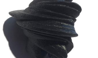
2013 – Releases
The New-York-based design agency HUSH crafted a piece of custom software that generates digital, three dimensional visual forms based on the unique timbres and tonalities of individual voices. They asked 100 people to share their feelings about the end of 2013, and the beginning of 2014, in the form of a spoken “release.” Using the forms generated by their software they then created and analog printed a limited run of 100 posters (right image) that they sent to the people that inspired them most in 2013. Some of the models were 3D-printed (left image). Source: HUSH (2013) Releases.
2013 – Doug McCune's Physical Maps
Doug McCune is a programmer turned artist, and he is obsessed with maps. In 2013, he got bored with screens and started to build physical thematic maps. He specializes in turning "horrible data" such as murders and natural disasters into beautiful objects. Above on the left is an artwork titled "stalagmite crime" that shows elevation maps of crime rates in San Francisco: narcotics-related crimes (green), prostitution (blue) and vehicle theft (orange). Sources: Doug McCune (2013) Physical Maps – My 360 | intersect Presentation. Doug McCune (2015) Deviant Cartography. Doug McCune (2015) Desperately Trying to Remove the Air Quotes Around the Word “Artist”.
2013 – Walkable Age Pyramid
A walkable age pyramid of the German population. It was part of an exhibition on demographics by Atelier Brückner. The sculpture gives an impression how the distribution of age groups shifted between 1950 and 2010. For example, it shows how two world wars took out certain age groups and the lasting effect of the "Pillenknick" (the drop of birth rates due to the wide availability of "the pill"). Sources: Left photo: front view (time goes from the front to the back) picture taken by Michael Jungblut, part of the press release package. Right photo: rear view, picture from Marius Watz' flickr stream.
2013 – Population Density Emerging from Walls
Two Yale architects created a room-sized physical visualization of world population density folded into itself: Hsiang and Mendis then turned that spatial visualization into a physical installation at the 2011 Chengdu Biennale in China. They modeled the population distribution of the entire world in a kind of inverted map that visitors could walk into, inside a 10-by-10-by-10 foot room, with North America on the ceiling, Asia on one wall, Africa on another (see also the little boy in the above photo): Sources: Emily Badger (2013). What If the Entire World Lived in 1 City? Via Rodrigo Derteano's pinterest
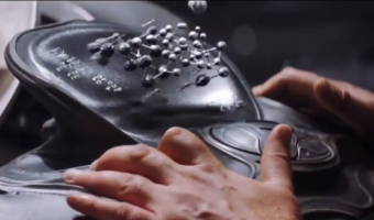
2013 – Programmable Matter Stars in a Movie
Programmable matter with levitation capabilities is a key visual element in the 2013 movie Man of Steel. The (slowed down) segment above reveals what appears to be a 3D node-link diagram. This display technology is employed by an advanced civilization on Krypton and is referred to as Liquid Geometry or Liquid Geo by the movie team. Visual effects supervisor Dan Lemmon explains that it consists in: a bunch of silver beads that are suspended through a magnetic field, and the machine is able to control that magnetic field so that the collection of beads behave almost like three-dimensional pixels, and they can create a surface that floats in the air and describes whatever the thing is you’re supposed to be seeing. Senior visual effects supervisor Joe Letteri clarifies the intent: This stems from an idea that Zack Snyder [the movie director] had. He wanted to do something that was interesting and different in the way you saw the information presented. He didn't want to do just a typical screen. So one of the ideas that Zack had was to make it a little bit more tactile. The shapes really need to transform. You need something that has that look but has to be in a sense more liquid. [...] They had this sort of metallic, liquid droplet kind of feel, but it felt tactile. Ironically, although liquid geo was designed to "feel tactile", no one ever touches it in the movie. One might also wonder why Kryptonians appear to be stuck with monochrome rendering. Nevertheless, Man of Steel significantly departs from sci-fi stereotypes featuring either flat displays or disembodied holograms. Computer representations become both three-dimensional and tangible, and most importantly, they reflect natural light. Are we finally reaching the end of antiquated sci-fi aesthetics inspired from the Tron movie? Sources: Warner Bros. Pictures (2013) Man of Steel. Wired (2013). Extra-Special Effects: The New Tech That Brought Krypton to Life in Man of Steel. Wikipedia article on Man of Steel. Related: Also see our entry on programmable matter.
2013 – Punchcard Economy: Data Knitting
Punchcard Economy is a machine-knitted tapestry inspired by a 1856 banner advertising the Eight-hour day movement. The layer of visual noise shows today's departure from the eight-hour day philosophy. Working hours were collected from 116 participants, and each hour of work outside normal working hours was encoded as a color-inverted knit. A smaller version was made for the 2014 Data as Culture exhibition. Sources: Sam Meech (2013) Punchcard Economy. Explanation of the data encoding in this video (starts at 2:45). Left image from www.fact.co.uk, right image from punchcardeconomy.co.uk.
2013 – Examined Life: Giving Shape to Activities
Designer Alex Getty logged his daily activities for 40 days and turned them into data sculptures that look like colored paper origami. Source: Alex Getty (2013) The Examined Life
2013 – Loci: 3D Printed Sculptures of Your Flights
Loci by Andrew Spitz lets you easily create physical 3d arc diagrams based on your past flights, and may be soon be available through an iphone app. Source: Andrew Spitz (2013) Loci - 3D Printed Sculptures of Your Flights.
2013 – Turning Facebook Connections into Data Sculptures
An application created by SOFTlab and The Creators Project lets you turn your facebook social network into a beautiful crystal-like data sculpture. Sources: Kree8tiv via iohannan's pinterest. See the page on shapeways.
2013 – A Snow Chart of Mobility in Science
A barchar made out of snow. Each bar is a percent of scientist after PhD that changed their university after thesis defence. Source: Przemyslaw Biecek (2013) SmarterPoland.
2013 – 3D Social Networks
Jeff Hemsley from Syracuse University explains how to create solid models of social networks using the statistical package R and a 3D printer. 3D node-link diagrams have been explored for a while due to their potential benefits. One is that any node-link diagram can be laid out in 3D without any link crossing. Some studies have also shown that in some cases 3D node-link diagrams are easier to read than 2D ones. However, 3D visualizations are generally hard to navigate and to perceive on regular screens, so researchers have progressively lost interest. Digital fabrication and reconfigurable materials may revive them. Source: Jeff Hemsley (2013) The MakeR way: Using R to reify social media data via 3d printing.
2013 – Motion Structures: Videos as Space-Time Objects
Everardo Reyes-Garcia from Université Paris 13 turns video sequences into space-time shapes that can be 3D printed. The sculpture above represents 5 seconds of the opening theme of Game of Thrones. Source: Everardo Reyes-Garcia (2013) Motion Structures. Related: Also see our entry 2006 – Peter Jansen's Movement Sculptures.
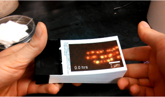
2013 – Flip Books Rather Than Movies
Cell biologist Jessica Polka discusses the benefits of making flip books to bring to scientific conferences: With the advent of smartphones and tablets, bringing movies to poster sessions is becoming more common than ever before. Even so, a low-tech flip book is still a lot more fun for visitors to use, and it's easier to pass around a large group. When the session's over, a flip book can live at your bench indefinitely, ready for visitors with no boot time. Source: Jessica Polka (2013) Hands on Data: How to Make Flip Books for Science. (Seems currently offline, try the version from archive.org).
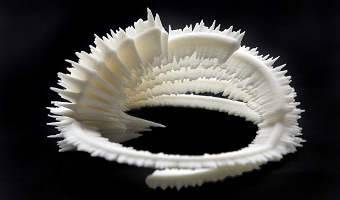
2013 – Data Sculpture of Chicken Inbreeding
Ryo Sakai and Jan Aerts from the Bioinformatics/Data Visualization Lab at KULeuven created a data-driven sculpture representing inbreeding in a particular chicken. Each loop in the sculpture represents a chromosome. On the outside is a histogram of the heterozygosity of the DNA; the inside a histogram of the homozygosity in that region. These sculptures are part of the Cosmopolitan Chicken Project, and have been presented at the Art Biennale in Venice. Source: Text and images from Jan Aerts.
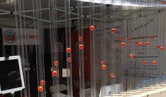
2013 – Pneumatic Charts
The Hive Big Data Think Tank at Palo Alto created a device for visualizing city data (power, waste, demographic, transportation) using blowers, microcontrollers and ping pongs balls. Sources: Lance Riedel, Christophe Briguet, Srinivas Doddi, Daniel Schwartz, Pashu Christensen, The Hive @City Camp Palo Alto for the National Day of Civic Hacking! Svetlana Sicular (2013) Now Open.
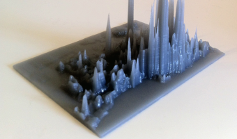
2013 – Very Pointy Elevation Map
Toronto-based startup DataAppeal, which develops Web apps for 3D geo-spatial data visualization, created this very pointy stalagmite-looking elevation map of GTA Transit volume in Toronto. Sources: Andy Kirk (2013) 3D Printing Capabilility via DataAppeal Maps. Candice So (2013) Data visualizations go from flat to 3D.
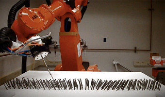
2013 – Robot Arranges 8,000 Nails Into a Data Sculpture of the Wind
Student and interaction designer Charles Aweida used a foam board, a robot and lots of nails to build a physical visualization of a wind simulation. Sources: Charles Aweida (2013) An exploration in art + robotics representing wind through digital fabrication and the tangible. Via The Creator Project (2013) Data Sculpture Of The Wind Created Using A Robot And Lots Of Nails.

2013 – Behavioral Landscapes
A mixed team of artists and scientists at Pennsylvania State University devised a method to visualize human behavior, personality and emotions as 3D probability density functions. They then produced solid models using CNC milling. Sources: Studio|Lab (2013) Behavioral Landscapes. Nilam Ram, Michael Coccia, David Conroy, Amy Lorek, Brian Orland, Aaron Pincus, Martin Sliwinski, and Denis Gerstorf (2013) Behavioral Landscapes and Change in Behavioral Landscapes: A Multiple Time-Scale Density Distribution Approach.
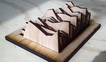
2013 – Line Charts of Cortisol Levels
This data sculpture created by Nilam Ram from the Studio|Lab team at Penn State University shows the evolution of cortisol levels for 34 people after they experienced a stressful situation. Source: Nilam Ram (2013) Cortisol Data Sculpture.
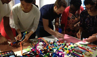
2013 – Quickly Authoring Physical Visualizations
Rahul Bhargava animates workshops where he has participants quickly build physical visualizations using raw material. One of the workshop's goals is to develop people's visual literacy. Source: Rahul Bhargava (2013) Activities for Building Visual Literacy. datatherapy.wordpress.com.
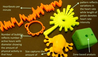
2013 – SweatAtoms: Physical Activity Sculptures
Rohit Ashok Khot is a PhD student at the Exertion Games Lab at RMIT University in Melbourne who studies how physical visualizations of self-logged physical activity data can enhance the experience of exercising and perhaps provide an incentive for exercising more. Sources: Khot et al (2013) SweatAtoms project page Khot et al (2014) Understanding Physical Activity through 3D Printed Material Artifacts
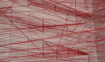
2013 – Network of the German Civil Code
A room-filling visualization by Oliver Bieh-Zimmert (Visual Telling) that illustrates the patterns of references within the German civil code. Each red thread stands for a reference to another paragraph. Source: you can find more info and images on the visual telling website.
2013 – Season in Review: iPad + Physical Charts Show Baseball Stats
Baseball stats for an entire season created by Teehan+Lax labs as a combination of an interactive ipad app with an overlay of physical charts cut from acrylic. Depending on the current choice in the app, the edges of different charts get highlighted by the ipad. Source: Teehan+Lax labs & vimeo.
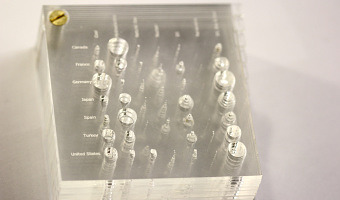
2013 – Layered 2D Plots
A series of stacked 2D plots showing changes in energy sources for different countries by PhD student Simon Stusak from University of Munich. All plots are cut from acrylic and hold together in one corner to facilitate alignment of the layers. The y-axis is mapped to countries, the x-axis to different energy sources, and the z-axis to time. Sources: Simon Stusak (2013) Physical Visualizations: An Exploration. Simon Stusak, Aurélien Tabard and Andreas Butz (2013) Can Physical Visualizations Support Analytical Tasks?
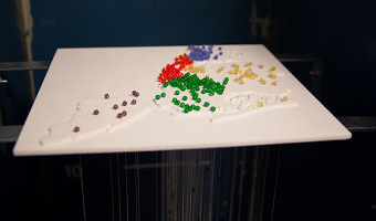
2013 – NYC High School Dropouts
Ben Kauffman and Sam Brenner created this visualization as part of the ITP program at the NYU Tisch School of the Arts. It is a combination of a 3D-printed relief map of New York City with beads where each bead represents one school location. Each bead on top of the relief map is connected to a string below whose length indicates the number of students who dropped out of that school. Source: More pictures, a video and all the details on the project can be found on their project page.
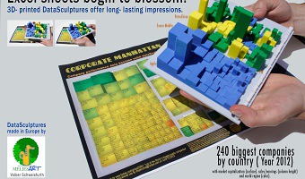
2013 – Solid Statistics
Left image: A 3D printed version of the "Forbes 2000" list showing the 240 largest companies, by Volker Schweisfurth. Market value is mapped to surface area, sales volume is mapped to volume, and the continent from which the company originates is mapped to color (America (blue), Europe (green), Asia (yellow)). The picture illustrates how a physical model of this 3D visualization gives a better impression of perspective than the printed perceptual cues in the original paper visualization. Right image: Other physical visualizations from Volker Schweisfurth showing showing city and country indicator data. They were all 3D-printed using a multi-color 3D printer. Source: Volker Schweisfurth. Check out his new website http://www.meliesart.de
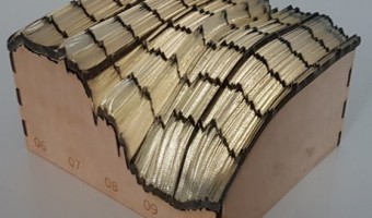
2014 – 3D Interest Rate Surface
3D print of a yield curve surface with change in material to create grid lines; on matching laser cut box with light inside. Left axis is time (2006-2010), right axis is "term structure", i.e. interest rates for 1 month out to 120 months; height at any given point is the interest rate on that day for that time period. Data is from Bank of Canada, visualization and print is is by Richard Brath at Uncharted Software. Source: Richard Brath, 3D Canadian Yield Curve Surface 2006-2010 for 1 to 120 months.
2014 – Data Sculpture in the White House
Gilles Azzaro, a French digital artist and fab lab co-founder, created a sound sculpture of Obama's 2013 State of the Union Address where Obama mentions 3D printing as the next revolution in manufacturing. Azzaro's sculpture was exhibited in the White House in 2014 during the inauguration of the first White House Maker Faire. The sculpture is interactive: a movement sensor activates the system and a laser beam scans the 3D recording to reveal the President’s speech. See this video for an example. Sources: Gilles Azzaro (2013). Barack Obama: Next Industrial Revolution. Image and video from Gilles Azzaro's website and youtube channel.

2014 – WeatherWindow
WeatherWindow – wall art that shows weather forecasts in a simple, ambient, and unobtrusive way. This old, wooden window is a decorative piece when it's off. Turn it on, and it becomes alive and connected to the Internet. Suddenly, this 8-paned window communicates to the world, fetches weather predictions, and lights up each pane with soothing colors communicating the weather outlook. Source: Tim Dye (2014) WeatherWindow – An IOT Art Piece.
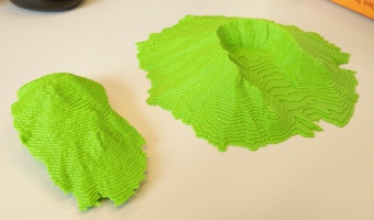
2014 – Mount Saint Helens - Pre and Post Eruption
Mount Saint Helens is an active volcano located in the north-west of the United States. In an eruption in 1980, the upper section of the volcano was destroyed, reducing the peak's elevation from 2950 m to 2549 m. This two-part 3D printed model of Mount Saint Helens visualizes the dramatic change that occurred over a very short period of time. The digital data for 3D printing and the white and red model were prepared by Drew Thompson, the green model was printed by Jeppe Vestergaard. Sources: Drew Thompson (Tree_House_Fire) Thingiverse Thing 581011 Jeppe Vestergaard (jeppev) Thingiverse Make 210362
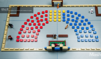
2014 – Lego Senate
Built by Lance Ulanoff, this Lego representation tells the story of the 2014 US midterms. Red and blue Lego blocks represent the number of Democrat and Republican senate seats. The representation was updated over the evening of the election, as seats went to either Democratic or Republican candidates. Captions tell the story, indicating the time of seat wins and the names of senators. Source: Mashable, The Lego Senate: How the 2014 midterms played out, brick by brick
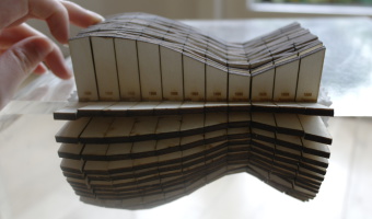
2014 – Rearrangeable Display of Ice Data
This 3d data visualization, created by Johannes Jacubasch and Judith Weda, shows sea ice levels from 1979 to 2012. The years are plotted on one axis and the months on the other axis, while the height of the wooden pieces shows the level of sea ice. This data visualization can be opened up at any year or month to view the data from up close. If you break the Y-axis it shows all the data from a particular year. If the X-axis is broken it shows ice levels of a particular month over all the years. The visualization exists out of 384 separate laser cut pieces of wood mounted on a piece of cloth, which makes it possible to fold or break the visualization to view all the data. Sources: Johannes Jacubasch Judith Weda
2014 – Sound Bites
Sound Bites is the result of an experimental design practice. Four days of 24/7 ambient sound recordings resulted in 128 4-second intimate sound loops. Fast Fourier Transform frequency analysis and geometrical operations transformed time, frequency, and amplitude into X, Y and Z dimensions, forming 3D sonic shapes. These ‘disco donuts’ were 3D printed into 128 sound objects. Vacuum molded they formed the base to cast 128 unique chocolate objects. New rhythmic patterns were created, comprising frozen moments in time. Matter is energy. Objects are processes. Memories are expectations. Source: Gerbrand van Melle and Stefan Marks
2014 – #Good vs. #Evil
A race is going on between two Twitter hashtags, materialized by two cars. The blue car represents #Good, the red car represents #Evil. Source: Patrick Keller (2014). I&IC Workshop #3 at ECAL: output > “Botcaves” / Networked Data Objects.

2014 – Made By Numbers
“Made By Numbers” represents a design methodology that translates data into form. The 5′ high sculpture is physical and interactive (sound, light). The form expresses the year-in-the-life of our agency, showing changes over time. The piece can also be “played” via a simple hand movement up or down, releasing 52 sonic chords and light effects – all tied to the data. Together, the sculpture (to be featured in an upcoming gallery show), a run of 250 limited posters featuring the sculpture, and the case study video about our process, told our 2014 story. Source: HUSH (2014) Made By Numbers.
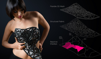
2014 – x.pose: a Wearable Dynamic Data Sculpture
x.pose is a dynamic wearable data sculpture that makes the collection of the wearer's location data visible in real-time in the physical world. From the project webpage: x.pose is a wearable data-driven sculpture that exposes a person's skin as a real-time reflection of the data that the wearer is producing. In the physical realm we can deliberately control which portions our bodies are exposed to the world by covering it with clothing. In the digital realm, we have much less control of what personal aspects we share with the services that connect us. In the digital realm we are naked and vulnerable. How it was created and how it works: The first step was to build a mobile app and server to automatically collect my data over time. Done using Node.js and PhoneGap. Second: the recorded data set was used as the basis for the generative aspects of the personalized wearable couture. The output is an abstract 3D mesh armature of my location data points collected over about a month. The dataset was fed into processing to produce the pattern and exported to Rhino to make the 3D mesh. Lastly, the mobile app and server is used to provide real-time data transmission through bluetooth to an Arduino, which controls reactive displays that change in opacity to reveal the wearer’s skin. This occurs in proportion to the volume of information that is passively generated. Source: x.pose is a thesis project for the ITP program at the Tisch School of the Arts, NYU, by Xuedi Chen in collaboration with Pedro G. C. Oliveira.
2014 – Silver Ring Shaped by DNA Profile
PhD student Alireza Rezaeian designed a silver ring whose texture and shape is uniquely determined by the wearer's DNA profile. His article explains how data is mapped to physical form in a way that balances between legibility and aesthetics. Right image: bracelet-sized prototype. Source: Rezaeian, Alireza & Donovan, Jared (2014) Design of a tangible data visualization. Related: Also see our other entries on data jewellery.
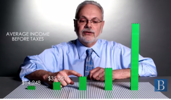
2014 – Data Storytelling with LEGOs
LEGO blocks are convenient tools to progressively construct a physical visualization while unfolding a story. In the same vein as Hans Rosling's educational stories on data, Brookings fellows use LEGO bricks to explain societal concerns such as how much the U.S. tax system helps shrink the gap between extreme social classes1 and the chances for economic success of Americans born at the bottom of the economic ladder 2. Sources: How much does the tax code reduce inequality? by David Wessel, April 9, 2015. Is America Dreaming?: Understanding Social Mobility. by Richard Reeves, August 2014.
2014 – District 5: Tube Charts Reveal Decline in Violence
California-based artist Loren Madsen, a long-time data sculptor (see our 1995 entry and our interview with him), created an outdoor sculpture where steel tubes show falling crime rates across eight crime categories over 30 years. The sculpture stands in front of a police station and jail in Chicago City. Sources: Healther Schultz (2015) California Sculptor Completes Commissioned Piece. Image courtesy of Loren Madsen. Also see Steven Pinker's TED Talk on the topic.
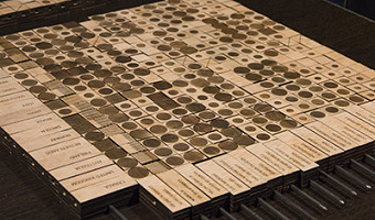
2014 – DIY Bertin Matrix
This wooden matrix is a large-scale replica of Jacques Bertin's reorderable physical matrices. It shows a subset of the World Value Survey, a series of questionnaires that assess people's moral values across countries and years. This physical visualization is interactive as row and columns can be manipulated, promoting engagement and collaboration. This 18x20 matrix was built by Mathieu Le Goc in the Fablab Digscope with Charles Perin and Romain Di Vozzo, on the occasion of the 25th birthday of the IEEE VIS conference in Paris, France. Follow the link below for more details on the matrix, including photos and videos. Source: Charles Perin & Mathieu Le Goc (2015) DIY Matrix.
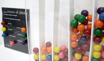
2014 – Physical Visual Sedimentation
This visualization created by Jennifer Payne and inspired by Samuel Huron's visual sedimentation was created from gumballs, an acrylic (plexiglass) box and adjustable foamcore bin dividers. Huron's work is inspired by the physical process of sedimentation. The above figures illustrate a participatory representation of hours of sleep for a university population, with different colours of gumballs representing different groups present on a university campus (i.e. blue gumballs for graduate students, violet gumballs for faculty etc.). Source: Huron, S., Vuillemot, R., & Fekete, J. D. (2013). Visual sedimentation. In IEEE Transactions on Visualization and Computer Graphics, 19(12), 2446-2455.
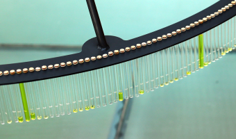
2014 – Drip-By-Tweet: Each Vote is a Drop
Team of developers Domestic Data Streamers created a real-time physical visualization of votes for a graphic design contest. A person can vote for a specific piece by sending a tweet, after which the machine releases a drop of yellow liquid and sends it to the corresponding test tube. Source: Domestic Data Streamers.
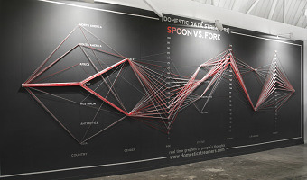
2014 – Data Strings: Physical Parallel Coordinates
During the SWAB International Contemporary Art Fair, the group of developers Domestic Data Streamers had the audience create a physical parallel coordinates visualization based on their demographic profile (social status, weight, etc.) and by answering a meaningless question on whether they choose a spoon or a fork. Source: Domestic Data Streamers (2014) Data Strings. They have a range of other interesting physical visualization projects on their Web page.
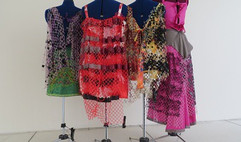
2014 – Data Clothing: Dresses Show Air Pollution
Laura Perovich explored the concept of data-driven clothes as part of her Master thesis at the MIT Media Lab. The fashion dresses above show the concentrations of 100 chemical contaminants measured in the air of a particular household (left image). Chemicals are mapped to small squares and relative concentration is mapped to square size. Squares are repeated to create lace patterns (right image shows the concentration of several factory-related pollutants). In her thesis Laura Perovich discusses how data clothing may be used in the future to raise air pollution awareness: One can imagine the print on your shirt changing as your chemical exposures change; your clothing changing shape and stiffness to become uncomfortable and encourage you to leave a heavily polluted area; or your clothing increasing its protectiveness by offering air filtration in polluted spaces. These types of projects would increase understanding by giving ongoing relevant information and prompting action based on these understandings. Sources: Laura Perovich (2014) Dressed in Data. Laura Perovich (2014) Data Experiences: novel interfaces for data engagement using environmental health data.
2014 – TiltWatch: Physical Tilt Indicator For Shipping Goods
This ShockWatch tilt indicator can be attached to packages which must remain upright during transportation. If the packet is tilted to either side, the little balls move into the next chamber. The recipient can then later check the degree of tilting the packet experienced during transportation. The upper row indicates tilting to the left, the lower to the right. The ball in the round indicator moves in to the outer torus when the packet is turned over 180°. Source: ShockWatch, TiltWatch Plus (company website)
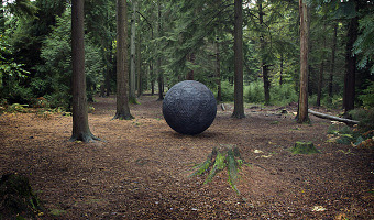
2014 – Cosmos: Carbon Exchange Captured in a Wooden Ball
Artist duo Ruth Jarman and Joe Gerhardt created this two-meter spherical wooden sculpture located in a forest in England, and representing the take up and loss of carbon dioxide from the forest trees across one year. Watching the video, I was somehow expecting this sphere to roll at some point, but it did not happen. Source: Semiconductor (2014) Cosmos.
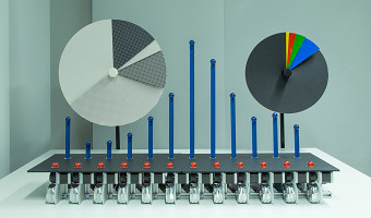
2014 – Dynamic Physical Charts Display Community Data
David Sweeney from Microsoft Research designed these beautiful, mechanically driven, physical charts to communicate data to people living or working on Tenison Road in Cambridge, UK. The charts are part of a research project to explore what is the general public’s understanding of data and how it can be used to improve the life at street level - be that, better access to services, improving social relationships, better engaging with local governance, etc. Beyond making data more eye catching and legible, the charts are part of an effort to engage people with their data and enable them to use it to actively participate in communal life. By materialising data using large, mechanically driven charts, the aim has been to produce both a spectacle - that visually appeals to onlookers - and forms of data that people find compelling and want to engage with. Currently, the physical charts are being used to display real-time data on a road in Cambridge. They switch between showing, one, vehicle journey data measured on the road, two, aggregated air quality measurements being recorded by residents, and, three, results from local polls and votes. As such, the charts provide a way for locals to see data that has an immediate relevance to them and that they may use to have some say over improving community life. Overall, the aim of the physical charts has been to work on an approach to data visualisation that weaves data into people’s ordinary lives. The hope is that by materialising the data in the highly visible, legible and dynamic charts, onlookers see it as knitting into daily life, becoming a meaningful and relevant part of how they see themselves, individually and collectively. Sources: Microsoft Research, Physical Charts. Tenison Road Project.
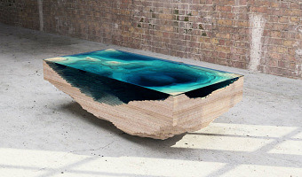
2014 – Abyss Table - Scale Model of Deep Sea as Furniture
This table created by the furniture design company Duffy London is a geological cross-section of the sea shown with layered wood and glass sheets. Designer Christopher Duffy got the idea while visiting a glass factory and noticing that glass sheets darken as more layers as added, as does the sea. You can have this piece of furniture at home for £9,800. Sources: Duffy London (2014) Abyss Table. Nina Azzarello (2014) Duffy London layers the abyss table to look like ocean depths.
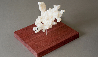
2014 – Data Crystals: Conglomerated World Stats
During his residency at Autodesk, artist Scott Kildall created crystal-looking data sculptures by turning world data such as city populations into small cubes laid out on an Earth globe, then running a force-directed algorithm that conglomerates them into a monolithic structure that can be 3D-printed. The image above shows the 2500 nuclear detonations in recorded history, two of which (the black dots) are the bombs dropped at Hiroshima and Nagasaki, the only ones used as weapons. Source: Scott Kildall (2014) World Data Crystals.
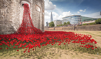
2014 – 888,246 Ceramic Poppies to Commemorate Fallen Soldiers in WW1
Don't miss the major art installation Blood Swept Lands and Seas of Red at the Tower of London, marking one hundred years since the first full day of Britain's involvement in the First World War. Created by ceramic artist Paul Cummins, with setting by stage designer Tom Piper, 888,246 ceramic poppies will progressively fill the Tower's famous moat over the summer. Each poppy represents a British military fatality during the war. The poppies will encircle the iconic landmark, creating not only a spectacular display visible from all around the Tower but also a location for personal reflection. The scale of the installation intends to reflect the magnitude of such an important centenary creating a powerful visual commemoration. We are hoping to sell all of the poppies that make up the installation and, in doing so, raise millions of pounds which will be shared equally amongst six service charities. Sources: Text: Historic Royal Palaces (website) Photos 1 and 2: designboom.com. Photo 3: pinterest.
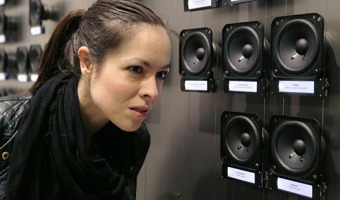
2014 – Pan-Anthem: Visualize Statistics Using National Anthems
"Pan-Anthem" is an interactive sound installation where the national anthem of every country in the World plays back on a movable speaker that is magnetically attached to a large wall. The speakers are precisely arranged to visualize national statistics: population, GDP, area, number of women in parliament, GINI, year of independence, HDI and so on. For example, when the work is configured to show military spending per capita, on the far left of the wall the public can hear the anthems of countries without military forces like Costa Rica, Iceland and Andorra while at the far right they can hear Saudi Arabia, Israel and the United States, which spend more than $2,000 per person per year. If no one is in the exhibition room all the speakers are silent, but as a visitor approaches a particular set of speakers these start playing automatically, creating a positional panoramic playback of anthems associated to similar statistics Source: Rafael Lozano-Hemmer http://lozano-hemmer.com/pan-anthem.php

2014 – Building Visualizations with Tokens
Samuel Huron and his collaborators show how anyone can build their own visualizations by assembling physical tokens. Sources: Samuel Huron, Sheelagh Carpendale, Alice Thudt, Anthony Tang, Michael Mauerer (2014) Constructive Visualization (Web Page) Samuel Huron, Yvonne Jansen and Sheelagh Carpendale (2014) Constructing Visual Representations: Investigating the Use of Tangible Tokens (Web page)
2014 – Blaue Blumen: Handcrafted Offline Data Visualization of Population Density
Physical visualization of the population density of the world. Handcrafted with toothpicks and a styrofoam ball. Based on data taken from this map. Source: Ewa Tuteja, (http://tuteja.info/blaueblumen/)
2014 – Light Painting Acceleration
By mapping the output of a motion sensor to the hue of an LED strip (red for +2 G's along the Z-axis, and blue for -2) we can visualize the acceleration changes at the peaks and valleys, as the sensor is waved around. Source: Jake Ingman (@jingman), Data Painting
2014 – Water Works: Maps of the San Francisco Water Infrastructure
“Water Works” is a 3D data visualization and mapping of the water infrastructure of San Francisco. These consist of three large-scale 3D-printed sculptures, each generated by custom C++ code. The concept behind the project is to make visible a small portion of an invisible network of pipes underneath our feet. The three physical data visualizations are: "San Francisco Cisterns", “Imaginary Drinking Hydrants” and "Sewer Works". "Sewer Works" uses 60,000 data points from San Francisco sewers and pipes and shows the flow of wastewater and stormwater near the San Francisco Bay waterfront. "San Francisco Cisterns" maps the 170 underground cisterns of San Francisco that were mostly built in the years just after the 1906 Earthquake. "Imaginary Drinking Hydrants" depicts potable water faucets attached to specific fire hydrants for general public use. In 2006, the SFPUC created a series of “blue drop” hydrants, which would provide water in case of emergency (but without a drinking faucet). These hydrants would be opened up by city officials if there were a city-wide disaster. Just a few years after introducing 67 emergency drinking hydrants, the city unceremoniously discontinued the program. This is part of a Creative Code Fellowship sponsored by Gray Area, Stamen Design and Autodesk. Sources: Scott Kildall, Water Works Scott Kildall (blog), Water Works
2014 – Sphere Packing: Visualize Composers' Total Musical Production
"Sphere Packing" is a series of 3D-printed spheres designed to concentrate the entire musical production of a composer in a single dense multi-channel device. The size of each sphere is directly proportional to how prolific the composer was, for example the sphere for Johann Sebastian Bach has 48 cm diameter and holds 1100 loudspeakers playing simultaneously Bach's 1100 different compositions, while the sphere for Hildegaard Von Bingen only has 11 cm diameter and 69 loudspeakers. The project presents at a glance the comparative production volume of many composers. As people are a couple metres away from a sphere they hear a quiet murmur of sounds, but as they approach and put their ear up close to individual speakers they can hone in on specific compositions. The series is inspired by American composer Charles Ives' practice of simultaneity as a compositional tool. Technically, a set of custom-made circuit boards allow the simultaneous playback of thousands of separate sound channels. The spheres are modeled algorithmically and then 3D printed in different materials depending on the composer: porcelain, steel, polymer, stainless steel, etc. Each piece is suspended from a small playback box which is hung from the ceiling of the exhibition space. The list of composers is as follows, showing the number of sound channels for each sphere: 17 Claudio Monteverdi,39 Gustav Mahler, 69 Hildegaard Von Bingen, 70 Luigi Nono, 79 Conlon Nancarrow, 87 György Ligeti, 105 Henryk Mikołaj Górecki, 113 Richard Wagner, 128 Charles Ives, 129 Igor Stravinsky, 203 Karlheinz Stockhausen, 269 John Cage, 487 Ludwig van Beethoven, 565 Wolfgang A. Mozart, 612 George Frideric Handel, 998 Franz Schubert, 1128 Johann Sebastian Bach Source: Rafael Lozano-Hemmer. Sphere Packing (2014).
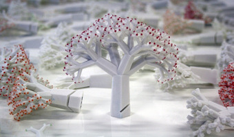
2014 – People Wood: Data Sculpture of Questionnaire Data
Manor House Development Trust, a charitable social enterprise centred in Hackney, commissioned Something & Son to create a sculpture to take pride of place in the new Redmond Community Centre at Woodbury Down in North-East Hackney. Something & Son approached Inition for help creating a crowd-sourced data sculpture featuring a forest of over 400 3D-printed trees, each corresponding to an individual’s answers to an online questionnaire. Source: Something & Son with Inition. People Wood (2014)
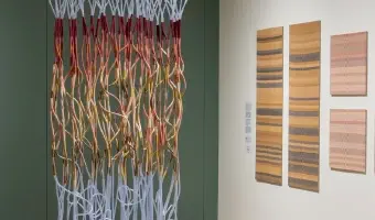
2015 – Climate Datascapes
Artist Tali Weinberg is working since 2015 on extensive series of textile data-art documenting heat waves, water color variations, average temperatures, etc. On her website you can discover the dozen different pieces from the “Climate Datascape” series, as well as other data projects.
I translate climate data from the National Oceanic and Atmospheric Administration into abstracted landscapes and waterscapes, materializing the data with plant-derived fibers and dyes and petrochemical-derived medical tubing and fishing line. These weavings and coiled sculptures merge practices of record keeping with practices of grieving and expressions of scientific research with expressions of lived experience.
Source: Tali Weinberg - Climate DataScapes.
Related: Also see our other entries on textile.

2015 – Spheres of Risk
These shiny porcelain spheres visualize how risky a person is. The project was created by Nikita Rokotyan and the team during the 72U creative residency program in 2015 led by Maria Scileppi. Thirty-eight guest speakers were asked to complete a survey consisting of 12 questions related to 3 different types of risk: financial, social and physical. Their answers were analyzed and mapped onto a sphere to visualize a person’s willingness to take certain risks. The individual spheres were then molded in porcelain and presented to the speakers as a thank you gift.
Project video: https://vimeo.com/273922538
Sources:
Nikita Rokotyan, https://rokotyan.com/dataviz/risky (archived version) Maria Scileppi: https://www.mariascileppi.com (archived version)
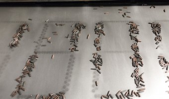
2015 – Quantum of Peace: Numerical Display Made with Bullets
"Quantum of Peace" by Miara Pokoju is an interactive installation and kinetic infosculpture commissioned by the Warsaw Rising Museum for the celebrations of the 71st anniversary of Warsaw Rising and the 70th anniversary of the end of WWII in Europe. The installation utilised thousands of bullet shells, 70 pneumatic actuators, hundreds of neodimium magnets and 5 industrial-grade transmission belts to present series of numbers conveying WWII and Warsaw Rising facts. Source: https://pangenerator.com/projects/quantum-of-peace/
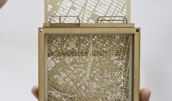
2015 – Rearrangeable Physical Map
Andrew Chard, an award-winning graduate student in architecture at Oxford Brookes, created this multi-layered wooden map where layers can be individually pulled out and rearranged. According to the object's legend, this map shows different cities on top of each other so that people can compare their structure. There is not much information available online but Andrew explained to us by e-mail: It was so long ago that I wouldn’t be able to remember the scale or locations I am afraid. Apart from the fact that the model was based on Piraeus in Greece. I called it the Rotary model. It was a collection of research undertaken to understand an architectural site, before actually visiting it. Each segment could be rotated to view each piece individually. This segment was used to understand the scale of the site by comparison, by sliding each map, known locations can be compared to the unknown, allowing a simple understanding of its spatial makeup. Sources: Andrew Chard (2015) Year 3/ Semester 1/ Rotary model. Images by Andrew Chard.
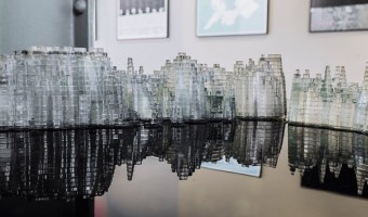
2015 – Wage Islands
The "Wage Islands" installation by Ekene Ijeoma makes clever use of water as a data query device. Wage Islands is an interactive installation which submerges a topographic map of NYC underwater to visualize where low-wage workers can afford to rent. Sources: Ekene Ijeoma: Wage Islands Huffington Post: Dazzling Interactive 3-D Artwork Visualizes The Tragic Affordable Housing Crisis In New York City Creators: Turning New York's Salary Gap into an Interactive Sculpture Design Boom: Wage islands installation by Ekene Ijeoma highlights New York's salary disparity
2015 – Life in Clay: Sharing Memories through Data Pottery
Alice Thudt, a PhD student in Computational Media Design, crafts pieces of pottery that embody data about moments she shared with her loved ones. Left image (2015): cereal bowls showing Skype-call history between Alice and her parents. On the front bowl, each line represents a day where they skyped. On the other bowl, each dot represents 10 min of call time. She offered a bowl as a present to her parents and kept the other one as a reminder to stay in touch every time she has breakfast. Middle image (2016): teapot showing instant messages containing the word "love" that Alice and her boyfriend exchanged since they started dating. Each dotted line represents one year; one dot stands for 10 messages. The teapot shows how they went from a long-distance relationship to recent years when they were geographically closer and texting was less necessary. Right image (2016): bowl showing the productivity of Alice's boyfriend over the course of one year, offered to him as a birthday gift – the outside surface shows git commits, while the inside shows the number of emails sent per month. Life in Clay explores turning data about my life and the lives of my loved ones into functional pottery. By making objects that can be touched, loved and used every day I want to give our elusive personal data a physical presence. The pattern of each handcrafted artifact represents a precious memory, experience or relationship that I want to remember or remind others of. The data pots create opportunities for the stories hidden in my data to be serendipitously reencountered, shared over dinner with friends or silently reflected upon with a cup of coffee on the couch. Sources: Alice Thudt (2017) Life in Clay. Alice Thudt, Uta Hinrichs and Sheelagh Carpendale (2017) Data Craft: Integrating Data into Daily Practices and Shared Reflections.
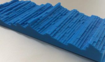
2015 – U.S. Unemployment Rate 1948-2015
Visual journalist Jon Keegan created this quick chart using U.S. unemployment rate starting from January 1948 (the first year that the U.S. started to record the number) through the end October 2015. The long axis represents years from 1948-2015, and each column is made of of 12 chips, each representing one month's unemployment rate figure. The height of each chip represents the rate for that month. One can see a dramatic cliff start to rise up in the fall of 2008, as the global economic downturn began to unfold. Equally interesting is the slow, but steady recovery as unemployment drops through the end of 2015. Source: U.S. Bureau of Labor Statistics http://data.bls.gov/timeseries/LNS14000000 Inspired by the fantastic 2D heat map from WSJ (where Jon used to work): http://graphics.wsj.com/job-market-tracker/ Source data and OpenSCAD files: https://github.com/jonkeegan/us_unemployment_3d_chart Source: Jon Keegan - U.S. Unemployment Rate 1948-2015 (monthly)
2015 – Summer in the City
The visualization explores the direct influence of weather and traffic volume on air pollution, comparing data of a 4-week period during summer 2015 in Lugano (Switzerland). Different colored laser cut plates fixed on wires represent daily data. As the wires are diagonally mounted on the structure, looking from different sides, they evidence either daily data or the evolution of the parameters. Source: Carola Bartsch (2015), Summer in the city
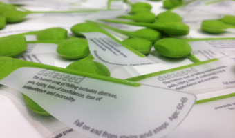
2015 – Dataseeds: Flying Data
The dataseeds are a translation of data on ‘falls on and from stairs and steps, aged 50-89’. The data drives the surface area of the wing of the dataseed, which dictates the spin and falling speed of the data-object©. Source: Nick Dulake and Ian Gwilt (2015) Dataseeds - flying data
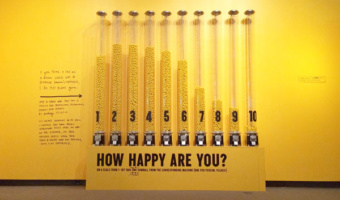
2015 – Participatory Representation of Happiness
This 2015 physicalization was part of designer Stefan Sagmeister's exhibit on happiness. It contains a participatory representation of exhibition viewer's happiness, remiscent of Hans Haacke's MOMA poll (1970) and Lucy Kimball's participatory chart (2006). The units which make up the representation are gumballs, like Jennifer Payne's participatory representation (2014). Sources: Stefan Sagmeister (2015) The Happy Show Myles Constable (2015) The Happy Show asked "How Happy Are You? The results are in...
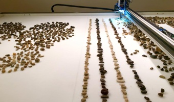
2015 – Jller: A Robot Rearranges Pebbles by Geologic Age
Jller is a machine created by German artist Benjamin Maus and Czech artist Prokop Bartoníček that sorts pebbles from the German river Jller by their geologic age. To do this, Jller first analyzes an image of the stone it selects, extracting information like dominant color, color composition, lines, layers, patterns, grain, and surface texture. The machine then places the stones in alignment of age and type by sucking them into an industrial vacuum gripper and dropping them in the correct location within the grid. Source: Kate Sierzputowski (2016) A Kinetic Artwork that Sorts Thousands of Random River Stones by Age. Related: Also see our other entries on physical visualizations created by rearranging objects.
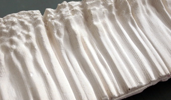
2015 – Create your own Sound Sculpture
This Rhinoscript/Grasshopper procedure creates a 3D printing of an audio file by translating the waves into 3D curves instead of displaying them in 2D, thus elabling the user to "feel" the sound. Source: 3D Sound representation Related: Also see our other entries on sound.
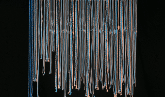
2015 – Inequalities Quipu
This project is about the revival of the ancient Incan Quipu. This project is about a comparison of well-being in Latin America and top leading countries in Scandinavia as assessed by the OECD Better Life Index. It shows the inequalities between those two cultures as well as between men and women visualised with the help of the Incan recording devise - the quipu. Source: Ewa Tuteja, http://tuteja.info/inequalities-quipu/
2015 – Lake Brite: Ecological Data on a LED Cube
Lake Brite is a data visualization project which allows the public to learn about Lake Champlain through a display of 7,500 LED’s. From temperature statistics to animal life, Lake Brite will encourage interaction and data literacy, connecting everyone around the common cause of Lake Champlain health. Sources: ECHO, Leahy Center for Lake Champlain; www.echovt.org/lakebrite
2015 – Passim: Visual Reconceptualisation of Spatial Theories
The master thesis of Paul Heinicker, Passim, visually reflects the humanistic discourse about space. The research of spatial theory led to four major notions how to think space from a sociopolitical perspective. The installation explores the relationship of these four spatial notions by projecting visualisations of geopolitical data from the Heidelberg Institute for International Conflict Research onto the physical sculpture. Eventually, different world-views are created, that show how notions of space directly influence recent geopolitical events, like the refugee crisis, and how we can spatially rethink global political constellations. Here the produced images are seen as counter drafts to previous imaginations about space. These visualisations do not clarify through simplification, but are an experimental approach of a visual research. Sources: Paul Heinicker (2015) passim.

2015 – U.S. Cost of Political Campaigns
The New York Times has used stacks of Monopoly plastic hotels to explain what the cost of the U.S. political campains means in terms of households. Though closer to concrete scales than it is to data visualization (that usually presents data in a more structured manner), this representation made of physical pieces from the famous board game makes the message particularly compelling. According to the New York Times, Just 158 families have provided nearly half of the early money for efforts to capture the White House. of which the animated webpage gives a good sense of scale. Source: The New York Times, 2016 Presidential Election Super Pac Donors Oct. 10, 2015.
2015 – Canadian Federal Election Explained with LEGOs
On Canadian national news, Toronto-based artist and organiser Dave Meslin used LEGO bricks to illustrate the results of the 2015 federal election. He shows election results based on a first-past-the-post system, and compares them to a representation illustrating what results would look like if based on proportional representation. Source: CBC News (2015) If Canada had proportional representation: Dave Meslin shows with Lego.
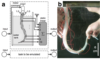
2015 – Kohei Nakajima's Computing Tentacle
Kohei Nakajima and his colleagues argue that soft bodies are hard to control from a robotics perspective, but precisely because of their complex dynamics they can be used as information processing devices for solving hard computational problems. In a recent article they explain how they send inputs to a motor that wiggles a silicon tentacle, and read the system's output by sensing the arm's posture. I'm not entirely sure what's being calculated exactly, but the idea seems quite compelling. Also see our other entries on physical computation. Sources: Nakajima et al (2015). Information processing via physical soft body (see video). Hauser et al (2014). Morphological Computation - The Body as a Computational Resource.
2015 – Dan Gilbert's TV Ads
The famous psychology professor Dan Gilbert made a series of TV commercials for the insurance company Prudential, together with Ray Del Savio from Droga5 and Colin McConnell from Prudential. These TV commercials make a clever use of participatory physical visualizations to demonstrate and explain human biases in financial planning. Ribbon Experiment (left image): Dan Gilbert asks bystanders to estimate how much money they will need to retire. He then gives each of them a ribbon and asks them to cut it according to how long that amount will actually last. Ribbons are then assembled into a large-scale radial visualization. Age Stickers (middle image): Dan asks people how old is the oldest person they know, and gives each of them a sticker to place on a wall to construct a histogram. Magnets Experiment (right image): Dan asks people to recall something that happened in their past and something that might happen in their future. Good things are put on yellow magnets, while the bad ones are put on blue magnets. The resulting participatory visualization clearly shows that people tend to be overly optimistic about their future. Also make sure you watch the Dominoes Experiment which set a new world record for the tallest domino stone ever toppled, watch Dan Gilbert's amazing TED talks, and check out our other entries on participatory physical visualization and storytelling. Sources: Freakonomics podcast (2015) How to Make a Smart TV Ad. Photos above from Prudential Financial, Inc.
2015 – Beeswax Maps Crafted by Bees
Artist Ren Ri uses beeswax as his medium for making geographical maps and a bee colony as the builder. This original project results in beautiful data visualizations collaboratively crafted by a human and a bee colony! Here's how it works: Because a colony will follow the queen bee and build a hive based on the pheromones that she releases, Ri is able to move the queen such that the others in the colony act accordingly. More details on the project can be found on the Flowing Data blog [1]: The three-part series is called Yuansu, which translates to "a comprehension of the gestalt of life". One part is a collection of abstract sculptures, and another is a performance with the bees themselves. But the first part, which Ri and the bees created back in 2008, is a series of geographic maps. Ren Ri's beeswax sculptures were exhibited at Pearl Lam Galleries Soho unti April 12, 2015. More pictures on Flowing Data [1] and MyModernMet [2]. Sources: Flowing Data. Getting bees to construct geographic maps. Alice Yoo's article Elaborate World Maps Made of Beeswax by Ren Ri Perl Lam Galleries website : http://www.pearllam.com/artist/ren-ri/
2015 – 3D Paper Model of Shrinking Aral Sea
The Aral Sea in Uzbekistan, formerly one of the largest lakes in the world, has been drying up since the 1960s and is currently 10% its original size. Peter Vojtek made a 3-D paper model that shows the shrinkage — from 1957 on top, down to 2007. Each layer represents the surface outline during the corresponding year on the right. Vojtek also provides his paper template in case you want to fashion your own box. Sources: FlowingData Peter Vojtek (2015) 3D Paper Model of Shrinking Aral Sea.
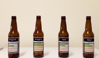
2015 – Multivariate Beer
Nathan Yau from flowingdata brewed four different types of beer based on county demographics. For example, he mapped population density to the total amount of hops, and race percentages to the type of hops used. He describes the process in detail on his web site, with R source code. The idea is reminiscent of Rohit Khot's TastyBeats shown at the CHI '14 conference, an installation that creates personalized energy drinks based on heart beat data. Sources: Nathan Yau (2015) Brewing Multivariate Beer (via the Partially Derivative podcast). Rohit Khot et al (2014) TastyBeats: Making Mocktails with Heart Beats. Related: Also see our entry on data cuisine
2015 – London Eye Chart: A 135m Tall Donut Chart
One week before the UK general election of 2015, the design studio Bompas & Parr and Facebook turned the Ferris wheel of London into a giant donut chart of the political parties most discussed on Facebook. Blue stands for the Conservative Party and red stands for the Labour Party. Learn more. Sources: Bompas & Parr (2015) London Eye Chart. Photo by Bompas & Parr.
2015 – Physical Weather Display
Japanese Software engineer Ken Kawamoto invented the Tempescope, a device that displays weather forecasts or current weather physically. The Tempescope physically simulates weather forecasts via a wireless connection from a computer or a smartphone in real-time in order to get a better idea of what the actual weather is outside. Raining is simulated by water dripping down the box, temperature is represented by color-chaning LEDs and cloudiness is conveyed by a mist diffuser. Source: Dovas (2015) This Box Shows Tomorrow’s Weather On Your Table With REAL Rain And Clouds.
2015 – Paper Cut Terrain Models
Paper models of terrain/landscape. Mapquest Elevation API is used to gather the elevation isolines and the paper layers are cut on a blade cutter machine. Source: Peter's DIY Blog
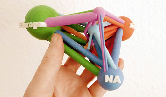
2015 – Interregional Merchandise Trade
Trade data often show a network of money flows. Spreadsheets of such data are difficult to remember and hardly find their way to the long-term memory. The chosen intra- and intraregional WTO data of 2012 have been modeled and printed as a 3D data sculpture. It offers some fresh insights on flows, intraregional trade sizes, has some haptic quality and can be put on the table to accompany presentations and debates. Source: Volker Schweisfurth / MeliesArt (2015) Trade Data Materialized.
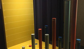
2015 – Sicherheit: Switzerland's Money in Bar Charts
This physical bar chart titled Sicherheit (Security) is part of the exhibition Geld – Jenseits von Gut und Böse (Money - Beyond Good and Evil) at the Stapferhaus in Lenzburg, Switzerland. It shows where Switzerland has its money from, where it spends it and how high Switzerland's debt is. Sources: Photo and most of the text above by Peter Gassner. Author of the piece currently unknown, as several studios have been involved in the making of the exhibition.
2015 – Touching Air: Necklace Shows Air Pollution
This necklace made by Stefanie Posavec and Miriam Quick shows one week of air quality data measured in the city of Sheffield. Each segment is a period of 6 hours, and its appearance conveys the concentration of particulate matter during that period of time. A low concentration yields a small, round, green segment. A high concentration yields a large, spiky, red segment. Sources: Stefanie Posavec (2015) Air Transformed: Better with Data Society Commission. Photos by Stefanie Posavec. Related: Also see our entry 2014 - Data Clothing: Dresses Show Air Pollution.
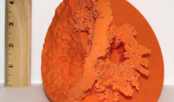
2015 – Solid Model of Stellar Winds
Scientists keep using solid models to help them better understand complex 3D data (here, an astrophysical simulation): They say this provides even more insight into what’s going on. “The ability to hold and inspect the 3-D printed models provides a new perspective on the WWIR’s geometry and an improved sense of the scale of the different structures,” they say. In particular, they say the model allows them to appreciate just how large the shockwave is compared to the stars and the distance between them. Sources: Clive Thompson (2015) Astronomers print 3D models of colliding solar winds. Madura et al (2015) 3D printing meets computational astrophysics: deciphering the structure of η Carinae’s inner colliding winds.
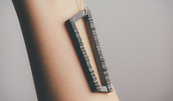
2015 – Data Necklace of Good Night SMS
Paul Heinicker, a master student in interaction design at the University of Applied Sciences Potsdam, created a data-driven necklace representing a long-distance relationship by sent "good night"-messages from him to his girlfriend. While visualising two years of message history, two diagonal opposing points of the rectangle constitute the starting points for both years. The ongoing sides in each case are coded to the days with and without good night SMS. In detail, the plain horizontal sides represent days spent together. The vertical sides illustrate the length of each of his SMS through the applied line graph. The necklace was then 3D printed using high-grade steel. Source: Paul Heinicker (2015) good night sms
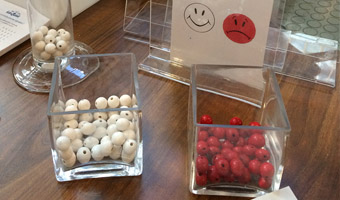
2015 – Physical Customer Satisfaction Survey
Participatory physical bar charts at the exit of the Antell cafeteria at the University of Helsinki. White beads represent statisfied customers, red beads are unsatisfied ones. Source: Antell. Photo by Luana Micallef. Related: Also see similar contraptions by Hans Haacke (1970), Lucy Kimbell (2006), and Jennifer Payne (2014).
2016 – Duo Tornado Vase
This work by the chinese designer Yisha Cai explores meteorological phenomena using digital data, conception and production tools. Especially interested in data visualization, Yisha Cai collected rain data through sensors and an arduino device. The data were then processed to generate a 3D model. The cylindrical clay tornado form was generated by code in a digital platform. It was subsequently printed in porcelain by a 3D ceramics printer. The accompanying glass globe form was shaped as a positive form of the (imaginary) void created by the profile of the tornado. The blown glass globe form was produced in a unique 3D printed ceramics mould.
Sources:
Yisha Cai (2016) DUO TORNADO. (archived version) Laboratoire CCE (2019) “La céramique comme expérience”, Editions du CCE, Laboratoire de recherche de l’Ecole Nationale Supérieure d’art de Limoges, p. 104-111.
2016 – Wait for the Oil Drop!
In this museum installation, four tons of (possibly fake) oil dramatically drop into a three-meter-tall glass tube in four seconds, showcasing the vast quantities of oil Kuwait produces. The liquid is pumped back up and dropped again every five minutes. The inscription on the tube reads:
Wait for the oil drop! Every second of every day, Kuwait produces this much oil.
This installation is part of the Ahmed Al Jaber Oil & Gas Exhibition, a permanent exhibition located in Al Ahmadi, Kuwait, and created in 2016 by the London-based design company Event Communications. The design and construction of this specific device was outsourced to InteractUn Limited, a London company led by the mechanical engineer Simon Pugh. The right video shows an early prototype.
Sources:
Website of the Ahmed Al Jaber Oil & Gas Exhibition. The oil drop installation can be seen by clicking on the second-to-last thumbnail in their 360 virtual tour (archived version). Website of InteractUn Limited. They have a web page explaining the design of their device (archived version). Website of Event Communications. A short description of their involvement in the exhibition can be found in their past projects page (archived version) – scroll down to the Archive section then year 2016. They also uploaded a 4-minute Vimeo video showing the full exhibition; oil drop installation shown at 4:05. Website of DPM. The company that oversaw the project. A short description of their involvement in the exhibition can be found here (archived version) Various Internet posts on the topic (but often without sources or attribution): A 2019 Linkedin post, a 2022 Reddit post, and a 2024 Reddit post. Video on the left: downloaded from the 2024 Reddit post. Original source unknown. Photo in the middle: still from Event Communication’s video. Video on the right: posted on YouTube by Simon Pugh (InteractUn Limited) in 2019. Related: Also see our other posts on single-datum physical visualizations.
2016 – Woven Chronicles
Woven Chronicle is a cartographic wall drawing that, in the artist’s words, represents “the global flows and movements of travelers, migrants, and labor.” Kallat uses electrical wires—some of which are twisted to resemble barbed wire—to create the lines, which are based on her meticulous research of transnational flows. Wire is an evocative and contradictory material: it operates as both a conduit of electricity, used to connect people across vast distances, and as a weaponized obstacle, such as the fences used to erect borders and encircle refugee camps. Kallat’s family was splintered by the Partition of India in 1947 upon independence from Britain, which divided the country geographically along religious lines and induced the movement of more than ten million people in one of the largest forced migrations in human history. Woven Chronicle speaks to this personal memory—and collective history—in its material presence, merging the artist’s research on migration with metaphors of violence, and accompanied by an ambient soundscape that evokes the steady hum of global movement. Source: Reena Saini Kallat (India, b. 1973), Woven Chronicle, 2011–19
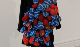
2016 – Accomplishments
Accomplishments is an exploration of personal data tracking, wearable art, wearable technology, social media, and data physicalization. Each day accomplishments were tracked, first on paper then by sewing spheroid masses onto a dress worn for four months. By hand sewing each accomplishment onto this dress, they became a part of the wearer's physical presence and identity. The work juxtaposes the immediateness of social media posts, and the separate identity we create for ourselves online which is often detached from our physical presence. The work also spoke to the use of wearable technology and the ability to track daily steps, sleep, emotions and other personal information as a standard practice. This data is often shared publicly online, however, these devices often remain invisible by their small size, camouflaged as watches, necklaces or hidden in pockets. Sources: Michelle Sylvestre, Accomplishments. University of Lethbridge (2016) Artist wears her heart, and her accomplishments, on her sleeve.
2016 – Topographic Jewelry
Jewelry made with data from the US Geological Survey. Source: Courtney Reckord.
2016 – Thoughtforms: 3D-Printed Thoughts
Kellyann Geurts and In Dae Hwang, Monash University, give physical shape to thoughts by turning EEG data into solid objects. During three public events at Melbourne in 2016, she placed a mobile EEG device on volunteers and asked them to think of a memory or emotion of their choice. Their EEG output was translated in real time into a 3D shape they could see on a computer screen. Participants could then press a button to pause the shape and send it to a 3D printer. They were then invited to write a description of their thought, which was used to tag the 3D object. Sources: Kellyann Geurts and In Dae Hwang (2016) ThoughtForms | Visualize and 3D Print Your Thoughts. (with video) Kellyann Geurts (2018) Imagining Thought in Digital Space: 3D Printed Thoughts. Image #1 by Andrew Morley and image #2 by Kellyann Geurts.
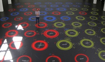
2016 – Walkable Collaboration Network
Designer Dario Rodighiero created a large (15x15m) walkable visualization showing scientific relationships between researchers and laboratories at the ENAC school of EPFL in Switzerland. The visualization was printed on tarpaulin, a heavy covering employed for trucks. Two years before, Dario created a coauthorship network visualization for the Digital Humanities 2014 conference. He initially considered showing a large poster, but since sticking posters was not allowed at the conference center, he decided to create a six-meter wide carpet instead. Sources: Dario Rodighiero (2016) The world’s largest data visualization. Dario Rodighiero (2018) Printing Walkable Visualizations. Images from Dario Rodighiero's paper. Related: Also see our other entries on walkable information artefacts.
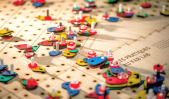
2016 – Cairn: Situated Data Collection and Analysis for Fab Labs
Designed within the community of practice of a French FabLab, Cairn aims at understanding the variety of practices within FabLabs. Cairn explores tangible alternatives to questionnaires and other traditional evaluation techniques, and stresses aesthetic and affective dimensions to create an engaging experience. It invites Fablab visitors to reflect on their practices by materializing their activities using small colored woodentiles. Interacting individually with Cairn, people contribute to create a collaborative and meaningful sculpture, upon which they can reflect collectively. Sources: Pauline Gourlet and Thierry Dassé (2017) Cairn: A Tangible Apparatus for Situated Data Collection, Visualization and Analysis. David-Julien Rahmil (2017) Cairn, la table qui permet de manipuler et visualiser des données.

2016 – Dataponics: Human-Vegetal Play
“Dataponics: Human-Vegetal Play” maps human physical activity measured by a Fitbit to the amount of light and water fed to a potted plant. Also, the system measures the moisture in the growing hydroponic medium (in this case, expanded clay) that surrounds the plant’s roots, and plays different internet radio stations accordingly. Source: Cercos, R., Nash, A., Yuille, J., Goddard, W. (2016) Coupling quantified bodies: affective possibilities of self-quantification beyond the self
2016 – Housing Prices Ripping San Francisco Apart
This data sculpture depicts a map of housing prices in San Francisco. It’s a map of the city, torn at the seams. The height of each area represents the average price per square foot for recent home sales. Where neighboring areas are close in value they are connected, but if neighboring areas are too far from each other I allow them to split, tearing the city along its most severe economic divides. Sources: Doug McCune (2016) Sculpture of Housing Prices Ripping San Francisco Apart Abigail Cain (2016) This Sculpture Shows How the Tech Boom Has Upended San Francisco’s Neighborhoods Related: Also see our entry 2013 – Doug McCune’s Physical Maps.
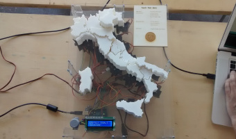
2016 – Actuated Prism Map of Italy
This actuated prism map was created by Alessandro Masserdotti in the OpenDot Fablab in Milan, Italy, for the SOD16 meeting and invites people explicitly to Touch That Data. OpenDot Fablab (Milan) project with Arduino and 3D printing visualizes regional statistics changing the height of each region. In the picture there's the building count from the regional extracts. Sources: Open streetmap wiki, 2016. Video from a demo at OSMIT 2016.
2016 – FizViz: A Wall-Mounted Data Gauge
Maker project by iot design shop of a clock-like physical visualization device. "The concept is that you'd hang a set of FizViz widgets in your office, workshop, or wherever you want to watch and share data that matters" Source: FizViz - Large Scale Physical Visualizations for your Stats! (video)
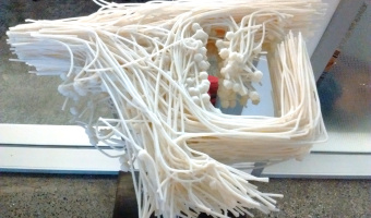
2016 – Motus Forma: People's Motions in a Shared Space
Motus Forma is a data sculpture by Brian Allen and Stephanie Smith that aggregates 10 hours of people movements in the lobby space at Pier 9. The 1300+ motion paths are piled up according to time. Sources: Autodesk (2016) Motus Forma Instructables (2016) Motus Forma Photo by Pierre Dragicevic Related: Also see our other entries on temporal data.
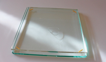
2016 – Turning Weight into Scale
This simple prop or analog interface by designer Chang Hee Lee is part of an art project titled "Three Studies of Synaesthesia", and studies how weight and scale could be associated with each other. The liquid between the two glass sheets immediately expands its surface according to the pressure it receives on the glass surface. The heavier the weight or pressure, the more the surface expands. Sources: via Chang Hee Lee website
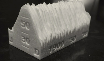
2016 – Central Park NYC Temperatures
Seasonal plot of the monthly average temperature in Central Park NYC since 1869. The long axis is mapped to years, the other axis is mapped to months from January to December. Data sourced from the National Weather Service. Source: RoundTableRdDesign on shapeways.

2016 – Podium: Physical Competition Monitor
Podium is an internet connected device that uses real-time social data to show comparative rankings of a brand’s performance versus their competitors. Developed in a partnership between iSketchLab and TrackMaven, Podium is a physical device that pulls Facebook, Instagram, and Twitter data from airline brands and offers an snapshot overview of the brands' performance on social media. Sources: Podium

2017 – Modern Dowry: Visualizing One's Debt and Assets in the Shape of a Teapot
Data materialization is a workflow developed to create 3D objects from data-informed designs. Building upon traditional metalwork and craft, and new technology’s data visualization with generative art, this workflow expresses conceptually relevant data through 3D forms which are fabricated in traditional media. The process allows for the subtle application of data in visual art, allowing the aesthetic allure of the art object or installation to inspire intellectual intrigue. This entry describes the technical and creative process of Modern Dowry, a silver-plated 3D-print teapot on view at the Museum of the City of New York, June 2017-June 2018.
Modern Dowry was created for an invitational exhibition at the Museum of the City of New York titled “New York Silver: Then and Now.” The curator’s charge was for the artists to take inspiration directly from the Museum’s collection of Colonial Silver. I was inspired by the history of silver objects holding the wealth of the family directly. Silver platters, porringers, and vessels were presented to a bride upon her marriage from her family, as a dowry of sorts. In comparing these stories to my personal financial situation, and the contrast of entering my marriage with a significant sum of student loan debt and joining that to my husbands, I created this teapot utilizing the figures of my debts and assets as represented in the convex and concave curves that make up the teapot footprint. (Courtney Starrett)
Sources:
Courtney Starrett (2017) Modern Dowry. Courtney Starrett (2015) Data materialization projects. Related: Also see our other entries on data-driven tableware.
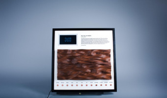
2017 – CNC-Milled Wood Visualization of a Studio's Energy Usage
"How might we make data more tangible, persuasive, and persistent?" This was the challenge I posed to myself during my internship at IDEO Chicago. My answer is an artistic exploration made tangible through different design disciplines: data design, industrial design, and electrical engineering. The data for this exploration is the energy usage of the Chicago studio during 2015. An algorithm created with Grasshopper, a visual programming language, turned unfiltered data into a three-dimensional object that I CNC-ed from walnut. While the digital object created through the algorithm is completely scalable, adaptable, and unique, the physical object synthesizes the ephemeral phenomenon of energy into one concise and compelling sculptural form. Source: ELIAS THADDÄUS PFUNER https://www.eliaspfuner.com/tangible-data
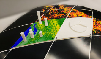
2017 – Fabricating Physical Globe Visualizations
Geospatial datasets are too complex to easily visualize and understand on a computer screen. Combining digital fabrication with a discrete global grid system (DGGS) can produce physical models of the Earth for visualizing multiresolution geospatial datasets. This proposed approach includes a mechanism for attaching a set of 3D printed segments to produce a scalable model of the Earth. Two models have been produced that support the attachment of different datasets both in 2D and 3D format. Source: Hessam Djavaherpour, Ali Mahdavi-Amiri, Faramarz F. Samavati (2017) Physical Visualization of Geospatial Datasets. Related: Also see our other entries on globe models and rearrangeable physical visualizations.
2017 – Yellow Dust: Making Visible Particulate Matter in the Air
A three-dimensional water vapor canopy; Yellow Dust is a sensing and sensuous infrastructure that monitors, makes visible and partially remediates particulate matter in the air through variable clouds of yellow mist. Composed by Do It Yourself sensors and using off-the shelf construction systems, it aims to contribute to collective forms of making air pollution visible. In contrast to scientific and policy making versions of air monitoring, where the devices remain invisible and sensing only about the data, Yellow Dust engages with the toxicity of the city by opening up the monitoring process in various ways: revealing the monitoring technology and its measurements, communicating the quality of air pollution not through screens or numbers, but through a sensuous experience with the data, and conditioning the environment by humidifying and cooling. It also provides the information to replicate the project in other contexts, as an open source urban infrastructure. Source: http://yellowdust.intheair.es/
2017 – Data Sculpture of Latin American Apprehensions
This piece is a physical matrix representing recorded data on Latin American migrants traveling to the United States between the years 2011 and 2014. It was constructed as a conceptual study into using sculpture and tangibility as an alternative form of expressing empirical data. Even though apprehensions do not account for those who make it through to the U.S. or those who were killed or gone missing, apprehensions still shed light on important migration patterns over time. Each column represents a border sector, starting in CA in the west, and ending in TX. Each row represents the years between 2011 (top row) and 2014. The clear acrylic layers represent apprehended Mexican population, and the colorful acrylic layers represent apprehended Central American (El Salvadoran, Honduran, and Guatemalan) population. Aesthetics and tangibility can be employed to counteract the reduction of a subject for easy consumption and instead embrace its complexity and humanity where the audience encounters multiple angles, differing perspectives, and the freedom to explore - ultimately creating a broader understanding of the subject with nuance and subtlety. Through an emotive and multifaceted data experience we may provoke a more critical and thoughtful discourse while agitating discussion of solutions addressing pressing social issues. Materials & Software Tools: Laser Cut Acrylic, Spray Paint, Illustrator, Python, Postgresql Source: Sadie Coughlin-Prego, Data Sculpture of Latin American Apprehensions, Sadieprego.com
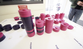
2017 – Participatory Matrix and Parallel Coordinates
In order to inform a local audience about a largely-avoided topic such as cancer, a research study was commissioned by KnowAndBe.Live, a startup working in the field of cancer prevention awareness, with the aim of fostering a bottom-up information request from a local audience. The research team included a designer, a sociologist and experts on the topic of cancer-prevention, who worked together relying on a collaborative design approach, with the goal of delineating possible strategies to encourage the search for and retrieval of information on a delicate and largely-avoided topic such as cancer. The project combined participatory data physicalization (PDP), an information-design approach where the geometry or material properties of physical artefacts encode data, with a you-draw-it approach. This term refers to a series of data journalism projects published by the New York Times, which challenged readers in a guessing game regarding specific data connected to the topic. The act of guessing, indeed, facilitates the assimilation of knowledge by arousing curiosity about the right answer (Golman, & Loewenstein, 2015). Combining these two approaches we designed an experience that involved the local audience of the TedMed 2017 in Milan in confronting the topic of cancer; the experience triggered a bottom-up demand for information which was answered by offering participants a well-designed information booklet. In 2019 the project has been adopted by the EU Joint Research Centre as a tool to raise awareness on cancer prevention. Sources: https://www.knowandbe.live/ https://www.nytimes.com/interactive/2017/01/15/us/politics/you-draw-obama-legacy.html Golman, & Loewenstein, 2015. Curiosity, Information Gaps, and the Utility of Knowledge. Related: Also see our other entries on participatory data physicalizations.
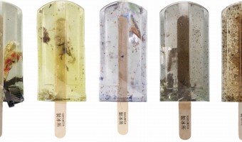
2017 – Popsicles of Pollution
Students from New Taipei City collected samples from urban rivers, creeks and ports which they then froze in moulds and preserved in resin. ‘We hope when more people see this they can change their lifestyles,’ said one of the group. Source: Elle Hunt (2017) Popsicles of pollution: ice lollies highlight Taiwan's contaminated waterways.
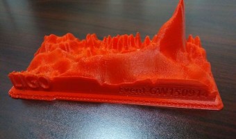
2017 – Gravity Wave Spectrogram - LIGO
Humanity has been gazing at light from distant stars since time immemorial. But in 2015, our ability to understand the University achieved a major milestone, when ripples in Spacetime itself - instead of light - told the tale of an ancient, cataclysmic collision between black holes. The Laser Interferometer Gravitational-Wave Observatory (LIGO) is an experimental system of almost unbelievable sensitivity. Using interferometer arms four kilometers long, it can detect changes in length as tiny as 1/10,000 the width of a proton. Over a billion years ago, two huge black holes, with a combined mass 60 times that of our Sun, spiraled into each other. This event shook the very fabric of space and time, and about three solar masses were converted completely into energy in the form of gravity waves. These waves have been travelling outwards in all directions at the speed of light, until they were noticed by LIGO, on 14 Sept 2015, first at the installation in Hanford, WA, and milliseconds later at Livingston, LA (GW150914). The LIGO team released a 2D spectrogram of the data, showing how the intensity of the gravity waves at different frequencies changed over the course of the event. In this case, the x-axis is time, the y-axis is frequency, and the intensity is indicated by the color. As predicted by Einstein's theory of General Relativity, the coalescing of the black holes involved a "ringdown" increase in intensity of the high-frequency components as they spiraled together faster and faster. I (Louis R. Nemzer) converted this spectrogram into a 3D-printed model. This way, the peak is much more apparent, and the primary signal, as well as the background noise, is much easier to appreciate. This event has paved the way for a new era in astronomy, in which gravity wave signals, along with light, will let us peer deeper into the vastness of Space. Sources: "Gravity Wave Spectrogram" by Louis R. Nemzer hosted on Thingiverse Data from the LIGO Open Science Center
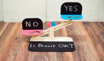
2017 – Street Debaters
Japanese designer Tomo Kihara invented a polling device that is both entertaining and profitable. Source: Tomo Kihara (2017) Street Debaters.
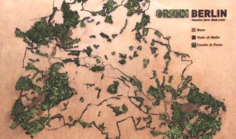
2017 – Green Berlin
Tangible data visualization of green areas and water in Berlin. "Green Berlin" is a living map showing parks and forests in Berlin. The green areas on the wooden map are laser cut, with moss growing through the holes. Source: Sebastian Meier, Green Berlin

2017 – The All Too Evident Ashtray
The ATEA is an ashtray made of concrete. It carries data about smoking habits & lung cancer in the United States between 1975 and 2014, split by gender. The data is encoded in concentric bubbles/half spheres, where the distance to the center shows lung cancer prevalence by year. The bubble diameters display the average number of cigarettes smoked per day during that particular year.
The causal relationship between smoking and cancer is well researched and known for decades, so there’s really no new information or new insight in there. But just in case they forget for a second, the All Too Evident Ashtray reminds it’s user of that fact.
Source: meikl3D (https://twitter.com/meikl3D/status/926902040235823106)
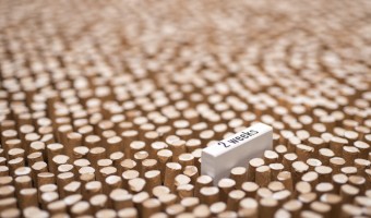
2017 – Are you Sure you Want to Smoke?
Giacomo Flaim, a student in Communication Design at Politecnico of Milan, made a single-datum physical visualization out of 4,234 cigarette butts to convey the average annual cigarette consumption of an Italian smoker. Labels were added to indicate the reduction in life expectancy depending on the quantity smoked, from 10 minutes for a single cigarette to more than a month for the entire year. Sources: Giacomo Flaim (2017) Are you sure you want to smoke? (behance.net). Information is Beautiful Awards entry. Photos by Giacomo Flaim.
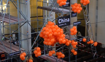
2017 – CO2 Emissions Shown with Balloons
The installation shows a representative selection of twenty countries and their CO2 emissions in 2014. Every orange beach ball equals 100 billion tonnes of carbon dioxide. The values refer to combustion of fossil fuels and production of cement. This work was created by Mario Klemm and José Ernesto Rodriguez in the context of the course « Data objects » with Prof. Boris Müller at University of Applied Science, Potsdam. Source: original post by Mario Klemm. Related: Also see our other entries on air pollution.
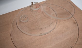
2017 – Animals Tracking
We wanted te show the difference of scale made by animals that were tracked including mankind depending on their needs. The result is a group of transparent disks with different sizes representing the employed path and its length during 24h for each subject. Sources: Noémie Duval, Timothé Gourdin, Simon Le Roux et Quentin Lambert Jérôme Héno, Matthias Rischewski and Louis Eveillard (2017) Workshop datafossil #3 Related: Also see other projects from the datafossil #3 workshop.
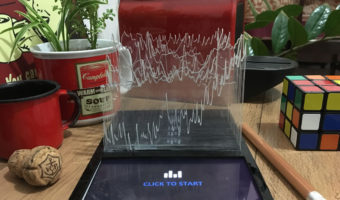
2017 – Damião's Dataphys Project
A project that communicates information in a beautiful and unusual way. Using simple features, Evandro Damião a data intelligence professional from Brazil creates a project that allows even blind people to interact with graphics through audio, braille, acrylic and a lot of creativity. Visualization and physicalization are not the secrets to communicating data, they are only some aspects that must be transcended. Source: Evandro Damião (2017) The Dataphys Project. Related: Also see our entry 2013 - Season in Review for another example of laser-cut acrylic charts overaid on a tablet.
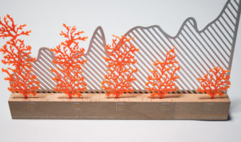
2017 – Coral Reefs
This data sculpture made by three design students at the datafossil #3 workshop depicts the destruction of Australian coral reef since 1985 (in orange) together with the rise of ocean temperature (in gray). The Great Barrier Reef has been losing more and more of its area since the last 27 years. One of the biggest cause is coral bleaching due to global warming and more exactly to the rise of the temperature of ocean's water. Scientists say that the reef is going to keep deteriorate as fast until 2022 if nothing is done. This topic seemed very interesting as it is a serious actuality and a serious problem. We wanted to put in relation the cause and the consequence which means the temperature rise and the surface diminution of the coral reef. Sources: Louise Chapalain, Thalia Falourd, Alizée Parry and Hubert Bezard (2017) Coral reefs Jérôme Héno, Matthias Rischewski and Louis Eveillard (2017) Workshop datafossil #3 Related: Also see other projects from the datafossil #3 workshop.
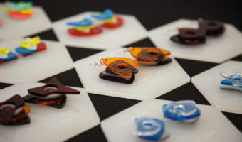
2017 – Wearable Self
Wearable Self is a collection of data jewelry which is Jiyeon Kang's master's thesis project at Parsons School of Design. South Korean designer Jiyeon Kang transformed a year of self-tracking data (e.g. daily steps) gathered by Fitbit and iPhone Health into personalized fashion items that can hold and wear. Through laser cut and 3d printing with different materials, the designer creates customizable fashion items generated by users' self-data, aiming to make self-tracking data more meaningful for individuals who use wearable devices. Where fashion design meets data visualization, Wearable Self creates unique business opportunities in personalized fashion and allows users to interact with their own data while it opens a new conversation related to data ownership and self-identity. "With the maturity of wearable technology, we are all unconsciously gathering activity data from our everyday movement by the sensors on our smartphone and wearable devices. The quantified self, which is a movement to track and quantify every aspect of lives with tracking technologies, has started to go mainstream. However, in many cases, those numbers gathered by fitness trackers often fail to make meaningful connections with us. We might get a better sense of self-awareness by looking at those real-time graphs displayed on data dashboards, but as time passes, it’s obvious that the data streams lose its context. Can those endless streams of self-data, which show traces of our lives, be more memorable beyond data dashboards? In this context, my thesis Wearable Self attempts to turn self-tracking data that belongs to us into art that can be mementos for individuals. I believe that making self-data tangible and wearable opens a business opportunity in terms of personalization and customization in fashion design." (Kang, 2017) Sources: See details on Jiyeon Kang's portfolio. Wearable Self: Your Data Jewelry (project webpage.)
2017 – EuroGums: Edible Population Pyramids
Eurogums are edible population pyramids of the 28 EU member countries. Whereas 27 countries taste cherry-sweet, the UK Eurogum is rather sour, due to the referendum and Brexit. Source: meikl3D Related: Also see our other entries on data-driven food.
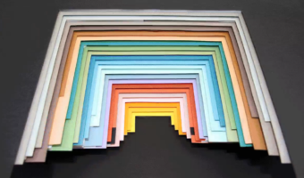
2017 – Hand-Crafted Magazine Infographics
Infographic designers at the National Geographic crafted a 3D physical visualization out of paper and colored cardboard in order to prepare a 2D infographic. Source: Alberto Lucas López (2017) Handmade #dataviz (tweet). Related: Also see our entry on IBM's cosmograph.

2018 – Materialism
In the Materialism series, the Dutch duo Studio Drift takes apart technological objects and use cubes and prisms to convey the raw materials they are made of. Although those data sculptures are conceptually physical rearrangements (see our other entries on physical rearrangements), the artists actually weigh the different components and create the prisms from scratch using new material. This new material often only looks like the original material due to practical constraints.
Left image: Bicycle (Gazelle), 2019, a “bicycle presented as chunks of rubber, polyurethane, steel, aluminium and lacquer paint, among many others”. Right image: 1975 Russian AK-47 machine gun with bullet from the Vietnam war, 2019.
Sources:
Studio Drift (2022) Materialism — (archived version) Eleanor Gibson (2019) Studio Drift deconstructs everyday objects for Materialism series at Frieze LA — (archived version) Peter-Astrid Kane (2021) What are the raw materials in your iPhone, Starbucks cup and bike? – in pictures — (archived version) Left image: Studio Drift (2019), Bicycle (Gazelle) Right image: Studio Drift (2019), Machine gun
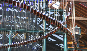
2018 – The 20 Year Gap
This data physicalization is an art installation that represents the difference in disability-free life expectancy* and overall life expectancy for different areas in the UK, thereby highlighting the unequal health conditions in the country. Each area is represented by a hanging thread. On each thread a red bottle corresponds to disability-free life expectancy while the blue bottle represents overall life expectancy. The title of the artwork refers to the finding that in the UK there is gap of just over 20 years between the lowest and highest average disability-free life expectancy. The artwork was created by SRG Bennett and Cath Sleeman and first shown at FutureFest 2018 in London. Source: SRG Bennett and Cath Sleeman (2018) The 20 Year Gap. * "the number of years a person can expect to live without a limiting persistent illness or disability"
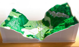
2018 – Landscaper: 3D Printing and Assembling of Terrain Models
Landscape models of geospatial regions provide an intuitive mechanism for exploring complex geospatial information. However, the methods currently used to create these scale models require a large amount of resources, which restricts the availability of these models to a limited number of popular public places, such as museums and airports. Landscaper is a system for creating these physical models using an affordable 3D printer in order to make the creation of these models more widely accessible. Source: Kamyar Allahverdi, Hessam Djavaherpour, Ali Mahdavi-Amiri, Faramarz F. Samavati (2018) Landscaper: A Modeling System for 3D Printing Scale Models of Landscapes. Related: Also see our other entries on terrain modeling and terrain models.
2018 – Harassment Plants
Harassment Plants is a situated physicalization exhibited in a Brazilian city to represent stories of harassment experienced by women in a public lakeside. Each vase represents a different category of harassment and contains glyphs that represent cases of harassment. The color in the middle of the vase corresponds to the type of harassment, which is also represented by the same color in one of the beads. Each glyph is composed of a rod — whose length represents the time of the day the harassment occurred — and a pendant with multiple beads — which correspond to the victim's reaction, the perceived age of the harasser, etc. Source: Luiz Morais (2018) Harassment plants.
2018 – CairnFORM: a Physical Ring Chart Showing Renewable Energy Data
CairnFORM is a stack of expandable illluminated rings for display that can change of cylindrical shape (e.g., cone, double cone, bicone, cylinder, spheroid). CairnFORM can be used as a dynamic physical ring chart for encoding 360°-readable data: we use it for encoding forecast data about renewable energy availability in collective and public spaces, such as public places and workplaces. Source: Maxime Daniel, Guillaume Rivière, and Nadine Couture (2019) CairnFORM: a Shape-Changing Ring Chart Notifying Renewable Energy Availability in Peripheral Locations.
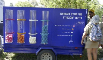
2018 – Traveling Datavis Game
A public participation project, in which the boundaries of the political debate were discussed. Hoping to define a respectable “clean” political discourse and formulate a treaty reflecting the public's expectations of what constitutes a legitimate discourse based on political ideology or clear up when is a misuse of a public position. The project was made up of an ice-cream truck, driving around Israel periphery, inviting the public to participate in 4 interactive games asking question about the dilemmas in a political discourse. ones answers the question each participant got an popsicle! the data was then used to formulate the “clean” political discourse Convention and handed out for Candidates and elected officials to sign. Source: https://www.ronilevit.com/traveling-dataviz-game
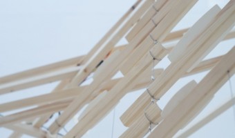
2018 – Stretch Orchestra Marble Run
A connected exercise pad made with textile sensors responds to your interaction by inviting you to experience physical activity data in a playful way; a giant marble run, to elicit a childlike feeling of wonder and satisfaction. The installation is part of research project using materials to explore the experience of systems and technologies designed to aid behaviour change. In collaboration with intelligent textiles innovators Footfalls and Heartbeats the interactive installation proposes a felt experience of data generated by technology products designed to support wellbeing. The research suggests that digital health technologies alter the ways we perceive our bodies and explores tangible alternatives to encourage healthy behaviours. “So many devices aimed at encouraging healthy behaviours flash up persuasive messages that actually work by giving us ‘the guilt’. I wanted to create a system where the sensory experience and physicality of materials could motivate us by provoking a positive feeling in response to your physical activity”. Sources: Marion Lean, Textile Design Researcher http://marionlean.co.uk/Methods-Collaboration-Interactive-installation Supported by EPSRC Get a Move On network https://getamoveon.ac.uk/events/stretch-orchestra
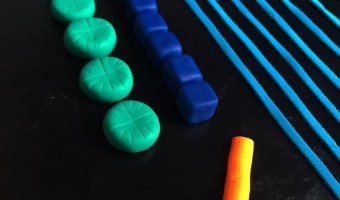
2018 – DayDohViz: Data Visualizations made with Play-Doh
DayDohViz is as a "daily" inspiration project that experiments with physically visualizing data in 3D using a smartphone and Play-Doh. Yes, Play-Doh. Creator Amy Cesal's subjects range from self-disclosing and serious (her personal financial data, government enforcement actions) to delicious and exhilarating (pizza types, top roller coasters). Amy has found the tactile, ephemeral & imprecise nature of Play-Doh - so different from the typical data viz technology - to be creatively liberating. Source: Amy Cesal, DayDohViz, www.amycesal.com/day-doh-viz-all
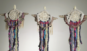
2018 – Anthropocene Footprints
Handmade physicalizations of Canada's greenhouse gas emissions, by Mieka West and Sheelagh Carpendale. Each object represents data from a specific year (1990, 2010, and projections to 2030). Initially meant to be smog masks, the designs evolved into strange and beautiful objects evoking indigeneous artefacts such as Native American dreamcatchers, Inca quipus and Polynesian genealogical instruments, and whose visual and material complexity is reminiscent of Nathalie Miebach’s Woven Sculptures. See their website for how to read the data. The objects were on display at the IEEE VIS 2018 Arts Program (VISAP’18) in Berlin. Sources: Mieka West and Sheelagh Carpendale (2018) Anthropocene Footprints. Kantar Information is Beautiful Awards 2018.
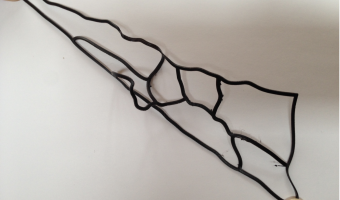
2018 – Solving the Shortest Route Problem with a 3D Printer
Christian Freksa, a professor of Cognitive Systems at the Department of Informatics at the University of Bremen, shows how a shortest route can be computed by 3D-printing the route network using flexible material, and then pulling apart the start and end nodes. The tight portion of the network immediately gives the shortest route. The right image shows an earlier version using strings. This idea was first proposed by mathematician George Minty in 1957, in a short letter to the editor of the Operations Research journal. It was later popularized by Alexander Dewdney. Sources: Christian Freksa, Thomas Barkowsky, Zoe Falomir and Jasper van de Ven (2018) Geometric Problem Solving with Strings and Pins. To appear in Spatial Cognition and Computation. Christian Freksa (2015) Strong Spatial Cognition. George G. Minty (1957) A Comment on the Shortest-Route Problem. First and second image from the 2018 article, last image from the 2015 article.
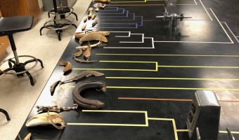
2018 – Phylogenetic Tree with Real Specimens
As part of a zoology class, evolutionary biologist Leo Smith created a phylogenetic tree of fishes where each leaf is an actual fish specimen. Source: Leo Smith's tweet (29 April 2018). Related: Also see our other entries on physical visualizations built by re-arranging physical items.
2018 – Living Map: Precipitation Visualized with Moss
Climate change is a very hot topic nowadays. We are facing extreme weather events more and more frequently. Unusual temperatures, excess rainfall or extremely strong winds, forest fires disrupt our habitual life. The LIVING MAP visualizes the change of summertime rainfall in Europe. A precipitation data comes from the European Environmental Agency. The data was derived using climate simulation model. It compares summer precipitation in the period 1971-2000 and 2071-2100. The simulation of climate change shows that a southern part of the continent will receive almost 40% less rainfall and the northern part will receive approx. 30% more precipitation. It means an amount of summertime precipitation will change our habitable environment dramatically. For a LIVING MAP data visualization, a local ecosystem was designed. A species of alive fire moss (Ceratondon purpureus) were plated onto a special surface. This type of moss can visually indicate the presence or absence of the water. If the moss receives enough water then it turns green. If it lacks water it turns brown or yellow. Excess of humidity makes the moss almost black. The controlled amount of water was supplied for a moss map. An amount of water correlates with digital data. Different areas of the map received a different quantity of water. In a few months, a special moss pattern on the surface of the map was created. It metaphorically represents the possible environmental scenario in the European continent in 2070. The LIVING MAP is an experimental visualization project, related to a doctoral study in Vilnius Academy of Arts, Lithuania. It explores displays of “rich information experience”. Source: Sigitas Guzauskas, https://www.behance.net/gallery/68572509/LIVING-MAP
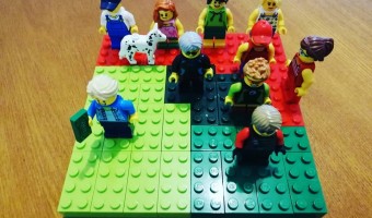
2018 – Inequality in Chile Represented with LEGO Bricks
Inequality in Chile represented with LEGO bricks. Made by Harry Lizama, a data scientist in the Ministry of the Environment of Chile. The surface represents the totality of the income. Each person represents a decile. In light green is decile 10. In green is decile 9. In dark green are deciles 7 and 8. In red are deciles 1 to 6. Sources: Harry Lizama, based on data from the Ministry of Social Development, CASEN 2017. Image taken from http://observatorio.ministeriodesarrollosocial.gob.cl/casen-multidimensional/casen/docs/Resultados_ingresos_Casen_2017.pdf Related: Also see our other entries featuring LEGO bricks.
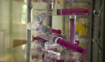
2018 – The Long Run: Marble Runs Convey Cost of Health Care
An artwork that represents the cost of health care for different age groups, based on the time it takes for a marble to fall. Each of the 7 runs represents a different decade of life, and the length of the runs presents the average cost of care to the UK's National Health Service, for a person in that year of their life. Each run is constructed from medical equipment. It was commissioned by the British Medical Association and the British Medical Journal to mark the NHS's 70th Birthday on the 5 July 2018, and installed at their headquaters for a month. The artwork was created by Tom Chambers and Theo Papatheodorou, experts in computational art, and founders of the Random Quark creative technology studio, working with digital artist and expert in physical computing Jesse Wolpert. Sources: Will Stahl-Timmins (2018) Creating a marbellous installation for the NHS’s 70th birthday. Images Richard H Smith.
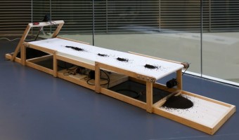
2018 – ON BRINK: Live Physicalization of the Bitcoin Blockchain
ON BRINK is a physical data visualisation of the Bitcoin blockchain: Adapting the mining metaphor, it encodes data on blocks appended to the chain in real-time. It produces piles of soil that relate in size to the number of transactions within a block, and displays six of them at a time on a continuous conveyor system, thus reflecting the human attention span given to a transaction on the blockchain: A transaction counts as confirmed after five blocks have been appended to its containing block. A display informs about the latest block appended to the chain. As the passed blocks accumulate to a growing pile at the end of the conveyor system, the initial pile of soil keeps decreasing: our digital tools are strongly dependent on physical resources. ON BRINK relates our digital to our physical environment by physicalizing the human-related data points of time, location and participation of the Bitcoin blockchain. Source: Dustin Stupp, ON BRINK
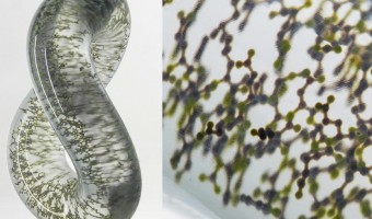
2018 – Multimaterial Printing of Volumetric Scientific Visualizations
Researchers from MIT Media Lab and Harvard University have developed a method for accurately physicalizing scientific visualizations using multimaterial 3D printers: To fabricate an item on conventional 3D printers, one must make calculations regarding the object’s digital description, and then convert the resulting numeric description to geometric shapes which can be used to 3D print it. But the research team has developed a new technique to 3D print multimaterial data sets as physical objects, which requires less pre-processing to create a more direct data-to-object translation, and builds a bridge between the physical and the digital. ... The technique actually negates the need to create an intermediate boundary representation of an object, which can end in information loss or data alteration for less ideal physical results. Sources: Sarah Saunders (2018) Researchers Develop Multimaterial Voxel-3D Printing Method For More Direct Data to Object Translation. Christoph Bader et al. (2018) Making data matter: Voxel printing for the digital fabrication of data across scales and domains. Images from chemeurope.com.
2018 – Spanish Dictionary Cemetery
1914-2014 consists of a comparison between the Spanish official Dictionary from the year 1914 and the one from 2014. The result of this comparison is a list of all the words which are not included in the last edition of the dictionary any longer. Every word is displayed on a single page in order to show the number of lost words physically. This visualization is materialised in an artist book with the format of a dictionary divided in two volumes. The size of the book already shows us the amount of words which have disappeared from the Spanish Dictionary. Sources: Marta PCampos (2018) Project's website MUSAC: Contemporary Art Museum of Castilla y León (2018). 1914 - 2014 at Open Call Lab987

2018 – Steven Pinker explains Global Life Expectancy with Physical Line Charts
Bill Gates shared a short video featuring Steven Pinker on his Twitter feed with the comment People today are living longer, healthier, and happier lives than ever before. I asked @sapinker to explain why. At first glance it appears that line charts are digitally overlaid on the video. However, closeups and a light swaying of the graphs when Steven Pinker touches them, as well as the addition of another country towards the end of the video indicate that the graphs visible in this video are actually physical line graphs. Sources: Tweet by Bill Gates, 24/02/2018. Direct acces to the video via youtube (posted by Bill Gates, 13/02/2018) Related: Also see the entry "Hans Rosling Adopts Physical Visualizations (2010)" which includes links to videos of Hans Rosling and Bill Gates using physical visualizations and props to explain data.
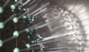
2019 – Physical Globe Model of Global Temperature Change
Using open source NASA GISS data, british model maker and designer Matthew Stewart created a sculpture which communicates the temperature rise of the globe compared to 50 years ago. With the data’s lat/long variable, Matthew Stewart represented temperature increase with length of protruding rod – the greater the difference, the longer the rod. Made of 3,204 pieces, assembly had to be perfect to ensure the lattice structure held its form correctly, & so the data was represented accurately.
Sources:
https://a-maker.co.uk/global_temperature_change/ (seemingly offline) Anne-Laure Fréant (2022) Interview with Matthew Stewart, Model maker and Data-sculpture designer. (archived version) Related: Also see our entry 2014 – Blaue Blumen: Handcrafted Offline Data Visualization of Population Density .
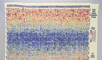
2019 – The 100-Year Climate Yarn
The 100 Year Climate Yarn is a large, crocheted Data-Art wall-hanging which tracks the daily maximum temperatures in Adelaide, South Australia over a 100 year period from 1920 to 2020. Textile Artist Sandra Lepore worked with Energy & Climate Specialist Heather Smith to plan the work using colours carefully selected to emphasise extreme temperatures.
Sources:
www.facebook.com/myclimateyarn/ www.instagram.com/myclimateyarn/ Related: Also see our entry 2013 – Temperature Scarves and Afghans and all our entries of visualizations made with fabric.
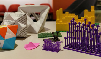
2019 – Data Beyond Vision: Physicalizing Bookshop Data
[Data Beyond Vision] explores new ways of engaging with a dataset and the arguments and narratives behind it, in order to challenge the dominant paradigms of conventional screen-based data visualization. The project currently comprises: 3D printing a model of library member activity over time from the Shakespeare and Company Project juxtaposing documented activities from two sets of archival materials Folding paper forms of borrowing activity from the Shakespeare and Company Project surfacing the activity of women and and non-famous members Weaving representing intertextuality based on references in Jacques Derrida’s de la Grammatologie from Derrida’s Margins Images from left to right and top to bottom: (1) some of the data physicalizations designed in the course of the project; (2) lollipop chart of Shakespeare and Company membership; (3) unit origami volumetric representation of Shakespeare and Company membership; (4) folded model of Shakespeare and Company lending library membership activities; (5) weaving Derrida’s references. Sources: Koeser, Rebecca Sutton, Gissoo Doroudian, Nick Budak, and Xinyi Li. “Data Beyond Vision.” Startwords, no. 1 (October 2020). https://doi.org/10.5281/zenodo.3713670. Koeser, Rebecca Sutton, Nick Budak, Gissoo Doroudian, and Xinyi Li. “Data Beyond Vision,” July 11, 2019. https://doi.org/10.5281/zenodo.3261531.
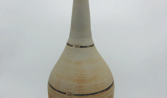
2019 – Physical Violin Plot
A physical violin plot created by sculptor and psychology researcher Hunter Brown. See related entries also using clay here. Source: Tweet from Julia Strand (@juliafstrand), June 12, 2019.
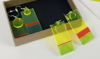
2019 – Data Earrings of Country Happiness
This data jewellery displays data the happiness of its citizens and potentially contributing factors. One earring encodes the proportion of a countries GDP as a stacked bar chart with categories: service, agriculture, and industry. Towards the top a circle encodes the overall happiness rank of a country's citizens. Source: Jang Lee: https://janglee.myportfolio.com/happiness-x-gdp Related: Also see our other entries on data jewelleries.
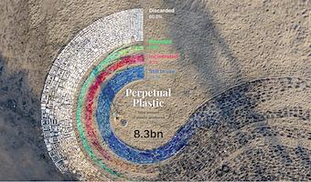
2019 – Perpetual Plastic
Winner of the National Geographic and Sky Ocean Ventures Ocean Plastic Innovation Challenge [This project] highlights the scope of the plastic problem (in terms of amount produced as well as its fate) and the transformation of plastic over its lifetime, using beach debris as a salient example. The situated, participatory data installation approach extends abstract displays of numbers towards a more gripping form of ‘data visceralization.’ The direct link to beach clean-up activities suggests immediate opportunities for action, turning the sculpture into a catalyst for engagement. Source: Liina Klauss, Skye Morét and Moritz Stefaner (2019) perpetual-plastic.net
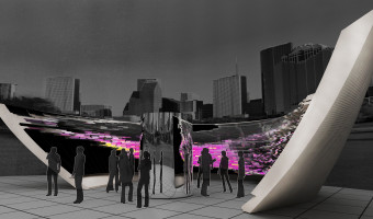
2019 – Anamorphic Data Spatialization
Data spatialization is a design technique through which data is used to create architectural spaces. It does not necessarily preserve the legibility of the represented data, but rather focuses on the spatial qualities that can be gained from the data. This research aims to introduce a method for the design of a data-driven pavilion that represents data spatially through catoptric (mirror-assisted) anamorphosis. In this work, a set of environmental datasets from North America–including elevation, precipitation, temperature, and population–is used to generate an anamorphic structure. The spatialized datasets can be updated by means of illuminating the components of the pavilion. Based on the result, this design methodology provides an accurate data representation in an anamorphic data-driven public space. Source: S Vahab Hosseini, Hessam Djavaherpour, Usman R Alim, Joshua M Taron, Faramarz F. Samavati (2019) Data-spatialized Pavilion: Introducing a Data-driven Design Method based on Principles of Catoptric Anamorphosis.
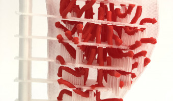
2019 – Physicalizing Cardiac Blood Flow Data
Blood flow data from cardiac 4D Flow MRI (magnetic resonance imaging) holds much potential for research and diagnosis of flow-related diseases. However, understanding this data is quite challenging – after all, it is a volumetric vector field that changes over time. This paper proposes a novel slice-based physical model as a complementary method for visualizing the flow data. The design of this model respects the conventional method of viewing medical imagery (i.e., in cross-sections) but has the added advantages of engaging one’s sense of touch. Source: Kathleen Ang, Faramarz F. Samavati, Samin Sabokrohiyeh, Julio Garcia, Mohammed S Elbaz (2019) Physicalizing cardiac blood flow data via 3D printing.
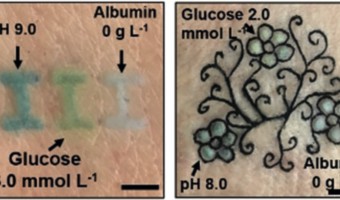
2019 – Tattoo Biosensors
Tattoos that Change Color When Reacting With Glucose Levels: minimally invasive, injectable dermal biosensors were developed for measuring pH, glucose, and albumin concentrations. Sources: Biotech (2019) Twitter post. Yetisen et al (2019) Dermal Tattoo Biosensors for Colorimetric Metabolite Detection.
2019 – Sleep Blanket
A visualization of my son's sleep pattern from birth to his first birthday. Crochet border surrounding a double knit body. Each row represents a single day. Each stitch represents 6 minutes of time spent awake or asleep. Source: Seung Lee (2019) Twitter thread. Related: Also see our entry 2013 – Temperature Scarves and Afghans.
2019 – Hostile Terrain 94: Deaths at the US/Mexico Border
Prototype of a series of physical maps that will be exhibited across 94 cities worldwide in fall 2020. Each of the 3500 hand-written toe tags represents the recovered body of a migrant who died while crossing the US/Mexico border in the Sonoran Desert between 2000 and 2020. Coordinated by the Undocumented Migration Project (UMP). To learn more about UMP and the context of this map, listen to the Radiolab podcast series Border Trilogy. Sources: hostileterrain94.wordpress.com Left image from Twitter user Jer Thorp Right image from hostileterrain94.wordpress.com
2019 – New Worry Beads: Deaths from Terrorism
Worry Beads, one for every year from 1945 (closest in the pic), are scaled at one cc per human life. The volume of each is set by the number of terrorist-caused deaths for that year globally. The whole thing is about 40' long, the largest bead (2014) is 19" dia. There’s other material which hopefully makes clear that the #1 American fear, terrorist attack, is ridiculous. There’s another string of beads, 50" long, which shows terrorist deaths in the US. You’re more likely to be killed by a human toddler.
The real horror: From 1945 thru 2017, globally, 413,000 people died via terrorism; in the same period in the US 992,000 people were murdered (and I’m missing data from 1946-1960)
Source: Loren Madsen (2018) Facebook post and personal communication.
Related: Also see our entry 2004 - Worry (Prayer) Beads for an earlier version by the same artist.
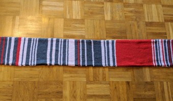
2019 – Self Knitted Scarf of Train Delays
The mother [of] Sara Weber knitted this scarf during her daily train rides to work in Munich and used different colors depending on train delays. Every day two rows: Grey, less than 5 minutes delay. Pink, 5 to 30 minutes delay. Red, both rides delayed or one more than 30 minutes. The huge red area was during construction work, where the train was substituted by a bus. Side note: The tweet went viral and at the end she sold the scarf at eBay and gave the money to the "Bahnhofsmission" who take care of homeless people at trainstations. Sources:
Sara Weber on Twitter: https://twitter.com/sara__weber/status/1081950904671240192 Zett Newspage: https://ze.tt/mit-einem-selbst-gestrickten-schal-zeigt-eine-pendlerin-wie-haeufig-ihre-bahn-verspaetung-hat/
2020 – Regression with a Cardboard, Straw and Strings
In November 2020, a public health expert named Jorge Pacheco Jara found he could explain regression with a cardboard, a straw, and strings. He posted a video of his idea on Twitter (video above), implying that his device performs a classic linear regression, but in reality it is closer to a Deming regression — for an illustration of the difference, see this image (but also, his device minimizes the total distance to the regression line and not the sum of the square distances). Presumably because people pointed out inaccuracies in Jorge Pacheco Jara’s description and he did not want to leave a misleading post, he deleted his tweet.
However, people had already downloaded his video and started sharing it on social media platforms like LinkedIn, Facebook and Twitter. To this day, people are still posting the video without attribution, always inaccurately presenting the method as doing classical linear regression.
It would be surprising if Jorge Pacheco Jara was the first person to discover this ingenious way of demonstrating the general concept of regression, but we are not aware of any prior source for the moment.
Sources:
Jorge Pacheco Jara’s reply to his deleted Twitter post (Nov 2020): https://x.com/jorge_pacheco/status/1327768017791434752 (archived version) A screenshot of his original Twitter post can be seen here (Nov 2020): https://notawfulandboring.blogspot.com/2020/11/stats-arts-and-crafts.html (archived version). In English, the post says: “I had an attack of artemania and tried to replicate a regression line.” A live discussion on Reddit about what the device does exactly, and whether it’s a good explanation at all (Nov 2020): https://www.reddit.com/r/interestingasfuck/comments/k40puy/line_of_best_fit_visualised/ The image comparing classic linear regression with Deming regression is from Nick McClure’s TensorFlow Machine Learning Cookbook. Related: Also see our other entries on physical computation.
2020 – Laina: Data Physicalization of Running Activity
Laina is a shape-changing art piece, presenting physicalized running routes over a delayed period of one or two days. Over this time, some of the pins on Laina are pushed out one by one, creating a data physicalization pattern corresponding to the mapping of the last running route. The length the pins come out represent a specific effort given at that point on the route. The metric related to the effort can be chosen by the user (e.g., pace, burned calories, heart rate). Laina adopts an aesthetics perspective to spark positive feelings towards running through a slow feedback mechanism, the art piece revealing itself to the user progressively. Hence, Laina aims to trigger longer satisfaction feelings of the run and reminds the user of the positive emotions of the previous run.
The shape-change interactions of Laina are twofold: indirect and direct interaction. Indirect interaction takes place when the user starts varying their running routes or their level of efforts (e.g., pace, heart rate), the user can indirectly control the shape of Laina, as this affects which of the pins come out and at what length. A direct interaction within Laina was integrated by enabling the possibility of pushing back the individual pins to the original position. If the pins are not pushed back, the different routes will stack on top of each other, showing the joint effort of previous running sessions. Once the maximum depth is reached, the pins do not actuate anymore unless they are pushed back by the user. If some of the pins are pushed back before Laina completes the art piece of the last session, the rest of the running route will still be physicalized in Laina. The direct interaction is integrated to provide autonomy to the user. Hence, the user is in charge of creating their own art-piece, erasing it entirely or keeping certain shapes they already created.
Source: Daphne Menheere, Evianne van Hartingsveldt, Mads Birkebæk, Steven Vos, and Carine Lallemand. 2021. Laina: Dynamic Data Physicalization for Slow Exercising Feedback. In Designing Interactive Systems Conference 2021 (DIS’21), June 28–July 02, 2021, Virtual Event, USA. ACM, New York, NY, USA, 16 pages.
2020 – Ownership: Occlusions, Night Terrors, and Pernicious Doubt
This series of bronzes visualizes 2020 data on gun ownership in America.
Pernicious Doubt
Access to a gun increases the risk of suicidal death by 3 times.
Occlusions
Carrying a gun makes the bearer 4 times more likely to be killed in an aggressive encounter than without a gun.
Night Terrors
Women are 5 times more likely to be killed in acts of domestic abuse when their partner owns a gun.
Source: Matthew Mosher. Ownership: Occlusions, Night Terrors, and Pernicious Doubt.
Related: Also see our other entries on crime.
2020 – Data Badges
A physical conference badge that participants create themselves during an event by assembling tokens on a wearable canvas. The process is guided by an instruction sheet that helps translate the tokens to various professional characteristics. Sources:
Tweet from Andre Vande Moere. Georgia Panagiotidou, Sinem Gorucu, Andrew Vande Moere (2020) Data Badges: Making an Academic Profile Through a DIY Wearable Physicalization. Related: Also see our entries on data jewellery and data clothing.
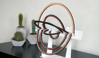
2020 – LOOP: Ambient Visualization of Personal Activity
LOOP is a physical artifact that changes its shape according to the activity data of the owner, providing an abstract visualization. The artifact consists of eight rings, of which seven represent weekdays from small to large, and the outermost ring represents the step goal. When the owner is active, the ring representing the current weekday moves upwards and positions itself in relation to the step goal ring. LOOP was used to investigate how an alternative approach to representing personal activity data can support self-tracking activities in everyday life.
Sources:
Kim Sauvé, Saskia Bakker, Nicolai Marquardt, and Steven Houben (2020) LOOP: Exploring Physicalization of Activity Tracking Data Kim Sauvé, Steven Houben, Nicolair Marquardt, Saskia Bakker, Bart Hengeveld, Sarah Gallacher, and Yvonne Rogers (2017) LOOP: A Physical Artifact to Faciliate Seamless Interaction with Personal Data in Everyday Life LOOP project page
2020 – The Anatomical Edutainer
Physical visualizations (i.e., data representations by means of physical objects) have been used for many centuries in medical and anatomical education. Recently, 3D printing techniques started also to emerge. Still, other medical physicalizations that rely on affordable and easy-to-find materials are limited, while smart strategies that take advantage of the optical properties of our physical world have not been thoroughly investigated. In our paper, which received the Best Short Paper Award at IEEE Vis 2020, we propose the Anatomical Edutainer, a workflow to guide the easy, accessible, and affordable generation of physicalizations for tangible, interactive anatomical edutainment. Our workflow consists of two main components: (1) the generation of 2D printable physicalizations, which exhibit different visual properties (i.e., hues of the visible spectrum) under colored lenses or colored lights, and reveal distinct anatomical structures, and (2) the generation of 3D foldable physicalizations, where anatomical structures undergo unfolding, to ensure that they can be printed and assembled to a 3D papercraft. The assembled papercraft can be subsequently explored under colored lenses or lights, similarly to its 2D counterpart. Anyone with access to a computer and a common printer can create our proposed physicalizations, while the colored filters or lights are widely available and affordable. Additionally, the templates of our physicalizations need to be created only once and can be easily reprinted, which makes them an affordable and accessible tool for educational purposes, such as at art exhibitions or science museums. The tangible character of the 3D papercraft assembly adds to the enjoyment of the process, making them especially suitable for children’s anatomical edutainment. Source: Renata Raidou (2020) https://renataraidou.com/anatomical-edutainer/
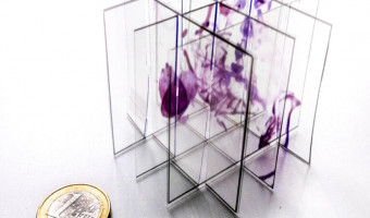
2020 – Slice and Dice: A Physicalization Workflow for Anatomical Edutainment
During the last decades, anatomy has become an interesting topic in education—even for laymen or schoolchildren. As medical imaging techniques become increasingly sophisticated, virtual anatomical education applications have emerged. Still, anatomical models are often preferred, as they facilitate 3D localization of anatomical structures. Recently, data physicalizations have proven to be effective and engaging—sometimes, even more than their virtual counterparts. So far, medical data physicalizations involve mainly 3D printing, which is still expensive and cumbersome for laymen use. In our paper, we investigate alternative forms of physicalizations, which use readily available technologies (home printers) and inexpensive materials (paper or semi-transparent films) to generate crafts for anatomical edutainment. To the best of our knowledge, this is the first computer-generated crafting approach within an anatomical edutainment context, which is based on volumetric medical imaging data. Our approach follows a cost-effective, simple, and easy-to-employ workflow, resulting into assemblable data sculptures (i.e., semi-transparent sliceforms). It primarily supports volumetric data (such as CT or MRI), but mesh data can also be imported. An octree slices up the imported volume, considering a user-defined transfer function. Then, an optimization step simplifies the slice configuration and proposes the optimal order for easy assembly. Finally, a packing algorithm places the resulting slices with their labels, annotations, and assembly instructions on a paper or transparent film of user-selected size. This can be later printed, assembled into a sliceform, and explored. An initial assessment of our work demonstrated its value for the successful creation of interactive and engaging anatomical physicalizations. Source: Renata Raidou (2020) https://renataraidou.com/slice-and-dice/
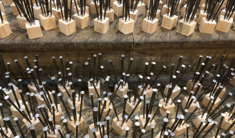
2020 – COVID-19 Deaths as Nails
An art installation in the Cathedral of Schwäbisch Gmünd (Germany) shows COVID-19 deaths as nails hammered into wooden cubes. More nails are added as the number of deaths increase. The text down the steps says "Fürchtet euch nicht", meaning "do not be afraid". Sources: Tweet from Friedrich Hart (@mxfh), Dec 9, 2020. SWR (2020) Schwäbisch Gmünd: 13.000 Nägel für Coronaopfer. Related: Also see our other entries on single-datum physical visualizations and on conveying deaths.

2020 – I am a Book. I am a Portal to the Universe.
All-ages book by Stefanie Posavec and Miriam Quick. Each of the book's dimensions – from its height, weight and volume to the loudness of the sound made when it is slammed shut – embodies a fact or measurement about the universe on a 1:1 scale. Hello. I am a book. But I’m also a portal to the universe. I have 112 pages, measuring 20cm high and wide. I weigh 450g. And I have the power to show you the wonders of the world. I'm different to any other book around today. I am not a book of infographics. I'm an informative, interactive experience, in which the data can be touched, felt and understood, with every measurement represented on a 1:1 scale. How long is an anteater’s tongue? How tiny is the DNA in your cells? How fast is gold mined? How loud is the sun? And how many stars have been born and exploded in the time you’ve taken to read this sentence? Using all the elements that make a book, well, a book in a completely original way, I blend playful design and data storytelling to introduce scientific concepts to a broad, all-ages readership. Source: Stefanie Posavec and Miriam Quick, https://www.iamabook.online/
2020 – Venous Materials
. A team of researchers at the MIT Media Lab developed physical user interfaces based on fluidic channels that can interactively respond to mechanical inputs from the user, without any electrical power. Above, line charts that are activated and animated by pressure input. Source: Hila Mor, Yu Tianyu, Ken Nakagaki, Benjamin Harvey Miller, Yichen Jia, and Hiroshi Ishii (2020) Venous Materials: Towards interactive, fluidic mechanism. Related: Also see our other artifacts involving mechanical interaction and physical computation.
2020 – Econundrum: Visualizing the Climate Impact of Dietary Choices
Econundrum is a shared physical system, designed to visualize the carbon emissions as a result of dietary choices. People of a community can indicate on their phone what food types they ate that day, which will be visualized on the physical installation. Every disk represents the impact of one person, and its elevation indicates the level of impact: higher is fewer carbon emissions, lower is more carbon emissions. The highlighted food types visualize how the 'foodprint' of each person is composed. The different sized circles within the disks show the impact ratio of the different food types, which could be used for choosing alternatives to decrease carbon emissions.
Sources:
Kim Sauvé, Saskia Bakker, and Steven Houben (2020) Econundrum: Visualizing the Climate Impact of Dietary Choices Through a Shared Data Sculpture Econundrum demonstration video Econundrum project page
2021 – Soft City
Soft City is a large-scale textile series that maps the urban fabric of Black neighborhoods in the Boston area. The tapestries map historic (redlined) and contemporary Black neighborhoods, including Roxbury, Dorchester, and East Cambridge. The information mapped tells the story of the past, present and future of Black residents, and the ecological resilience of the neighborhoods they live in. Hard (impervious) and soft (pervious) land uses are codified using colors with overlays of Black residents and flood zones on the tapestries. The softness and materiality of tufting interrogates the traditional top-down approach to space planning and management in the city and offers new tactile ways to explore our understanding of urban space, at all ages.
Source: just practice - Amanda Ugorji & Sophie Weston Chien - Just Practice.

2021 – The Flood Necklace
The “Flood Necklaces” embeds flood history data of the river Loire in the city of Orleans. Each ball of clay is sized according to the water heights measured on flood scales between 1800 and 2003, in the city of Orleans. Data is from the Region Centre-Val-de-Loire (DREAL), for floods between 1804 and 2003. The biggest flood recorded happened in 1866, and impacted most rivers and regions of France. It was such a major event that a report to the Emperor has been written to estimate the damages nationaly. It impacted the urban planning and river containment national policy for the decades to come and lead to major construction works on all major rivers.
Made by Anne-Laure Fréant in 2021. Ceramics & rope.
Source: Anne-Laure Fréant (2022) The making of the Loire river “Flood Necklace” data-object. (archived version)
Related: Also see our other entries on data jewellery.
2021 – Phylogenetic Tree with Real Plants
There’s a fantastic plant phylogenetic tree display at the Geneva Botanical Garden with live examples growing at the tips of the evolutionary branches.
This display was part of an exhibition open from 20 May 2021 to 17 October 2021.
Sources:
Quote and photo: tweet by Marko Kaksonen Conservatoire et Jardin botaniques de Genève (2021) Le grand bazar de l’évolution – Grande exposition sur l’évolution de la vie sur terre (archived version). Related: Also see our similar entry 2018 – Phylogenetic Tree with Real Specimens, and our other entries on physical rearrangement.
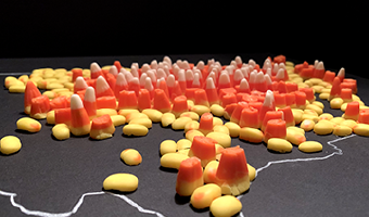
2021 – Map of Corn Production Using Candy Corn
The prompt for the 27th day of the 2021 #30DayMapChallenge was ‘heatmap.’ I looked at corn production in the US - just the lower 48. The data is from USGS and it was made with 3 bags of candy corn.
Source: Jill Hubley
Related: Also see our other entries on visualizations made of food.
2021 – State of the World as Population Pyramids
The collection "State of the World" is composed of population pyramids and was created by Mathieu Lehanneur for the 2021 exhibition art basel - design miami. Each of the 100 sculptures encodes the population data of one country: age is encoded in rings from birth at the bottom to 100 years at the top; the width of each ring encodes the proportion of the population being of that age. each age pyramid reveals the particularities of a nation — the youth of chad, translated by the geometric perfection of its flared base that consistently slims all the way to the top or, conversely, the immigrant population of adults in the united arab emirates, which forms a prominent bump for the age range from 20 to 40 years resting on top of a fine base of emirati births. passing from one work to another proves to be a fascinating journey through time and history. the notches left by the war in cambodia or the second world war in many european countries act as evidence that evoke the immediate empathy of the visitor, who is suddenly part of a greater whole: a living, moving, global body. Source: designboom. mathieu lehanneur renders the earth's shifting populations into sculptural objects. 2021 Related: Also see our other entries about age pyramids.
2021 – Walkable Bar Chart
A bar chart conveying two quantities, one of which is clearly larger.
The activists and artists at the Respect New Haven rally yesterday offered this stunning graphic to visualize Yale's $32 Billion endowment compared to its paltry $13 million contribution to the city of New Haven...a FRACTION of the taxes it would pay if properly assessed.
Source: Tweet from Davarian L. Baldwin.
Related: Also see our other entries on walkable physical visualizations.

2021 – Watermap: A Physical Live Weather Visualization
Without water, nothing organic exists. This water installation visualizes - symbolically - how rain brings the whole world to life. In a very tangible way of presenting and visualizing data, rain is represented by real drops of water. The installation features a black, wooden pedestal with a recessed world map filled with sand. Technically, the realization is done by a mini-computer, which evaluates live weather data and positions a water tank in an X-Y system above the world map. At places with precipitation, water drops fall onto the sand.
Source: https://www.daniel-fischer.at
Related: Also see our entry 2015 – Physical Weather Display and our other physical weather visualizations.
2021 – Personal Data Physicalizations in Class
Images created by students to represent their personal data. Refer to the publication below for image attributions.
I describe the results of implementing a personal data physicalization assignment in an information visualization course for senior undergraduate and graduate students in computer science and software engineering. By collecting data about themselves and representing this data in physical forms, students were able to i) learn about data visualization, ii) design creatively; and iii) learn about themselves. While data physicalization in education has been explored with non-technical and novice audiences, the experience I report in this paper provides evidence that data physicalization also has benefits for technical, visualization-savvy students.
Also check out our entry 2010 – Data Sculptures in Class
Sources:
Charles Perin. What Students Learn with Personal Data Physicalization. CG&A SPecial Issue on Visualization Education, 2021.10.1109/MCG.2021.3115417. Author pre-print available at https://hal.inria.fr/hal-03360714. Charles Perin. Personal Data Physicalization assignment v1. University of Victoria Information Visualization course. 2019. Charles Perin. Personal Data Physicalization assignment v2. University of Victoria Information Visualization course. 2021.

2022 – Jordan Cunliffe's Data Embroidery
Jordan Cunliffe is an embroidery designer and author with a focus on data and storytelling. Cunliffe is taking traditional and historic textile techniques, and pairing them with contemporary concepts. Her work includes binary encoding of her childhood diary with black and white beads, representing overlapping series of data using embroidery, representing time, sleep patterns, migration patterns, with threads and beads. Jordan Cunliffe is the author of a book called “Record, Map & Capture in Textile Art, Data Visualization in Cloth and Stitch”, Batsford Editions (2022) featuring other projects along with her own work, and encourages anyone to try their own data project.
Source: Jordan Cunliffe’s website.

2022 – Europa 2022: Multilingual Sound Sculptures
Going beyond a definition of Europe limited to its borders, Europa 2022 imagines a soundscape of Europe that reveals its linguistic diversity and identity through its languages, accents, and intonations. Supported by the Art and Design research program “Objects, Crafts and Computation” in collaboration with the ceramics and glass faculty of the Eugeniusz Geppert Academy of Art and Design in Wrocław, the Europa 2022 project is a participatory and generative device designed on the basis of a linguistic map of the continent, incorporating a collection of sculptures generated through a process of physicalization of sound data from recordings of a text by Czech philosopher Jan Patočka read in different European languages.
Source: ESAD Orléans (2022) Europa 2022 | EuroFabrique.

2022 – Codes in Knots: Sensing Digital Memories
The artifacts consist of three-dimensional knots based on the analysis on the physical structure of Khipu knots. By using digital tools and analog methods to encrypt information, knots and knotted surfaces are created for the archiving and transmission of different forms of text such as poems or stories.
Nayeli Vega’s project “Codes in Knots” revisits the ancient Andean information recording system of Khipus with modern technologies, to encode texts into series of textured, sculptural knots.
Nayeli Vega (2022) Codes in Knots. Nayeli Vega (2022) Codes in Knots. Sensing Digital Memories Related: Also see our other entries on quipus.

2022 – Kinetic Sculpture of Pi Digits
Pi is a kinetic sculpture based on the noise of randomly distributed digits of the eponymous number. The noise appears as a seemingly inexhaustible well of non-periodic elements, setting the objects in motion. In turn, the object’s shapes communicate the source.
Every of the ten installation objects represents a decimal place’s integer, zero to nine. The seemingly infinite quantity of digits triggers the rotating movements of the objects with a predestined sequence but without any repeating patterns.
Video: https://vimeo.com/760540429
Credits:
Concept: Robin Woern Development: Niklas Thran Photos: Niklas Thran Source: Robin Woern (2022) Pi. (archived version)

2022 – River Meandering Through Time
Zoltán Sylvester is a research scientist in the field of geology and a world-known sedimentologist, stratigrapher, and modeler. He is a co-PI of the Quantitative Clastics Laboratory (QCL) at the University of Texas at Austin in the United States. Zoltán Sylvester works especially on river meandering over time and how to precisely track how a river – that can sometimes erase its own sedimentary deposits – has moved and changed its path over time. The 3D prints Zoltán Sylvester made so far (with time on the z axis) are from a numerical model, not a specific river. They allow to capture the sedimentary history of the river through time within one object, which is usally very difficult to represent.
Source: Anne-Laure Fréant (2022) Interview with geology researcher Zoltán Sylvester: understanding river meandering through time. (archived version)
Related: Also see our entry 2004 – Full-Color 3D-Printed Scientific Visualizations.
2022 – Making with Data: Book Cover
Making with Data is a physical data-driven papercraft sculpture that serves as the cover of the book, “Making with Data: Physical Design and Craft in a Data Driven World.” The paper waves of the piece reflect the undulating word counts of each of the book’s 24 chapters. Each of these chapters tells the story behind the creation of a physical object, space, or experience that represents data — with the artists and designers who crafted the piece explaining the unique and creative process through which they gave that data physical form.
The Making with Data sculpture captures the lengths of each chapter’s Motivation, Practices & Processes, Materials & Tools, and Reflection subsections and reveals them via a physical ridgeline plot. To create the piece, the book’s editors (Samuel Huron, Till Nagel, Lora Oehlberg, and Wesley Willett) compiled the data and created vector graphics files for each paper layer. We then commissioned a paper artist, Betty Soliman, to select paper colors, cut each layer, and assemble them together. Graphic designer Elodie Maigné then composited photographs of the piece to create the final cover. The resulting visualization embodies the vision of the book — representing its contents as an evocative data object and bringing the idea of making with data full circle.
Source: Samuel Huron, Till Nagel, Lora Oehlberg, and Wesley Willett (2022) Making the Cover with Data.
Related: Also see our other entries of physical visualizations made with paper.

2022 – STRAIDE: A String-Actuated Shape Display
STRAIDE is a string-actuated interactive display environment that allows to explore the promising potential of shape-changing interfaces for casual visualizations. It is a open-source hardware platform that spatially levitates elements to create dynamic visual shapes in space. The physical research environment is highly modular and can thus be adjusted along manifold parameters, like the number of elements, arrangement, illumination, or input capabilities. Multiple representative physical setups showcase this versatility in different scenarios. Several applications, including ambient notifications, personal smart home controls, and entertainment, are already demonstrated. For conveniently designing and implementing novel applications, developer software tools are available online.
Sources:
Severin Engert, Konstantin Klamka, Andreas Peetz, and Raimund Dachselt (2022) STRAIDE: A Research Platform for Shape-Changing Spatial Displays based on Actuated Strings. STRAIDE Project Page. STRAIDE Github Repository. Related: Also see our other entries on shape displays.
2022 – Physical Map of Arctic Sea Ice
Sea ice is frozen ocean water that is most commonly found near the poles in the Arctic Ocean and Southern ocean around Antarctica. Sea ice plays a critical role in regulating the ocean circulation, thereby influencing the global climate. Abnormal melting of sea ice brought forth by warming temperatures leads to changes in global climate making it important to study the fluctuations in the sea ice extant. Scientists use different methods to study sea ice which include observations and climate models.
This tactile representation shows the impact of climate change on sea ice over four decades through a climate model (CESM2) showing the drastic decline in sea ice extant.
Acknowledgements: National Center for Atmospheric Research, University Corporation for Atmospheric Research, Boulder Public Library, BLDG61
Source: Arctic sea Ice. (archived version)
2022 – Edo: A Participatory Physicalization of Food Impact
Edo is a participatory data physicalization meant to enable a small community to track the carbon impact of their dietary choices. Each type of food item is represented as a token, a disk, whose surface area encodes the carbon impact of a typical portion of that type of food (data source: Agribalyse). After a meal, one can add data by selecting tokens for all the types of food one just consumed. For example, a burger with fries would require a beef token, a bread token, a salad token, and a potato token. All tokens are then added to the board which can have different layouts. The first image shows a grouping by day, where each column shows the impact of food consumed by the people who contributed data that day. The second image shows a grouping by person, where each circle belongs to one person and illustrates the total carbon budget per person for 5 days if one was aiming to remain within a 2t yearly budget.
This project was presented as a pictorial at the ACM TEI 2023 conference. A video of the presentation given by Kim Sauvé is available on Vimeo.
Sources:
The ACM TEI pictorial: Kim Sauvé, Pierre Dragicevic, and Yvonne Jansen. 2023. Edo: A Participatory Data Physicalization on the Climate Impact of Dietary Choices. In Proceedings of the Seventeenth International Conference on Tangible, Embedded, and Embodied Interaction (TEI ‘23). Association for Computing Machinery, New York, NY, USA, Article 35, 1–13. (https://doi.org/10.1145/3569009.3572807) Fabrication instructions and data are available under CC-BY 4.0 on OSF.

2023 – Light Sculptures, Matters of Impermanence
Dexter Callender III’s work captured light moving across several iconic architectures of the Boston area throughout the course of a day. He captured light using a unique setup of photography and code. Those data were then converted into layers and shapes, carved into glass and assembled to form a set of unique sculptures that won Dexter the Harold and Arlene Schnitzer Prize in the Visual Arts in 2024. The final shape represents the “immaterial” shape of light moving through the day in a defined, indoor space.
Source: Dexter Callender (2023) Light Sculptures .

2023 – PlanetWalker: Public Physicalization of Walking Activity
PlanetWalker is a public physicalization displayed in an open workplace, using a mosaic art style to present the walking activity of 16 co-located users over four weeks. The mosaic patterns were pre-designed based on the eight planets (Mercury, Venus, Earth, Mars, Jupiter, Saturn, Uranus, and Neptune), symbolizing exploration and representing individual users. It encouraged participants to walk 7,500 steps per day. This daily goal was divided into ten small goals, each represented by a colored tile. Each user was assigned half of a planet consisting of 200 unfilled tiles. Unmet goals remained as unfilled tiles. As users met their daily goals, colored mosaic tiles appeared, gradually revealing the full form of the planet, like the footprints left by astronauts while exploring the moon. This metaphor was used to inspire users to embark on their journey toward physical activity.
Source: Mengyan Guo, Qianhui Wei, Xingjian Zeng, Lorenzo James, Pieter Van Gorp, Steven Vos, Steven Houben, Jun Hu, “Having it physical is a different story”: Physicalizing personal data publicly to motivate physical activity, International Journal of Human-Computer Studies, Volume 203,2025,103552,ISSN 1071-5819,
Related: Also see our entry 2013 – SweatAtoms: Physical Activity Sculptures

2023 – A Matter Of Air
“A Matter of Air” is an interactive installation about environmental and public health policy. This project was a team effort of Aurelie Barbier, Katrin Bichler, Aron Cohen and Julie McEldoon.
The installation visualizes data from the New York Community Air Survey from 2005–2016. Mapping Fine Particulate Matter, attributable health events, and income levels, we asked: Are the communities with the highest air pollution experiencing the worst health impacts, or are there other factors at play?
The immersive installation allowed the audience to move through an abstraction of NYC and see pollution data mapped around them as tiny light particles. It consists of an array of 42 LED strings – each representing one of New York’s neighborhoods. Each individual LED on the string shows an annual data point. The colors of the LEDs indicate how the data is trending. Hot Spots are pink, Cold Spots are blue.
The installation cycles through five data-sets: Fine Particulate Matter, Asthma in Children, Cardiovascular Events, Respiratory Hospitalizations and Poverty Level. The audience could access these datasets through an interactive panel that also provided more information. What we learned: Air Quality is improving overall. The worst Air Pollution could be found in Midtown / Chelsea between 2009-2014. The South Bronx had similar levels of pollution, but suffered more health consequences. In general, we see a correlation of the neighborhood’s poverty levels and how poor air quality affects the population’s health.
Video: https://www.youtube.com/watch?v=B8tb9gvKxfQ&t=21s
Source: Aurelie Barbier, Katrin Bichler, Aron Cohen and Julie McEldoon (2023) A Matter of Air, Visualizing Air Pollution in New York City. (archived version)
Related: Also see our entry 2002 – LED Cubes.

2023 – Sensing Network Physicalization
To support interactivity, a computational design pipeline enables designers to 3D print various network datasets. The result are sensing network physicalizations that have innate sensing capabilities. The 3D printed networks can recognize touch selection because of the conductive traces routed throughout the network links.
Source: Bae, S. Sandra, Takanori Fujiwara, Anders Ynnerman, Ellen Yi-Luen Do, Michael L. Rivera, and Danielle Albers Szafir (2023). A Computational Design Pipeline to Fabricate Sensing Network Physicalizations. In: IEEE Transactions on Visualization and Computer Graphics, vol. 30, no. 1, pp. 913-923.

2023 – Weave: 3D Parallel Coordinates
Weave is a project that aim to raise the awareness of invisible barriers faced by immigrants navigating Dutch public systems through data physicalization. People can pick a thread corresponding to their country of origin, and thread individual responses to each question. Upon finishing, they can wear the special glasses that unveil a deeper meaning of each question.
The project employs metaphors to help interpret the discursive artifact. The more challenging options are placed higher to symbolize the effort required to climb over these metaphorical mountains. The entire shape is alike an iceberg, linking to the cultural iceberg model. The deeper audience go down the iceberg, the more invisible the barriers are. The glasses symbolizes a shift in perspective, inviting viewers to put themselves in other’s shoes and seeing from other’s eyes.
Source: K. Xing (2023) Weave. (archived version)
Related: Also see our previous entries on migration and on physical parallel coordinates.

2023 – Carbon Scales
Carbon Scales is a low-tech data physicalisation of carbon emissions acribed to different phases of food production - agriculture, processing, packaging, and transport. People use Carbon Bits (i.e., 80-100g blocks made from wood, screws, bolts, and a binding agent) to touch and make sense of carbon emissions and place these bits on each platform of Carbon Scales to try and guess the emissions it takes to make and transport a specific food product.
Source: Lindrup, M. V. A., Menon, A. R., & Biørn-Hansen, A. (2023). Carbon Scales: Collective Sense-making of Carbon Emissions from Food Production through Physical Data Representation. Proceedings of the 2023 ACM Designing Interactive Systems Conference, 1515–1530.

2024 – Dipsea Chimes: A Kinetic Data Sculpture
Dipsea Chimes is a kinetic data sculpture made by information designer Maggie Shi celebrating the Dipsea Race, America’s oldest trail race. Installed on a terrace overlooking Mt. Tamalpais - the race’s iconic setting - it is accessible to the local community. The piece aims to raise awareness of the race’s historical significance, particularly its pioneering role in equity and gender inclusion. To achieve this, the design presents race data in a tangible, interactive format, making it engaging and approachable.
The installation features 30 suspended paddles, each representing a winning runner from the past 30 years, a subset of the race’s 120-year history. The length of the supporting sticks corresponds to race time, while the paddles encode age and gender-board size scales with age, and color indicates gender. Labels on each paddle display the year, time, age, and gender, allowing viewers to explore the dataset.
Sources:
Maggie Shi (2025) Dipsea Chimes – A Kinetic Data Sculpture. Information is Beautiful Awards 2024

2024 – Sensing Data
The Sensing Data course was held at KH-Berlin weißensee in 2024–2025. Its focus was on questioning “What happens when we can not only read information visually, but also can experience it through other senses?”. As a result of the course, 17 student projects have been realized, all being original data-physicalizations involving textile work addressing a specific research question. All 17 projects are documented on the course’s website.
Source: Mark-Jan Bludau (2025) Sensing Data.
2024 – Eco-Garden: Encouraging Sustainable Practices in Households
Eco-Garden is a shared physical data sculpture designed to be an aesthetically pleasing object that communicates household consumption information in a friendly manner to children and adults in households. Households are able to visualise their consumption (for electricity, gas, and food waste) and be motivated to collaboratively work towards reducing it.
Eco-Garden is a result of a three-year long Human-Centered Design (HCD) process (2021 to 2024). The researchers went through a four-phased HCD process designing several low to medium fidelity prototypes and getting user feedback.
How it works: Eco-Garden is a wooden box with three disks for electricity use practices, gas use practices, and food waste practices, which are colour-coded as blue, yellow, and green, respectively. A flower sits on each disk, and a bee is attached to one of the petals which is considered as the beginning petal. The smaller flowers around each disk are connected to Addressable LEDs, which correspond to a configurable target set by users through Eco-Garden’s companion mobile application which displays detailed consumption data. The disks follow the functioning of a traditional wall clock. Initially, Eco-Garden starts with the beginning petal with the bee, at the 12 o’clock position (representing a consumption of 0). The bees gradually rotate clockwise throughout the week to show consumption, while one lit LED in each disk shows the customised target. The bees are updated every hour. The idea is not to let the bee roate beyond the target. After the set time period, the Eco-Garden resets itself (bees rotate back to zero, and user sets a target for the new week) and continues the process with new data for the next week.
Sources:
Perera et al. (2024) Eco-Garden: A Data Sculpture to Encourage Sustainable Practices in Everyday Life in Households Perera et al. (2024) Exploring the design of physical artefacts to visualise household consumption Perera et al. (2025) Eco-Garden: Fostering Sustainable Practices Eco-Garden Demonstration video Eco-Garden Short introductory video Eco-Garden Project page
2024 – Bike Repair Stations as 3D Sculptures
Making the Invisible Visible is a project that tracks cyclists’ routes throughout the city and transforms this data into three-dimensional sculptures that double as public bike repair stations. These sculptural objects not only enhance public space and act as reference points for urban navigation, but also invite cyclists to reflect on bicycle movement across Quito (Ecuador) while repairing their bikes.
Sources:
Barriga-Abril, X., Vivanco, J., Rosas, C., Medina, X., Aulestia, A., & Basantes, A. (2024). Making the Invisible Visible: revealing data in the city. Proceedings of International Structural Engineering and Construction, 11(1), 2024. https://doi.org/10.14455/ISEC.2024.11(1).AAE-04 Barriga-Abril, X. (2025). Data-Driven Self-Portraits: Intimate connections with urban information. Street Art & Urban Creativity, 11(3), 77–92. https://doi.org/10.62161/sauc.v11.5724

2024 – Climate Bracelet
A handmade bead bracelet visualizing temperature changes in Arkhangelsk city over several decades. Inspired by the Warming Stripes method, each 2 rows encodes a year: red beads for warmer-than-average years, blue for cooler ones. The project involved translating historical climate data into bead colors and weaving them into a tangible artifact—a physical timeline of local global warming.
Sources:
Project’s Website Information is Beautiful Awards website Related: Also see our entry 2013 – Temperature Scarves and Afghans, as well as our entries about data jewellery and weather.

2024 – Travels on the Wind
Travels on the Wind is a tangible data visualization of a decade of travel. Each year is represented by a vertical thread with rings and beads encoding data about trip duration, region, season, transportation, accommodation, and companions. The piece was handcrafted over several months using 3D-printed elements, jewelry findings, and UV epoxy resin. Suspended from driftwood, it is both a personal story and a physical expression of data art.
Sources:
Project’s website Information is Beautiful Awards
2024 – Monarch Butterfly Migration
A wall at IDEO Chicago that is an interactive system allowing the participant to view the size of the annual Monarch butterfly migration site in Mexico (the number maps to the amount of butterflies on the wall that have their wings open). This roughly maps to the population size of a given year.
Sources:
Instagram post with video: https://www.instagram.com/p/C8ckPxkP8VK/ Data from Monarch Watch
2030 – Digitally-Fabricated Visualizations of the Future
These images have nothing to do with physical visualizations: they are not data-driven but abstract, and they are not even physical but instead photo-realistic computer-generated images. However, these images from digital artist Lee Griggs give an idea of what physical visualizations may look like in the near future once we overcome the limitations of today's digital fabrication technology: they will be visually and haptically elaborate, colorful, rich, and beautiful. Make sure you look at the full-res images. Sources: Colin Lecher (2014) This artist's colorful renderings look like Atlantis - Cities made from code. Lee Griggs (2014) XGen rendered with Arnold for Maya.
2033 – Cetonia: Drone Swarm Visualizations
As part of the VIS'14 Workshop Death of the Desktop, infovis researcher Wesley Willett imagines how nano drone swarms may be used in 2033 both to capture and visualize data directly in the real world: At barely 1.5 centimeters across, each Cetonia scarab is a marvel of precision engineering. Designed from the ground up for agile flight, their integrated hydrogen chambers and a high-efficiency hover mode permit 15+ minutes of air time between charges. The hueSHIFT carapace is capable of displaying over 22 million possible colors and provides clear visual feedback in day or night with visibilities up to 1.5 kilometers. Integrated camera and sensor arrays permit full 6D reconstructions with composition profiling. From your wrist or a personal field station you can quickly deploy flights in automated formations to survey, measure, record, and manipulate almost anything. Source: Wesley Willett (2014) Cetonia - A Dynamic Swarm at your Fingertips.
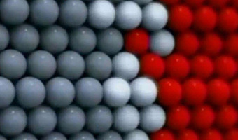
2060 – Programmable Matter
In 1965 Ivan Sutherland already mentioned programmable matter as the ultimate computer display: The ultimate display would, of course, be a room within which the computer can control the existence of matter. A chair displayed in such a room would be good enough to sit in. Handcuffs displayed in such a room would be confining, and a bullet displayed in such a room would be fatal. With appropriate programming such a display could literally be the Wonderland into which Alice walked. Several research labs have been exploring ways to implement programmable matter through nanoscale robotics. This line of research goes by many names: dynamic physical rendering, smart dust, synthetic reality, utility fog, radical atoms or programmable matter. Looking at current publications and demos, we are far from being there yet. But in a few decades, we will have physical displays that offer full control over their shape, color and other material properties. Cephalopods won't feel alone anymore. With programmable matter, physical visualizations will be able to accomodate any data set, they will be fully dynamic and interactive, and will allow both data analysts and lay people to perform complex data exploration tasks. Plugins will be available that will let people play with several of the physical visualizations listed here, in their original physical form. The two concept videos above show how some designers and scientists envision interaction with programmable matter in a 3D modelling context. The first one is from the Carnegie Mellon University, the second one is from the MIT Media Lab. Will programmable also be free floating, as we've seen in movies? Sources: Sutherland (1965) The Ultimate Display. Carnegie Mellon University (2004) Claytronics. Hiroshi Ishii et al (2012) Radical Atoms: Beyond Tangible Bits, Toward Transformable Materials.