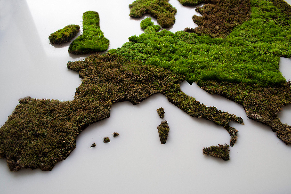
Climate change is a very hot topic nowadays. We are facing extreme weather events more and more frequently. Unusual temperatures, excess rainfall or extremely strong winds, forest fires disrupt our habitual life. The LIVING MAP visualizes the change of summertime rainfall in Europe. A precipitation data comes from the European Environmental Agency. The data was derived using climate simulation model. It compares summer precipitation in the period 1971-2000 and 2071-2100. The simulation of climate change shows that a southern part of the continent will receive almost 40% less rainfall and the northern part will receive approx. 30% more precipitation. It means an amount of summertime precipitation will change our habitable environment dramatically.
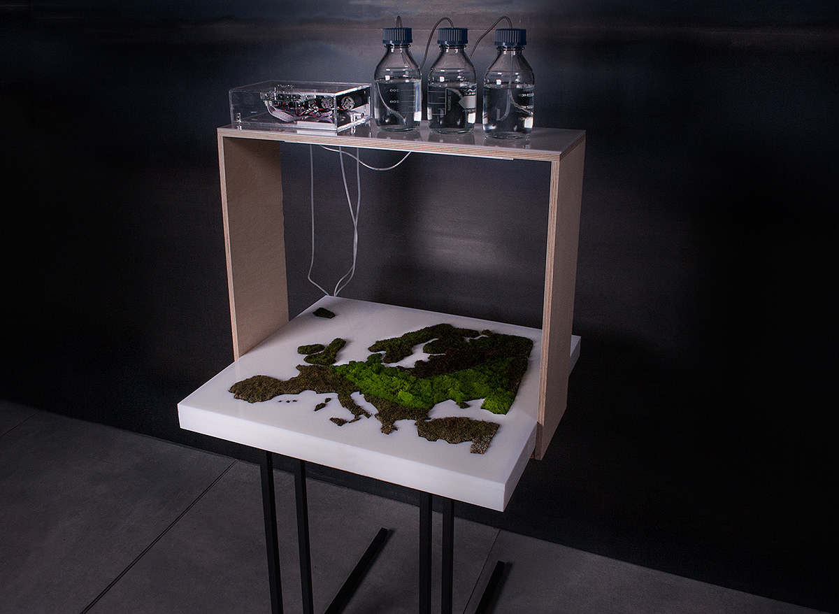
For a LIVING MAP data visualization, a local ecosystem was designed. A species of alive fire moss (Ceratondon purpureus) were plated onto a special surface. This type of moss can visually indicate the presence or absence of the water. If the moss receives enough water then it turns green. If it lacks water it turns brown or yellow. Excess of humidity makes the moss almost black. The controlled amount of water was supplied for a moss map. An amount of water correlates with digital data. Different areas of the map received a different quantity of water. In a few months, a special moss pattern on the surface of the map was created. It metaphorically represents the possible environmental scenario in the European continent in 2070.
The LIVING MAP is an experimental visualization project, related to a doctoral study in Vilnius Academy of Arts, Lithuania. It explores displays of “rich information experience”.
Source: Sigitas Guzauskas, https://www.behance.net/gallery/68572509/LIVING-MAP