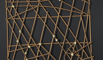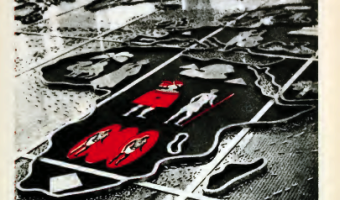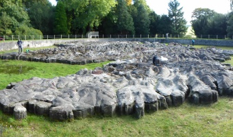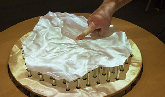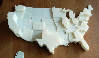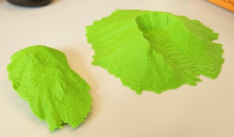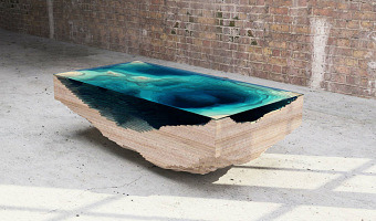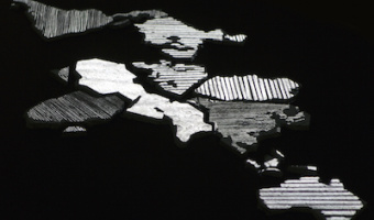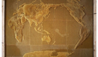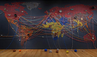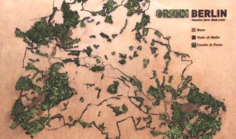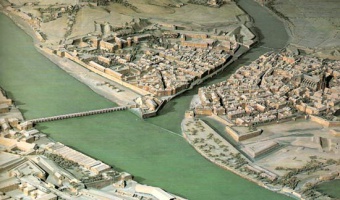
The first terrain/city models date back from the 16th century and were created for military purposes. Left image: a plan-relief of Bayonne, created by Sébastian Vauban (1633–1707), a famous fortification engineer of King Louis XIV. Right image: a plan-relief of Grenoble from 1848. These scale models were highly prized for the tactical advantage they brought, and they were also shown around for dissuasive purposes. “Il y a un relief de Namur dans les Tuileries, je vous demanderai d'avoir la […]
The first terrain/city models date back from the 16th century and were created for military purposes. Left image: a plan-relief of Bayonne, created by Sébastian Vauban (1633–1707), a famous fortification engineer of King Louis XIV. Right image: a plan-relief of Grenoble from 1848. These scale models were highly prized for the tactical advantage they brought, and they were also shown around for dissuasive purposes. “Il y a un relief de Namur dans les Tuileries, je vous demanderai d'avoir la complaisance d'y venir avec moi. Je vous ferai toucher au doigt et à l'œil tous les défauts de cette place, qui sont en bon nombre [...].” There is a relief of Namur in the Tuileries, I would ask you to kindly come with me. I will make you touch with your finger and your eye all the defects of this place, which are in good number. — Vauban's letter to Le Pelletier, president of the constituent assembly (1695). “Le Moniteur parle d'un plan de la Suisse, du feu général Pfiffer. Faites examiner ce plan, et, s'il est meilleur que celui que j'ai acheté dernièrement, faites-le acheter et transporter à Paris. Comme il est possible que nous ayons encore la guerre, il n'y a point de meilleure carte que ces plans en relief.” The Monitor speaks about a map of Switzerland, from the late general Pfiffer. Have this map examined, and if it is better than the one I bought recently, have it bought and transported to Paris. Since it is possible that we may still have war, there is no better map than these relief maps. — Napoléon's letter to Maréchal Berthier (1805). Also see our entry on modern solid terrain modeling. Sources: Institute of Cartography and Geoinformation, ETH Zurich (2006-2015) www.terrainmodels.com Yvonne Jansen (2014) Physical and Tangible Information Visualization. Robert-Max Antoni (1992-2000) Vocabulaire illustré de l'Art urbain - Relief Model. Napoléon I (1858) Correspondance de Napoléon 1er. Wikipedia Plan-relief de Grenoble. Left image from www.terrainmodels.com, right image from Jean-Pierre Dalbéra (Flickr).
Added by: Pierre Dragicevic.
Category:
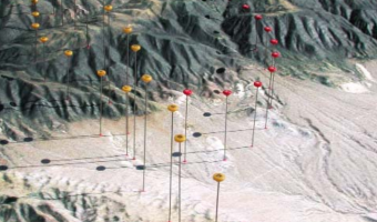
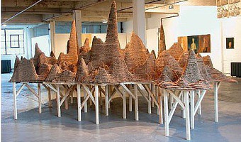
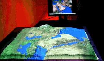
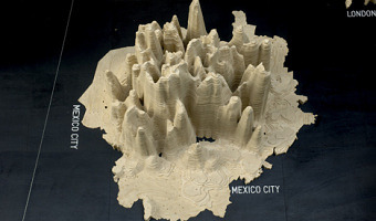
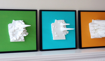
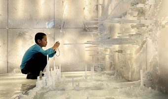
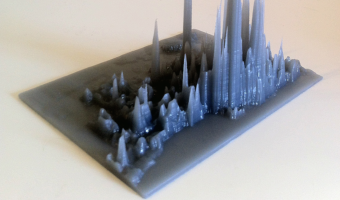
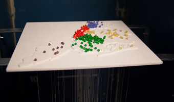
Physical model
Tags:
cartographic, plan relief, terrain model, walkable