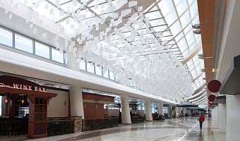
Left image: eCLOUD is an airport installation at the San Jose International Airport created by Dan Goods, Nik Hafermaas, and Aaron Koblin. It is made of many large LCD pixels laid out in 3D space whose opacity change as a function of weather. Right image: A similar installation called airFIELD was created by the same team two years later. It shows air traffic and is installed at the Hartsfield-Jackson Atlanta International Airport. For other examples of non-regular or 3D layouts of physical […]
Left image: eCLOUD is an airport installation at the San Jose International Airport created by Dan Goods, Nik Hafermaas, and Aaron Koblin. It is made of many large LCD pixels laid out in 3D space whose opacity change as a function of weather. Right image: A similar installation called airFIELD was created by the same team two years later. It shows air traffic and is installed at the Hartsfield-Jackson Atlanta International Airport. For other examples of non-regular or 3D layouts of physical pixels, also see Brygg Ullmer's Strata/ICC system (2010), Rémi Brun's kinematic LED sculptures (2012), and LED cubes. Sources: eCloud project (2010) airFIELD sculpture (2012)
Added by: Pierre Dragicevic, sent by: Fanny Chevalier.
Category:
Active physical visualization
Tags:
air traffic, hybrid, weather