Tag: hand-made

1820 – Papier-Mâché Anatomical Models

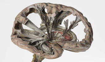
Left image: As part of its 2014 exhibition entitled Mind Maps: Stories from Psychology, the London Science Museum showcased this very accurate and intricate papier-mâché brain model from 1900 that shows path of nerve fibers. French physician Louis Thomas Jerôme Auzoux developed this technique around 1820 due to the shortage of human cadavers and wax models to study human anatomy. He was inspired by papier-mâché dolls that were common at the time. His models became popular in schools, […]

Added by: Pierre Dragicevic, sent by: Tobias Isenberg. Category: Physical model  Tags: anatomy, hand-made, model, papier-mâché, rearrangeable, science


2003 – Time Pieces: Physical Space-Time Cubes

Artist Marilynn Taylor created seven three-dimensional maps (one for each day of the week) in which time is the z-axis and a copper wire shows how she moved across the city during the day. Source: Maryline Taylor (2003) Time pieces - Mapping the time and space of place (2003 version).

Added by: Pierre Dragicevic, sent by: Benjamin Bach. Category: Passive physical visualization  Tags: hand-made, temporal data


2004 – Of All the People in All the World: Stats with Rice

Since around 2004 the British group of artists Stan’s Cafe is creating data landscapes all over the world by mapping each grain of rice to a person in order to convey various statistics such as city populations or deaths in the holocaust. The size and theme of the show change depending on the location. The largest one involved 104 tons of rice. Rice is weighted manually in small quantities and manually poured over piles. This labor-intensive process is part of the show. Sources: Stan's […]


2005 – Time-Evolving Scatterplot

Unemployment rate plotted against inflation for 8 countries over 10 years. Every layer represents a year and each country is a wire of a different color. This physical visualization was built by Tim Dwyer for his PhD dissertation. His goal was to experimentally compare a 3D and a 2D data representation, and he used a physical object to emulate a perfect 3D display. Source: Tim Dwyer (2005) Two and a Half Dimensional Visualisation of Relational Networks. PhD Dissertation.

Added by: Pierre Dragicevic. Category: Passive physical visualization  Tags: hand-made, temporal data, user study


2006 – RoomQuake: Earthquake Visualization for the Classroom

Styrofoam balls hung from classroom ceiling representing the epicenters (location), magnitudes (diameter and color), and depths (length of the string) of a series of simulated earthquakes in a fifth grade classroom. Source: Tom Moher (2006) Embedded Phenomena: Supporting Science Learning with Classroom-sized Distributed Simulations.

Added by: Pierre Dragicevic, sent by: Tom Moher. Category: Passive physical visualization  Tags: earthquake, education, hand-made, styrofoam, walkable


2006 – Nathalie Miebach's Woven Sculptures

Artist Nathalie Miebach created a range of beautiful woven sculptures out of weather data. Source: Nathalie Miebach. http://www.nathaliemiebach.com/weather.html (see TED Talk).

Added by: Pierre Dragicevic, sent by: Fanny Chevalier. Category: Passive physical visualization  Tags: artistic, data sculpture, hand-made, weather


2011 – Jose Duarte's Handmade Visualization Toolkit

Colombian designer Jose Duarte wants to bring the DIY concept to data visualization. Using ordinary materials like balloons, tape and rubber balls, he has experimented with various visualization techniques from area charts to bubble graphs and ven diagrams in diverse scenarios as business, art, street interventions and even astronomy. To help people build physical visualizations he designed a physical toolkit he calls the Handmade visualization toolkit. Sources: Maria Popova (2011) Analog […]

Added by: Pierre Dragicevic. Category: Passive physical visualization  Tags: authoring, charts, hand-made, toolkit


2014 – Blaue Blumen: Handcrafted Offline Data Visualization of Population Density

Physical visualization of the population density of the world. Handcrafted with toothpicks and a styrofoam ball. Based on data taken from this map. Source: Ewa Tuteja, (http://tuteja.info/blaueblumen/)

Added by: Krasser Terror. Category: Passive physical visualization  Tags: cartographic, data sculpture, globe, hand-made


2015 – Life in Clay: Sharing Memories through Data Pottery

Alice Thudt, a PhD student in Computational Media Design, crafts pieces of pottery that embody data about moments she shared with her loved ones. Left image (2015): cereal bowls showing Skype-call history between Alice and her parents. On the front bowl, each line represents a day where they skyped. On the other bowl, each dot represents 10 min of call time. She offered a bowl as a present to her parents and kept the other one as a reminder to stay in touch every time she has breakfast. Middle […]

Added by: Pierre Dragicevic. Category: Passive physical visualization  Tags: hand-made, mementos, memories, personal data, pottery, self-logging


2015 – Inequalities Quipu

This project is about the revival of the ancient Incan Quipu. This project is about a comparison of well-being in Latin America and top leading countries in Scandinavia as assessed by the OECD Better Life Index. It shows the inequalities between those two cultures as well as between men and women visualised with the help of the Incan recording devise - the quipu. Source: Ewa Tuteja, http://tuteja.info/inequalities-quipu/

Added by: Ewa Tuteja. Category: Passive physical visualization  Tags: hand-made, physical dataviz


2017 – Hand-Crafted Magazine Infographics

Infographic designers at the National Geographic crafted a 3D physical visualization out of paper and colored cardboard in order to prepare a 2D infographic. Also see our entry on IBM's cosmograph. Source: Alberto Lucas López (2017) Handmade #dataviz (tweet).

Added by: Aurélien Tabard & Pierre Dragicevic. Category: Passive physical visualization  Tags: animation, hand-made, infographic


2018 – Harassment Plants

Harassment Plants is a situated physicalization exhibited in a Brazilian city to represent stories of harassment experienced by women in a public lakeside. Each vase represents a different category of harassment and contains glyphs that represent cases of harassment. The color in the middle of the vase corresponds to the type of harassment, which is also represented by the same color in one of the beads. Each glyph is composed of a rod — whose length represents the time of the day the […]

Added by: Luiz Morais. Category: Passive physical visualization  Tags: glyph, hand-made, plants, sexual harassment, situated


2018 – DayDohViz: Data Visualizations made with Play-Doh

DayDohViz is as a "daily" inspiration project that experiments with physically visualizing data in 3D using a smartphone and Play-Doh. Yes, Play-Doh. Creator Amy Cesal's subjects range from self-disclosing and serious (her personal financial data, government enforcement actions) to delicious and exhilarating (pizza types, top roller coasters). Amy has found the tactile, ephemeral & imprecise nature of Play-Doh - so different from the typical data viz technology - to be creatively […]

Added by: Amy Cesal. Category: Passive physical visualization  Tags: clay, hand-made, play-doh


2018 – Anthropocene Footprints

Handmade physicalizations of Canada's greenhouse gas emissions, by Mieka West and Sheelagh Carpendale. Each object represents data from a specific year (1990, 2010, and projections to 2030). Initially meant to be smog masks, the designs evolved into strange and beautiful objects evoking indigeneous artefacts such as Native American dreamcatchers, Inca quipus and Polynesian genealogical instruments, and whose visual and material complexity is reminiscent of Nathalie Miebach’s Woven Sculptures. […]

Added by: Pierre Dragicevic. Category: Passive physical visualization  Tags: fabric, greenhouse gas, hand-made, pollution