List of Physical Visualizations
and Related Artifacts
Passive physical visualization

5500 BC – Mesopotamian Clay Tokens

The earliest data visualizations were likely physical: built by arranging stones or pebbles, and later, clay tokens. According to an eminent archaeologist (Schmandt-Besserat, 1999): "Whereas words consist of immaterial sounds, the tokens were concrete, solid, tangible artifacts, which could be handled, arranged and rearranged at will. For instance, the tokens could be ordered in special columns according to types of merchandise, entries and expenditures; donors or recipients. The token system […]

Added by: Pierre Dragicevic. Category: Passive physical visualization  Tags: anthropology, archaeology, clay, mesopotamians, rearrangeable


2600 BC – Quipus

Quipus were complex assemblies of knotted ropes that were used in South America as a data storage device and played an important role in the Inca administration. Only a handful of specialists could use and decipher them. Their meaning mostly remains a mystery but it seems that color, relative position of knots, knot types and rope length were used to encode categorical and quantitative variables. The oldest known Quipu is 4600 years old. In the late 16th century quipus were still being used by […]

Added by: Pierre Dragicevic. Category: Passive physical visualization  Tags: anthropology, incas, knots, peru, quipus


500 BC – Pebble Voting

The earliest participatory visualizations were probably voting systems. Voting in Greece was introduced in the 5th century BC. Adult male citizens were invited to express their opinion by dropping a pebble in an urn: a white pebble meant "yes" and a black pebble meant "no". Sometimes two urns were used. The left image is a detail of a Greek wine cup from the 5th century BC, and is one of the earliest known depictions of the act of voting. The middle image is a modern reconstruction from a TV […]

Added by: Pierre Dragicevic. Category: Passive physical visualization  Tags: archaeology, democracy, greeks, participatory, voting


1862 – Marshall Islands Stick Charts

These physical visualizations show ocean swell patterns, and were built by native Micronesians from the Marshall Islands to facilitate canoe navigation. They were memorized before trips. The Western world remained unaware of the existence of these artifacts until 1862. The photo above is a stick chart from 1974. Straight sticks represent regular currents and waves, curved sticks represent ocean swells, and seashells represent atolls and islands. Sources: Wikipedia. Marshall Islands Stick […]

Added by: Pierre Dragicevic. Category: Passive physical visualization  Tags: anthropology, cartographic, marshall islands, stick chart


1871 – Thermodynamic Surfaces

A physical visualization by Scottish physicist James Maxwell (left), constructed over the course of about seven months, from November 1874 to July 1875, based on the descriptions of thermodynamics surfaces described in two 1873 papers by American engineer Willard Gibbs. The molded shape depicts the geometry of the three-dimensional thermodynamic surface of the various states of existence of water: solid, liquid, orgas, shown on Cartesian coordinates of the entropy (x), volume (y), and energy […]

Added by: Yvonne Jansen, sent by: Fanny Chevalier. Category: Passive physical visualization  Tags: clay, Maxwell, science, thermodynamics, Thompson


1890 – Polynesian Genealogical Instrument

This artefact from the Marquesas Islands (French Polynesia) served as a memory aid for reciting genealogies during ceremonies. Each thread, made of woven coconut fiber, is a genealogical line and each knot is a generation. The genealogy goes back to the mythical origins of Earth, materialized by the oblong ball on top, made of wood (see left image). The date of the artefact is unknown. It was collected by Alphonse Long, French navy physician, while he was on duty in the Marquesas Islands […]

Added by: Pierre Dragicevic. Category: Passive physical visualization  Tags: anthropology, genealogy


1898 – Crookes' Vis Generatrix

Model of Crookes’ "Vis Generatrix" made in 1898, built by his assistant, Gardiner. From: Proc. R. Soc. Lond. 63, 408. The vertical scale represents the atomic weight of the elements from H = 1 to Ur = 239. Missing elements are represented with a white circle. Similar elements appear underneath each other. With this model, Crookes was trying to visualize the hypothetical relationship between various elements in three dimensions. See all the other entries with the tag "periodic table" to see […]

Added by: Fanny Chevalier. Category: Passive physical visualization  Tags: chemistry, crooke, generatrix, periodic table


1898 – Tallies Used as Social Displays on Pacific Islands

In the 19th century, the Torres Strait Islanders did not have a numeral system and used sticks to keep counts. Sticks were tied to a string, forming a bundle (called kupe) that could be rolled and unrolled when needed. Kupes were typically used by men to keep track of their accomplishments, such as turtles caught in deep water, fishes speared, or adventures with women (as the one above). These physical visualizations were used as social displays, and big kupes were greatly prized. According to […]

Added by: Pierre Dragicevic. Category: Passive physical visualization  Tags: anthropology, preliterate, self-logging, social use


1900 – Pearson and Lee's Height Correlation Chart

The physical model on the left is a bivariate histogram showing the correlation between the heights of fathers (horizontal axis) and sons ("vertical" axis). This data was famously collected by Karl Pearson and Alice Lee between 1893 and 1898. The physical visualization is thought to have been constructed around this time period or soon after, possibly under the supervision of Pearson. It is kept at the Department of Statistical Science, University College London, founded by Pearson in 1911. I […]

Added by: Pierre Dragicevic, sent by: Richard Chandler. Category: Passive physical visualization  Tags: correlation, distribution, science, statistics


1901 – Davenport's Physical Distributions

In 1901, biologist Charles Davenport "built" physical visualizations that show the distributions of features of objects and people. These visualizations were made out of the objects and the people themselves. The purpose was to explain the notion of statistical distribution to a lay audience. On the left image, seashells are piled up according to how many ribs they have. On the middle image, students are arranged in bins according to their height. On the right image, they are simply sorted. […]


1907 – Pin Maps

Left image: residence of Harvard students 6 years after their graduation (1907); made with beads, pins and wires. Middle image: Sources of the 3,000 first letters of appeal sent to Mrs. E. H. Harriman (1912); eight different kinds of pins were used to represent different kinds of appeals. Right image: collection of pins and beads made for maps. Sources: Willard Cope Brinton (1914) Graphic Methods for Presenting Facts pp. 227-253. John Krygier (2010) A Discourse on Map Pins and Pinnage. New York […]

Added by: Pierre Dragicevic. Category: Passive physical visualization  Tags: cartographic, pin map, tactile map


1913 – Frankfurt Streetcar Load

Strips of woods glued on top of each other convey the average number of passengers carried between two stops. Each strip corresponds to 4,000 passengers. Shown at the 1913 International building trade exhibition in Leipzig. Source: Willard Cope Brinton (1914) Graphic Methods for Presenting Facts pp 224-226.

Added by: Pierre Dragicevic. Category: Passive physical visualization  Tags: Brinton, cartographic


1914 – Solid 3D Curves for Engineering

In his 1914 book, Brinton discusses various techniques for building solid models of three-dimensional charts and functions for the purposes of engineering, and uses the two designs above as examples. Although these don't look like they could be solid models, the text from Brinton's book suggests they are. The first one (left) is made of plaster and shows the characteristics of a light bulb. The second (right) is made of cardboard and shows the results of tests of a fan. The two artifacts are […]

Added by: Pierre Dragicevic. Category: Passive physical visualization  Tags: 3d curves, engineering, industry, technology


1915 – Wire Models of Factory Worker Movements

3D wire models of hand motion paths (or chronocyclegraphs) created by Frank Gilbreth, a pioneer in the study of motion in the workplace. In his 1917 book, Gilbreth explains how he created these solid models from time-lapse photographs, and how useful they are to study and teach human motion. Left image: Wire model of foreman on drill press. This shows “positioning” in the midst of “transporting.” Right image: First photograph of wire models showing one man's progress of learning paths of least […]

Added by: Pierre Dragicevic. Category: Passive physical visualization  Tags: factory, hand movement, pragmatic, temporal data, wire


1920 – Yakama Time Ball

Women from the Yakama Native American tribe used strings of hemp as personal diaries. Each major event in their life was represented by a knot, a bead or a shell. This mnemonic device is called an Ititamat, or counting-the-days ball, or simply time ball. The first image shows an Ititamat created before 1920. On the second image, each string is a different Ititamat. The last image shows a 2003 replica. A young woman would use a time ball to record her courtship, marriage, and other experiences […]

Added by: Pierre Dragicevic. Category: Passive physical visualization  Tags: anthropology, preliterate, self-logging, social use


1926 – Karsten's Tridimensional Chart

American economist and statistician Karl G. Karsten patented a method for creating physical visualizations of temporal data by stacking two-dimensional plates, each representing a time period. Each of the plates shown above is a variable-width column chart representing the state of the stock market at the end of a particular month. Each bar is a type of stock, where the height of the bar encodes the stock price and its width encodes volumes of sales. Each month, a new layer is added. Seen from […]

Added by: Pierre Dragicevic, sent by: RJ Andrews. Category: Passive physical visualization  Tags: rearrangeable, stock market, temporal data


1933 – IBM's Cosmograph

The left image above shows a physical flow chart (Sankey diagram) made of 1000 sheets of paper. It was not meant to be directly read, but to be photographed (see right image). The physical apparatus, called Cosmograph, allowed people without graphic skills to easily produce nice-looking Sankey diagrams. It was copyrighted by IBM in 1933 and sold for $50. Sources: Willard Cope Brinton (1939) Graphic Presentation, p. 78. Jim Strickland (2012) Cosmograph? What's a Cosmograph?

Added by: Pierre Dragicevic. Category: Passive physical visualization  Tags: Brinton, cosmograph, flow chart, Sankey diagram


1935 – 3D Visualizations of Power Consumption

A large 3D physical visualization made by the Detroit Edison Company showing electricity consumption for the year 1935, with a slice per day and each day split into 30 min intervals. Two other examples from different Edison electricity companies are discussed in Brinton's book. These physical visualizations seem to have been used to better anticipate power demands. Also see our entry 1951 - Electricity Generated or Demanded. Sources: Willard Cope Brinton (1939) Graphic Presentation pp 354-355. […]

Added by: Yvonne Jansen & Pierre Dragicevic, sent by: Samuel Huron. Category: Passive physical visualization  Tags: Brinton, electricity consumption, temporal data


1939 – Map of Great Britain's Marine Trade

A physical World map made of copper and glass showing the size of Great Britain's merchant marine and the main trade routes as 9,000 miniature ship models. Exhibited at the New York World Fair in 1939. Sources: Willard Cope Brinton (1939) Graphic Presentation, p. 207. Life Magazine (1939) New York Opens the Gates to the World of Tomorrow. Vol. 6, No. 20, May 15 1939.

Added by: Pierre Dragicevic. Category: Passive physical visualization  Tags: Brinton, cartographic, cartography


1940s – Stedman's 3D Periodic Table

Dr. Don Stedman from the National Research Council Canada designed this 3-D periodic table in the 1940s. Stedman considered many factors and characteristics of the elements as he designed his models. While in this model all the usual groups of elements are found, changes from one group to another are also represented, and their origins are more easily understood. Stedman believed that his model gave more insight into “the orderly development and classification of the elements.” Source: Canada […]

Added by: Devon Elliott. Category: Passive physical visualization  Tags: chemistry, periodic table, science


1941 – Traffic Flow Profiles of the Interregional Highway System

2D area diagrams encoding average daily traffic as height and color are set up along their respective highways on a background map of the US. Background map seems to be a cut-out wooden panel; area diagrams potentially cardboard, or also wood veneer. Source: In: Fortune, June 194, pp. 94-95. Original by-line reads "Map by PRA. Photograph by Richard Carver Wood". PRA is presumably the Public Roads Administration (cf. https://en.wikipedia.org/wiki/Federal_Highway_Administration#History). Accessed […]

Added by: Till Nagel. Category: Passive physical visualization  Tags: cardboard, cartograpic, map, paper, roads, traffic


1945 – Electron Density Map and Molecular Model of Penicillin

Electron density map and model of Penicillin created by Dorothy Crowfoot Hodgkin in 1945 based on her work on X-ray crystallography. The Penicillin molecule was the first molecule whose structure was derived entirely from X-ray data. Dorothy Hodgkin later received the Nobel price for applying the same technique to determine the structure of the B12 molecule. Dorothy Hodgkin (1910-94) was awarded the prestigious and exclusive Order of Merit in 1965 to add to her 1964 Nobel Prize for ”her […]


1947 – Dorothy Hodgkin's Electron Density Contours

Nobel prize winning crystallographer Dorothy Crowfoot Hodgkin created another physical visualization in the mid 1940's, showing part of the structure of penicillin. An original of this artifact is in the Oxford Museum of the History of Science. This technique recently inspired artist Angela Palmer for her glass portraits. Sources: Lachlan Michael and David Cranswicka (2008) Busting out of crystallography's Sisyphean prison: from pencil and paper to structure solving at the press of a button: […]

Added by: Pierre Dragicevic, sent by: Jean-Baptiste Labrune. Category: Passive physical visualization  Tags: chemistry, crystallography, penicillin, science


1951 – Electricity Generated or Demanded

A 3D chart made out of a jagged cardboard for each year representing generated electricity and demand over time. Three-dimensional chart used by Central Electricity Generating Board planners, c.1954. Consists of about 300 cards with square-cut stepped edges in an enclosure of chrome steel uprights, mounted on a wooden base, with a handle at each end. Data represented from October 1951 to April 1954. An early example of 3D data visualisation [...] Also see our entry 1935 - 3D Visualizations of […]

Added by: Till Nagel, sent by: Jill Hubley. Category: Passive physical visualization  Tags: 3D, cardboard, electricity, power, temporal data


1957 – Proteine Visualizations

Left image: The very first physical model of a protein (myoglobin) built by crystallographer John Kendrew in 1957 using plasticine. The image is from a 1958 Nature article, for a more recent photo see here. In 1960 Kendrew completed a higher-resolution skeletal model known as the "forest of rods". The model was 2-meter wide, made of brass, and supported with 2,500 vertical rods, making it barely legible. Colored clips were attached to the rods to visualize electron density. See photos here and […]

Added by: Pierre Dragicevic. Category: Passive physical visualization  Tags: chemistry, hemoglobin, Perutz, proteine, science


1960 – 3D Spectrogram

The object on the left may be one of the first sound sculptures. It appears in a 1960 book by German acoustician and musicologist Fritz Winckel (click on the middle image to see the full page). It is a physical 3D spectrogram showing a frequency analysis of an 8-second recording of Beethoven's Eighth Symphony. The left axis is frequency, the bottom/right axis is time, and the vertical axis is the strength of a particular frequency at a particular time. The figure caption uses the term […]

Added by: Pierre Dragicevic, sent by: Jill Hubley. Category: Passive physical visualization  Tags: music, science, sound, sound sculpture, spectrogram


1965 – Stop Motion Animation of Physical 3D Map

This educational movie from the 1960s uses physical bars and stop motion animation to show the evolution of population in the Paris area between 1801 and 1961. It was made between 1962 and 1967 by the Institut des Sciences Humaines Appliquées (ISHA) and the Centre de Mathématique Sociale et de Statistique (CMSS), in collaboration with the Laboratoire de Cartographie directed by Jacques Bertin. You can see the physical visualization from all sides by […]

Added by: Pierre Dragicevic. Category: Passive physical visualization  Tags: bar chart, cartographic, stop motion animation, storytelling


1968 – Grace Hopper's Nanoseconds

Grace Hopper, a computer scientist and US Navy Rear Admiral, used wire to visualise very short durations of time in computing. Each wire is cut to the maximum distance that light or electricity can travel in a nanosecond, one billionth of a second. She wanted programmers to understand 'just what they're throwing away when they throw away a millisecond', and describes using them to help military commanders understand why signals take so long to relay via satellite. This lecture was given at MIT […]

Added by: Kim Plowright. Category: Passive physical visualization  Tags: wire, physics, science, single-datum, light


1968 – Jacques Bertin's Reorderable Matrices

The reorderable matrix is a physical device developed in the mid 1960s by French cartographer Jacques Bertin for exploring and presenting tabular data. Bertin designed several reorderable physical matrices he called Dominos, each with a different size and visual encoding. The first three images above show a small, medium, and large version. A rod mechanism allowed unlocking either rows or columns for reordering. The dominos were part of a general method of “graphic information processing”, […]

Added by: Pierre Dragicevic. Category: Passive physical visualization  Tags: Bertin, rearrangeable, reorderable matrix


1970 – MoMA Poll: Participatory Bar Chart

German-American artist Hans Haacke created a participatory physical bar chart as part of a 1970 exhibition at the Museum of Modern Art (MoMA). The audience expressed his opinion on the question "Would the fact that Governor Rockefeller has not denounced President Nixon's Indochina Policy be a reason for your not voting for him in November?". The left plexiglass box collected "Yes" answers, while the right box collected "No" answers. Rockefeller was running for re-election and was a major donor […]

Added by: Pierre Dragicevic. Category: Passive physical visualization  Tags: bar chart, participatory, politics


1970 – 3D Sankey Diagram

This physical 3D Sankey diagram shows complex energy flows and was created in the 70s by the Center for Strategic & International Studies (CSIS). Little information is available about it. It seems to be composed of five layers of transparent sheet, with four additional layers running perpendicularly. Physical size unknown. Source: Energy Education References Wiki. Energy Flow Diagrams 1949-2009.

Added by: Pierre Dragicevic. Category: Passive physical visualization  Tags: energy, Sankey diagram


1973 – Mazamet Ville Morte

In 1973, the French town of Mazamet had a population that closely matched the nationwide number of motor vehicule deaths across the previous year. A TV reporter decided to show all inhabitants lying on the floor to symbolize these deaths. Source: Marieaunet (2010) 1973 Mazamet ville morte.

Added by: Pierre Dragicevic, sent by: Charles Nepote. Category: Passive physical visualization  Tags: deaths, participatory, people, rearrangement, single-datum


1985 – Using the Physical to Explain the Virtual

In this 1985 video, Rick Becker from AT&T Bell Labs explains the concept of "dynamic graphics". Already in the early 70s, statisticians like John Tukey were starting to experiment with multidimensional data visualization on flat computers screens, including 3D data visualizations that could be interactively rotated to convey depth. This video shows how enthusiastic these people were to transition from the physical to the virtual. Nevertheless, it is interesting to see that Rick Becker felt […]

Added by: Pierre Dragicevic. Category: Passive physical visualization  Tags: 3d scatterplot, statistical graphics


1987 – All the Submarines of the United States of America

This installation from American artist Chris Burden shows the 625 submarines of the US fleet from the late 1890s to the late 1980s. The cardboard models have been suspended at different heights to look like a school of fish. Also see our other entries on single-datum physical visualizations. Sources: Found on Loren Madsen's lecture slides Art as Information – Information as Art. Wikipedia article on Chris Burden. Photo from Giorgia Valli, Grey Magazine.

Added by: Pierre Dragicevic. Category: Passive physical visualization  Tags: installation, single-datum, submarines, walkable


1991 – Münster Congestion Visualization

In order to encourage bus use, in 1991 the city of Münster, Germany created a poster that compares the space taken by 72 bicycles (left), 72 cars (middle), and a bus (right). This idea is not new. For example, the city of London has made a very similar poster in 1965. Thanks to Will Stahl-Timmins for pointing this out. Sources: Benjamin Starr (2014) How Much Space Do Cars Take? Cyclists Demonstrate How Bicycles Flight Congestion Image from visualnews.com

Added by: Pierre Dragicevic. Category: Passive physical visualization  Tags: city, participatory, people, rearrangement, traffic, transportation


1992 – Tactile Infographics

In 1994 the American Printing House for the Blind publishes a short guidebook explaining how to convey infographics for the blind using tactile graphics (first and second images). Most of it is inspired by a 1992 book by Polly Edman. Although it's not clear when were the first tactile infographics created, (non-thematic) tactile maps already existed in the 1910s (right image). Sources: APH (American Printing House for the Blind), Inc. (1994) Tactile Graphics Starter Kit. Polly Edman (1992) […]

Added by: Pierre Dragicevic. Category: Passive physical visualization  Tags: accessibility, blind, cartographic, tactile graphics


1993 – Slumber: Brainwave Weaving

Slumber was a multi-year gallery installation/performance by artist Janine Antoni. From the website description: Performance with loom, yarn, bed, nightgown, EEG Machine and artist’s REM reading. Antoni transforms the fleeting act of dreaming into a sculptural process. Between 1994 and 2000, the artist slept in the bed while an electroencephalograph machine recorded her eye movement. During the day, Antoni would sit at the loom and weave shreds of her nightgown in the pattern of her REM. The […]

Added by: Judith Donath. Category: Passive physical visualization  Tags: brainwaves, dreams, EEG, fabric, self-logging, sleep, weaving


1995 – San Diego TeleManufacturing Facility

In 1995, Mike Bailey from the San Diego Supercomputer Center created the SDSC TeleManufacturing Facility to help scientists visualize their data in physical form. In 1997, the facility produced one of the first digitally-fabricated molecular models using laminated object manufacturing. The biochemists involved in the project got insights that they were not able to get from the on-screen 3D models, and concluded that: modern physical models are important tools that significantly extend the […]


1995 – Loren Madsen's Early Data Sculptures

Californian artist Loren Madsen has been making data sculptures since 1995 and still continues today. CPI / Cost of Living (left image) is the first of his series: A lamination is one year. Vertical axis is the Consumer Price Index (CPI) for food; the horizontal axis is the CPI for gasoline + electricity. The rising center line is the CPI for housing. The 'snout' is the 1960's when housing and food were cheap. The bulge above the snout is 1973---OPEC, gasoline lines, etc. Thereafter the cost of […]

Added by: Loren Madsen & Pierre Dragicevic. Category: Passive physical visualization  Tags: art, CPI, data, data sculpture, housing, income, information


1996 – Ned Kahn's Wind-Visualizing Facades

Since 1996, Nothern California artist Ned Kahn creates large-scale installations that visualize wind patterns. The left image shows Wind veil (2000), a facade of a parking garage covered with 80,000 small aluminum panels that are hinged to move freely in the wind. The right video shows Wind arbor (2011), a facade of a hotel lobby in Singapore covered with a cable net structure composed of a half a million hinged elements. Sources: List of Ned Kahn's wind sculptures on his website. David Mather […]

Added by: Pierre Dragicevic, sent by: Samuel Huron. Category: Passive physical visualization  Tags: embedded, facades, wind, wind sculpture, walkable


2002 – Bathsheba Grossman's Crystal Engravings

Artist Bathsheba Grossman has been 3D printing mathematical surfaces as early as 1997. In 2002 she started to use subsurface laser engraving to produce 3D physical visualizations of data from astronomy, biology, and physics. Left image: a piece of DNA molecule. Right image: a 3D map of our nearby stars. The artist explains to us: This medium excels at imaging less structural data such as disconnected volumes, non-compact point clouds, and the convoluted strands of proteins. It works by […]

Added by: Pierre Dragicevic & Bathsheba Grossman. Category: Passive physical visualization  Tags: 3d printing, astronomy, biology, digital fabrication, math, physics, science, subsurface laser engraving


2003 – Time Pieces: Physical Space-Time Cubes

Artist Marilynn Taylor created seven three-dimensional maps (one for each day of the week) in which time is the z-axis and a copper wire shows how she moved across the city during the day. Source: Maryline Taylor (2003) Time pieces - Mapping the time and space of place (2003 version).

Added by: Pierre Dragicevic, sent by: Benjamin Bach. Category: Passive physical visualization  Tags: hand-made, temporal data


2003 – Solid Terrain Model with Airplane Trajectory

A real case study involving the use of a physical 3D trajectory visualization on top of a 3D terrain model to analyze the causes of a plane crash. This case study is interesting in terms of cost-benefit analysis, since these models appear to be extremely time-consuming to build. The case study includes an informal comparison with animations: "The mock jurors later related that the physical model was easier to understand and it allowed them to discuss the issues with each other more easily than […]

Added by: Pierre Dragicevic. Category: Passive physical visualization  Tags: cartographic, litigation, plane crash, solid terrain model


2003 – Mount Fear: Elevation Map of Crime Rates

A 3D map of East London where elevation represents the rate of violent crimes between 2002 & 2003. Corrugated cardboard, 145h x 540w x 425d cm. Source: Abigail Reynolds. Mount Fear East London.

Added by: Pierre Dragicevic & Yvonne Jansen. Category: Passive physical visualization  Tags: cartographic, crime, data sculpture, elevation map


2004 – Worry (Prayer) Beads

One bead = one year. Size of colored beads is proportional to number of terrorist-caused deaths. Black beads = no terrorist deaths. The largest bead is 2001. Also see Loren Madsen's earlier piece Tops (2001) featuring the same dataset, our entry 1995 – Loren Madsen’s Early Data Sculptures, and our interview with the artist. Sources: Loren Madsen


2004 – Of All the People in All the World: Stats with Rice

Since around 2004 the British group of artists Stan’s Cafe is creating data landscapes all over the world by mapping each grain of rice to a person in order to convey various statistics such as city populations or deaths in the holocaust. The size and theme of the show change depending on the location. The largest one involved 104 tons of rice. Rice is weighted manually in small quantities and manually poured over piles. This labor-intensive process is part of the show. Sources: Stan's […]


2004 – Cylinder: Early Sound Sculpture

Cylinder by Andy Huntington and Drew Allan may be one of the first digitally-fabricated sound sculptures. Also see our entry 2007 - Explosion of sound sculptures. Source: http://extraversion.co.uk/2003/cylinder/

Added by: Pierre Dragicevic, sent by: Fanny Chevalier. Category: Passive physical visualization  Tags: 3d printing, digital fabrication, sound, sound sculpture, temporal data


2004 – Scripps' Molecule Models

Since 2004 the Molecular Graphics Laboratory at the Scripps Research Institute has been making heavy use of 3D-printed full-color physical molecule models, some of which are articulated (left image), flexible (middle image), and even self-assembling (right image, see video). They also publish augmented reality systems that use those physical models. Also see our entry 1995 – SDSC TeleManufacturing Facility. Sources: Web Page: http://mgl.scripps.edu/projects/tangible_models Tommy Toy (2011) How […]


2004 – Full-Color 3D-Printed Scientific Visualizations

In 2004, the Visualization Research Lab from Brown University printed full-color 3D models of scientific visualizations. They published a poster on the topic where they discuss the technical challenges they faced. The printer used was a Zcorp Z406. Also see our entry 1995 – SDSC TeleManufacturing Facility. Source: http://vis.cs.brown.edu/areas/projects/rapid.html


2005 – Time-Evolving Scatterplot

Unemployment rate plotted against inflation for 8 countries over 10 years. Every layer represents a year and each country is a wire of a different color. This physical visualization was built by Tim Dwyer for his PhD dissertation. His goal was to experimentally compare a 3D and a 2D data representation, and he used a physical object to emulate a perfect 3D display. Source: Tim Dwyer (2005) Two and a Half Dimensional Visualisation of Relational Networks. PhD Dissertation.

Added by: Pierre Dragicevic. Category: Passive physical visualization  Tags: hand-made, temporal data, user study


2006 – RoomQuake: Earthquake Visualization for the Classroom

Styrofoam balls hung from classroom ceiling representing the epicenters (location), magnitudes (diameter and color), and depths (length of the string) of a series of simulated earthquakes in a fifth grade classroom. Source: Tom Moher (2006) Embedded Phenomena: Supporting Science Learning with Classroom-sized Distributed Simulations.

Added by: Pierre Dragicevic, sent by: Tom Moher. Category: Passive physical visualization  Tags: earthquake, education, hand-made, styrofoam, walkable


2006 – Nathalie Miebach's Woven Sculptures

Artist Nathalie Miebach created a range of beautiful woven sculptures out of weather data. Source: Nathalie Miebach. http://www.nathaliemiebach.com/weather.html (see TED Talk).

Added by: Pierre Dragicevic, sent by: Fanny Chevalier. Category: Passive physical visualization  Tags: artistic, data sculpture, hand-made, weather


2007 – Explosion of Sound Sculptures

In 2007-2008, sound became an endless source of inspiration for data sculptors. Examples include (images from left to right): Binaural by Daniel Widrig & Shajay Bhooshan (2007) Sound/Chair by Plummer Fernandez (2008) Sound Memory by Marius Watz (2008) Reflection by Andreas Nicolas Fischer & Benjamin Maus (2008) I Will Never Change by Us by Benga (2012) Microsonic Landscapes by Juan Manuel de J. Escalante (2012) The Shape of the Sound of the Shape of the Sound by Stephen Barrass (2012) […]

Added by: Pierre Dragicevic & Yvonne Jansen, sent by: Fanny Chevalier - Benjamin Bach. Category: Passive physical visualization  Tags: art, data sculpture, sound, sound sculpture, temporal data


2007 – Global Cities: Elevation Maps of City Population

Large-scale physical density models where plywood forms represent the populations of 12 of the world’s major urban centres. Made by a team of designers and architects led by Professor Richard Burdett. Source: Eliza Williams (2007) Global Cities at Tate Modern. Right photo by Stefan Geens.

Added by: Pierre Dragicevic. Category: Passive physical visualization  Tags: cartographic, data sculpture, large-scale, population, walkable


2008 – Psychogeographical Mapping: Travel Logging with LEGO bricks

American artist Cory Imig reconstructed the layout of the city of Savannah using LEGO bricks, and over the course of one month she added a colored brick every time she went to a particular place. Each color is a different day of the week. Source: Cory Imig (2008) Psychogeographical Mapping (see the section Documenting of her Web page for more data sculptures).

Added by: Pierre Dragicevic, sent by: Loren Madsen. Category: Passive physical visualization  Tags: data sculpture, LEGO, self-logging, temporal data, travels


2008 – Activity Logging with LEGO Bricks

A visualization and logging method for personal work activity. Every tower is a day of the week. A layer is one working hour, horizontally subdivided in four quarters of an hour. Different colors are different projects. The constant availability of this interface makes it easier to log personal activity data on-the-fly, before entering it in a PIM software (an automatic method involving computer vision is being considered). Source: Michael Hunger (2008) On LEGO Powered Time-Tracking. Blog post. […]


2008 – Rearrangeable Wooden Model of Brain Scan

A selection of MRI data glued on 60 wooden blocks which allow to physically dig into cross sections, by Neil Fraser. More details on infosthetics. Source: infosthetics.com.

Added by: Yvonne Jansen. Category: Passive physical visualization  Tags: brain, dynamic, rearrangeable, science


2008 – Andreas Fischers' Data Sculptures

Andreas Nicolas Fischer is a Berlin-based artist. Above are four of his 3-D data sculptures: Fundament (world GDP and derivatives volume) Indizes (finance data over time) A week in the life (cellphone communications) Reflection (FFT of a music piece). Source: http://anfischer.com via infosthetics.


2008 – Scientific Visualization in Crystal

Paul Bourke proposes to use sub-surface laser engraving for communicating about scientific findings at conferences. He also has seminar slides and a poster discussing the use of 3D-printed models. Source: Paul Bourke (2008) Presenting Scientific Visualisation Results as 3D Crystal Engravings.

Added by: Pierre Dragicevic, sent by: Yvonne Jansen. Category: Passive physical visualization  Tags: digital fabrication, science, subsurface laser engraving


2008 – Kids Reconstruct Harry Potter's Social Network

At the 2008 science fair (fête de la science), the Aviz group had kids build physical node-link diagrams of Harry Potter's social network using magnets and rubber bands. Source: Aviz. http://www.aviz.fr/old/fetedelascience08/

Added by: Pierre Dragicevic. Category: Passive physical visualization  Tags: education, hand-built, network, participatory, rearrangeable


2009 – How Much Sugar do you Consume?

Nutrition labels are often difficult to apprehend: when you drink a can of coke, you consume 39g of sugar, but how much is that? In order to increase consumer's awareness of how much sugar they ingest when eating and drinking, several campains have used a physical visualization using actual sugar cubes and sugar grains to represent the sugar content in food. Many examples can be found online (search for "sugar stacks" and "rethink your drink"). It is unclear when these representations started. […]

Added by: Fanny Chevalier. Category: Passive physical visualization  Tags: concrete scale, food, single-datum, sugar


2009 – Federal Budget Explained with 10,000 Pennies

Political Math (formerly called 10000Pennies on the Youtube channel) is a blogger who criticizes the US policy using stats and low-tech physical visualizations. His first 2009 video titled "Obama Budget Cuts Visualization" (left image) got 1.7 million views. Coins, but also bills, water or whisky stand for units of money or jobs. A video often ends with a dramatic action where the blogger cuts a penny in two, overturns a gallon container, spills hundreds of coins from a table, freezes water, or […]

Added by: Pierre Dragicevic. Category: Passive physical visualization  Tags: budget, employment, politics, storytelling


2009 – Windcuts: Wind Travels Captured on Wood

Windcuts is a physical information visualisation retelling the Helsinki wind's travels over five days, using wind sensor measurements from Helsinki, and wood and a CNC machine to cut it from there too. [...] The line's direction shows the wind's direction, the line's width shows the wind's speed - a more intense wind makes a bigger line - and the line's height shows the wind's temperature. Source: Miska Knapek (2012) Windcuts.

Added by: Pierre Dragicevic, sent by: Miska Knapek. Category: Passive physical visualization  Tags: digital fabrication, Helskini, weather, wind, wooden


2009 – Marcovici's Single-Datum Visualizations

Vienna artist Michael Marcovici created two physical visualizations that convey a single numerical value. The first one shows one billion dollar - the most expensive piece of art ever made, according to him (although these were actually miniature bills). The second one called Rolex Time Sand shows an entire lifetime worth of hourglass sand. For another single-datum physical visualization see our entry Ceramic Poppies to Commemorate Fallen Soldiers in WW1, and our entry on Chris Burden's […]

Added by: Pierre Dragicevic. Category: Passive physical visualization  Tags: concrete scale, large numbers, money, single-datum, time


2009 – Mitchell Whitelaw's Weather Sculptures

Weather data is another interesting choice for creating data jewelry. Above to the left is a bracelet created by Mitchell Whitelaw based on one year of weather data from Canberra. The right image shows a measuring cup made by the same artist, where each ring represents monthly average temperatures in Sydney over 150 years. Sources: Mitchell Whitelaw. Weather Bracelet (2009) Mitchell Whitelaw. Measuring Cup (2010)

Added by: Yvonne Jansen, sent by: Mitchell Whitelaw. Category: Passive physical visualization  Tags: 3d printing, data jewellery, digital fabrication, tableware, weather


2009 – In-Formed: More Data-Driven Tableware

Another data-driven tableware, this time conveying world statistics. The fork on the image shows calories consumption for the US and three other countries. Source: Nadeem Haidary.

Added by: Yvonne Jansen, sent by: Fanny Chevalier. Category: Passive physical visualization  Tags: data sculpture, tableware, world statistics


2010 – and Counting... Tattoo of War Casualties

Wafaa Bilal’s brother, Haji, was killed by a missile at a checkpoint in their hometown of Kufa, Iraq in 2004. Bilal feels the pain of both American and Iraqi families who have lost loved ones in the war, but the deaths of Iraqis like his brother are largely invisible to the American public. and Counting… addresses this double standard as Bilal turns his own body — in a 24-hour live performance — into a canvas, his back tattooed with a borderless map of Iraq covered with one dot for each Iraqi […]

Added by: Aarati Akkapeddi. Category: Passive physical visualization  Tags: body, cartographic, deaths, interactive, performance, tattoo, war


2010 – Computer Glitches as 3D Objects

Glitch objects is a series of artworks by Tracy Cornish which transform two-dimensional visual results of computer glitches into three-dimensional objects by mapping properties of a visual glitch into 3D space. The left image shows glitch object 22, the right image shows glitch object 218. Computer glitches are the completely random, unpredictable and unexpected failures of digital systems. They are the result of approximated values and computational compensations for inaccessible information. […]

Added by: Yvonne Jansen, sent by: Todd Margolis. Category: Passive physical visualization  Tags: 3d printing, data sculpture


2010 – Cookbook Arranges Ingredients into Physical Visualizations

In Sweden, IKEA gives away baking books where ingredients are arranged into physical visualizations. The photos are by Karl Kleiner. This idea is reminiscent of Ursus Wehrli's art projects. Sources: Niels-Peter Foppen (2010) Hembakat är Bäst. Via Iohanna Nicenboim's pinterest. Images from notcot.com.

Added by: Pierre Dragicevic. Category: Passive physical visualization  Tags: cookbook, food, ingredients, rearrangement, recipes


2010 – Retweet Ripples

Interpreting tweets as droplets on an imaginary fluid surface, Karsten Schmidt and his colleagues created a 3D printed abstract visualization of tweets and their retweets forming ripple patterns. The visualization is created by first executing a Twitter search (here: "Justin Bieber") to create the initial droplets shown in the center of each ring. For each search result they then recursively executed secondary Twitter searches for retweets to create more droplets and used these to form […]

Added by: Karsten Schmidt. Category: Passive physical visualization  Tags: 3D print, cluster, network, twitter


2010 – Quipu of the Periodic Table

As a result of bringing together each pair of periods in a single function or binod, the author has found a new regular on the subject, which has been defined as a new quantum number, since the number of orders or regulations binod growth elements in the table, under the appearance of pairs of new types of quantum structures or periods whose organization responds to a simple mathematical function: a parable of the type Y = 4 X ^ 2 - In this case report: a) That the strings correspond to pairs […]

Added by: Fanny Chevalier. Category: Passive physical visualization  Tags: chemistry, periodic table, quipus


2010 – Data Sculptures in Class

The two data sculptures above have been created by undergraduate students as part of a design class given by Andrew Vande Moere at the University of Sydney. A 2010 article he coauthored with Stephanie Patel (link below) provides many other examples of these. Andrew Vande Moere has published several articles on data sculptures since 2008. Sources: Andrew Vande Moere and Stephanie Patel (2010) The Physical Visualization of Information: Designing Data Sculptures in an Educational Context. Also see […]

Added by: Pierre Dragicevic. Category: Passive physical visualization  Tags: data sculptures, education


2010 – Hans Rosling Adopts Physical Visualizations

Hans Rosling is famous worldwide for his fascinating speeches about population growth and income inequalities, notably his 2006 TED Talk where he debunks myths about the third world using animated charts. In 2010 he started to tell stories about data using physical visualizations. He started by stacking Ikea boxes, then switched to a variety familiar objects including pebbles, toy construction kits, fruit juice, snow balls and even toilet paper. Hans' son Ola Rosling is behind the technology […]

Added by: Pierre Dragicevic & Yvonne Jansen. Category: Passive physical visualization  Tags: LEGO, rearrangeable, storytelling, TED


2010 – Thematic Maps of Germany

Physical cartographic visualizations built by geographer Wolf-Dieter Rase with a Z650 printer. Left: average prices for building lots in Germany in 2006. Middle: unemployment in Germany in 2006; The surface represent trends, the columns represent local deviations from the trends (magenta means higher, cyan means lower). Right: travel distance to airports. Source: Wolf-Dieter Rase (2012) Creating Physical 3D Maps Using Rapid Prototyping Techniques.

Added by: Pierre Dragicevic. Category: Passive physical visualization  Tags: 3d printing, cartographic


2010 – Limbique: Brain Slices

A neuroscientific physical visualization made by an artist and a neuroscientist. Exhibited at the at the VisWeek 2011 art show. Source: David Paulsen and Pinar Yoldas. Photo by Samuel Huron.

Added by: Pierre Dragicevic. Category: Passive physical visualization  Tags: brain, science


2010 – Relational Ornaments: Networks Shown with Textile

Textile art based on the network maps of Valdis Krebs. Gundega Strautmane, a Latvian textile artist and designer, visualizes social and physical networks in a show called Relational Ornaments. The networks are created using various sized pins to depict nodes and threads connecting them to show relationships. Bringing visualization into the tactile world lends it a weight not able to be achieved on a computer screen. It allows the viewer to pause, spend time with the information, feel it, sense […]

Added by: Jean-Daniel Fekete, sent by: Fanny Chevalier. Category: Passive physical visualization  Tags: network data, textile


2011 – Digital Arab Spring

Twitter-networks were used by the citizens of the North African states to communicate and organize during the Arab Spring. The virtuality of a computer network becomes tactile and palpable here, like the virtual organization led to actual protests in the streets. The purpose of this data visualisation is to illustrate a magazine-cover and spread and was created as part of an academic graphic design programme. Sources: René Rieger, Digital Arab Spring. Gestalten Blackboard entry (2012).

Added by: René Rieger. Category: Passive physical visualization  Tags: citizen infrastructures, network, textile, twitter


2011 – Ursus Wehrli's Art of Clean Up

Ursus Wehrli, a Swiss comedian and artist, is known for his parodic art project called "Tidying up Art", where he rearranges well-known paintings in an orderly fashion (see his 2003 book and his 2006 TED Talk). In 2011, he started a project called "The Art of Clean Up" where he rearranges everyday objects and people. Also see our other entries on physical visualizations created by rearrangement. Sources: Maria Popova (2013) The Art of Cleanup: Ursus Wehrli Playfully Deconstructs and Reorders […]

Added by: Pierre Dragicevic. Category: Passive physical visualization  Tags: art, participatory, people, rearrangement


2011 – Sleep Patterns

Laurie Frick's Pokey Red is a physical visualization of sleep data over a month. Frick makes an interesting use of the physical support: in her visualization, periods of sleep of a lesser interest (light sleep) are folded up, giving more importance to the periods of quality sleep (coloured rectangles), while remaining integral part of the visualization. "Pokey Red" 12 in x 12 in, cut paper, watercolor and ink. Based on a month of sleep data, with the light sleep (aka trash sleep) periods folded […]

Added by: Fanny Chevalier. Category: Passive physical visualization  Tags: paper, quantified slef, sleep, temporal data


2011 – Blip: A Year of Travel

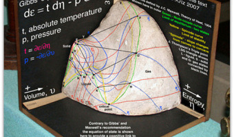
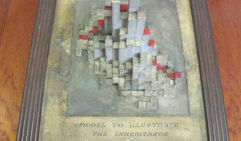
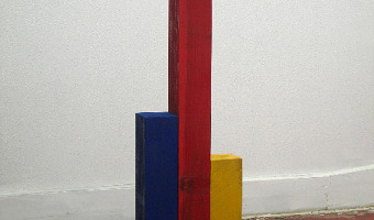
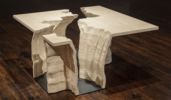
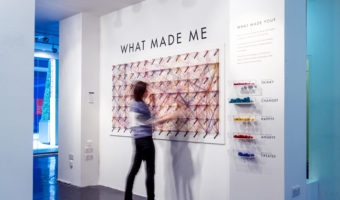
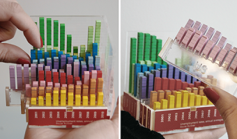
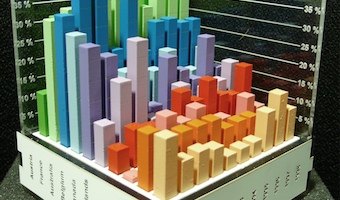
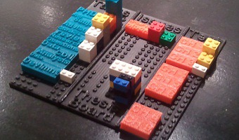
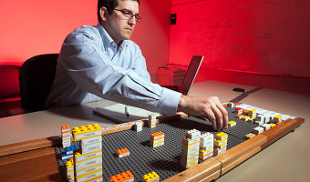
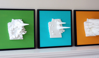
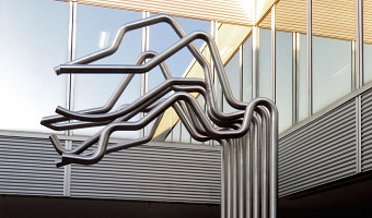
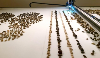
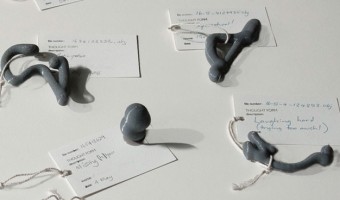
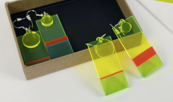
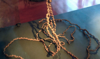
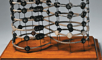
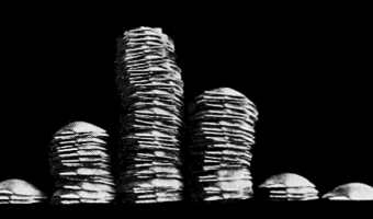
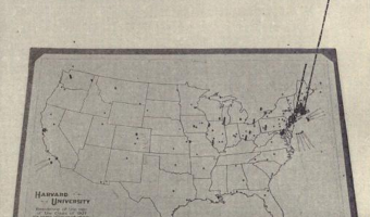
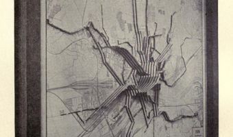
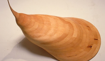
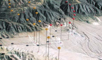
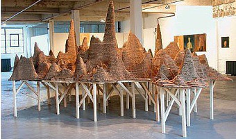
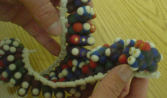
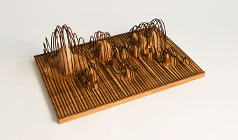
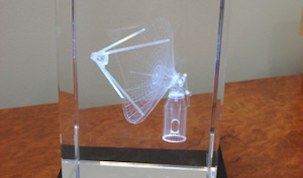
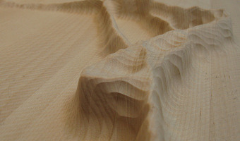
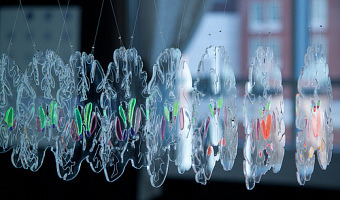
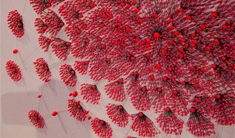
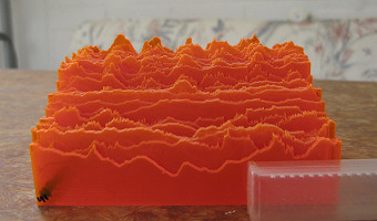
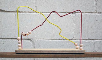
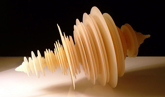
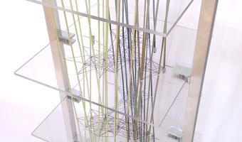
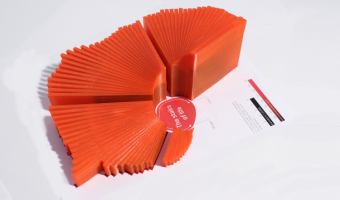
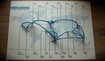
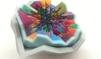
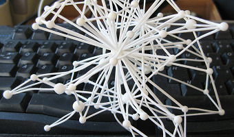
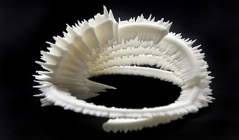
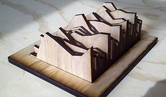
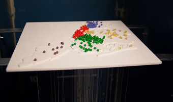
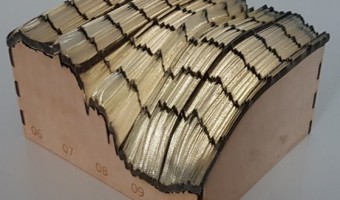
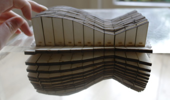
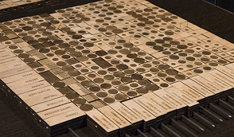
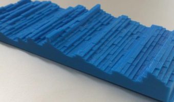
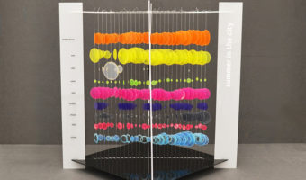
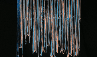
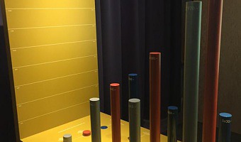
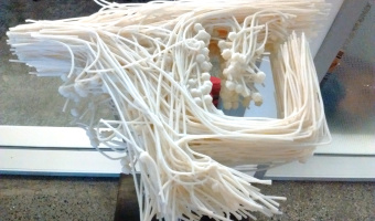
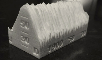
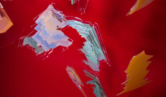
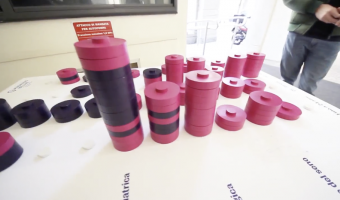
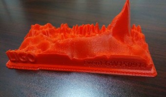
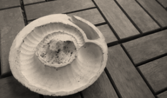
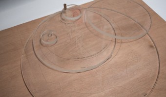
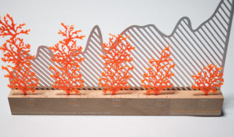
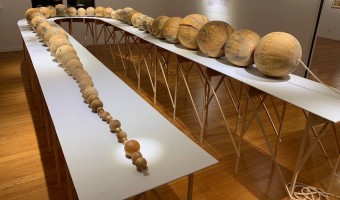
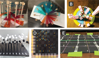
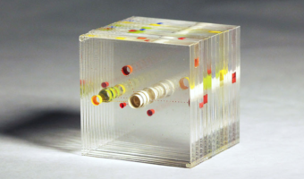
In his experiments with visualizing data from Tripit to look back at his own (and other people's) travel, Cemre Güngör came up with a new system to create data sculptures from one's travels over time. This work is of a particular interest, in that it shows an excellent example of how a physical visualization design process unfolds, with many questions unique to physicalization add up to the challenge of designing an effective visual representation, i.e., contrasting materials and treatments […]

Added by: Fanny Chevalier. Category: Passive physical visualization  Tags: see-through, self-logging, temporal data, travel


2011 – Manually Animated Graph of Scientific Data

Philadelphia-based multi-discipline artist Bradley Litwin built this physical chart that can be animated by turning a crank. It is the only manually-animated physical visualization we know of so far. It was commissionned by a pharmaceutical company, intended as an educational device for distributing to doctors. Bradley was kind enough to send us an image of the insides of the original prototype, "not quite as pretty as the final product", he says. His explanation: As the crank is turned, a […]

Added by: Yvonne Jansen & Pierre Dragicevic. Category: Passive physical visualization  Tags: animation, mechanical interaction, science


2011 – Jose Duarte's Handmade Visualization Toolkit

Colombian designer Jose Duarte wants to bring the DIY concept to data visualization. Using ordinary materials like balloons, tape and rubber balls, he has experimented with various visualization techniques from area charts to bubble graphs and ven diagrams in diverse scenarios as business, art, street interventions and even astronomy. To help people build physical visualizations he designed a physical toolkit he calls the Handmade visualization toolkit. Sources: Maria Popova (2011) Analog […]

Added by: Pierre Dragicevic. Category: Passive physical visualization  Tags: authoring, charts, hand-made, toolkit


2011 – Stephen Barrass' Physical Data Sonifications

Physical representations of data can target other senses than vision or touch. Stephen Barrass, one of the inventors of sonification in the late 90s and now at the University of Canberra, started to explore physical sonifications in 2011. He calls this principle Acoustic Sonification: Acoustic Sonifications are physical objects designed to make sounds that convey useful information about a dataset of some kind. Unlike other sonifications, they do not require a power supply, and the sounds are […]

Added by: Pierre Dragicevic, sent by: Yvonne Jansen. Category: Passive physical visualization  Tags: blood pressure, data jewellery, health, HRTF, sonification, sound


2011 – Warning: Real Time Global Air Quality Display

Warning - Real Time Global Air Quality Display is an installation of ambient display that receives data from the internet about the air quality in 30 cities in 5 continents. The installation of these data is dynamically displayed on a screen and a physical structure through a lighting system (LED) located in a public space. The motivations for this project are digital aesthetics of climate change created by Pold, (2010), that means artworks in digital art involving the issue of the environment […]


2011 – Adrien Segal's Data Furniture

Adrien Segal is an artist with a background in furniture design. She takes a data-driven approach where she uses data of natural events and environmental developments and transforms them into beautiful furniture. The choice of forms and materials conveys the origin of the data in an intriguing way. Left image: TRENDS IN WATER USE is a data sculpture that graphs national statistics of water usage in the United States over 50 years, from 1950 - 2000. The width of the canyon walls represent how […]

Added by: Yvonne Jansen. Category: Passive physical visualization  Tags: data sculpture, furniture


2011 – DataCoaster: Data-Driven Toys

DataCoaster is a re-imagining of the classic waiting room toy. But instead of arbitrarily loopy lines, DataCoaster's lines are generated by data, essentially transforming a simple, kinetic toy into a graph of information. If you're interested in getting one of these for your data, have a look at the source for this entry and contact Bobby - he is planning to offer this service. Source: Bobby Genalo. DataCoaster.

Added by: Yvonne Jansen, sent by: Bobby Genalo. Category: Passive physical visualization  Tags: toy


2011 – Can We Keep Up: Sponges Show Domestic Water Usage

Can We Keep Up is a a physical data visualisation that investigates the domestic need for water in cities all over the world. Source: infosthetics.com. Image from Hal Watts.

Added by: Yvonne Jansen, sent by: Romain Vuillemot. Category: Passive physical visualization  Tags: cartographic, data sculpture, sponge, water


2011 – DIY United States Electoral Vote Map

This is a 3D scale replica of the United States, the state height corresponds to the number of electoral votes each state controls in a presidential election. Source: thing 11178 on thingiverse.com


2011 – From Over Here: News Trends

"From Over Here" is a physical representation of articles from the New York Times from 1992-2010. Each card represents a month of articles about, or related to Ireland. The people and topics mentioned in the articles are etched on each card. Sources: Paul May, From Over Here, March 2011. infosthetics. Flickr album by Paul May - paulmay.org.

Added by: Jean-Daniel Fekete. Category: Passive physical visualization  Tags: cardboard, New York Times


2011 – LEGO Prism Maps

Prism maps showing migration patterns between the Americas. Each Lego brick represents 10.000 people. Source: Samuel Granados. Lego Cartograms (via FlowingData and infosthetics).

Added by: Pierre Dragicevic. Category: Passive physical visualization  Tags: cartographic, LEGO, prism map


2012 – Stop & Frisk: Physical Data Filtering

Chilean designer Catalina Cortázar created a physical visualization showing the proportion of black, hispanic and white people searched by the New York police in 2010. Each of the three compartments stands for a race and contains an amount of powder proportional to the race's population in New York. When the object is turned upside down, the powder falls into an adjacent compartment except for coarser particles that do not make it through the holes and represent people stopped by the police. […]

Added by: Pierre Dragicevic, sent by: Alice Thudt. Category: Passive physical visualization  Tags: new-york, physical computation, police, powder, race


2012 – What made me

An interactive public installation where visitors could engage by picking coloured strings corresponding to feelings, inspirations, thoughts or influences that make the person they are today, and link these strings to words on the wall to make a path visualizing associated concepts tied to each of these feelings, inspirations, thoughts and influences. WHAT MADE ME was designed by Dorota Grabkowska and Kuba Kolec for the Birmingham Made Me Design Expo (15-22 June 2012) at the Mailbox, […]

Added by: Fanny Chevalier. Category: Passive physical visualization  Tags: emotion, graph, participatory


2012 – Bit Planner - LEGO calendar

Vitamins studio created The Bit Planner, an elegant wall mounted time and resource planner made entirely of Lego bricks. In this tangible calendar, each gray row represents a month, and each gray rectangle represents a week, and everyone in the group has their own line in the calendar (see left image). Projects are associated to different colors, and each LEGO block corresponds to half a day spent working on a project. While entirely tangible, the Bit Planner can be synched with an online, […]


2012 – Google Eye: Radial Visualization of Page Visits

During the Generator.x 3.0 workshop, interaction designer Andrej Boleslavský created a radial visualization of page visits where each day spans a specific angle of the ring, and the entire ring spans one year. Source: Andrej Boleslavský (2012) Google Eye.

Added by: Pierre Dragicevic, sent by: Mathieu Le Goc. Category: Passive physical visualization  Tags: 3d printing, digital fabrication, page visits, temporal data


2012 – Grand Old Party: Political Satire

American designer Matthew Epler shows how to build physical visualizations out of silicone using 3D printing and mold casting. He also shows how to use them to make political statements. Source: Matthew Epler (2012) Grand Old Party (video here).

Added by: Pierre Dragicevic, sent by: Fanny Chevalier. Category: Passive physical visualization  Tags: 3d printing, adult toy, digital fabrication, extruded 2d, moulding, opinion polls, politics, satire, silicone


2012 – Data Cuisine

The left image is a map that shows the differences in alcohol consumption across Finland, as well as typical local food. The right image shows the number of immigrants in Finland by nationality (rice for the Chinese, salmon for the Swedish). Many other examples of edible physical visualizations can be found on the Data Cuisine web site. Data Cuisine is a series of workshops organized by Moritz Stefaner and prozessagenten. Seven workshops took place so far, the first one was in Helsinki in 2012. […]

Added by: Pierre Dragicevic, sent by: Romain DiVozzo. Category: Passive physical visualization  Tags: cartographic, data cuisine, edible, food, world stats


2012 – Dynamic Network Sculpture

A physical space-time cube representation of cultural heritage data. Source: Florian Windhager, Eva Mayr. Cultural Heritage Cube: A conceptual framework for visual exhibition exploration. IV '12.

Added by: Yvonne Jansen, sent by: Florian Windhager - Benjamin Bach. Category: Passive physical visualization  Tags: network data, space-time cube, temporal data


2012 – Rearrangeable 3D Bar Chart

A modular physical visualization like this rearrangeable 3D bar chart allows people to sort, filter, compare and examine data by direct physical manipulation. Sources: Yvonne Jansen and Pierre Dragicevic (2013) An Interaction Model for Visualizations Beyond the Desktop. Also see Yvonne Jansen's PhD dissertation on Physical and Tangible Information Visualization (2014)

Added by: Pierre Dragicevic. Category: Passive physical visualization  Tags: bar chart, rearrangeable


2012 – Putting Physical Visualizations to the Test

These physical bar charts, showing the evolution of country indicators over time, were used to conduct the first empirical study showing that physical visualizations can outperform their on-screen counterparts for data retrieval tasks. Sources: Yvonne Jansen, Pierre Dragicevic and Jean-Daniel Fekete (2013) Evaluating the Efficiency of Physical Visualizations. Also see Yvonne Jansen's PhD dissertation on Physical and Tangible Information Visualization (2014).

Added by: Pierre Dragicevic. Category: Passive physical visualization  Tags: bar chart, study


2012 – Matthijs Klip's Data Sculptures

Left image: data sculpture by Dutch designer Matthijs Klip showing life expectancy of the Netherlands population. Each bar maps to an age; the bar's height represents life expectancy while its length represents the amount of people having that age. Right image: other designs by Matthijs Klip. Source: Matthijs Klip (2012) Physical Information Design.


2012 – Meshu.io: Data Jewellery you can Order Online

A company lets you enter in cities you've been to and generates a physical mesh to order as a necklace, earrings, or cufflinks. Source: http://meshu.io/

Added by: Pierre Dragicevic, sent by: Moritz Stefaner. Category: Passive physical visualization  Tags: data jewellery, personal data, remote fabrication, trips


2012 – Thesis LEGO Board

A design exploration of LEGO-based physical visualizations for project management by educational scientist Daniel K. Schneider. Sources: Daniel K. Schneider (2012) Lego-compatible thesis project board. Edutech Wiki. Daniel K. Schneider (2015) Poster presentation from the EIAH'15 conference (the paper, the actual poster)

Added by: Pierre Dragicevic. Category: Passive physical visualization  Tags: LEGO, manual update, project management, rearrangeable


2012 – General Motors' 3D LEGO Visualizations

LEGOs help business executives log and explore data. Sources: Mark Wilson (2012) How GM Is Saving Cash Using Legos As A Data Viz Tool. The Daily Drive (2012) GM Plays with Legos (Video).

Added by: Pierre Dragicevic, sent by: Fanny Chevalier. Category: Passive physical visualization  Tags: industry, interactive, LEGO, manual update, pragmatic visualization, rearrangeable


2013 – Pop-Up Infographics

In 2013, Italian graphic designer Elena Turtas crafted four books that convey data about sustainability using pop-up and movable paper mechanisms. Source: Elena Turtas (2014) The Four Books of Visualising Sustainability.


2013 – Temperature Scarves and Afghans

On January 2013, Kristen Cooper Nutbrown from British Columbia had the idea to create a temperature scarf by knitting one row every day using a color that encodes the temperature of the day. At the end of the year, the scarf visualized local temperature readings for the whole year. Soon after Kristen pitched her idea, Arlene Cline, also from British Columbia, started to create a temperature afghan (a blanket of knitted or crocheted wool). Temperature scarves and afghans became quite popular in […]

Added by: Pierre Dragicevic, sent by: Andy South. Category: Passive physical visualization  Tags: data clothing, fabric, temperatures, textile, weather


2013 – Releases

The New-York-based design agency HUSH crafted a piece of custom software that generates digital, three dimensional visual forms based on the unique timbres and tonalities of individual voices. They asked 100 people to share their feelings about the end of 2013, and the beginning of 2014, in the form of a spoken “release.” Using the forms generated by their software they then created and analog printed a limited run of 100 posters (right image) that they sent to the people that inspired them […]

Added by: David Schwarz. Category: Passive physical visualization  Tags: 3d printing, sound, sound sculpture, voice


2013 – Doug McCune's Physical Maps

Doug McCune is a programmer turned artist, and he is obsessed with maps. In 2013, he got bored with screens and started to build physical thematic maps. He specializes in turning "horrible data" such as murders and natural disasters into beautiful objects. Above on the left is an artwork titled "stalagmite crime" that shows elevation maps of crime rates in San Francisco: narcotics-related crimes (green), prostitution (blue) and vehicle theft (orange). Sources: Doug McCune (2013) Physical Maps – […]

Added by: Pierre Dragicevic. Category: Passive physical visualization  Tags: 3d printing, cartographic, cartography, digital fabrication, maps


2013 – Walkable Age Pyramid

A walkable age pyramid of the German population. It was part of an exhibition on demographics by Atelier Brückner. The sculpture gives an impression how the distribution of age groups shifted between 1950 and 2010. For example, it shows how two world wars took out certain age groups and the lasting effect of the "Pillenknick" (the drop of birth rates due to the wide availability of "the pill"). Sources: Left photo: front view (time goes from the front to the back) picture taken by Michael […]

Added by: Yvonne Jansen. Category: Passive physical visualization  Tags: age pyramid, data sculpture, demographics, walkable


2013 – Population Density Emerging from Walls

Two Yale architects created a room-sized physical visualization of world population density folded into itself: Hsiang and Mendis then turned that spatial visualization into a physical installation at the 2011 Chengdu Biennale in China. They modeled the population distribution of the entire world in a kind of inverted map that visitors could walk into, inside a 10-by-10-by-10 foot room, with North America on the ceiling, Asia on one wall, Africa on another (see also the little boy in the above […]

Added by: Pierre Dragicevic. Category: Passive physical visualization  Tags: cartographic, data sculpture, population density, walkable


2013 – Punchcard Economy: Data Knitting

Punchcard Economy is a machine-knitted tapestry inspired by a 1856 banner advertising the Eight-hour day movement. The layer of visual noise shows today's departure from the eight-hour day philosophy. Working hours were collected from 116 participants, and each hour of work outside normal working hours was encoded as a color-inverted knit. A smaller version was made for the 2014 Data as Culture exhibition. Sources: Sam Meech (2013) Punchcard Economy. Explanation of the data encoding in this […]

Added by: Pierre Dragicevic, sent by: Adrian McEwen. Category: Passive physical visualization  Tags: digital fabrication, fabric, knitting, textile, working hours


2013 – Examined Life: Giving Shape to Activities

Designer Alex Getty logged his daily activities for 40 days and turned them into data sculptures that look like colored paper origami. Source: Alex Getty (2013) The Examined Life

Added by: Pierre Dragicevic. Category: Passive physical visualization  Tags: activity data, origami, paper, self-logging


2013 – Loci: 3D Printed Sculptures of Your Flights

Loci by Andrew Spitz lets you easily create physical 3d arc diagrams based on your past flights, and may be soon be available through an iphone app. Source: Andrew Spitz (2013) Loci - 3D Printed Sculptures of Your Flights.


2013 – Turning Facebook Connections into Data Sculptures

An application created by SOFTlab and The Creators Project lets you turn your facebook social network into a beautiful crystal-like data sculpture. Sources: Kree8tiv via iohannan's pinterest. See the page on shapeways.

Added by: Pierre Dragicevic. Category: Passive physical visualization  Tags: data sculpture, remote fabrication, social network


2013 – A Snow Chart of Mobility in Science

A barchar made out of snow. Each bar is a percent of scientist after PhD that changed their university after thesis defence. Source: Przemyslaw Biecek (2013) SmarterPoland.

Added by: Przemyslaw Biecek. Category: Passive physical visualization  Tags: bar chart, snow


2013 – 3D Social Networks

Jeff Hemsley from Syracuse University explains how to create solid models of social networks using the statistical package R and a 3D printer. 3D node-link diagrams have been explored for a while due to their potential benefits. One is that any node-link diagram can be laid out in 3D without any link crossing. Some studies have also shown that in some cases 3D node-link diagrams are easier to read than 2D ones. However, 3D visualizations are generally hard to navigate and to perceive on regular […]

Added by: Pierre Dragicevic, sent by: Jeff Hemsley. Category: Passive physical visualization  Tags: 3d printing, digital fabrication, network, social network


2013 – Data Sculpture of Chicken Inbreeding

Ryo Sakai and Jan Aerts from the Bioinformatics/Data Visualization Lab at KULeuven created a data-driven sculpture representing inbreeding in a particular chicken. Each loop in the sculpture represents a chromosome. On the outside is a histogram of the heterozygosity of the DNA; the inside a histogram of the homozygosity in that region. These sculptures are part of the Cosmopolitan Chicken Project, and have been presented at the Art Biennale in Venice. Source: Text and images from Jan Aerts.

Added by: Pierre Dragicevic, sent by: Jan Aerts. Category: Passive physical visualization  Tags: 3d printing, bio-engineering, digital fabrication, dna, science


2013 – Very Pointy Elevation Map

Toronto-based startup DataAppeal, which develops Web apps for 3D geo-spatial data visualization, created this very pointy stalagmite-looking elevation map of GTA Transit volume in Toronto. Sources: Andy Kirk (2013) 3D Printing Capabilility via DataAppeal Maps. Candice So (2013) Data visualizations go from flat to 3D.


2013 – Robot Arranges 8,000 Nails Into a Data Sculpture of the Wind

Student and interaction designer Charles Aweida used a foam board, a robot and lots of nails to build a physical visualization of a wind simulation. Sources: Charles Aweida (2013) An exploration in art + robotics representing wind through digital fabrication and the tangible. Via The Creator Project (2013) Data Sculpture Of The Wind Created Using A Robot And Lots Of Nails.

Added by: Pierre Dragicevic. Category: Passive physical visualization  Tags: digital fabrication, foam board, nails, robot, wind


2013 – Behavioral Landscapes

A mixed team of artists and scientists at Pennsylvania State University devised a method to visualize human behavior, personality and emotions as 3D probability density functions. They then produced solid models using CNC milling. Sources: Studio|Lab (2013) Behavioral Landscapes. Nilam Ram, Michael Coccia, David Conroy, Amy Lorek, Brian Orland, Aaron Pincus, Martin Sliwinski, and Denis Gerstorf (2013) Behavioral Landscapes and Change in Behavioral Landscapes: A Multiple Time-Scale Density […]

Added by: Pierre Dragicevic. Category: Passive physical visualization  Tags: behavior, personality, psychology


2013 – Line Charts of Cortisol Levels

This data sculpture created by Nilam Ram from the Studio|Lab team at Penn State University shows the evolution of cortisol levels for 34 people after they experienced a stressful situation. Source: Nilam Ram (2013) Cortisol Data Sculpture.


2013 – SweatAtoms: Physical Activity Sculptures

Rohit Ashok Khot is a PhD student at the Exertion Games Lab at RMIT University in Melbourne who studies how physical visualizations of self-logged physical activity data can enhance the experience of exercising and perhaps provide an incentive for exercising more. Sources: Khot et al (2013) SweatAtoms project page Khot et al (2014) Understanding Physical Activity through 3D Printed Material Artifacts

Added by: Pierre Dragicevic. Category: Passive physical visualization  Tags: physical exercise, self-logging


2013 – Network of the German Civil Code

A room-filling visualization by Oliver Bieh-Zimmert (Visual Telling) that illustrates the patterns of references within the German civil code. Each red thread stands for a reference to another paragraph. Source: you can find more info and images on the visual telling website.

Added by: Yvonne Jansen, sent by: Pierre Dragicevic - Benjamin Bach. Category: Passive physical visualization  Tags: network, room-sized, walkable


2013 – Layered 2D Plots

A series of stacked 2D plots showing changes in energy sources for different countries by PhD student Simon Stusak from University of Munich. All plots are cut from acrylic and hold together in one corner to facilitate alignment of the layers. The y-axis is mapped to countries, the x-axis to different energy sources, and the z-axis to time. Sources: Simon Stusak (2013) Physical Visualizations: An Exploration. Simon Stusak, Aurélien Tabard and Andreas Butz (2013) Can Physical Visualizations […]

Added by: Yvonne Jansen, sent by: Pierre Dragicevic. Category: Passive physical visualization  Tags: lasercut, rearrangeable, stacked 2D


2013 – NYC High School Dropouts

Ben Kauffman and Sam Brenner created this visualization as part of the ITP program at the NYU Tisch School of the Arts. It is a combination of a 3D-printed relief map of New York City with beads where each bead represents one school location. Each bead on top of the relief map is connected to a string below whose length indicates the number of students who dropped out of that school. Source: More pictures, a video and all the details on the project can be found on their project page.

Added by: Yvonne Jansen, sent by: Ben Kauffman. Category: Passive physical visualization  Tags: 3d printing, cartographic


2013 – Solid Statistics

Left image: A 3D printed version of the "Forbes 2000" list showing the 240 largest companies, by Volker Schweisfurth. Market value is mapped to surface area, sales volume is mapped to volume, and the continent from which the company originates is mapped to color (America (blue), Europe (green), Asia (yellow)). The picture illustrates how a physical model of this 3D visualization gives a better impression of perspective than the printed perceptual cues in the original paper visualization. Right […]

Added by: Yvonne Jansen, sent by: Volker Schweisfurth. Category: Passive physical visualization  Tags: 3d printing, statistical data


2014 – 3D Interest Rate Surface

3D print of a yield curve surface with change in material to create grid lines; on matching laser cut box with light inside. Left axis is time (2006-2010), right axis is "term structure", i.e. interest rates for 1 month out to 120 months; height at any given point is the interest rate on that day for that time period. Data is from Bank of Canada, visualization and print is is by Richard Brath at Uncharted Software. Source: Richard Brath, 3D Canadian Yield Curve Surface 2006-2010 for 1 to 120 […]

Added by: Richard Brath. Category: Passive physical visualization  Tags: 3d printing, finance, surface, yield curve surface


2014 – Data Sculpture in the White House

Gilles Azzaro, a French digital artist and fab lab co-founder, created a sound sculpture of Obama's 2013 State of the Union Address where Obama mentions 3D printing as the next revolution in manufacturing. Azzaro's sculpture was exhibited in the White House in 2014 during the inauguration of the first White House Maker Faire. The sculpture is interactive: a movement sensor activates the system and a laser beam scans the 3D recording to reveal the President’s speech. See this video for an […]

Added by: Pierre Dragicevic, sent by: Christophe Hurter. Category: Passive physical visualization  Tags: 3d printing, president, sound sculpture


2014 – Lego Senate

Built by Lance Ulanoff, this Lego representation tells the story of the 2014 US midterms. Red and blue Lego blocks represent the number of Democrat and Republican senate seats. The representation was updated over the evening of the election, as seats went to either Democratic or Republican candidates. Captions tell the story, indicating the time of seat wins and the names of senators. Source: Mashable, The Lego Senate: How the 2014 midterms played out, brick by brick

Added by: Jennifer Payne & Samuel Huron. Category: Passive physical visualization  Tags: LEGO, politics, stop motion animation, storytelling


2014 – Rearrangeable Display of Ice Data

This 3d data visualization, created by Johannes Jacubasch and Judith Weda, shows sea ice levels from 1979 to 2012. The years are plotted on one axis and the months on the other axis, while the height of the wooden pieces shows the level of sea ice. This data visualization can be opened up at any year or month to view the data from up close. If you break the Y-axis it shows all the data from a particular year. If the X-axis is broken it shows ice levels of a particular month over all the years. […]


2014 – Sound Bites

Sound Bites is the result of an experimental design practice. Four days of 24/7 ambient sound recordings resulted in 128 4-second intimate sound loops. Fast Fourier Transform frequency analysis and geometrical operations transformed time, frequency, and amplitude into X, Y and Z dimensions, forming 3D sonic shapes. These ‘disco donuts’ were 3D printed into 128 sound objects. Vacuum molded they formed the base to cast 128 unique chocolate objects. New rhythmic patterns were created, comprising […]


2014 – Silver Ring Shaped by DNA Profile

PhD student Alireza Rezaeian designed a silver ring whose texture and shape is uniquely determined by the wearer's DNA profile. His article explains how data is mapped to physical form in a way that balances between legibility and aesthetics. Right image: bracelet-sized prototype. Also see our other entries on data jewellery. Source: Rezaeian, Alireza & Donovan, Jared (2014) Design of a tangible data visualization.

Added by: Pierre Dragicevic, sent by: Simon Stusak. Category: Passive physical visualization  Tags: 3d printing, data jewellery, dna, genetics


2014 – Data Storytelling with LEGOs

   LEGO blocks are convenient tools to progressively construct a physical visualization while unfolding a story. In the same vein as Hans Rosling's educational stories on data, Brookings fellows use LEGO bricks to explain societal concerns such as how much the U.S. tax system helps shrink the gap between extreme social classes1 and the chances for economic success of Americans born at the bottom of the economic ladder 2. Sources: […]

Added by: Fanny Chevalier. Category: Passive physical visualization  Tags: LEGO, rearrangeable, storytelling


2014 – District 5: Tube Charts Reveal Decline in Violence

California-based artist Loren Madsen, a long-time data sculptor (see our 1995 entry and our interview with him), created an outdoor sculpture where steel tubes show falling crime rates across eight crime categories over 30 years. The sculpture stands in front of a police station and jail in Chicago City. Sources: ​Healther Schultz (2015) California Sculptor Completes Commissioned Piece. Image courtesy of Loren Madsen. Also see Steven Pinker's TED Talk on the topic.

Added by: Pierre Dragicevic, sent by: Loren Madsen. Category: Passive physical visualization  Tags: crime rate, data sculpture, outdoor sculpture, statistics, temporal data


2014 – DIY Bertin Matrix

This wooden matrix is a large-scale replica of Jacques Bertin's reorderable physical matrices. It shows a subset of the World Value Survey, a series of questionnaires that assess people's moral values across countries and years. This physical visualization is interactive as row and columns can be manipulated, promoting engagement and collaboration. This 18x20 matrix was built by Mathieu Le Goc in the Fablab Digscope with Charles Perin and Romain Di Vozzo, on the occasion of the 25th birthday of […]


2014 – Physical Visual Sedimentation

This visualization created by Jennifer Payne and inspired by Samuel Huron's visual sedimentation was created from gumballs, an acrylic (plexiglass) box and adjustable foamcore bin dividers. Huron's work is inspired by the physical process of sedimentation. The above figures illustrate a participatory representation of hours of sleep for a university population, with different colours of gumballs representing different groups present on a university campus (i.e. blue gumballs for graduate […]

Added by: Jennifer Payne. Category: Passive physical visualization  Tags: participatory, visual sedimentation


2014 – Data Strings: Physical Parallel Coordinates

During the SWAB International Contemporary Art Fair, the group of developers Domestic Data Streamers had the audience create a physical parallel coordinates visualization based on their demographic profile (social status, weight, etc.) and by answering a meaningless question on whether they choose a spoon or a fork. Source: Domestic Data Streamers (2014) Data Strings. They have a range of other interesting physical visualization projects on their Web page.

Added by: Pierre Dragicevic. Category: Passive physical visualization  Tags: demographic, nails, parallel coordinates, participatory, threads


2014 – Data Clothing: Dresses Show Air Pollution

Laura Perovich explored the concept of data-driven clothes as part of her Master thesis at the MIT Media Lab. The fashion dresses above show the concentrations of 100 chemical contaminants measured in the air of a particular household (left image). Chemicals are mapped to small squares and relative concentration is mapped to square size. Squares are repeated to create lace patterns (right image shows the concentration of several factory-related pollutants). In her thesis Laura Perovich […]

Added by: Pierre Dragicevic, sent by: Yvonne Jansen. Category: Passive physical visualization  Tags: air pollution, data clothing, digital fabrication, environment, fabric, textile


2014 – Cosmos: Carbon Exchange Captured in a Wooden Ball

Artist duo Ruth Jarman and Joe Gerhardt created this two-meter spherical wooden sculpture located in a forest in England, and representing the take up and loss of carbon dioxide from the forest trees across one year. Watching the video, I was somehow expecting this sphere to roll at some point, but it did not happen. Source: Semiconductor (2014) Cosmos.

Added by: Pierre Dragicevic, sent by: Mathieu Le Goc. Category: Passive physical visualization  Tags: air pollution, carbon emission, data sculpture, digital fabrication, milling, sustainability, wooden


2014 – Data Crystals: Conglomerated World Stats

During his residency at Autodesk, artist Scott Kildall created crystal-looking data sculptures by turning world data such as city populations into small cubes laid out on an Earth globe, then running a force-directed algorithm that conglomerates them into a monolithic structure that can be 3D-printed. The image above shows the 2500 nuclear detonations in recorded history, two of which (the black dots) are the bombs dropped at Hiroshima and Nagasaki, the only ones used as weapons. Source: Scott […]


2014 – 888,246 Ceramic Poppies to Commemorate Fallen Soldiers in WW1

Don't miss the major art installation Blood Swept Lands and Seas of Red at the Tower of London, marking one hundred years since the first full day of Britain's involvement in the First World War. Created by ceramic artist Paul Cummins, with setting by stage designer Tom Piper, 888,246 ceramic poppies will progressively fill the Tower's famous moat over the summer. Each poppy represents a British military fatality during the war. The poppies will encircle the iconic landmark, creating not only a […]

Added by: Yvonne Jansen, sent by: Dan Hagon. Category: Passive physical visualization  Tags: ceramics, deaths, ephemeral, remembrance day, single-datum, walkable


2014 – Building Visualizations with Tokens

Samuel Huron and his collaborators show how anyone can build their own visualizations by assembling physical tokens. Sources: Samuel Huron, Sheelagh Carpendale, Alice Thudt, Anthony Tang, Michael Mauerer (2014) Constructive Visualization (Web Page) Samuel Huron, Yvonne Jansen and Sheelagh Carpendale (2014) Constructing Visual Representations: Investigating the Use of Tangible Tokens (Web page)


2014 – Blaue Blumen: Handcrafted Offline Data Visualization of Population Density

Physical visualization of the population density of the world. Handcrafted with toothpicks and a styrofoam ball. Based on data taken from this map. Source: Ewa Tuteja, (http://tuteja.info/blaueblumen/)

Added by: Krasser Terror. Category: Passive physical visualization  Tags: cartographic, data sculpture, globe, hand-made


2014 – Water Works: Maps of the San Francisco Water Infrastructure

“Water Works” is a 3D data visualization and mapping of the water infrastructure of San Francisco. These consist of three large-scale 3D-printed sculptures, each generated by custom C++ code. The concept behind the project is to make visible a small portion of an invisible network of pipes underneath our feet. The three physical data visualizations are: "San Francisco Cisterns", “Imaginary Drinking Hydrants” and "Sewer Works". "Sewer Works" uses 60,000 data points from San Francisco sewers and […]


2014 – People Wood: Data Sculpture of Questionnaire Data

Manor House Development Trust, a charitable social enterprise centred in Hackney, commissioned Something & Son to create a sculpture to take pride of place in the new Redmond Community Centre at Woodbury Down in North-East Hackney. Something & Son approached Inition for help creating a crowd-sourced data sculpture featuring a forest of over 400 3D-printed trees, each corresponding to an individual’s answers to an online questionnaire. Source: Something & Son with Inition. People […]


2015 – Life in Clay: Sharing Memories through Data Pottery

Alice Thudt, a PhD student in Computational Media Design, crafts pieces of pottery that embody data about moments she shared with her loved ones. Left image (2015): cereal bowls showing Skype-call history between Alice and her parents. On the front bowl, each line represents a day where they skyped. On the other bowl, each dot represents 10 min of call time. She offered a bowl as a present to her parents and kept the other one as a reminder to stay in touch every time she has breakfast. Middle […]

Added by: Pierre Dragicevic. Category: Passive physical visualization  Tags: hand-made, mementos, memories, personal data, pottery, self-logging


2015 – U.S. Unemployment Rate 1948-2015

Visual journalist Jon Keegan created this quick chart using U.S. unemployment rate starting from January 1948 (the first year that the U.S. started to record the number) through the end October 2015. The long axis represents years from 1948-2015, and each column is made of of 12 chips, each representing one month's unemployment rate figure. The height of each chip represents the rate for that month. One can see a dramatic cliff start to rise up in the fall of 2008, as the global economic […]


2015 – Summer in the City

The visualization explores the direct influence of weather and traffic volume on air pollution, comparing data of a 4-week period during summer 2015 in Lugano (Switzerland). Different colored laser cut plates fixed on wires represent daily data. As the wires are diagonally mounted on the structure, looking from different sides, they evidence either daily data or the evolution of the parameters. Source: Carola Bartsch (2015), Summer in the city


2015 – Dataseeds: Flying Data

The dataseeds are a translation of data on ‘falls on and from stairs and steps, aged 50-89’. The data drives the surface area of the wing of the dataseed, which dictates the spin and falling speed of the data-object©. Source: Nick Dulake and Ian Gwilt (2015) Dataseeds - flying data

Added by: Pierre Dragicevic, sent by: Ian Gwilt. Category: Passive physical visualization  Tags: injury, kinetic, plants, seeds


2015 – Participatory Representation of Happiness

This 2015 physicalization was part of designer Stefan Sagmeister's exhibit on happiness. It contains a participatory representation of exhibition viewer's happiness, remiscent of Hans Haacke's MOMA poll (1970) and Lucy Kimball's participatory chart (2006). The units which make up the representation are gumballs, like Jennifer Payne's participatory representation (2014). Sources: Stefan Sagmeister (2015) The Happy Show Myles Constable (2015) The Happy Show asked "How Happy Are You? The results […]

Added by: Jennifer Payne. Category: Passive physical visualization  Tags: participatory


2015 – Jller: A Robot Rearranges Pebbles by Geologic Age

Jller is a machine created by German artist Benjamin Maus and Czech artist Prokop Bartoníček that sorts pebbles from the German river Jller by their geologic age. To do this, Jller first analyzes an image of the stone it selects, extracting information like dominant color, color composition, lines, layers, patterns, grain, and surface texture. The machine then places the stones in alignment of age and type by sucking them into an industrial vacuum gripper and dropping them in the correct […]

Added by: Pierre Dragicevic, sent by: Alice Thudt. Category: Passive physical visualization  Tags: age, geology, pebbles, rearrangement, robot


2015 – Inequalities Quipu

This project is about the revival of the ancient Incan Quipu. This project is about a comparison of well-being in Latin America and top leading countries in Scandinavia as assessed by the OECD Better Life Index. It shows the inequalities between those two cultures as well as between men and women visualised with the help of the Incan recording devise - the quipu. Source: Ewa Tuteja, http://tuteja.info/inequalities-quipu/

Added by: Ewa Tuteja. Category: Passive physical visualization  Tags: hand-made, physical dataviz


2015 – U.S. Cost of Political Campaigns

The New York Times has used stacks of Monopoly plastic hotels to explain what the cost of the U.S. political campains means in terms of households. Though closer to concrete scales than it is to data visualization (that usually presents data in a more structured manner), this representation made of physical pieces from the famous board game makes the message particularly compelling. According to the New York Times, Just 158 families have provided nearly half of the early money for efforts to […]

Added by: Fanny Chevalier. Category: Passive physical visualization  Tags: concrete scale, finances, LEGO, Monopoly, politics


2015 – Canadian Federal Election Explained with LEGOs

On Canadian national news, Toronto-based artist and organiser Dave Meslin used LEGO bricks to illustrate the results of the 2015 federal election. He shows election results based on a first-past-the-post system, and compares them to a representation illustrating what results would look like if based on proportional representation. Source: CBC News (2015) If Canada had proportional representation: Dave Meslin shows with Lego.

Added by: Jennifer Payne. Category: Passive physical visualization  Tags: LEGO, politics, storytelling


2015 – Dan Gilbert's TV Ads

The famous psychology professor Dan Gilbert made a series of TV commercials for the insurance company Prudential, together with Ray Del Savio from Droga5 and Colin McConnell from Prudential. These TV commercials make a clever use of participatory physical visualizations to demonstrate and explain human biases in financial planning. Ribbon Experiment (left image): Dan Gilbert asks bystanders to estimate how much money they will need to retire. He then gives each of them a ribbon and asks them to […]

Added by: Pierre Dragicevic. Category: Passive physical visualization  Tags: participatory, storytelling, walkable


2015 – 3D Paper Model of Shrinking Aral Sea

The Aral Sea in Uzbekistan, formerly one of the largest lakes in the world, has been drying up since the 1960s and is currently 10% its original size. Peter Vojtek made a 3-D paper model that shows the shrinkage — from 1957 on top, down to 2007. Each layer represents the surface outline during the corresponding year on the right. Vojtek also provides his paper template in case you want to fashion your own box. Sources: FlowingData Peter Vojtek (2015) 3D Paper Model of Shrinking Aral Sea.

Added by: Fanny Chevalier. Category: Passive physical visualization  Tags: cartographic, paper model, temporal visualization


2015 – Multivariate Beer

Nathan Yau from flowingdata brewed four different types of beer based on county demographics. For example, he mapped population density to the total amount of hops, and race percentages to the type of hops used. He describes the process in detail on his web site, with R source code. The idea is reminiscent of Rohit Khot's TastyBeats shown at the CHI '14 conference, an installation that creates personalized energy drinks based on heart beat data. Also see our entry on data cuisine. Sources: […]

Added by: Pierre Dragicevic. Category: Passive physical visualization  Tags: beer, data cuisine, demographics, food


2015 – London Eye Chart: A 135m Tall Donut Chart

One week before the UK general election of 2015, the design studio Bompas & Parr and Facebook turned the Ferris wheel of London into a giant donut chart of the political parties most discussed on Facebook. Blue stands for the Conservative Party and red stands for the Labour Party. Learn more. Sources: Bompas & Parr (2015) London Eye Chart. Photo by Bompas & Parr.

Added by: Pierre Dragicevic, sent by: Loren Madsen. Category: Passive physical visualization  Tags: large-scale, pie chart, politics, social networks


2015 – Interregional Merchandise Trade

Trade data often show a network of money flows. Spreadsheets of such data are difficult to remember and hardly find their way to the long-term memory. The chosen intra- and intraregional WTO data of 2012 have been modeled and printed as a 3D data sculpture. It offers some fresh insights on flows, intraregional trade sizes, has some haptic quality and can be put on the table to accompany presentations and debates. Source: Volker Schweisfurth / MeliesArt (2015) Trade Data Materialized.

Added by: Volker Schweisfurth. Category: Passive physical visualization  Tags: 3d printing, network, trade, WTO


2015 – Sicherheit: Switzerland's Money in Bar Charts

This physical bar chart titled Sicherheit (Security) is part of the exhibition Geld – Jenseits von Gut und Böse (Money - Beyond Good and Evil) at the Stapferhaus in Lenzburg, Switzerland. It shows where Switzerland has its money from, where it spends it and how high Switzerland's debt is. Sources: Photo and most of the text above by Peter Gassner. Author of the piece currently unknown, as several studios have been involved in the making of the exhibition.

Added by: Pierre Dragicevic, sent by: Peter Gassner. Category: Passive physical visualization  Tags: data sculpture, debt, money, switzerland


2015 – Touching Air: Necklace Shows Air Pollution

This necklace made by Stefanie Posavec and Miriam Quick shows one week of air quality data measured in the city of Sheffield. Each segment is a period of 6 hours, and its appearance conveys the concentration of particulate matter during that period of time. A low concentration yields a small, round, green segment. A high concentration yields a large, spiky, red segment. Also see our entry 2014 - Data Clothing: Dresses Show Air Pollution. Sources: Stefanie Posavec (2015) Air Transformed: Better […]

Added by: Pierre Dragicevic, sent by: Maarten Lambrechts - Fanny Chevalier. Category: Passive physical visualization  Tags: air pollution, air quality, data jewellery, data sculpture, digital fabrication


2015 – Data Necklace of Good Night SMS

Paul Heinicker, a master student in interaction design at the University of Applied Sciences Potsdam, created a data-driven necklace representing a long-distance relationship by sent "good night"-messages from him to his girlfriend. While visualising two years of message history, two diagonal opposing points of the rectangle constitute the starting points for both years. The ongoing sides in each case are coded to the days with and without good night SMS. In detail, the plain horizontal sides […]

Added by: Paul Heinicker. Category: Passive physical visualization  Tags: 3d printing, data jewellery, data sculpture, gift, sms


2015 – Physical Customer Satisfaction Survey

Participatory physical bar charts at the exit of the Antell cafeteria at the University of Helsinki. White beads represent statisfied customers, red beads are unsatisfied ones. Also see similar contraptions by Hans Haacke (1970), Lucy Kimbell (2006), and Jennifer Payne (2014). Source: Antell. Photo by Luana Micallef.

Added by: Pierre Dragicevic. Category: Passive physical visualization  Tags: bar chart, customer satisfaction, participatory


2016 – Woven Chronicles

Woven Chronicle is a cartographic wall drawing that, in the artist’s words, represents “the global flows and movements of travelers, migrants, and labor.” Kallat uses electrical wires—some of which are twisted to resemble barbed wire—to create the lines, which are based on her meticulous research of transnational flows. Wire is an evocative and contradictory material: it operates as both a conduit of electricity, used to connect people across vast distances, and as a weaponized obstacle, such […]

Added by: Santiago Ortiz. Category: Passive physical visualization  Tags: art, cartographic, migration, network, wires


2016 – Accomplishments

Accomplishments is an exploration of personal data tracking, wearable art, wearable technology, social media, and data physicalization. Each day accomplishments were tracked, first on paper then by sewing spheroid masses onto a dress worn for four months. By hand sewing each accomplishment onto this dress, they became a part of the wearer's physical presence and identity. The work juxtaposes the immediateness of social media posts, and the separate identity we create for ourselves online which […]

Added by: Michelle Sylvestre. Category: Passive physical visualization  Tags: data clothing, fabric, textile


2016 – Thoughtforms: 3D-Printed Thoughts

Kellyann Geurts and In Dae Hwang, Monash University, give physical shape to thoughts by turning EEG data into solid objects. During three public events at Melbourne in 2016, she placed a mobile EEG device on volunteers and asked them to think of a memory or emotion of their choice. Their EEG output was translated in real time into a 3D shape they could see on a computer screen. Participants could then press a button to pause the shape and send it to a 3D printer. They were then invited to write […]

Added by: Pierre Dragicevic, sent by: Benjamin Bach. Category: Passive physical visualization  Tags: 3d printing, digital fabrication, EEG, thoughts


2016 – Cairn: Situated Data Collection and Analysis for Fab Labs

Designed within the community of practice of a French FabLab, Cairn aims at understanding the variety of practices within FabLabs. Cairn explores tangible alternatives to questionnaires and other traditional evaluation techniques, and stresses aesthetic and affective dimensions to create an engaging experience. It invites Fablab visitors to reflect on their practices by materializing their activities using small colored woodentiles. Interacting individually with Cairn, people contribute to […]

Added by: Pauline Gourlet. Category: Passive physical visualization  Tags: collecting tool, fab lab, participatory, rearrangeable


2016 – Housing Prices Ripping San Francisco Apart

This data sculpture depicts a map of housing prices in San Francisco. It’s a map of the city, torn at the seams. The height of each area represents the average price per square foot for recent home sales. Where neighboring areas are close in value they are connected, but if neighboring areas are too far from each other I allow them to split, tearing the city along its most severe economic divides. Also see our entry 2013 – Doug McCune’s Physical Maps. Sources: Doug McCune (2016) Sculpture of […]


2016 – Motus Forma: People's Motions in a Shared Space

Motus Forma is a data sculpture by Brian Allen and Stephanie Smith that aggregates 10 hours of people movements in the lobby space at Pier 9. The 1300+ motion paths are piled up according to time. Also see our other entries on temporal data. Sources: Autodesk (2016) Motus Forma Instructables (2016) Motus Forma Photo by Pierre Dragicevic

Added by: Pierre Dragicevic. Category: Passive physical visualization  Tags: 3d printing, data sculpture, people, temporal data


2016 – Central Park NYC Temperatures

Seasonal plot of the monthly average temperature in Central Park NYC since 1869. The long axis is mapped to years, the other axis is mapped to months from January to December. Data sourced from the National Weather Service. Source: RoundTableRdDesign on shapeways.

Added by: Kris Dawsey. Category: Passive physical visualization  Tags: digital fabrication, temperatures, weather


2017 – CNC-Milled Wood Visualization of a Studio's Energy Usage

"How might we make data more tangible, persuasive, and persistent?" This was the challenge I posed to myself during my internship at IDEO Chicago. My answer is an artistic exploration made tangible through different design disciplines: data design, industrial design, and electrical engineering. The data for this exploration is the energy usage of the Chicago studio during 2015. An algorithm created with Grasshopper, a visual programming language, turned unfiltered data into a three-dimensional […]

Added by: Nicolas Stark. Category: Passive physical visualization  Tags: energy consumption, wood


2017 – Data Sculpture of Latin American Apprehensions

This piece is a physical matrix representing recorded data on Latin American migrants traveling to the United States between the years 2011 and 2014. It was constructed as a conceptual study into using sculpture and tangibility as an alternative form of expressing empirical data. Even though apprehensions do not account for those who make it through to the U.S. or those who were killed or gone missing, apprehensions still shed light on important migration patterns over time. Each column […]

Added by: Sadie Prego, sent by: Sadie Prego. Category: Passive physical visualization  Tags: apprehensions, migrants


2017 – Participatory Matrix and Parallel Coordinates

In order to inform a local audience about a largely-avoided topic such as cancer, a research study was commissioned by KnowAndBe.Live, a startup working in the field of cancer prevention awareness, with the aim of fostering a bottom-up information request from a local audience. The research team included a designer, a sociologist and experts on the topic of cancer-prevention, who worked together relying on a collaborative design approach, with the goal of delineating possible strategies to […]

Added by: Matteo Moretti. Category: Passive physical visualization  Tags: cancer, participatory


2017 – Gravity Wave Spectrogram - LIGO

Humanity has been gazing at light from distant stars since time immemorial. But in 2015, our ability to understand the University achieved a major milestone, when ripples in Spacetime itself - instead of light - told the tale of an ancient, cataclysmic collision between black holes. The Laser Interferometer Gravitational-Wave Observatory (LIGO) is an experimental system of almost unbelievable sensitivity. Using interferometer arms four kilometers long, it can detect changes in length as tiny as […]

Added by: Louis R. Nemzer. Category: Passive physical visualization  Tags: astronomy, Gravity Waves, physics, science


2017 – Green Berlin

Tangible data visualization of green areas and water in Berlin. "Green Berlin" is a living map showing parks and forests in Berlin. The green areas on the wooden map are laser cut, with moss growing through the holes. Source: Sebastian Meier, Green Berlin

Added by: Till Nagel. Category: Passive physical visualization  Tags: 3d printing, cartographic, moss, plants


2017 – The All Too Evident Ashtray

The ATEA is an ashtray made of concrete. It carries data about smoking habits & lung cancer in the United States between 1975 and 2014, split by gender. The data is encoded in concentric bubbles/half spheres, where the distance to the center shows lung cancer prevalence by year. The bubble diameters display the average number of cigarettes smoked per day during that particular year. The causal relationship between smoking and cancer is well researched and known for decades, so there’s […]

Added by: Michael Stanka. Category: Passive physical visualization  Tags: ashtray, data object, deaths, risk, smoking


2017 – Are you Sure you Want to Smoke?

Giacomo Flaim, a student in Communication Design at Politecnico of Milan, made a single-datum physical visualization out of 4,234 cigarette butts to convey the average annual cigarette consumption of an Italian smoker. Labels were added to indicate the reduction in life expectancy depending on the quantity smoked, from 10 minutes for a single cigarette to more than a month for the entire year. Sources: Giacomo Flaim (2017) Are you sure you want to smoke? (behance.net). Information is Beautiful […]

Added by: Pierre Dragicevic. Category: Passive physical visualization  Tags: cigarette, health, rearrangement, risk, single-datum, smoking


2017 – CO2 Emissions Shown with Balloons

The installation shows a representative selection of twenty countries and their CO2 emissions in 2014. Every orange beach ball equals 100 billion tonnes of carbon dioxide. The values refer to combustion of fossil fuels and production of cement. This work was created by Mario Klemm and José Ernesto Rodriguez in the context of the course « Data objects » with Prof. Boris Müller at University of Applied Science, Potsdam. Source: original post by Mario Klemm. Also see our other entries on air […]


2017 – Animals Tracking

We wanted te show the difference of scale made by animals that were tracked including mankind depending on their needs. The result is a group of transparent disks with different sizes representing the employed path and its length during 24h for each subject. Also see other projects from the datafossil #3 workshop. Sources: Noémie Duval, Timothé Gourdin, Simon Le Roux et Quentin Lambert Jérôme Héno, Matthias Rischewski and Louis Eveillard (2017) Workshop datafossil #3

Added by: Quentin Lambert. Category: Passive physical visualization  Tags: animals, datafossil, gps, tracking


2017 – Coral Reefs

This data sculpture made by three design students at the datafossil #3 workshop depicts the destruction of Australian coral reef since 1985 (in orange) together with the rise of ocean temperature (in gray). The Great Barrier Reef has been losing more and more of its area since the last 27 years. One of the biggest cause is coral bleaching due to global warming and more exactly to the rise of the temperature of ocean's water. Scientists say that the reef is going to keep deteriorate as fast […]

Added by: Alizée Parry & Pierre Dragicevic. Category: Passive physical visualization  Tags: coral, datafossil, global warming, sea, water, weather


2017 – Wearable Self

Wearable Self is a collection of data jewelry which is Jiyeon Kang's master's thesis project at Parsons School of Design. South Korean designer Jiyeon Kang transformed a year of self-tracking data (e.g. daily steps) gathered by Fitbit and iPhone Health into personalized fashion items that can hold and wear. Through laser cut and 3d printing with different materials, the designer creates customizable fashion items generated by users' self-data, aiming to make self-tracking data more meaningful […]


2017 – EuroGums: Edible Population Pyramids

Eurogums are edible population pyramids of the 28 EU member countries. Whereas 27 countries taste cherry-sweet, the UK Eurogum is rather sour, due to the referendum and Brexit. Also see our other entries on data-driven food. Source: meikl3D

Added by: Michael Stanka. Category: Passive physical visualization  Tags: age pyramid, brexit, data cuisine, europe, population


2017 – Hand-Crafted Magazine Infographics

Infographic designers at the National Geographic crafted a 3D physical visualization out of paper and colored cardboard in order to prepare a 2D infographic. Also see our entry on IBM's cosmograph. Source: Alberto Lucas López (2017) Handmade #dataviz (tweet).

Added by: Aurélien Tabard & Pierre Dragicevic. Category: Passive physical visualization  Tags: animation, hand-made, infographic


2018 – The 20 Year Gap

This data physicalization is an art installation that represents the difference in disability-free life expectancy* and overall life expectancy for different areas in the UK, thereby highlighting the unequal health conditions in the country. Each area is represented by a hanging thread. On each thread a red bottle corresponds to disability-free life expectancy while the blue bottle represents overall life expectancy. The title of the artwork refers to the finding that in the UK there is gap of […]

Added by: Petra Isenberg. Category: Passive physical visualization  Tags: art, installation


2018 – Harassment Plants

Harassment Plants is a situated physicalization exhibited in a Brazilian city to represent stories of harassment experienced by women in a public lakeside. Each vase represents a different category of harassment and contains glyphs that represent cases of harassment. The color in the middle of the vase corresponds to the type of harassment, which is also represented by the same color in one of the beads. Each glyph is composed of a rod — whose length represents the time of the day the […]

Added by: Luiz Morais. Category: Passive physical visualization  Tags: glyph, hand-made, plants, sexual harassment, situated


2018 – Traveling Datavis Game

A public participation project, in which the boundaries of the political debate were discussed. Hoping to define a respectable “clean” political discourse and formulate a treaty reflecting the public's expectations of what constitutes a legitimate discourse based on political ideology or clear up when is a misuse of a public position. The project was made up of an ice-cream truck, driving around Israel periphery, inviting the public to participate in 4 interactive games asking question about […]

Added by: Roni Levit. Category: Passive physical visualization  Tags: participatory, politics


2018 – DayDohViz: Data Visualizations made with Play-Doh

DayDohViz is as a "daily" inspiration project that experiments with physically visualizing data in 3D using a smartphone and Play-Doh. Yes, Play-Doh. Creator Amy Cesal's subjects range from self-disclosing and serious (her personal financial data, government enforcement actions) to delicious and exhilarating (pizza types, top roller coasters). Amy has found the tactile, ephemeral & imprecise nature of Play-Doh - so different from the typical data viz technology - to be creatively […]

Added by: Amy Cesal. Category: Passive physical visualization  Tags: clay, hand-made, play-doh


2018 – Anthropocene Footprints

Handmade physicalizations of Canada's greenhouse gas emissions, by Mieka West and Sheelagh Carpendale. Each object represents data from a specific year (1990, 2010, and projections to 2030). Initially meant to be smog masks, the designs evolved into strange and beautiful objects evoking indigeneous artefacts such as Native American dreamcatchers, Inca quipus and Polynesian genealogical instruments, and whose visual and material complexity is reminiscent of Nathalie Miebach’s Woven Sculptures. […]

Added by: Pierre Dragicevic. Category: Passive physical visualization  Tags: fabric, greenhouse gas, hand-made, pollution


2018 – Phylogenetic Tree with Real Specimens

As part of a zoology class, evolutionary biologist Leo Smith created a phylogenetic tree of fishes where each leaf is an actual fish specimen. Also see our other entries on physical visualizations built by re-arranging physical items. Source: Leo Smith's tweet (29 April 2018).

Added by: Pierre Dragicevic, sent by: Mark Simpson. Category: Passive physical visualization  Tags: biology, rearrangement, tree


2018 – Inequality in Chile Represented with LEGO Bricks

Inequality in Chile represented with LEGO bricks. Made by Harry Lizama, a data scientist in the Ministry of the Environment of Chile. The surface represents the totality of the income. Each person represents a decile. In light green is decile 10. In green is decile 9. In dark green are deciles 7 and 8. In red are deciles 1 to 6. Also see our other entries featuring LEGO bricks. Sources: Harry Lizama, based on data from the Ministry of Social Development, CASEN 2017. Image taken from […]

Added by: Harry Lizama. Category: Passive physical visualization  Tags: Chile, income, inequality, LEGO


2018 – Steven Pinker explains Global Life Expectancy with Physical Line Charts

Bill Gates shared a short video featuring Steven Pinker on his Twitter feed with the comment People today are living longer, healthier, and happier lives than ever before. I asked @sapinker to explain why. At first glance it appears that line charts are digitally overlaid on the video. However, closeups and a light swaying of the graphs when Steven Pinker touches them, as well as the addition of another country towards the end of the video indicate that the graphs visible in this video are […]

Added by: Yvonne Jansen, sent by: Cedric Honnet. Category: Passive physical visualization  Tags: rearrangeable, storytelling


2019 – Data Beyond Vision: Physicalizing Bookshop Data

[Data Beyond Vision] explores new ways of engaging with a dataset and the arguments and narratives behind it, in order to challenge the dominant paradigms of conventional screen-based data visualization. The project currently comprises: 3D printing a model of library member activity over time from the Shakespeare and Company Project juxtaposing documented activities from two sets of archival materials Folding paper forms of borrowing activity from the Shakespeare and Company Project surfacing […]

Added by: Rebecca Sutton Koeser & Pierre Dragicevic. Category: Passive physical visualization  Tags: 3d printing, digital humanities, kirigami, origami, weaving


2019 – Physical Violin Plot

A physical violin plot created by sculptor and psychology researcher Hunter Brown. See related entries also using clay here. Source: Tweet from Julia Strand (@juliafstrand), June 12, 2019.

Added by: Pierre Dragicevic, sent by: Steve Haroz. Category: Passive physical visualization  Tags: clay, statistics


2019 – Data Earrings of Country Happiness

This data jewellery displays data the happiness of its citizens and potentially contributing factors. One earring encodes the proportion of a countries GDP as a stacked bar chart with categories: service, agriculture, and industry. Towards the top a circle encodes the overall happiness rank of a country's citizens. Also see our other entries on data jewelleries. Source: Jang Lee: https://janglee.myportfolio.com/happiness-x-gdp

Added by: Petra Isenberg. Category: Passive physical visualization  Tags: data jewellery


2019 – Perpetual Plastic

Winner of the National Geographic and Sky Ocean Ventures Ocean Plastic Innovation Challenge [This project] highlights the scope of the plastic problem (in terms of amount produced as well as its fate) and the transformation of plastic over its lifetime, using beach debris as a salient example. The situated, participatory data installation approach extends abstract displays of numbers towards a more gripping form of ‘data visceralization.’ The direct link to beach clean-up activities suggests […]

Added by: Petra Isenberg. Category: Passive physical visualization  Tags:


2019 – Physicalizing Cardiac Blood Flow Data

Blood flow data from cardiac 4D Flow MRI (magnetic resonance imaging) holds much potential for research and diagnosis of flow-related diseases. However, understanding this data is quite challenging – after all, it is a volumetric vector field that changes over time. This paper proposes a novel slice-based physical model as a complementary method for visualizing the flow data. The design of this model respects the conventional method of viewing medical imagery (i.e., in cross-sections) but has […]


2019 – Tattoo Biosensors

Tattoos that Change Color When Reacting With Glucose Levels: minimally invasive, injectable dermal biosensors were developed for measuring pH, glucose, and albumin concentrations. Sources: Biotech (2019) Twitter post. Yetisen et al (2019) Dermal Tattoo Biosensors for Colorimetric Metabolite Detection.

Added by: Pierre Dragicevic, sent by: Maarten Lambrechts. Category: Passive physical visualization  Tags: indexical, medical, skin, tattoo


2019 – Sleep Blanket

A visualization of my son's sleep pattern from birth to his first birthday. Crochet border surrounding a double knit body. Each row represents a single day. Each stitch represents 6 minutes of time spent awake or asleep. Also see our entry 2013 – Temperature Scarves and Afghans. Source: Seung Lee (2019) Twitter thread.

Added by: Pierre Dragicevic, sent by: Steffen (@s1effen). Category: Passive physical visualization  Tags: baby, data clothing, fabric, self-logging, sleep


2019 – Hostile Terrain 94: Deaths at the US/Mexico Border

Prototype of a series of physical maps that will be exhibited across 94 cities worldwide in fall 2020. Each of the 3500 hand-written toe tags represents the recovered body of a migrant who died while crossing the US/Mexico border in the Sonoran Desert between 2000 and 2020. Coordinated by the Undocumented Migration Project (UMP). To learn more about UMP and the context of this map, listen to the Radiolab podcast series Border Trilogy. Sources: hostileterrain94.wordpress.com Left image from […]

Added by: Pierre Dragicevic, sent by: Luiz Augusto de Macêdo Morais. Category: Passive physical visualization  Tags: cartographic, deaths, migration, toe tag


2019 – New Worry Beads: Deaths from Terrorism

Worry Beads, one for every year from 1945 (closest in the pic), are scaled at one cc per human life. The volume of each is set by the number of terrorist-caused deaths for that year globally. The whole thing is about 40' long, the largest bead (2014) is 19" dia. There’s other material which hopefully makes clear that the #1 American fear, terrorist attack, is ridiculous. There’s another string of beads, 50" long, which shows terrorist deaths in the US. You’re more likely to be […]

Added by: Pierre Dragicevic, sent by: Loren Madsen. Category: Passive physical visualization  Tags: beads, deaths, terrorism


2019 – Self Knitted Scarf of Train Delays

The mother [of] Sara Weber knitted this scarf during her daily train rides to work in Munich and used different colors depending on train delays. Every day two rows: Grey, less than 5 minutes delay. Pink, 5 to 30 minutes delay. Red, both rides delayed or one more than 30 minutes. The huge red area was during construction work, where the train was substituted by a bus. Side note: The tweet went viral and at the end she sold the scarf at eBay and gave the money to the "Bahnhofsmission" who take […]

Added by: Steffen Haesler. Category: Passive physical visualization  Tags: data clothing, delays, fabric, knitting, textile, transportation


2020 – Ownership: Occlusions, Night Terrors, and Pernicious Doubt

This series of bronzes visualizes 2020 data on gun ownership in America. Pernicious Doubt Access to a gun increases the risk of suicidal death by 3 times. Occlusions Carrying a gun makes the bearer 4 times more likely to be killed in an aggressive encounter than without a gun. Night Terrors Women are 5 times more likely to be killed in acts of domestic abuse when their partner owns a gun. Source: Matthew Mosher. Ownership: Occlusions, Night Terrors, and Pernicious Doubt.

Added by: Matthew Mosher. Category: Passive physical visualization  Tags: gun violence, bronze


2020 – Data Badges

   A physical conference badge that participants create themselves during an event by assembling tokens on a wearable canvas. The process is guided by an instruction sheet that helps translate the tokens to various professional characteristics. Also see our related entries on data jewellery and data clothing. Sources: Tweet from Andre Vande Moere. Georgia Panagiotidou, Sinem Gorucu, Andrew Vande Moere (2020) Data Badges: Making an Academic Profile Through a DIY Wearable […]

Added by: Georgia Panagiotidou. Category: Passive physical visualization  Tags: badge, situated


2020 – COVID-19 Deaths as Nails

An art installation in the Cathedral of Schwäbisch Gmünd (Germany) shows COVID-19 deaths as nails hammered into wooden cubes. More nails are added as the number of deaths increase. The text down the steps says "Fürchtet euch nicht", meaning "do not be afraid". Also see our other entries on single-datum physical visualizations and on conveying deaths. Sources: Tweet from Friedrich Hart (@mxfh), Dec 9, 2020. SWR (2020) Schwäbisch Gmünd: 13.000 Nägel für Coronaopfer.

Added by: Pierre Dragicevic, sent by: Friedrich Hart. Category: Passive physical visualization  Tags: covid-19, deaths, nails, people, single-datum


2021 – State of the World as Population Pyramids

The collection "State of the World" is composed of population pyramids and was created by Mathieu Lehanneur for the 2021 exhibition art basel - design miami. Each of the 100 sculptures encodes the population data of one country: age is encoded in rings from birth at the bottom to 100 years at the top; the width of each ring encodes the proportion of the population being of that age. each age pyramid reveals the particularities of a nation — the youth of chad, translated by the geometric […]

Added by: Yvonne Jansen, sent by: Loren Madsen. Category: Passive physical visualization  Tags: age pyramid, data sculpture, demographics, small multiple


2021 – Walkable Bar Chart

A bar chart conveying two quantities, one of which is clearly larger. The activists and artists at the Respect New Haven rally yesterday offered this stunning graphic to visualize Yale's $32 Billion endowment compared to its paltry $13 million contribution to the city of New Haven...a FRACTION of the taxes it would pay if properly assessed. Also see our other entries on walkable physical visualizations. Source: Tweet from Davarian L. Baldwin.

Added by: Pierre Dragicevic & Yvonne Jansen, sent by: Benjamin Bach. Category: Passive physical visualization  Tags: walkable, city, politics, taxes, bar chart, street, paint


2021 – Personal Data Physicalizations in Class

      Images created by students to represent their personal data. Refer to the publication below for image attributions. I describe the results of implementing a personal data physicalization assignment in an information visualization course for senior undergraduate and graduate students in computer science and software engineering. By collecting data about themselves and representing this data in physical forms, students were able to i) learn about data visualization, ii) […]

Added by: Charles Perin. Category: Passive physical visualization  Tags: teaching, personal data, physicalization, education


2022 – Edo, a participatory data physicalization of the climate impact of dietary choices

Edo is a participatory data physicalization meant to enable a small community to track the carbon impact of their dietary choices. Each type of food item is represented as a token, a disk, whose surface area encodes the carbon impact of a typical portion of that type of food (data source: Agribalyse). After a meal, one can add data by selecting tokens for all the types of food one just consumed. For example, a burger with fries would require a beef token, a bread token, a salad token, and a […]

Added by: Yvonne Jansen. Category: Passive physical visualization  Tags: participatory, carbon impact, wood