Tag: storytelling

1965 – Stop Motion Animation of Physical 3D Map

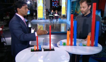
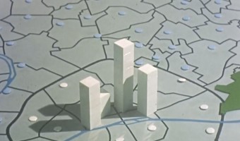
This educational movie from the 1960s uses physical bars and stop motion animation to show the evolution of population in the Paris area between 1801 and 1961. It was made between 1962 and 1967 by the Institut des Sciences Humaines Appliquées (ISHA) and the Centre de Mathématique Sociale et de Statistique (CMSS), in collaboration with the Laboratoire de Cartographie directed by Jacques Bertin. You can see the physical visualization from all sides by […]

Added by: Pierre Dragicevic. Category: Passive physical visualization  Tags: bar chart, cartographic, stop motion animation, storytelling


2009 – Federal Budget Explained with 10,000 Pennies

Political Math (formerly called 10000Pennies on the Youtube channel) is a blogger who criticizes the US policy using stats and low-tech physical visualizations. His first 2009 video titled "Obama Budget Cuts Visualization" (left image) got 1.7 million views. Coins, but also bills, water or whisky stand for units of money or jobs. A video often ends with a dramatic action where the blogger cuts a penny in two, overturns a gallon container, spills hundreds of coins from a table, freezes water, or […]

Added by: Pierre Dragicevic. Category: Passive physical visualization  Tags: budget, employment, politics, storytelling


2010 – Hans Rosling Adopts Physical Visualizations

Hans Rosling is famous worldwide for his fascinating speeches about population growth and income inequalities, notably his 2006 TED Talk where he debunks myths about the third world using animated charts. In 2010 he started to tell stories about data using physical visualizations. He started by stacking Ikea boxes, then switched to a variety familiar objects including pebbles, toy construction kits, fruit juice, snow balls and even toilet paper. Hans' son Ola Rosling is behind the technology […]

Added by: Pierre Dragicevic & Yvonne Jansen. Category: Passive physical visualization  Tags: LEGO, rearrangeable, storytelling, TED


2014 – Lego Senate

Built by Lance Ulanoff, this Lego representation tells the story of the 2014 US midterms. Red and blue Lego blocks represent the number of Democrat and Republican senate seats. The representation was updated over the evening of the election, as seats went to either Democratic or Republican candidates. Captions tell the story, indicating the time of seat wins and the names of senators. Source: Mashable, The Lego Senate: How the 2014 midterms played out, brick by brick

Added by: Jennifer Payne & Samuel Huron. Category: Passive physical visualization  Tags: LEGO, politics, stop motion animation, storytelling


2014 – Data Storytelling with LEGOs

   LEGO blocks are convenient tools to progressively construct a physical visualization while unfolding a story. In the same vein as Hans Rosling's educational stories on data, Brookings fellows use LEGO bricks to explain societal concerns such as how much the U.S. tax system helps shrink the gap between extreme social classes1 and the chances for economic success of Americans born at the bottom of the economic ladder 2. Sources: […]

Added by: Fanny Chevalier. Category: Passive physical visualization  Tags: LEGO, rearrangeable, storytelling


2015 – Canadian Federal Election Explained with LEGOs

On Canadian national news, Toronto-based artist and organiser Dave Meslin used LEGO bricks to illustrate the results of the 2015 federal election. He shows election results based on a first-past-the-post system, and compares them to a representation illustrating what results would look like if based on proportional representation. Source: CBC News (2015) If Canada had proportional representation: Dave Meslin shows with Lego.

Added by: Jennifer Payne. Category: Passive physical visualization  Tags: LEGO, politics, storytelling


2015 – Dan Gilbert's TV Ads

The famous psychology professor Dan Gilbert made a series of TV commercials for the insurance company Prudential, together with Ray Del Savio from Droga5 and Colin McConnell from Prudential. These TV commercials make a clever use of participatory physical visualizations to demonstrate and explain human biases in financial planning. Ribbon Experiment (left image): Dan Gilbert asks bystanders to estimate how much money they will need to retire. He then gives each of them a ribbon and asks them to […]

Added by: Pierre Dragicevic. Category: Passive physical visualization  Tags: participatory, storytelling, walkable


2018 – Steven Pinker explains Global Life Expectancy with Physical Line Charts

Bill Gates shared a short video featuring Steven Pinker on his Twitter feed with the comment People today are living longer, healthier, and happier lives than ever before. I asked @sapinker to explain why. At first glance it appears that line charts are digitally overlaid on the video. However, closeups and a light swaying of the graphs when Steven Pinker touches them, as well as the addition of another country towards the end of the video indicate that the graphs visible in this video are […]

Added by: Yvonne Jansen, sent by: Cedric Honnet. Category: Passive physical visualization  Tags: rearrangeable, storytelling